Quebec is a great use case for election cartograms. The map below (via CBC) shows how dominant the cities and suburbs are in population.
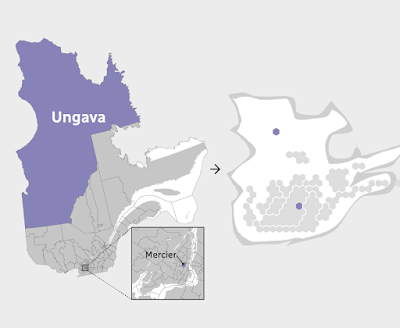
 I like how they shaded the shape of the Province behind the hexagons. The geography be unrecognizable without it. The map at the bottom of their page illustrates how one Riding (district), Ungava covers over half of Quebec's area but contains a similar population to a tiny Riding in Montreal.
 In the recent election the conservative Coalition avenir Quebec (CAQ) made huge gains at the expense of the Liberal and Québécois parties. Here are before and after maps. I rearranged the from the side by side view on CBC because the layout of this blog makes it easier to read this way.
 Light blue is CAQ, dark blue Québécois red is Liberal and Orange is Québec Solidaire, another party that saw gains in this election. Above is before and below after the election.
 Here is the side by side images as they appear on the CBC web page. The comparisons are easier to make when not distracted by the giant low density areas of northern Quebec.


1 comment:
The shading behind the province was a great idea!
Post a Comment