
Martin Grandjean shows the network of air traffic patterns with an animation that loops between a purely geographic view and a force directed layout. This network view expands the busy areas such as Europe so you can see individual airports where they are tightly clustered.
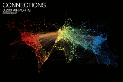 Colors are arranged by longitude to help untangle the network - and also make it pretty. The network view is also arranged to visualize clusters where travel connections are more frequent. His observations about these clusters are interesting:
Mark Evans created visualizations of commutes to every county in the United States from ACS (US Census) data.
 Non-blue dots represent the most common four counties that commuters come from, while the blue dots are other common locations. ACS data is aggregated by census tracts or block groups so the to and from locations are generalized. His blog post explains.
I find it interesting to compare the density of jobs among cities. This comparison of Houston and San Francisco gives a good idea of the differing transportation needs in those cities.

 Here are screen shots of the final work destinations. You can explore your own favorite places here.


"India is more connected to the Middle East than to South and East Asia. The Russian cluster is very visible, connecting airports in Russia but also in many former Soviet republics. Latin america is clearly divided between a South cluster and a Central American cluster very connected with the U.S."More information about this visualization and larger versions of the maps can be found here.
Mark Evans created visualizations of commutes to every county in the United States from ACS (US Census) data.

I find it interesting to compare the density of jobs among cities. This comparison of Houston and San Francisco gives a good idea of the differing transportation needs in those cities.


No comments:
Post a Comment