Wednesday, December 29, 2010

Google Zeitgeist-the most popular searches of 2010

Google Zeitgeist reviews the most popular search terms of 2010. You can pick a country and see the most popular searches by month and the most searched personalities (some muppet named Justin Bieber tops most of the lists.) For the United States you can choose a city and see the most popular searches (university web mail servers are huge.)
Of course the best part is the interactive map.


You see how frequently some of the major stories of the year were queried by month with bar charts for each country. You can also play an animation for the entire year and compare up to three stories.

Also, you can choose a subject or person and get a map showing interest by state. Here is the Justin Bieber popularity map. Pardon the hideous plate carree (or something similar) projection. Happy New Year Justin-Virginia loves you!

Tuesday, December 21, 2010

Map of the Week-Census Preview

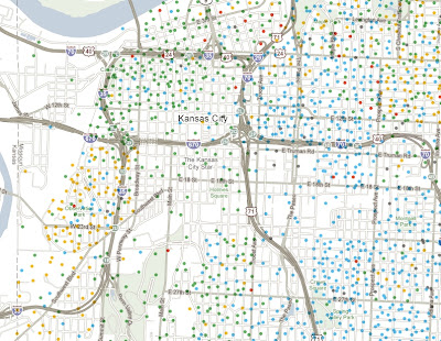
Last week the New York Times put out this nice interactive map showing some of the latest data released from the Census Bureau. The dot maps are the most interesting. They nicely illustrate patterns of race:


and income:


The entire country is covered so you can zoom, pan or choose a location. If you zoom too far in you lose the patterns a bit and also get some misleading information because each dot represents multiple people, not individual households.


 To really see the patterns of segregation, zoom out.


Here's a larger city with a more diverse breakdown.


The income map reveals the inner city income holes that are prevalent in older cities like Baltimore, but less so in Washington D.C. where there is much more inner city wealth.


If you zoom out a ways the dots seem to follow county boundaries. Zooming in arranges them in a more realistic pattern. I'm not sure what algorithm produces that result.


Happy Holidays and may your next year be filled with new census maps!

Wednesday, December 8, 2010

States and Provinces Auto-Completed

The auto-correct feature on smart phones can be really annoying but if it didn't exist we wouldn't be able to waste our workday looking at Damn You Auto Correct!


Google has a slightly different feature called autocomplete based on web searches. Here is a map of the United States showing google's autocomplete suggestions - via Very Small Array.


Too bad the gratuitous topography makes it hard to read at this scale but if you click the map you'll get a readable version. There are at least five unfortunate states, that do not even contain google's autocorrect suggestion. See if you can figure them out.

Here's Canada, courtesy of the GIS User blog.

Wednesday, December 1, 2010

Holiday Books and Exhibit

I will now proceed to discuss two books I have not read yet and one exhibit I haven't been to yet. After all, this is the internet where you just say stuff!

The Hand Drawn Map Association (HDMA) has a book out entitled From Here to There: A Curious Collection from the Hand Drawn Map Association.

Those of you in the Philadelphia area can see a parallel exhibit of their maps called No where at Arcadia University in Glenside, PA.

The exhibit only goes until December 19th so hurry up!


Here are some maps in the exhibit lifted from Kris Harzinski's website. Harzinski is the founder of the HDMA and an artist from the semi-hip Fishtown neighborhood of Philadelphia.

Perry Steindel, Untitled, 1965.

Scott Griffith, Window map of Anchorage, 2010.

****************************************************************
Mapping America is a follow up to the Mapping New York book featured previously. Once again Black Dog Publishing is offering a 40% discount for readers of this blog. For the discount send an e-mail to Jess Atkins jess@blackdogonline.com

Here are some sample images.

Detail from a pictorial Wildlife and Game map from 1956.

"Dissected Map of the United States" by Rev. E. J. Clemens, 1893. This is the box of a jigsaw puzzle meant to teach geography. The American figure is handing out pieces to grateful representatives of various foreign countries. On the back is an ad for Sherwin Williams paint.

Finally, I will leave you with this heart-warming image- "States United", a poster by Greg Beauchamp, 2009.


I like the legend at the bottom of the poster.