Wednesday, October 31, 2018

Canada's Declining Caribou Population

Canadian Geographic posted this map as a snapshot of the status of caribou herds.
https://www.canadiangeographic.ca/article/mapping-decline-canadas-caribou
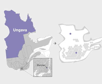
This map, while visually appealing is a little hard to grasp. The colors represent groupings (referred to as "designated units") of caribou species and the text around the map is color coded to these groups.  The circles show the highest estimated population in gray versus today's estimated population, color coded to the designated unit.

In the words of Justina Ray, the president and senior scientist of Wildlife Conservation Society Canada
“We are a natural resource-driven economy, and limits to our footprint is anathema to most. Our system of monetizing does not extend to species. They have no value.”
more details here

Wednesday, October 24, 2018

The Quebec Election Cartogram

Quebec is a great use case for election cartograms. The map below (via CBC) shows how dominant the cities and suburbs are in population.
http://ici.radio-canada.ca/special/2018/elections-quebec/circonscriptions-resultats-cartes-vote-analyse-politique/
I like how they shaded the shape of the Province behind the hexagons. The geography be unrecognizable without it. The map at the bottom of their page illustrates how one Riding (district), Ungava covers over half of Quebec's area but contains a similar population to a tiny Riding in Montreal.
http://ici.radio-canada.ca/special/2018/elections-quebec/circonscriptions-resultats-cartes-vote-analyse-politique/
In the recent election the conservative Coalition avenir Quebec (CAQ) made huge gains at the expense of the Liberal and Québécois parties. Here are before and after maps. I rearranged the from the side by side view on CBC because the layout of this blog makes it easier to read this way.
Light blue is CAQ, dark blue Québécois red is Liberal and Orange is Québec Solidaire, another party that saw gains in this election. Above is before and below after the election.
Here is the side by side images as they appear on the CBC web page. The comparisons are easier to make when not distracted by the giant low density areas of northern Quebec.


Wednesday, October 17, 2018

Ghastly Halloween Poster Maps

What, where, why? It all started with a software tutorial using data from upstate New York. GIS software packages tend to open with random color schemes. When I brought the data into GlobalMapper, it gave a nice orange and black Halloween palette - the orange below got browned a bit when by Twitter.

Looking around the area I decided that the Syracuse street pattern provided nice, creepy look for a Halloween poster - I will put some boring technical details about the process for these at the bottom so you can skip that part if not your thing.

Next, I thought about spider webs and looked for a city with a nice, webby street (or highway) pattern. San Antonio works-when looking at the regional highway network.
Here's a final one - another S city inspired by my childhood skeleton costume.
Enjoy!

Technical details:
Each map was done using a very different process. For Syracuse I downloaded data from OpenStreetMap, styled it in QGIS using a fiery pattern, then exported an image which I altered using a ridiculous combination of GIMP, Inkscape and Photoshop. If I knew those packages better I could have surely done all that in one but I used the bits and pieces I know from each. I used an online font generator for the title and then styled and altered it a bit in Inkscape.

For San Antonio, instead of downloading the data, I made a screen shot from OpenStreetMap and then used Photoshop to select and remove certain colors, then manipulated it in Inkscape with various spider web pattern fills.

Seattle was mostly done in Photoshop by manipulating layers and tracing the major roads from a screen shot with bones. The background is a knee x-ray image that I smudged to fill in the non-knee-like areas of the city like West Seattle and Magnolia.

Thursday, October 11, 2018

Cha if by Land, Tea if by Sea

There's a very interesting post on Quartz, titled Cha if by Land, Tea if by Sea: Why the world only has two words for tea. Actually, its only one word, represented by the Chinese character 茶. This character is pronounced in most of China as "chá" but in the coastal provinces where the Dutch traded, it is pronounced "te". The Dutch brought tea back to Europe on ships where variations of the word were spread, while overland trade to other regions led to variations on chá, such as chai.

https://cms.qz.com/wp-content/uploads/2018/01/tea-map1.png?w=2520&strip=all&quality=75
The map above was clipped to fit this page better. To see the entire image with legend and credits click on it. Blue dots are variations of "te" based on the Min Nan (south coastal Chinese) dialect while magenta dots are variations of Sinitic (common to most forms of Chinese) dialects. There are a few scattered gray dots where other local words are used. These are mostly in native tea growing regions, where the crop developed independently.

 Countries along the Silk Road trading routes, as well as parts of East Asia and East Africa have "chá"-like words for tea while most of Europe uses "te"variations. Eurpoean exceptions include Portugal, whose trade was conducted through Macao, where chá was used, the Basque region, possibly due to proximity to Portugal, and parts of Eastern Europe where trade was likely to have been from overland routes.

For New Zealanders, who may be upset at the omission from the original map (wider maps show up less clearly in this format), here you go:
 

Wednesday, October 3, 2018

The Wealth of African Cities

Africa's economy is growing rapidly as are its cities. Population projections for 2100 show Lagos. Nigeria becoming the world's largest "megacity" with a population reaching over 88 million. This video shows the predicted top 20 cities in 2100, the top three will be in Africa. A map, via Visual Capitalist shows where private wealth is concentrated on the continent.
http://www.visualcapitalist.com/map-cities-hold-africas-wealth