Showing posts with label books. Show all posts

Thursday, September 28, 2023

Philadelphia Bookstore Map

Note: As September comes to a close so does Philadelphia month. There will be a couple more posts today and tomorrow before I return to my normal weekly schedule.

This one is personal. Several years ago I was working with a Philly-based computer programmer and an artist to create a map of bookstores in Philadelphia. We put together lists, artwork and I made a few mock up maps but we never got much interest from the store owners. Apparently someone else did because the Philadelphia Bookstore Map is now a reality. A creation of artist Henry Crane (I don't know him) and the booksellers (unlike us he got them to buy into the project), the map succeeds pretty well while incorporating some similar artwork to what we were going for-images of the stores and some local sites.

As a disclaimer, I have not yet seen the paper copy, only what is available on the web page and on Instagram. It looks like there is an inset map (not shown online) of the stores on South Street, a good way of the solving the density problem we also faced.

A few minor points of criticism. I would have muted the background map to make the points stand out more though he could have also done that using bolder point colors. I'm not a big fan of the overly Google-looking teardrop shapes but they work fine here. The colors for different categories of stores could also be more distinct. 

One of the best things about this is that in the online version there is a page to access sub-pages for each store by clicking on the bookstore drawings.

I chose this image of Bindlestiff Books because that is one of the stores we visited on our journey. One last nice detail - he used one of my favorite Rittenhouse Square statues from my childhood, Billy the goat on the cover.

via Instagram


Thursday, October 6, 2022

A Collection of Raymond Chandler Maps

I'm not really a fan of detective novels so all I previously knew about Raymond Chandler is from the Robyn Hitchcock song "Raymond Chandler Evening". The pavements are all wet, there's a body on the rails, he's not the reassuring type, etc. I've since learned that his work is so geographically detailed that it has inspired at least three maps of Los Angeles.

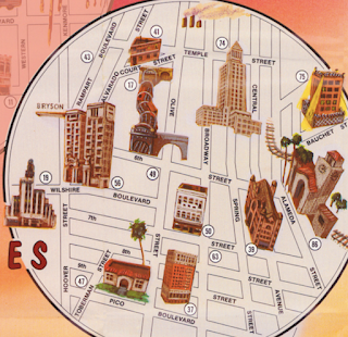
The above map, titled "Shamus Town" refers to the author's use of "Shamus" to mean cop or sometimes detective. This seems to be just a pictorial map from that era with a different title block. Originally drawn by Karl M. Leuschner, it was published in 1932 by Metropolitan Surveys of Los Angeles. Then modified to be a "Raymond Chandler Mystery Map" in 2014 by Loren Latker who runs the Shamus Town web site dedicated to Chandler. I have not found anything different other than the title. The original can be seen here via LA Magazine. The original can be seen here via LA Magazine. Here is the title block.

The second map is from Aaron Blake Publishers, 1985-1987.

It features blow-up circles for areas covered in the novels: Downtown, Hollywood, Santa Monica (sometimes aliased as Bay City), Lake Arrowhead and Mexico. 

There is a number key on the right listing locations by book. Some addresses are in italics suggesting his desire to disguise locations. These are listed after the actual locations. The map is "thoroughly researched" but "some places no longer exist, others never existed ... the exact placement of still others remains debatable."
These bubbles allow the size of important areas to be enlarged but even within the bubbles there are major distortions like placing Malibu immediately next to Santa Monica on a straight coastline. I like the electric look of the Beverly Hills area that connects the Hollywood and Santa Monica bubbles. The Shamus Town site has a nice feature where you can click on a section of the map and get both a blow-up of that area and the relevant text from the sidebar.
 
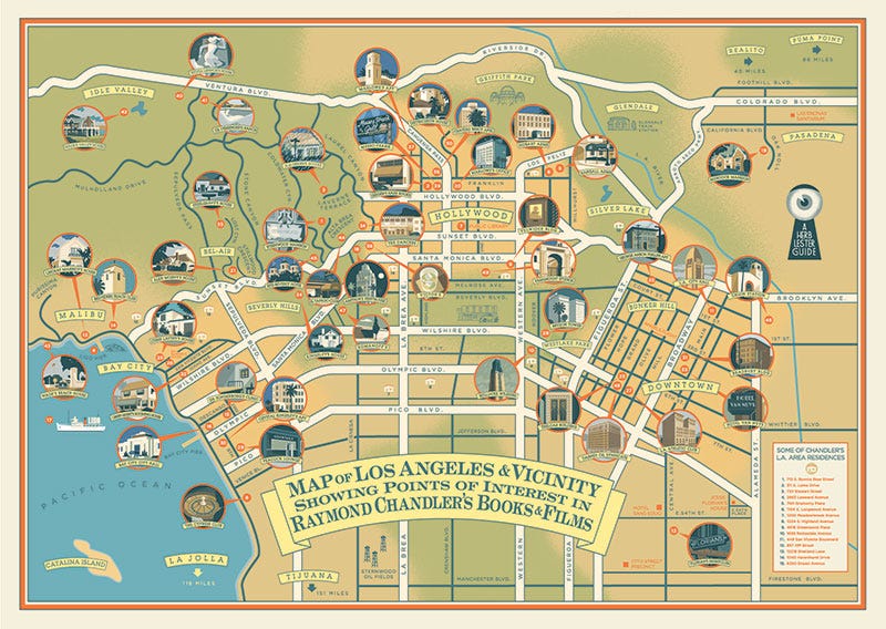
More recently historian Kim Cooper collaborated with Herb Lester Associates in the U.K. to create this "guide to Chandler's world and that of his noble alter-ego, the private detective Philip Marlowe. It mixes locations from the books, the films and Chandler’s personal life. There’s the crummy dive where Moose Malloy went looking for Velma (Farewell, My Lovely); the actual lounge where Marlowe and Terry Lennox ordered gimlets (The Long Goodbye); the top-floor suite where oil executive Chandler got his priceless education in how a dirty, sun-drenched city really operated. It’s an insider's guide to the city Chandler knew, and can still be visited today."

It can be purchased here and more details about the map are available on Electric Lit. Here is a not much higher resolution detail via heflinreps.

Tuesday, August 24, 2021

Detroit in 50 Maps

 It's a strange coincidence but less than a week after blogging about Cleveland in 50 Maps, I got a notice about a successor book.

There are no maps on the web page, just the cover. The book is only available for preorder right now. Maybe when it is ready will be more to see. Here is part of the write-up

"Detroit in 50 Mapsdeconstructs the Motor City in surprising new ways. Track where new coffee shops and coworking spaces have opened and closed in the last five years. Find the areas with the highest concentrations of pizzerias, Coney Island hot dog shops, or ring-necked pheasants. In each colorful map, you'll find a new perspective on one of America’s most misunderstood cities and the people who live here."

Yes Cleveland was also described as "one of America’s most misunderstood cities".

Wednesday, August 18, 2021

Cleveland in 50 Maps

This book is almost two years old now but sometimes things stay in my in-box for a long time! Long enough that you can now buy it at a steep discount.

From the website: "Cleveland in 50 Maps deconstructs the Forest City in surprising new ways. Follow the changing locations of breweries, music venues, and commuter rail lines over time. Track the Clinic’s growing east side footprint, year-by-year attendance at the Jake, and the addition of communities to the Cultural Gardens. Find out which local high schools produce the most NFL players and which locations the major presidential candidates visited in 2016. Discover the massive salt mine under Lake Erie and the barricades on the border of Shaker Heights. In each colorful map, you'll find a new perspective on one of America’s most misunderstood cities and the people who live here."

Here is that massive salt mine under Lake Erie, who knew?

The logic of streets and avenues in Cleveland's "grid" is explained in two maps showing each respectively. The avenue map is much prettier. Avenues run east-west while streets are north-south

Here is an interesting map showing the evolution of the Cultural Gardens
Read more about it and buy a copy here.

Wednesday, February 22, 2017

Tokyo on Foot

Florent Chavouet is a French graphic artist. He spent six months in Tokyo ("the most beautiful of ugly cities") where his girlfriend had an internship. He spent his days there riding a bicycle to various neighborhoods and sketching them. Eventually these became a graphic memoir, Tokyo on Foot. The book is full of great hand drawn maps. Here is part of the table of contents.
Here is a detail from the house they lived in in Ochiai.
The circled numbers show where sketches on those corresponding pages were drawn. Here are some details from the busy Shinjuku neighborhood.
Scattered comments such as "smells of Yakitori" really bring the place to life.
Gakushuin University
And finally a map of a bike trip to Kamakura and the Miura Peninsula to the south.
The non-map sketches are also wonderful. If you're fascinated by Japan this is a wonderful, unique book for armchair travel


Wednesday, February 1, 2017

The Meltropolis

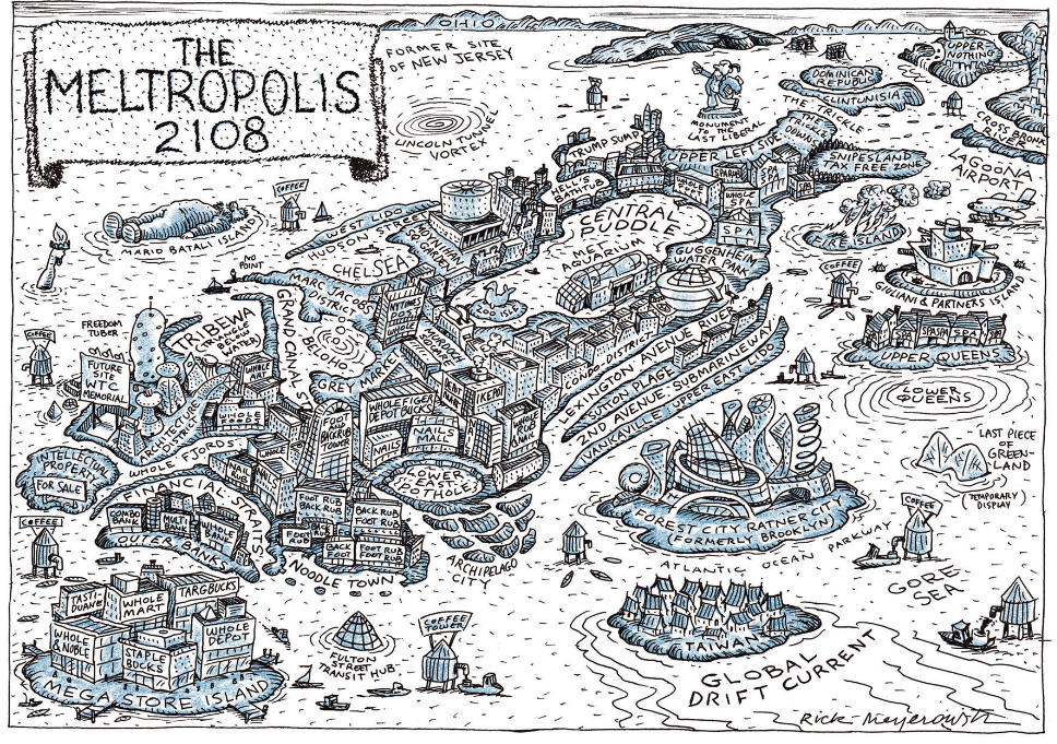
There have been many excellent map books lately that I have not had a chance to properly look at. One recent addition is a new Katharine Harmon "You Are Here" volume NYC : Mapping the Soul of the City. One of the best maps is by illustrator Rick Meyerowitz (also see his New Yorkistan map) - "The Meltropolis 2108" - image via Atlas Obscura
http://assets.atlasobscura.com/media/W1siZiIsInVwbG9hZHMvYXNzZXRzLzA4NDc4MWYzMzc1ZTc4MDE3OF9TY3JlZW4gc2hvdCAyMDE2LTExLTIyIGF0IDkuMDMuNDggQU0ucG5nIl0sWyJwIiwiY29udmVydCIsIi1xdWFsaXR5IDkxIC1hdXRvLW9yaWVudCJdLFsicCIsInRodW1iIiwiMTI4MHg-Il1d/Screen%20shot%202016-11-22%20at%209.03.48%20AM.png
The map shows New York as not just the victim of global warming, but also of mass consumerism. The map is full of watery puns such as Central Puddle, the Met Aquarium (the flooded museum), Lagoona Airport, ChelSEA, Brooklyn's Atlantic Avenue changed to Atlantic Ocean Avenue and the former site of New Jersey. Wall Street has become the Outer Banks separated from the rest of the island by the Financial Straits.

Sociopolitical humor is found in place names such as the Snipesland Tax Free Zone, the Condo District, Times Square renamed Murdoch Square, Staten Island re-branded as Mega Store Island and Ivankaville. Other nice touches include the a large spud known as the Freedom Tuber and the Monument to the Last Liberal.

To see more details click the map above, see the Atlas Obscura article or buy the book.


Wednesday, January 25, 2017

Early Islamic Maps

Karen Pinto's new book Medieval Islamic Maps; An Exploration covers a very overlooked school of cartography.
https://www.amazon.com/Medieval-Islamic-Maps-Karen-Pinto/dp/022612696X
These maps are more representational than geographic, following the early Christian T-O maps. In an interview, Pinto describes the typical world map as having the form of a bird. The map on the cover puts south at the top. The white land areas are the bird's features: Africa is the upper wing, the Arabian Peninsula is the head, Asia is the body and Europe (the tiny triangle in the lower left) is the tail. Here is another version by Al Istahkri from cartographic-images.net circa 977 AD.
http://cartographic-images.net/Cartographic_Images/211_al-Istakhri.html
The large water body on the left side is the Persian Gulf and Indian Ocean. The teardrop shaped water on the right side is the Mediterranean Sea. The Nile is shown sticking up from there while below the Mediterranean is the Bosporus Strait. Rivers coming down from the Sea on the left are the Tigris and Indus. Both seas are shown containing three large islands, it is not always agreed which ones they are. Other important water bodies in the lower half of the image are the Caspian and Aral Seas. Another image from cartographic-images.net  helps translate the place names.

There is no scale on these maps but Al Istahkri lists distances between places in marhalah (a day's journey.) A journey through the inhabitable world was 210 days. The far north and south were considered uninhabitable because extreme cold and heat respectively. The southern hemisphere was unknown to these travelers.

Pinto discusses how scholars have often belittled these maps for their simplicity while ignoring that they are iconographic representations, meant to promote a common world perception. The simple forms also made them easy for traveling scholars to reproduce and bring back to their home libraries.


Wednesday, November 2, 2016

Portland's Floor Plan

My wife recently bought me Portlandness: A Cultural Atlas for our anniversary. Maps were created by students and at least in one case, children. As a result there is plenty of creative cartography to see. One of my favorites is this floor plan, titled "Putting Our House In Order"
https://www.pdx.edu/insidepsu/mapping-portlandness
In order to not run afoul of copyright restrictions, I will only show what is available on the book's web pages. The map is full of clever metaphors - the river dividing the city is the front hallway, industrial zones are bathrooms, Pioneer Courthouse is the living room, downtown the office, and bedroom communities are bedrooms. It is easy to guess the nature of less familiar areas like Alberta (craft room) and Gresham (garage) - I also like that the bluffs are the balcony.

The map also shows up on the cover
You can see the entire map using the "look inside" feature on Amazon.

Wednesday, December 16, 2015

The Atlas of Design II

Last year the North American Cartographic Information Society (NACIS) published Volume II of the Atlas of Design. I looked at some of the online content, was very impressed and then stupidly forgot about it. This year with the holidays coming, I hinted to my wife that I might know of a nice Hanukkah gift. She took the hint and this fantastic book landed in our doorway. There's too much awesome to do it all justice but here are a few samples of what's inside. Note - since these maps are copyrighted, I only reproduced pieces that are already available on the Atlas site.

1. "The Road from Madison..." by Andrew Umentum
http://atlasofdesign.org/two/
This map chronicles a bicycle trip from Umentum's home in Madison, Wisconsin to New Orleans and then back again via Detroit. It is presented as a series of strips, inspired by Jon Ogilby's 1675 atlas of England and Wales - example here.

I love the details he brings out to give the map life. Also the way the lack of state boudaries and south(!) arrows force you to see these places from a different perspective. Rather than divide us, the states merge together into one continuous landscape.

2. "Map of the Beijing-Shanghai High-Speed Railway" by Dong Zheng
http://atlasofdesign.org/two/
Inspired by pre-modern Chinese maps that were primarily intended to be paintings, the map uses a birds-eye view. The modern railroad and buildings blend harmoniously with the ancient landscape and built environment.

 3. "The Heart of Canyonlands National Park" by Tom Patterson
http://atlasofdesign.org/two/
This was an exercise in using Terrain Texture Shader to generate improved hillshading. The author was inspired by Bradford Washburn's Grand Canyon map and by Swiss topo map techniques and shows that beauty can be found in cartographic algorithms.

4. "The Family Farm" by Alex Hotchin
http://atlasofdesign.org/two/
I love a good hand drawn map and this one tells a story of a particular place. Where exactly this is is not clear. The stories have no personal meaning outside of the author's family, yet he still makes you care about this place.

5. "The Asheville Map" by Bruce and Nora Daniel
http://atlasofdesign.org/two/
This fold-out paper map can also be found and purchased online. The base colors are unique (beige roads!) and were inspired by the colors of the nearby Blue Ridge Mountains. The map is artistic yet much more easily readable (and more accurate) than those touristy maps you often get when traveling.

There are many more maps here - 32 in total. Some are made by people I know. The range of techniques and styles is impressive. Most of them beautiful, all interesting in their own way. The previews don't do the maps justice and since in many cases they are not available online I guess you need to buy the atlas to see the full maps. If you're looking for a nice holiday gift for a map fanatic (or even casual map gawker) check it out.


Wednesday, April 24, 2013

Map Your Memories

For the Map Your Memories project, Becky Cooper printed hundreds of blank maps of Manhattan and walked around the island asking strangers to map "their Manhattan." These maps are compiled into a new book, Mapping Manhattan: A Love (and Sometimes Hate) Story in Maps by 75 New Yorkers


The results vary from the wordless and strictly artistic to maps full of illegible scribbles to simple numbers with separate translation pages.


Here are some examples - chosen based on personal tastes and legibility. These images are all from Cooper's tumblr page.

 
This one is from cartoonist and essayist Tim Kreider.

Wednesday, February 27, 2013

Paddle-to-the-Sea is on Google Earth!

 
A young Indian boy carves a little canoe with a figure inside and names him Paddle-to-the-Sea. Paddle's journey, in text and pictures, through the Great Lakes to the Atlantic Ocean provides an excellent geographic and historical picture of the region.
When I was in school one of the teachers showed us the movie version of Paddle-to-the-Sea. At first I thought it was kind of dumb watching a kid carve a canoe and I probably wasn't paying complete attention. Then suddenly, the canoe slid down the hill and into the river and began its journey. I was transfixed and transformed and all those other cliches. Ever since then the movie has had a powerful hold on my imagination, though not in the forefront of my mind until I found out that you can see it in Google Earth.

The COSEE Great Lakes web site allows you to download a kml file and explore it, chapter by chapter. Here are the beginning chapters from the Nipigon River region of Ontario.

Paddle the enters Lake Superior. After heading the wrong way and getting stranded on beaches and marshes, it eventually finds its way to the Soo Locks with the help of a dog sled.
After a detour through Lake Michigan, it ends up in the lower Great Lakes where it tumbles over Niagara Falls and into the St Lawrence Seaway.
Finally reaching the Atlantic it gets caught by a French fishing boat and brought to France.
The book itself is worth re-reading or even purchasing. I took a nicely worn copy of it out of the library. Here is an image of the main map from the book taken from SecretPlans.

In addition to the geography lessons, the book also diagrams a sawmill, a canal lock, a lake freighter and several other industrial processes that take place in the Great Lakes region. It also has diagrams that morph the lakes into recognizable shapes long before morphing became fashionable. Lake Superior is morphed into a wolf's head, while Huron becomes a trapper carrying a pack of furs.The maps also show the birthplace of the Dionne Quintuplets - this must have been a big story for the pre-octomom era. 

Thursday, October 20, 2011

Boylan Heights and the Poetics of Cartography

Denis Wood's recent book Everything Sings: Maps for a Narrative Atlas is featured on Places, an online journal of design. In the 1970's and 80's he began working with his students on a "narrative atlas" of the Boylan Heights neighborhood in Raleigh, North Carolina. These maps are unique in that they remove the usual street patterns to reveal the bare details. His map of jack-o'-lanterns from this series was featured here on a Halloween post a couple of years ago.  The Places feature has a slideshow of some of these maps. Here are a couple of examples:

Fences

Traffic Signs

Porch Ceiling Colors


The Places feature includes Wood's eloquent descriptions of the creative process. Here is a quote about making the "Pools of Light" map:
 The usual “efficient” map would have located everything on the street onto a single sheet — that is, different marks for lamp posts, fire hydrants, street signs, trees. Our inefficient map concentrated on a single subject, and, rather than lamp posts, it brought the pools of light into view. No legend, no north arrow, no neat line, none of the usual apparatus. At last, a modernist feel!

That’s when I knew we could write poems in maps, and I began thinking seriously about a poetics of cartography.
 A few more maps:

Intrusions Under the Hill - water, sewer and gas lines


Barking Dogs

Other maps include a map of power lines titled "Squirrel Highways", a mailman's delivery route, a diagram of the distance and direction that rent money travels to absentee landlords, wind chimes, viewsheds, and a bunch of others. The slideshow can be seen here.