Showing posts with label environment. Show all posts

Wednesday, May 24, 2023

The Incredible Shrinking Great Salt Lake(s)

NOTE: due to accidental deletions on this platform I have lost some of the original attributions for this post.

Here is a map of the paleo-lakes of the Great Basin from the Pleistocene Era.

The present day lakes are shown in lighter blue though even those have shrunk from the outlines shown above. These water bodies are endorheic,  meaning their water is retained-they do not drain to any external bodies of water. Among the many large lakes is Lake Bonneville, whose remnants include the Great Salt Lake and Utah Lake. Bonneville had many levels or shorelines formed during periods of rising and falling water levels.

About 18,000 years ago Lake Bonneville reached its highest elevation and began to overflow into the Snake River basin in southern Idaho. The overflow became a massive catastrophic flood that drained a huge amount of the lake's water away, possibly in less than a year. Post-flood the lake receded to the Provo level, shown in light blue on the above map or the dark blue area on this (probably colored from the original) US Geological Survey map from 1890.

This image, via Wikipedia, shows what some of the different past shorelines look like on an aerial view.

Recently as the climate has warmed these lakes, like many others in desert climates have shrunk quite a bit. Although a typical map of Utah shows this outline for the Great Salt Lake,

the real water level is now what is shown on the right below. Utah just had an unusually snowy winter so the levels have probably risen, but the long term trend of shrinking is likely to continue.
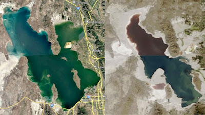
Image via Utah State University


Wednesday, June 22, 2022

Isolated Tribes of the Amazon

Indigenous advocate Bruno Pereira and journalist Dom Phillips were recently murdered on an expedition in the remote Javari (or Yavari) Valley in westernmost Brazil. They were studying and working to protect isolated indigenous tribes. These are tribes that do not want contact with the outside world. They are under threat from illegal fishermen, religious missionaries who want to convert them, dieases, drug trafficking, and the large scale destruction of the Amazon by agriculture and logging, along with a right wing government that is actively promoting those interests.  There are 28 conformed isolated tribes in Brazil, 10 in the Javari region, and possibly as many as 86 nationwide.  

The above map is from El Pais. Due to some technical problems I can only shows the western half at a good enough resolution to be able to read the text. Here is the map's legend,

and the entire map at a less readable resolution.

Pereira and Phillips were killed by a local fisherman on the Rio Itacoai while heading north to the town of Atalaia do Norte. A map from Uol News shows the area where they were last seen.

There is a good, detailed summary of the threats to these tribes in El Pais.

Wednesday, January 17, 2018

Extermination of the American Bison

Artist David Buckley Borden created this wonderful, sad map showing the demise of the bison.
http://davidbuckleyborden.tumblr.com/post/85623204515/american-bison-extermination-map-digital

Borden adds many clever touches to his maps including the downward facing buffalo head.
The map is based on conservationist William Hornaday's 1889 map that showed the declining range of the bison throughout North America. Hornaday is credited with preserving the bison from extinction. The present day (2003) tiny distribution of bison herds is shown in the tiny upside down* map in the bottom right corner.

Hornaday's original map is also quite striking.
https://digital.library.cornell.edu/catalog/ss:3293847
 Here is a detail-you can click on the map above for a full, zoomable version.
*The upside down map is a theme of Borden's. Here is a detail of his Ecological Distress Hydroscape Map. I like the clever use of arrows to indicate distress points-including the City of Ecological Sin.
http://davidbuckleyborden.com/wild-west-at-bodega/
In Borden's words:
No disrespect should be shown to the map of the United States of America; the map should never be displayed with the Great Lakes down, except as a signal of dire distress in instances of extreme danger to life, property or landscape.

More of his maps can be seen on this page.

Wednesday, April 19, 2017

Mexico City's Shaky Laky Foundation

Mexico City, one of the world's largest urban areas is built on a lake. The Aztecs built what was Tenochtitlán on an island in Lake Texcoco, connected by causeways to the mainland.
http://www.mexicolore.co.uk/images-4/414_01_2.jpg
When the Spanish arrived they decided to expand the city by draining the lake. They did not manage the water properly as the Aztecs had done. Draining and pumping water from underground has caused the city to sink. This in turn has caused very frequent flooding and also ironically made water scarce.

I was curious to see what areas of the modern day city sit on top of the ancient lake beds but have not found a map on the web that makes this very clear. This circa 1519 map on Wikipedia shows some locations, but not the modern urban area.
https://i1.wp.com/upload.wikimedia.org/wikipedia/commons/thumb/9/99/Basin_of_Mexico_1519_map-en.svg/2000px-Basin_of_Mexico_1519_map-en.svg.png?ssl=1
I took the .svg version of this map through a complicated software process and georeferenced it as best I can with my limited knowledge of the area. Here are two versions of this map overlaid on two different base maps to give and idea of where the ancient lake was. The first is on a National Geographic map via ESRI.
Keep in mind that the location of the lake is based on my best estimates. To avoid the assumption of higher level accuracy, I did not make a zoomed in version.
Here is another version using CARTO for the background. Each map has its advantages and disadvantages for legibility. On the one below, you can see the subway network which is kind of cool.
There are some interesting ideas of how such a large city can cope with the ecological and public health problems it faces including an ambitious proposal for a 145 million square mile Lake Texcoco Ecological Park - 23 times the size of the city's huge Chapultepec Park. Clicking the numbers on the map below, you can see some of the proposed projects.
http://www.parquetexcoco.com/en/project/  
The Texcoco Lake Ecological Park will become a tangible symbol of how our society can enter as an integral part into natural processes and help the proper functioning of the landscape.

Lake Texcoco Park is a work in progress, a vision of a remarkable place conceived by a collaborative group of scientists, engineers, biologists, chemists, ecologists, architects, urban planners, landscapers, and politicians.

Wednesday, March 12, 2014

The Nicaragua Canal - Construction Begins This Year?

While the Panama Canal celebrates its 100th anniversary this summer, backers planning a new rival canal in Nicaragua hope to break ground by December. The project is a strange mix of centuries of aspiration, globalism and communist politics. President Daniel Ortega granted a 50 year concession to Wang Jin, a Chinese businessman and CEO of the HKND group, to build and manage the canal.
There are six proposed routes from the Atlantic Ocean to Lake Nicaragua, all of them exiting through a newly built canal across the Isthmus of Rivas to the Pacific. The southernmost route through the San Juan river has been rejected for "technical reasons." The river forms the border with Costa Rica and while the entire river is considered part of Nicaragua, many investors would drop out of the project without the approval of the Costa Rican government.

Warnings by legal and environmental experts about the impact and feasibility of the project are dismissed by the Nicaraguan government as political attacks. The Sandinista government has convinced much of the population that this project will bring jobs and wealth to Nicaragua, however most of this wealth may end up in the hands of Wang and his business partners (more details at AP.)

Several colonial powers had looked at constructing a canal through Nicaragua before the canal in Panama was built.
Even after the Panama Canal was built, proposals for another canal continued to surface periodically. There have also been proposals for a "land bridge" consisting of railroads and fiber optic cables. Increased global shipping has reinvigorated the project.

Wednesday, November 2, 2011

Melting Sea Ice in the Arctic Ocean

Ice in the Arctic Ocean is melting faster than climate models have predicted. A recent article from The Economist looks at the causes. Included is this map comparing average and recent sea ice extents.


The article also links to an animation that shows the opening up of potential new shipping routes - also shown on the map above. Here is a still frame.


Some interesting notes from the article:

Melting ice creates a "feedback loop" where there is more water and less ice. Water absorbs light and heat, while ice reflects it. More water and less ice means more heat is retained.

Melting ice will enable the extraction of more fossil fuel from the area, creating another feedback loop in which more greenhouse gas emissions will be created.

The melting of the ocean ice will do little to raise the sea level, however eventually more ice will melt off of Greenland and other land areas and that will cause a sea level rise.

Wednesday, September 8, 2010

Map of the Week-Maine Expedites Wind Power

I just got back our annual trip to Maine. The trip primarily involves the following steps.
1. throw a tennis ball into the lake
2. watch the dog bring it back
3. repeat
4 - infinity. repeat

Remy taking a rare break


In between throws I got a little reading done. This article about wind energy from the Maine Center for Public Interest Reporting (reprinted in the Lincoln County News) caught my attention because it's largely about a map the state made under poorly documented circumstances. The map shows sites where wind turbines can get "fast track" consideration. Maine passed a law in 2008 designed to get wind projects moving with a goal of generating 2000 megawatts by 2015.

The map in question does not appear to be freely available to the public. Official records from the meetings where the map was drawn also appear to be non-existent. In fact, the whole process seems to be poorly documented and full of questionable connections between politicians and industry insiders. These projects are causing a rift among environmental groups with some of the groups seeing more harm than good. Beyond the usual "NIMBY" concerns about noise, property values and visual blight, there is also the required cutting of forests, installation of transmission lines, modest power output and much of the power and money being funneled out of state.   

The map was approved by the state legislature as a first step in deciding which projects should be built where and does not guarantee approval. While that map is not available, here is a map from the National Resources Council of Maine showing present and possible future wind projects.


Most of these projects are mountain top sites. The term "In Development" seems optimistic as it appears to mean that permits have been submitted, not necessarily approved. The "Under Construction" category is apparently nowhere-but it seems that the state is hoping the next version of this map will have some yellow stars.

Wednesday, September 1, 2010

The Great Green Wall

Eleven sub-Saharan countries in Africa are working together to create a "Great Green Wall" (La Grande Muraille Verte) of vegetation to halt the growing of the Sahara Desert. This will be a 15 km wide strip of various types of vegetation running the continent from Dakar, Senegal to Djibouti. Local and international organizations are working together to design the route and choose the most effective and useful species of vegetation. The wall's designers hope to help farmers and stem the exodus of environmental refugees.


Wednesday, August 25, 2010

Map of the Week-Pakistan Floods

Flooding in Pakistan has affected more than 17 million people and is "the worst natural calamity of its history" according to Prime Minister Yousuf Raza Gilani. In addition to the 1.2 million homes that have been destroyed there are also problems with water borne diseases, sanitation, lack of medical staff and supplies, destruction of agriculture and growing political unrest. See the BBC for sources and details.

The floods have destroyed more than 17,000 sq km (6,600 sq miles) of land and affect a huge percentage of the country.

Comparing this area side by side with a population density map from Wikipedia gives a good picture of the degree to which the population of the country has been affected.


A list of places to donate money or supplies is available at the Pakistani site Chowrangi.

Thursday, August 19, 2010

Confusing Map of the Week-Oil and Much More

Preemptive Media is an organization that lets participants monitor air quality with GPS enabled monitoring devices. However, this post is not about that. This post is about the confusing map they have posted on their web page.

It's an interesting visualization but full of cartographic problems. First of all too much information takes away from the focus on US oil imports. The title and blocks of text at the bottom about gas and coal confuse the reader about what the map actually shows. It's not a map about all fossil fuels, just one. The country sizes are also confusing - is this supposed to be a cartogram? I'm pretty sure it's not. The colors? I guess they're just colors and have no additional meaning. They did get it right in sizing (by width) the connecting pipelines according to the number of barrels a day we import.

Nevertheless this map does show some interesting statistics about where our oil comes from. Canada and Mexico are our top two sources for oil? Ecuador's in the top ten? Who knew? I also like the chart at the lower right showing how we create greenhouse gases.

One solution to the "Fossil Fuel Fix"

Get a zero emissions car and race it around the world! The Zero Emissions Race is sending four teams (Switzerland, Germany, South Korea and Australia) on an "Around the World in 80 Days" race. The vehicles are all electric and the costs of the energy (including transport across two oceans) will be "offset". They left from UN Headquarters in Geneva, Switzerland on Tuesday and two of the vehicles are currently in Mainz, Germany.

For some reason the other two vehicles are nowhere to be found.


Here is the route they will be taking around the world.

Wednesday, August 11, 2010

Hoboken's Corner Cars

Hoboken, New Jersey, the hometown of the overrated Frank Sinatra and way underrated Yo La Tengo has stepped to the forefront of urban transportation policy with the introduction of Corner Cars.  The program is a partnership between the city and Hertz. Like any other densely populated area, the city has a major parking problem. By placing 50 rental cars around the city they hope to remove over 750 cars from the streets. Here is a map showing the location of the first group of cars.


The cars are placed so that 90% of the city's population live within a five minute walk of a car as illustrated by the map below. They have assigned spaces so you know where to find them and where to park when you're finished.


If you choose to use the local bus service instead the city also provides you with a map showing the live bus locations.


Now what's your excuse for keeping your car? You probably don't live in Hoboken, that's what.

Thursday, July 22, 2010

There's Other Kinds of Petroleum in the Ocean Too

In addition to the oil spills in the Gulf of Mexico and China, there is lots of other petroleum floating around the oceans in the form of plastics. The "Great Pacific Garbage Patch" has made the news but there's lots of stuff floating in the Atlantic as well.

The Sea Education Association (SEA) just concluded a research expedition examining the accumulation of plastic debris in the Atlantic Ocean. With no advocates for the open ocean, SEA hopes that this excursion will raise awareness of the pollution problem.
The expedition sailed 1000 nautical miles east from Bermuda in an attempt to find the eastern end of the concentration of debris. As the map below indicates no edge was found. The ship took readings every 30 nautical miles along a jagged course through an area of converging currents .


The map could certainly be improved. Purple is a lousy choice for the top category-or is that green dot the top category? While there is no obvious pattern here, it is clear that the problem is widespread and comes from all of us. SEA is hoping we all re-evaluate our behaviors to help stop the problem from getting out of hand. The July 13th daily update eloquently states the problem and potential mitigation measures we can all take.

This map of the Pacific from NOAA shows how currents can take garbage from all over the planet and push them into these convergence zones. Note that this map is an oversimplification of ocean currents, as is the term "garbage patch"-see the link for details.

Wednesday, June 30, 2010

Map of the Week-GOOD Volcano Map

GOOD is an online journal that asks the question "what is good right now?" One of the highlights is their "transparency" series of graphics and maps. The latest transparency shows how small the recent Eyjafjallajökull volcanic eruption in Iceland was compared to other historic volcanoes. The disruption to the economy and to air traffic was huge but as the graphic indicates we should expect much worse in the future.


The tall orange triangles on the map are "decade volcanoes." I've never heard that term either but according to the description page it means a volcano "currently noted to have a history of large eruptions and a proximity to populated areas."  In other words if one of those blows it's really going to mess things up.

Friday, May 21, 2010

Map of the Week Oil Slick Update

There is a cool app on the Google Lat Long Blog where you can compare the size of the oil spill to your own corner of the world. That way you get a better sense of how large this disaster really is. People love to compare things to Rhode Island but try and you'll see it's much bigger. In fact it's threatening to swallow New Jersey whole.

Wednesday, May 19, 2010

Map of the Week-Deepwater Drilling and Spilling

The New Orleans Times-Picayune has some very detailed coverage about the BP Deepwater Horizon Oil Spill in the Gulf of Mexico. There are lots of maps and graphics showing how the spill happened, what BP is trying to do to contain it, fishing closures and the extent of the damage. You can also read some fascinating comments. Blame an accident by a British oil company on whatever US politician you don't like. Choose the comments that work for your agenda!

Here is an image from NASA. Not pretty.


Below are forecasts of the extent of the oil slick for today and tomorrow.


They also have a map animation. Click on the image below to see.    


Wednesday, March 24, 2010

Map of the Week-Replumbing California

The April issue of National Geographic is devoted to water, specifically the growing scarcity of fresh water. Articles cover ways to acquire, conserve and protect fresh water, our changing climate and conflicts over water, from the local to the international level. There are various maps, including a fold out worldwide "mapping of every river system." Online content includes this interactive map of California's water system. The online map is synchronized to a legend that shows the length and volume of the man-made water conduits that bring water west and south toward the Central Valley and large cities.

The article discusses the need to reduce the state's reliance on the Sacramento-San Joaquin Delta as a fresh water supply given that area's potential for salt water contamination and earthquakes. Without significant new conservation measures and better ways to transport water, the cities and farms of California will revert to the arid landscape that it was before these water projects were built.

Wednesday, April 29, 2009

Re-Imagining Cleveland

Cleveland, like many northeastern US cities, has been experiencing a steady population decline for decades. The estimated 2007 population is less than half of its 1950 population. An excellent article from the Planning Commissioners Journal highlights some interesting ideas the city's planners have for some of the empty spaces. These ideas include farms, community gardens, and restored wetlands among new commercial and residential districts. Kent State University's Cleveland Urban Design Collaborative (CUDC) has a great report entitled "Re-Imagining a More Sustainable Cleveland" that details many of these ideas. The report can be downloaded from their site, however it is a large file. There are lots of maps that if overlaid can be used to determine the best sites for the above uses. For example, here are maps of foreclosures and vacant land.


The map below on the left shows population loss in blue while the map on the right is the county's proposed"Greenprint."


The report has a nice overlay map showing different soil types to distinguish areas that are more suited to agriculture vs. areas that are better for wetland restoration. These are overlaid on top of existing parks and vacant areas (in dark brown).


Other useful overlays for these purposes are brownfields, estimated population trends and impervious surfaces. Some of these maps are from the Green City Blue Lake website while others are from the CUDC report. Below is a design concept from the report for land in areas around stream headwaters.

Population loss can be a tough pill for a city to swallow but if these ideas are carried out it could turn Cleveland into a model of a desirable urban community.