Showing posts with label boundary disputes. Show all posts

Wednesday, June 29, 2016

India Wants to Punish Cartographic Aggressors

This map via geocurrents shows India's disputed lands. 
A draft law in India aims to punish cartographers who do not include the claimed territories as part of the country. From the Washington Post:
Let's start with a basic fact: India claims much more land than it controls.

Thus, any map of India and its neighbors makes an inherently political statement based on how it depicts their borders. The issue is particularly thorny because the border disputes are with India's great rivals: Pakistan and China.
The law would punish offenders with up to seven years of jail time and fines running from $150,000 to $15 million. That's a high price to pay for trying to represent reality.

A few years ago Al Jazeera was banned for five days after showing a map that depicted Jammu and Kashmir as being divided between India, Pakistan and China. The media company was denounced for "cartographic aggression."

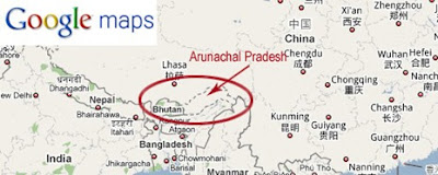
So how do the online map providers deal with these situations? A GIS Lounge article shows three different Google representations of the disputed state of Arunachal Pradesh, depending whether you are in India, China or the rest of the world (the last image.) While the rest of the world sees two parallel dashed lines, users in China and India see the border the way their governments want them to see it.


https://www.gislounge.com/wp-content/uploads/2010/07/World11.jpg
Apple maps (here in the United States) represents this border with two thin, unshaded lines. Note that there is another set of these along the Bhutan-China border. Last summer those two countries held their 23rd round of talks on this border.
Maps can be weapons.Be careful how you use them! I'll finish this with this nicely done map of Chinese "Intrusions" into India. I'm sure China has a different word for this. Click here for source.
https://blogger.googleusercontent.com/img/b/R29vZ2xl/AVvXsEhi7UdoqNdJAmXY3nvfxExgcoGUw-9L3csudKpNFMvZsugrLmgSxd1UpNxCRFTFpEP6G6MhtCfjzbxjKMGDhvbScXBEgppt8onbjnSDcLlbKQppbnbvHkTkorjQXW_l-7trnSaZssf1xSth/s1600/Neighbours-large_918.jpg


Wednesday, October 15, 2014

Flying Map Cancels Soccer Game

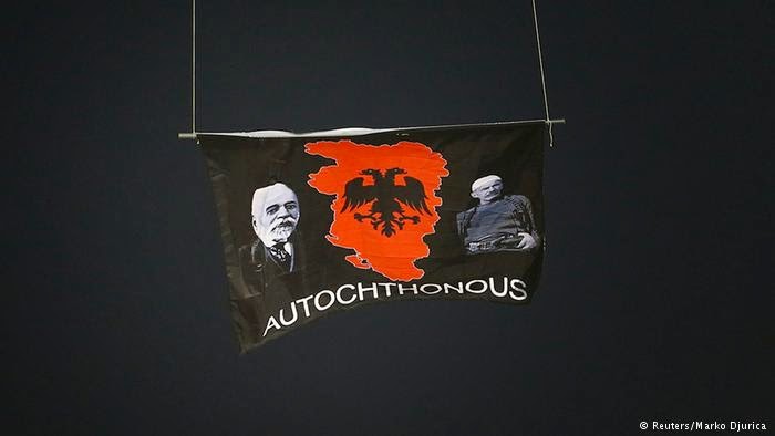
A drone carrying a flag that features a map of "Greater Albania" flew over the pitch in Belgrade during the Serbia vs. Albania Euro 2016 qualifying match. One of the Serbian players pulled the flag down, resulting in brawls among the players and fans and the game was subsequently canceled.
http://www.dw.de/albanian-pms-brother-arrested-as-euro-qualifier-with-serbia-abandoned/a-17996531
My quick assumption was that this was a map showing Albania united with Kosovo, an independent republic still claimed by Serbia. However, the shape is completely different. After some digging I came across a map of Greater Albania that explains the shape.
http://www.novinite.com/articles/122305/%27Greater+Albania%27+Enjoys+Massive+Support+in+Kosovo,+Albania,+Macedonia
Not only do the Greater Albania supporters want Kosovo but also large chunks of Serbia, Macedonia, Montenegro and Greece. Good luck with that!

More details on the soccer (football) story here.

Wednesday, September 3, 2014

This Pizza Proves Vietnam's Sovereignty Over Islands

Students at Hoa Sen (Lotus) University in Ho Chi Minh City (aka Saigon) made this pizza after a dispute with China over control of the Paracel (Hoang Sa) and Spratly (Truong Sa) archipelagos in the South China (or East Vietnam) Sea.
http://tuoitrenews.vn/lifestyle/20005/students-make-mapshaped-pizza-to-support-vietnams-sovereignty-over-islands
Tuna from nearby waters was used to shape the archipelagos. Boundaries and details were made from shrimp, chicken and mushrooms. This project was a response to the Haiyang Shiyou 981 standoff, China's deployment of an oil rig in the waters near the Paracel Islands (claimed by China, Vietnam and Taiwan) over the summer. See tuoitrenews for more details.

Here is a map from Wikipedia outlining the disputed archipelagos.
 For some older context here is the Paracel Islands as shown in Zheng He Voyage Map (the group of rocks at the lower right hand corner)
http://en.wikipedia.org/wiki/Paracel_Islands#mediaviewer/File:MAO_KUN_MAP-19.jpg
 "MAO KUN MAP-19" by Mao Kun - mybook. Licensed under Public domain via Wikimedia Commons - http://commons.wikimedia.org/wiki/File:MAO_KUN_MAP-19.jpg#mediaviewer/File:MAO_KUN_MAP-19.jpg


Wednesday, February 5, 2014

Circassians and the Sochi Olympics

The are several excellent articles in GeoCurrents about the largely forgotten (in the West) Circassian people whose territory was centered in the Sochi region. The majority of these people were either massacred or forced out of the Caucasus in the 19th century and primarily settled in the Ottoman Empire. Russia has three partly Circassian republics, as illustrated here.
http://www.geocurrents.info/place/russia-ukraine-and-caucasus/caucasus-series/dreams-of-a-circassian-homeland-and-the-sochi-olympics-of-2014
Many Circassians outside the Caucasus dream of returning to the area and having a unified republic. However, Russia has imposed immigration quotas and other restrictive laws. Poverty and violence in nearby places, notably Chechnya, have also slowed Circassian migration.

Circassian nationalists have organized a protest movement over the Olympics calling attention to the history of oppression, the disturbance of burial sites including possible mass graves, and the location of the Olympic skiing events at Krasnya Polyana, the site of their last major battle with the Russians.
This skiing facility, the easternmost dot on the map above, is also claimed by some Abkhazians. While linguistically similar to Circassians, Abkhazians have a tense coexistance with them, partly due to their enlisting the help of Russia in their own struggle for independence from the Republic of Georgia.  

For more on the Circassians see the GeoCurrents article that the top map was taken from.

Thursday, January 23, 2014

New Provinces in Iraq?

Iraq's Shiite government has decided "in principal" to create three new provinces to address Sunni grievances, counter Kurdish expansion and possibly, to appease Christian and Turkomen minorities. I immediately looked for a map but there is none because the government has only described it in general terms. The idea is to create a province around Fallujah, and two others on the edge of the Kurdish regions, in the Nineveh Plain and around Tuz Khormato. Here is a map from the Public Intelligence Blog showing where these provinces might be.
The text on this map is tiny and weak on descriptions but the color scheme nicely illustrates the ethnic and religious areas and where they mix. The article describes the situation in more depth. The black outline is the area with Christian minorities that could compose the Nineveh Plain province while purple outlines the Turkomen minority areas including Tuz Khormato. Fallujah is the yellow star in the middle of the country. 

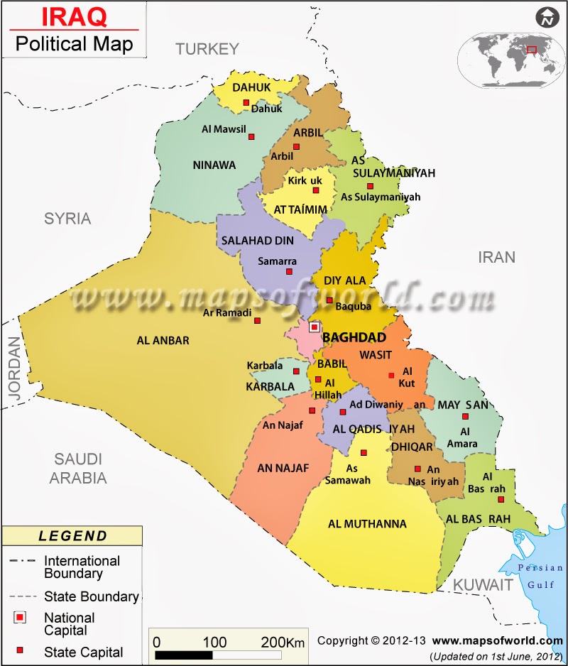
The map above does not show the current provinces. To get both the provinces and cities here's a map from Maps of the World. Fallujah is not shown because it is not a capital but it is near the bottom of the "f" in their watermark, between Baghdad and Ramadi. Nineveh is Ninawa on this map.
http://www.mapsofworld.com/iraq/iraq-political-map.html
Finally, for some classic sarcasm there's this map of the provinces of Iraq. The author showed an admirable respect for the actual provincial boundaries.
https://twitter.com/willJens/status/226247406939955200/photo/1


Wednesday, February 13, 2013

Map of Chicago's Gangland

On my recent visit to the Newberry Library, I walked into the Hermon Dunlap Smith Center for the History of Cartography. It was not clear whether the public is welcome there but the room was unlocked. On a large table under glass was a copy of A Map of Chicago's Gangland from Authentic Sources. This is a tounge-in-cheek map from 1931 "designed to inculcate the most important principles of piety and virtue in young persons and graphically portray the evil and sin of large cities."

This map romanticizes the prohibition era and Al Capone style gangsters with details showing events from gang wars, neighborhoods such as Little Sicily, bootleggers, auto theft, Mrs. O'Leary's cow, a lawyer running to spring his client and machine gunners from Detroit arriving for "Post-Graduate work," and a scale of murders, instead of miles. Gangland killings are marked with skulls and crossbones. Here is a detail of the area around the Newberry.
The map can be seen in greater detail at the Encyclopedia of Chicago.

Note the cartographic and cultural differences between a 1931 gangster map and the current map.

Wednesday, October 17, 2012

Mapping the Gangs of Chicago-is there any value?

The Chicago Crime Commission creates maps of gang territories for internal use. Elliott Ramos from radio station WBEZ obtained these maps in a freedom of information request and made them available through WBEZ's web page. Here is a sample map.

With 59 or more gangs and 625 different factions you need the kind of crazy patterned symbols seen above to distinguish them all. Here is a sample legend for this particular west side neighborhood.
Ramos took these maps and created an interactive gang map, overlaid onto google maps.


There is an interesting discussion on WBEZ's Afternoon Shift with Ramos, Natalie Moore, author of The Almighty Black P Stone Nation, and CPD's Chief of Organized Crime, Nicholas Roti. Both Moore and Roti are very skeptical of the worth of making these maps available. They stigmatize neighborhoods and gangs themselves, many of which are not associated with any criminal activity. The maps also are out of date and in the case of many gangs oversimplify a more complex geographical structure. Roti also expresses concern that the maps could cause gang rifts by showing the uneven distribution of territory. Finally, there's the inevitable confusion that gang presence on a block means gang dominance or high crime.

So should these maps really be made public? Maybe not. Should I have posted them on this blog? Maybe not but I couldn't resist.

via The Atlantic Cities

Wednesday, October 10, 2012

The Pennsylvania-Maryland War

My mother reads Now I Know by Dan Lewis. She recently sent me his post about Cresap's War, a border dispute between Maryland and Pennsylvania. The map via Wikipedia effectively illustrates the competing claims.


Pennsylvania's charter references the Twelve Mile Circle* around New Castle, Delaware and it's intersection with the 40 degree latitude line as its southern boundary. However, the circle is well south of 40 degrees. Both colonies used this error to try and extend their claims. Maryland claimed up to the 40 degree parallel (the northern red line on the map), thus including Philadelphia, the capital of Pennsylvania at the time. Pennsylvania proposed that the charter's error should be compensated for by moving the border further south. Britain issued a proclamation in 1724 prohibiting the establishment of new settlements until the border issue was resolved.

The resolution of this border did not come easily and hostilities broke out throughout the 1730's after Marylander Thomas Cresap set up settlements and ferry service across the Susquehanna River while collecting taxes for Maryland. His presence was not welcomed by the Pennsylvania settlers. An agreement between the colonies was reached in 1732, and then reneged upon by the governor of Maryland. After much nastiness and many failed attempts to capture him, Cresap was finally arrested by the Lancaster County sheriff. As he was paraded through the streets of Philadelphia with "his spirit unbroken", he announced, "Damn it, this is one of the prettiest towns in Maryland!**"

King George II intervened and in 1738 the parties signed a peace treaty in London. The 1732 agreement was upheld and the border was set at 39 degrees, 43 minutes and various seconds (it is not purely a line of latitude.) Mason and Dixon surveyed the line from 1763-1767 and it went on to greater fame as a political, cultural and metaphorical line.

* The Twelve Mile Circle is also an interesting historical anomaly, with it's own border disputes and may be worthy of a future blog post - stay tuned.

 ** This quote is from John Gibson, ed., History of York County, Pennsylvania via Wikipedia - the link to the original text is broken.

Boring Personal Note:  At the time of Cresup's War, all of Philadelphia lay south of the 40th parallel, now the line is well inside the city. When I lived in Philadelphia, I liked to imagine that when I was traveling up Bustleton Avenue, I'd cross from Kansas (home of my grad school) into Nebraska at Grant Ave - same latitude in other words. However due to an error, either on the map I was using, or my interpretation of it, I was pretty far off. The line is well to the south, approximately at Tioga Station on the elevated Market-Frankford subway line, or if you prefer, the corner of Broad and Clearfield. It also runs through the area depicted on this blog's header image.

Wednesday, August 13, 2008

Map of the Week - Georgia's Abkhazian and Ossetian Problems

It's been tough finding good maps that really show what's going on in the Caucasus region. This CIA map illustrates why the South Ossetian and Abkhazian people want independence from Georgia - though I'm not sure that being a part of Russia is really what they want either. The Abkhaz are linguistically unique while the Ossetians not only have a different language but are also not considered to be "Caucasian". The map nicely illustrates how difficult it would be to create contiguous countries in the region. Also note the proximity of other recent spots of conflict such as Chechnya, Dagestan and Nagorno-Karabakh in Azerbaijan. There are a couple of versions of this map on the web but Wikipedia has the best one I've seen.

For a nice, detailed general reference map of the region click here.

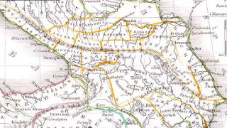
This is an interesting historical map of the region produced by American cartographer Thomas Bradford in 1835. Clicking the image will bring up a window so you can zoom and pan to get more detail.

Thursday, January 24, 2008

Map of the Week 109-Russian Claims in the Arctic

Put in your claim before it's too late! This is an excerpt from a story that appeared on the BBC this past August (2007). The text below the map explains the numbers.

"The Russians are leading a new 'gold rush' in the high north, with a bold attempt to assert a claim to oil, gas and mineral rights over large parts of the Arctic Ocean up to the North Pole."


1) North Pole: Russia leaves its flag on the seabed, 4,000m (13,100ft) beneath the surface, as part of its claims for oil and gas reserves
2) Lomonosov Ridge: Russia argues that this underwater feature is an extension of its continental territory and is looking for evidence
3) 200-nautical mile (370km) line: Shows how far countries' agreed economic area extends beyond their coastline. Often set from outlying islands
4) Russian-claimed territory: The bid to claim a vast area is being closely watched by other countries. Some could follow suit

Some interesting solutions that appear in this story:

The "median line method", supported by Canada and Denmark, would divide the Arctic waters between countries according to their length of nearest coastline. This would give Denmark the Pole itself but Canada would gain as well.

The "sector method" would take the North Pole as the centre and draw lines south along longitudes. This would penalise Canada but Norway and, to a lesser extent, Russia, would gain.

Thursday, October 27, 2005

MOTW #4

A map showing territorial claims in Antarctica. I don't know the original source.