Showing posts with label nature will kill ya. Show all posts

Wednesday, June 24, 2026

Cool Spaces

Europe has been very hot lately. The City of London created a cool spaces map last year highlighting indoor spaces, water fountains (the small blue dots), shade, and cooler areas of the city. 


The interactive map lets you choose what you want to see, filter for only air conditioned spaces and click points for more information. 


If you have your own venue, you can register it with the city to be on the map.

Here is a striking heat map from The Evening Standard, showing London’s hottest and coolest spots, from 2022 data. They are remarkably close together. Stay cool!

Wednesday, June 14, 2023

Forest Fires All Over North America

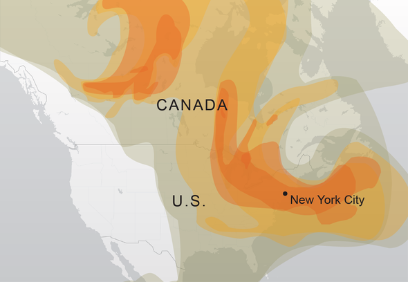
This has been a remarkably heavy year for forest fires and it's still very early in the season. The last few summers the West Coast has experienced many days of terrible air quality. This year the East Coast is experiencing it. Last week cities like New York, Philadelphia and Toronto has some of the poorest air quality in the world and residents were advised to stay indoors. Here is a map from NASA showing where major fires are burning. The red dots show smaller fires.

You can click and zoom for details.

A map from Scientific American shows how the smoke has moved from eastern Canada to New York City (the only city, apparently).

Here's one more map from the Fire, Weather and Avalanche Center showing active fires in the United States. It gives more details but doesn't cover Canada, where the largest fires are. The purple dots are lightning strikes.

Wednesday, December 21, 2022

The 2022 Hurricane Season

While I was busy obsessing over my 30 Day Map Challenge in November, CNN put out this map in a summary of the 2022 hurricane season.

It's interesting to see all the hurricane tracks on one map. While the season started out slowly, it finished with several memorable storms including Fiona, the strongest storm to ever hit Canada; Nicole, the first November hurricane in nearly 40 years and Ian, the most destructive storm of the year. Ian's huge rainfall amounts led to many deaths by drowning.

The full article can be seen here.
 

Thursday, December 8, 2022

Mauna Loa Lava Maps

 Sure, there are cool livestreams of the Mauna Loa volcano you can watch, but even better, you can see live maps of the lava flow.

Here is yesterday's status map from the U.S. Geological Survey

The dark red in these maps shows the new lava flow from the last 24 hours. It is moving very slowly towards the main highway, mostly due to breakouts of lava upstream. The NOAA observatory has been inaccessible. For comparison, here is the November 29th map, two days into the first eruptions.

There is also an interactive map where you can zoom in and really see the details.

Wednesday, May 12, 2021

Cicada Invasion

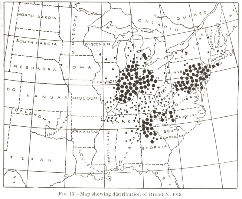
In the next few weeks Brood X cicadas will emerge from underground as part of their 17-year life cycle. They will fly up to the trees, mate and from my childhood memory, make a ton of noise. This charming 1919 map from the US Department of Agriculture, Bureau of Entomology shows the distribution of this brood then - via Cicada Mania.

The University of Connecticut has an updated, interactive map showing a very similar distribution. I guess they don't like the northern Appalachians.
The large cicada symbols are verified records while the smaller ones have a lower degree of certainty.

A huge swath of the country is about to get noisy!


Wednesday, June 10, 2020

Mapping the Locust Swarms

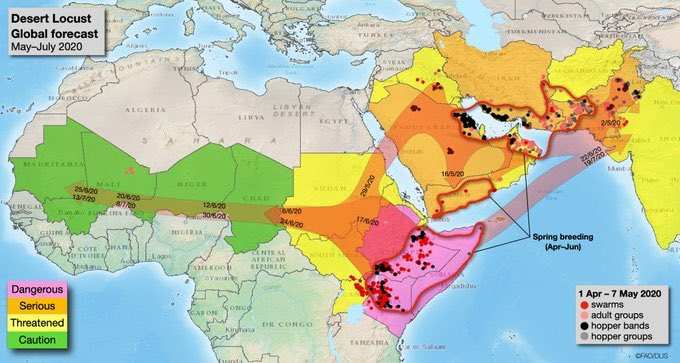
Locusts have been deviating crops in Africa and South Asia in the worst attack in decades. This map, via Business Insider India shows where the swarms are and where they are heading.
The article is full of disturbing photos (if you don't like locusts) and details some interesting efforts to drive them away such as beating thalis (small hand drums) or playing loud music. A silver lining is offered in that these locusts are a healthy food option for birds and fish (people not mentioned) and can be profitable to those who catch them.

Tuesday, November 20, 2018

California Wildfires

Despite the remarkably little press the massive wildfires in California are getting here in the eastern United States, the best sources for maps are from the New York Times and other non-California news organizations. The Times has a fantastic video of the smoke plume over the past week. Unfortunately the code they provided to put it below did not work so here is a small piece of it.
https://www.nytimes.com/interactive/2018/11/16/upshot/california-smoke-map.html
 You can see the entire country here - scroll down the the end of the page. Some of the smoke plumes are shown traveling completely across to the Atlantic Ocean.

Popular Science has a great map showing five years of fires-updated to six including this fire season.
https://www.popsci.com/california-five-year-wildfire#page-2
The best map I've seen showing the current conditions is from the BBC.
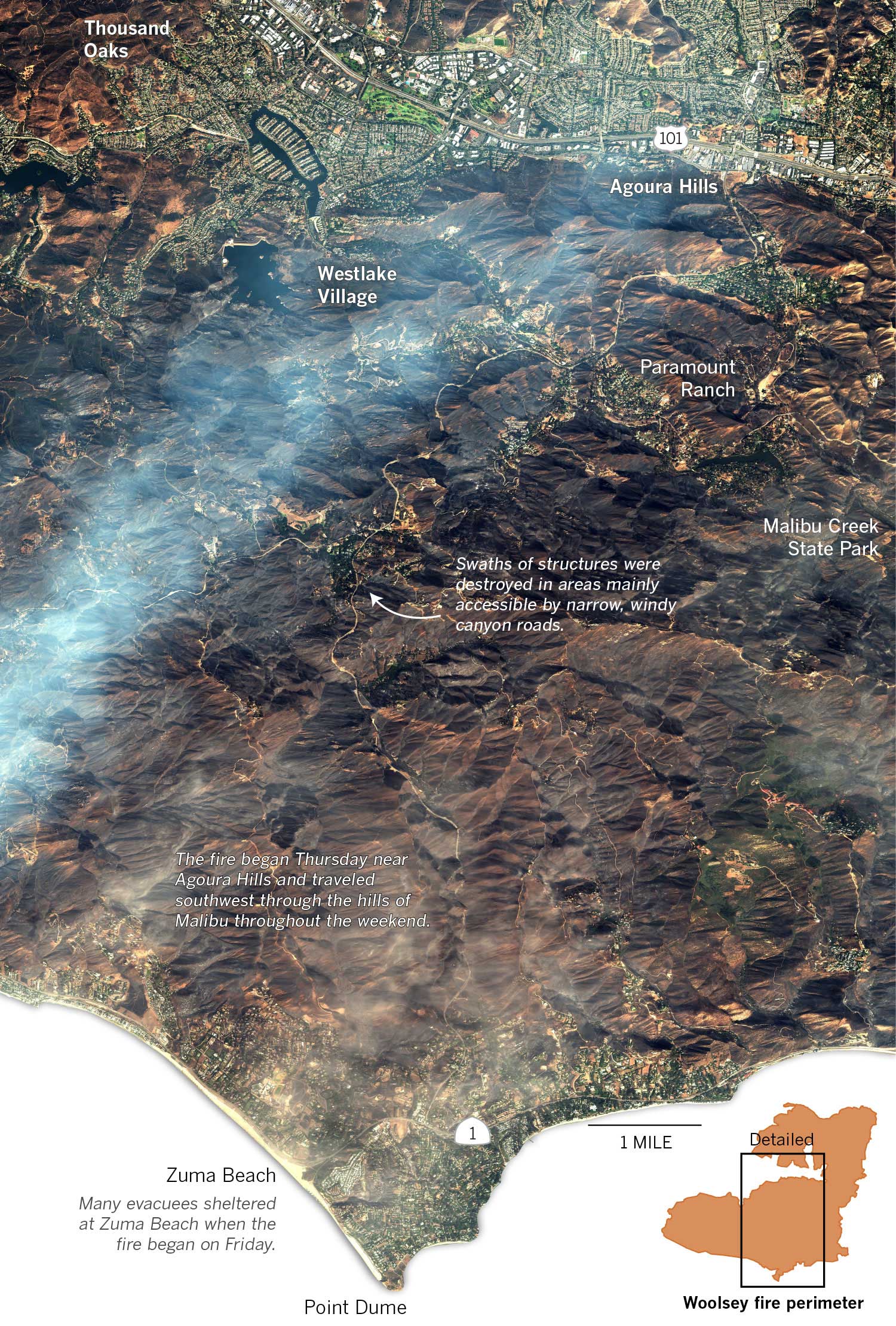
The Los Angeles Times has a great graphic (via DigitalGlobe) showing the Woolsey Fire near Malibu. To see some zoomed in views showing specific houses that were destroyed click here.
https://www.latimes.com/projects/la-me-woolsey-fire-progression/static/img/woolsey_overview_natural.jpg


Wednesday, September 13, 2017

Hurricane Footage from Snap Map

I don't spend much time with social media. As a result, I've been missing one of the bigger map stories of the year, the growth of Snapchat's Snap Map. Hurricanes Harvey and Irma have brought Snapchat to the forefront of media coverage. 
Image via Elite Daily
According to Elite Daily, when Irma made landfall Snapchat received 250,000 submissions within 24 hours. These numbers are way higher than the already high 100,000 daily submissions from Hurricane Harvey. Major media outlets used these pictures and videos in their coverage. The map part of the app is useful to focus on what is happening in specific geographic areas.
Image via Recode
The yellow-red colors in the background show where larger concentrations of posts are geotagged. Zoom in to see more Snapchat pictures and videos. Here's an example via Recode.
Early previews of the mapping function focused on it as a fun way to send your private data to corporations.
http://www.refinery29.com/2017/06/160114/how-to-use-snapchat-snap-map-update#slide-6
Having fun at the club!!!
It's somewhat ironic then that it has become a way to voyeuristically watch people's lives get torn apart by natural disasters.

NOTE: I tried to get Snapchat on my old phone so I could see for myself and get my own images for this post. Unfortunately I do not have enough storage on my phone to download the app. Sorry that I have to rely on second hand images like the ones above instead of providing original content.

Wednesday, August 30, 2017

Awful Hurricane Inspires Cartographic Greatness

At the risk of minimizing an awful tragedy, Hurricane Harvey has inspired some wonderful maps, particularly from the New York Times and Washington Post. This animation from the Times is spectacular. Click the play button and watch it unfold.
The subtle dark circles indicating areas of peak rainfall create a remarkable sense of the storm's movement.

The Washington Post's cube showing the total rainfall is also pretty remarkable.
https://www.washingtonpost.com/news/capital-weather-gang/wp/2017/08/27/texas-flood-disaster-harvey-has-unloaded-9-trillion-tons-of-water/?tid=graphics-story&utm_term=.c92fead7bb78
This only shows what rain had fallen as of August 27th so the situation has gotten much worse. In fact, here is an animation they just put on Twitter.
They did a nice job highlighting buildings and areas on the background map.

The total rainfall map is also quite striking. I lost the text on the image below but you almost don't need it. You can see the entire map with city labels, precipitation totals, legends and all by clicking on the picture.
https://www.washingtonpost.com/graphics/2017/national/harvey-impact/?utm_term=.59c3b4a0ab9d
Their map of rain gauges is also excellent.The arrows almost give it a three dimensional effect.
https://www.washingtonpost.com/graphics/2017/national/harvey-houston-flooding/?utm_term=.1266d16af560
I tried to break out of the New York/Washington media to see what other maps are out there but these really are much better than anything else I've seen. The Houston Chronicle has little to offer for maps though they do have an impressive collection of photos of the devastation and rescue efforts. What is encouraging is to see many articles about cooking, sports and politics showing that life is getting back to normal for at least some people in the area.

Wednesday, July 6, 2016

The Worst Wildfire in US History

The worst wildfire recorded in US History took place in Wisconsin and part of Michigan in 1871. The Great Peshtigo Fire burned 3.8 million acres and killed more at least 1,200 people and possibly as many as 2,500.* Some of them were boiled to death after trying to escape by jumping in rivers or lakes.
http://www.wunderground.com/hurricane/chrisburt/peshtigo2.jpg
An area twice the size of Rhode Island was burned completely and 12 communities were destroyed. The map below (via Weather Underground) shows the origin and extent of the fire, wind direction and estimated number of deaths in each area. 
http://www.wunderground.com/hurricane/chrisburt/peshtigo.jpg
The fire broke out in October after a very hot and dry summer. These conditions also helped set up numerous other fires in the region including the Great Chicago Fire - also the same week.
http://www.wunderground.com/hurricane/chrisburt/michiganfire.jpg
Though the fire is largely forgotten it has its own museum in Pehtigo, Wisconsin - with some nice public art.

 * An accurate death toll has never been determined because many records were destroyed by the fire.

Wednesday, August 26, 2015

Hurrican Katrina Water Depth

Ten years ago Hurricane Katrina slammed into the Gulf Coast destroying much of New Orleans. This extremely colorful image shows the depth of water at the height of the flooding. The colors are a bit counterintuitive for water depth (blue is one of the low water depth colors) but it still works effectively.
http://www.loyno.edu/~rrkr/maps/flood.jpg

Also shown are levee breaches and arrows indicating the direction of storm surges. The peculiar geography of New Orleans with its levees protecting areas below sea level means that unlike just about everywhere else, the elevation is higher in the waterfront areas. That means the inland parts of the city are more susceptible to flooding. The map is by Dan Swenson and was originally from the Times-Picayune. The large version can be seen here.

Wednesday, November 19, 2014

Misleading Buffalo Snow Maps

As we prepare to spend Thanksgiving with my wife's family in western New York, here are some maps of what we could be in for. This one, posted on Flowing Data a few years ago does a nice job of showing the lake effect snowbelt south of Buffalo. But there are problems...
http://flowingdata.com/2007/09/27/misleading-map-of-buffalo-snow/
Green implies that the rest of the area including Buffalo (inside the dashed box) is not so bad. However, a look at the legend shows that green is up to 80 inches a year and the yellow that appears in many of the suburbs is 90-100 inches. Chautauqua County people may consider 80 inches to be minor but for the rest of us this color choice is terribly misleading.

The map also may need an update as parts of the region are getting half their average this week.
http://lintvwwlp.files.wordpress.com/2014/11/wivb-snowfall-map.jpg
 Be "4 Warned" - this is another misleading map. How much snow will we see in Rochester? Apparently nothing even though family members tell us otherwise. The dropoff from 18-24" to nothing at the Livingston-Wyoming county line is remarkable as is the sudden lack of snow in Erie County, Pennsylvania. No data and no snow are not the same thing so don't treat them the same.

Wednesday, April 23, 2014

How Hollywood has Destroyed America

From the Concourse - an animated map showing the many ways places in the US have been destroyed in movies.
http://theconcourse.deadspin.com/map-how-hollywood-has-destroyed-america-1542969906
Hollywood clearly does not shy away from destroying their own city. The page includes lists and explanations for each symbol type along with several caveats and a discussion of the fine distinction between monsters and creatures. The yet to be released Sharknado 2 was not included. 

Wednesday, November 13, 2013

Nature's Toll on the Philippines

National Geographic has an excellent map showing all the problems nature causes for the Philippines. Not only are the islands magnets for huge typhoons, they also have to cope with earthquakes, volcanoes and landslides. The light brown lines represent a mere 10 years of storm tracks.
http://news.nationalgeographic.com/news/2013/11/131111-philippines-dangers-haiyan-yolanda-death-toll-rises/
The islands are located in a very warm part of the Pacific with no major land masses to the east so they get the full force of these storms. More than 60 percent of the population lives in coastal zones, often in poorly constructed housing. High rates of poverty mean that many people have little control over their living situations. Deforestation has caused mudslides which in turn create sediment clogged stagnant water leading to outbreaks of cholera. On top of all of this, the Philippines are located in the Pacific "ring of fire" where volcanoes, earthquakes and tsunamis are common.

For a more complete summary of their precarious situation see the National Geographic article.

Thursday, November 7, 2013

The Great Lakes Storm of 1913

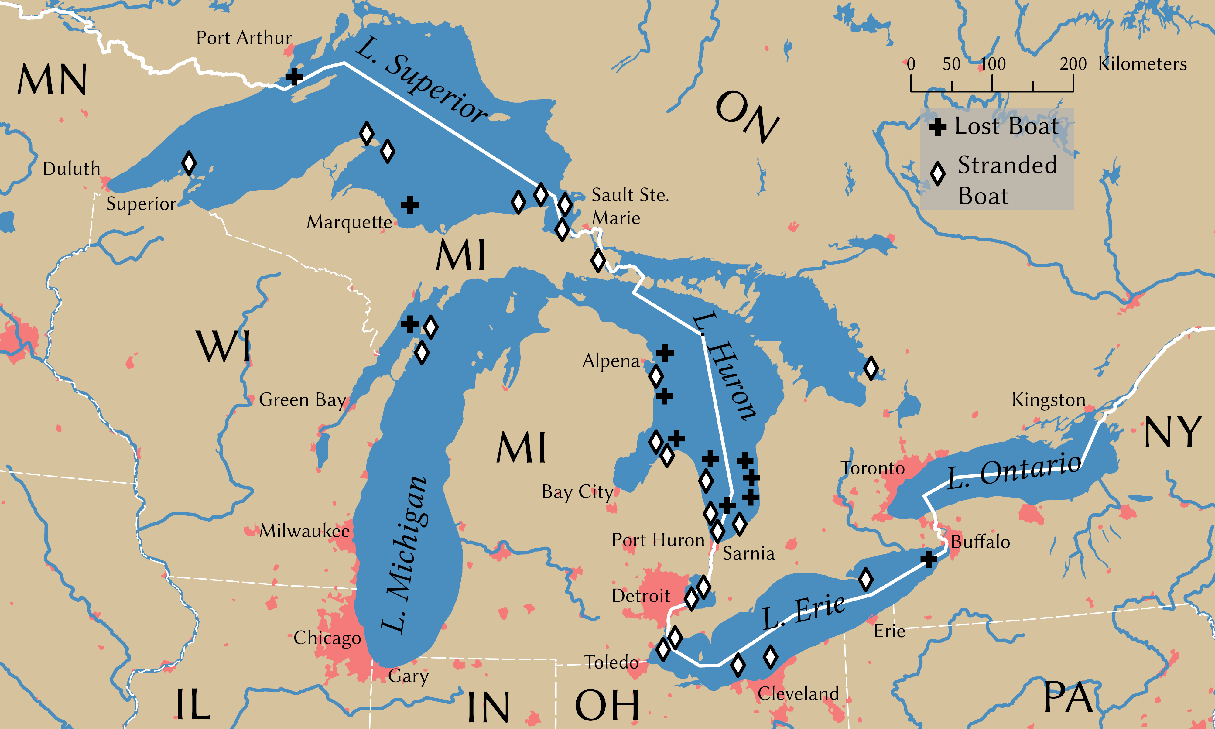
100 years ago today was the beginning of the Great Lakes Storm, the most deadly and destructive storm to ever hit the region. Also known as the "White Hurricane" because of the blinding snow that fell, the storm killed over 250 people, destroyed 19 ships and stranded 19 ships and some additional cargo barges. The storm raged for several days with a few lulls that only served to give false hope to stranded mariners. Most of the destruction occurred in Lake Huron. Wikipedia has this excellent map, originally from the USGS showing sunken ships in black and stranded ones in gray. Click for the original, more readable image.
The storm intensified and built up to hurricane force on November 9th. The US Weather Bureau only issued reports twice a day so most of this build up was not noted until too late. Cleveland saw 22 inches of snow and lost power for days as did much of the region. Breakwaters were destroyed in Chicago and Milwaukee.
   
There is a story on NPR's Morning Edition on the search for two ships in Lake Huron that have never been found. Another interesting account of the attempts by some crews to survive can be found in The Paragraph.

Wednesday, May 22, 2013

Oklahoma Destruction

The New York Times put together an excellent map showing the extent of destruction from Monday's tornado in Moore, Oklahoma. The map is based on a visual survey of the aerial photography. It shows that at least 1,500 buildings were destroyed or severely damaged, including entire neighborhoods.


It's truly amazing what nature can do in a few minutes and there's lots of voyeuristic photos on the web page - just be thankful if you're not one of the thousands of people affected.

Friday, February 8, 2013

Purple is the New Scary

With winter storm Nemo* bearing down on us the weather cartographers have decided that purple is now the scary color. Kind of like the recent Australia maps except this time indicating snow instead of heat.

Maps are from The Weather Channel. Apparently oblique is now the scary map angle. Working in the "Action" zone, I just set up our town's emergency mapping function - sounds more exciting than it really is.
So hunker down and buy all the bread and milk you can find, it's going to be a purple day for many of us. 

* Since when do they name snow storms? It used to always be the Blizzard of (Insert Year Here.)

Wednesday, December 5, 2012

What Could Disappear

The New York Times recently put out these interactive maps showing what areas of various US cities could disappear from rising sea levels if they are not protected. The page is a bit alarmist because the map defaults to the most extreme scenario - a 25 foot sea level rise. This is the "potential level in coming centuries" not the "probable level in about 100 to 300 years." In the extreme view you can say goodbye to Miami, New Orleans, Norfolk, Atlantic City, and most of Souf Philly, Cambridge, Mass. and Charleston:

The 5 foot rise view gives a more realistic picture of what to expect in the coming century. This also gives a good picture of areas likely to flood in an extreme storm event. Here are some examples:

Miami looks mostly OK but Miami Beach is 94% gone and the western suburbs are also looking wet.
New Orleans is in trouble again. In fact the 5 foot model is not much better than the 25 foot (88% flooded in the city and surrounding areas in the next 100 to 300 years.)


Houston is dry but 68% of Galveston is under water.
Here's an animation I created for Savannah from present to the extreme followed by a side by side comparison between the 5 foot model and the 25 foot model.