Wednesday, December 30, 2020

The Coronavirus Worldwide

The most appropriate way I can think of to end 2020, this year of pandemic, is to show where we are at worldwide.

This is from statista. Here is the same map from March 6, 2020 via Newsweek. Note that the highest number category in March is now the middle category.

 Stay safe, listen to science instead of grandstanding politicians, and maybe we'll have better news in 2021.


Wednesday, December 23, 2020

The Springfield Subway

I recently saw the Simpsons episode Postcards from the Wedge for the first time. It prominently features this map of the abandoned Springfield Subway.

In a long ago post I featured the map of Springfield - a direct link to it is here

While these maps look very different a close look shows an unexpected attention to geographic detail. The street layouts are very similar between the two. The street names are also consistent. 

A newer version of the subway appears in a later episode with more jokes but less geographic fidelity. This version is full of puns such as the musical references Boulevard of Broken Dreams and Yes Roundabout. There's also Queasy Street and a Varmint District.

Springfield also famously had a monorail. I have not found any maps of it but here are the other towns that were sold on a monorail. This map is also available as a T-shirt.


Wednesday, December 16, 2020

Naismith International Park

Kirk Goldsberry a former geography professor and basketball data visualization specialist has just unleashed a new map, "Naismith International Park". Named after the inventor of basketball, it is a fantasy landscape shaped like the frontcourt of a basketball court.

Cleverly designed with the fonts, symbols and colors of the U.S. National Park Service the map is full of basketball references, some of which I even understand. The elevations are also a nice touch.

I don't follow basketball very closely but I would guess that the placement of player names relates to their shot maps (covered here in a previous post).

As a 76ers fan my favorite spot is the Round Mound of Rebound.

You can purchase a copy of the map (or just admire it some more) here.


Wednesday, December 9, 2020

Mapping NYC Capital Spending

Chris Whong, a former planner for the City of New York found a way to muddle through various budget documents to quantify and map where money is being spent on capital projects. The process, documented in a Medium article, involved "scraping" PDF documents ("where data goes to die") and then grouping projects by district to look at his own neighborhood in Brooklyn. Here is the result - click for a more readable version

A sample area.


He also did some nice "small multiple" maps showing 4 year spending by project type across the city. The image below is just a sample - the thing is huge. Clicking it will get you the whole thing.


For details on the convoluted process click here.


Wednesday, December 2, 2020

Albert Kahn Architecture Map

Detroit's legendary industrial architect Albert Kahn left an impressive imprint locally and throughout the country. His firm has a nice interactive map of his legacy projects.

The map features residences, offices and walking tours.

Click on a project for pictures and details.


Zoom far in for some nice 3D details,


and zoom far out to see the nationwide scope of his work.

-via DETROITography


Wednesday, November 25, 2020

Coronavirus Cases Expanding

It's probably too late to sound the warning on Thanksgiving holiday travel but don't do it! The latest New York Times map shows hot spots all over the country but especially in the Upper Midwest and other rural areas.

Their site also has maps showing total cases and deaths by county those these are really just population maps, as xkcd fans love to point out..
 

Total Covid-19 Cases by County
The per capita case map tells a much different story.

Per capita Covid-19 Cases by County

The situation in nursing homes is getting bad again, 


and also at colleges.

For more infographic fun you can see how the states with the fewest restrictions have the worst outbreaks - surprise! Have a good, safe holiday and don't go anywhere!

Wednesday, November 18, 2020

The NACIS 2020 Quilt

Last month I attended my first conference of the North American Cartographic Information Society (NACIS). One of their traditions is to create a Map Quilt. This year, in honor of the society's 40th anniversary the quilt was made up of submissions from past NACIS presidents. The theme is Milwaukee- where NACIS is headquartered.

Alex Tait
Each quilt square is another take on mapping Milwaukee. Here are some examples - many interesting approaches to the same place.

Tanya Buckingham

Henry Castner

Erik Steiner

Keith Rice

James Meacham

Wednesday, November 11, 2020

Some Good Election Maps

I really dislike most U.S. election maps. The binary red-blue scheme that dominates most maps is very misleading (see last post) and obscures more interesting patterns. 

I particularly like this map from the Washington Post showing how the political "winds" are shifting.

The red "gusts" to the right show greater Republican support from four years ago while the blue leftward lines show greater support for Democrats. Purple vertical lines are places that saw little change. The legend is complicated but the patterns are pretty clear.


The leftward drift in the Great Plains and diverging areas of the south central states are patterns you won't see on a typical red/blue map. By contrast here is the same map showing the 2016 changes (from 2012). 

This is a nice "scrollytelling" article. When you scroll down enough you can see the two maps animated.


The New York Times, in addition to the usual red-blue offerings has this size of lead map.

One of the best things about this approach is the subtlety of the colors. The clever choice of size of lead makes it so the viewer has a better sense of the population and how certain states were won or lost. Some of the biggest counties have smaller circles because the size of the lead was less than in other places. Largely empty counties are de-emphasized because land doesn't vote.


Thursday, November 5, 2020

Election Reminder

As this election insanity wears on here is a previously posted reminder that land doesn't vote, people do. Yes, I have posted this before but it bears repeating.


You will probably see many very red looking maps over the next week or two. Karim Douïeb created this visualization (from the 2016 election) along with a set of visualizations you can step through here. They include a nice map to cartogram transition.


Wednesday, October 28, 2020

The New York Times Covid-19 Site

 Much praise over the last six months has been lavished on the Johns Hopkins Covid-19 Dashboard. I have always found that site hard to read with too much information in one place. I find the New York Times graphics to be a huge improvement.

The color scheme is much easier on the eyes. One of the best things is that the data is by census tract (I'm pretty sure that's how it is aggregated) so you get a much better sense of where cases are. Also it keeps the mostly empty areas uncolored so the reader is not overwhelmed. Texas is a good example-you can choose any state to see maps and graphs. You can see how Hale County is considered a hot spot but within the county the cases are primarily around Plainview in the northeastern corner.

The graphs do an excellent job of showing the trends since March.

The state and territories are sorted by most cases per capita and you can see the difference between places that are having a huge uptick now (the Dakotas) versus ones that are having a second big wave (Guam, Utah, Idaho). It is also notable that Guam and Nebraska had much earlier first waves than Idaho and Utah.

Both these sites also offer the world view. It is interesting to see how the African countries have kept their cases very low, especially compared to Europe.


The "small multiple" charts are also a nice touch.

Much more to explore here.


Wednesday, October 21, 2020

What Can We Learn From Orientation

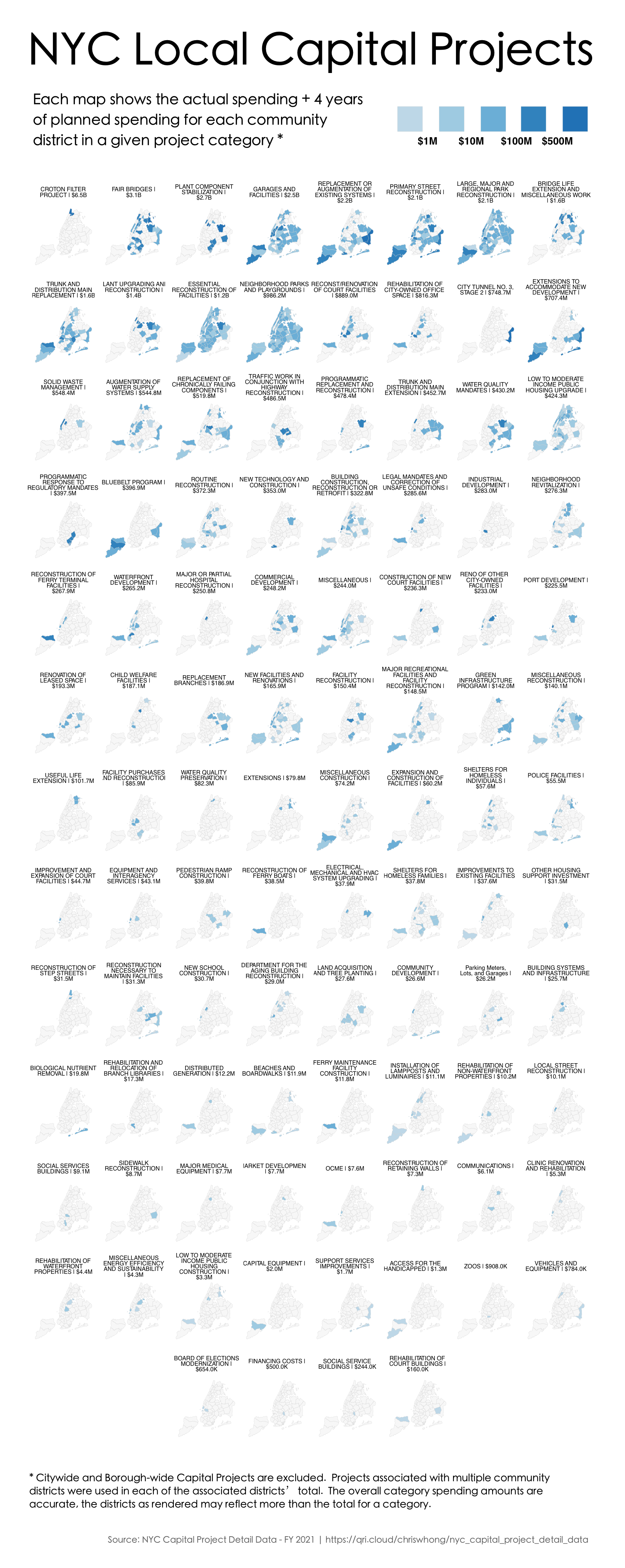
This week's popular distraction on the geo-webs is an app that draws every street in a city (or other location) colored by orientation. Here is one of my favorite personal places, Philadelphia.

While seemingly just a meaningless distraction the colors do tell you something about settlement patterns. Settled on a part of the Delaware River that runs due south and then west, the major part of the city is along an almost north-south (red) grid. However most of the river flows at about a 45 degree angle and much of southeastern Pennsylvania is on a grid shaped by the river's direction (the purple and blue lines). In the outer parts of the city these grids collide creating some of the more interesting urban spaces in the city (IMHO). Here is the southeastern part of Pennsylvania. I expected to see more purple but there is still quite a bit in the northern regions of the metro area where I grew up.

Note that the app allows you to change the background color. For most of these images I set it to black because the roads show up more clearly. 

For a more meta view here is all of Pennsylvania.

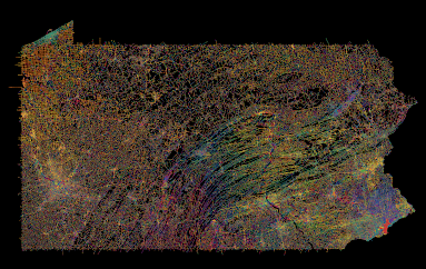
I do not recommend loading an entire state as it takes a while and may overwhelm your computer (and their server).

Points of interest include the colorful twists and turns of the central valleys and ridges, the separately unique Lake Erie grid, and the holes in the northern forests where no roads run. As a different type of city Pittsburgh, one of the toughest cities in the country to navigate, is quite colorful. There are still many grid neighborhoods but they run at all kinds of angles, often at the whims of the rivers.

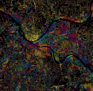
Pittsburgh-taste the rainbow!

For a suburban view, here is the area around my childhood home in Levittown, PA. The blue lines in the upper left corner are from a shopping mall parking lot.

Many cities in the western half of the United States strictly follow the township and range grid of the public land survey system. Often the downtown areas run at an angle either to follow a railroad or to accommodate an older grid system. Here is Denver. 

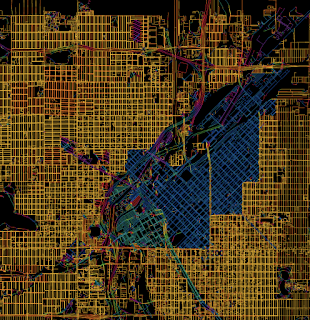
Denver-embrace the yellow!
As a proof of concept here are four other cities with a similar pattern.

I could go on about this for way too long but I'll end with an artistic mashup of some of the more interesting and colorful places I've explored in Philadelphia. You can explore you favorite places here.
 

Clockwise from top left - the art museum area, the effect of the Schuylkill River bends, roads curving around the airport runways, the way Roosevelt Boulevard breaks up the northeast grid, some curvy suburban colors, and a difficult to see Logan Circle.