Showing posts with label agriculture. Show all posts

Wednesday, July 5, 2023

Protein Survey Map

While looking for unrelated items I came across this 1920's Protein Survey Map of Western Canada.

Wondering what any of this means, I did some research and discovered that protein refers to the gluten content of wheat. In the early 1900's flour mills began classifying their wheat based on protein content with premiums offered for the highest protein flour.

The map follows along the railroad lines because rail cars were tested for gluten content. The color scheme of this map is hard to follow but red is the highest protein content followed by blue. 

The map credits the chemists in addition to the Trade and Commerce Department minsters. I lost the original source of the above map but found this map from a few years later

with an even more detailed and confusing color scheme.

Here is the title block.
 

In a previous post I highlighted the Alphabet Railway. Here is a piece of that, with a few interruptions for pre-existing towns.

See the whole map here.

Wednesday, August 8, 2018

Sheep and Wheat

Sheep and wheat together.
This charming map, downloaded from the National Library of Australia is one of a series of maps by geographer Thomas Griffith Taylor. It is one of a series  from the 1920's called "The New Oxford Wall Maps of Australia." Taylor liked to show multiple variables, in this case density of sheep in green overlaid with wheat in a black line pattern. Helpful text tells you where there are "No Sheep" and "Some Sheep" with a thick boundary separating the sheep and non-sheep areas.

Also, though there is some shading in Tasmania, there are "no very important wheat areas" there. Similarly, here are cattle and minerals.
Cattle follow a similar pattern to sheep (neither animal does well in the desert) except in the north where cattle do better. The "V.F.C." and "FEW" text bits add charm. Minerals are identified mostly as points rather than areas, except for some more defined gold areas in the west.

Here is his vegetation map. There is a lot of Mulga. I had to look this up - it refers to bushy, sandy lands containing mulga trees, a type of acacia. Mallee, common in the south is a semi-arid climate region with scattered eucalyptus trees.
More of his maps can be seen on this page from ABC (Australia) news.

Wednesday, May 2, 2018

Canadian Checkerboard-Part 2

Last week's post featured a map of Alberta, Saskatchewan and Manitoba showing lands available for homesteaders in 1918. Here is a much more detailed map of Northern Alberta, beginning a bit south of Edmonton. Grid cells are 1 mile square sections.
Here are some detailed views.

The meanings of the categories in the legend are a bit unclear to me but the lightest orange are lands reserved for soldiers. These are mostly in the northern and western parts of the province. The middle orange are lands the are "finally disposed of" meaning they have been claimed and are being actively used as homesteads, schools or other. The red squares are "unpatented (entered for, sold or reserved)" - possibly meaning that a claimant is working on establishing a homestead. The uncolored (white-ish with some yellowing of the paper) areas were surveyed and available (my assumption) to be entered as homesteads.

These maps also show parks, timber berths, coal seams, tar sands, borings for oil and gas and grazing leases.
As seen below, most of the land in and around Edmonton has been transferred to private owners.
There is a lot of unsurveyed land (another assumption based on no grid lines) but the map comments seem to be trying to sell people on the virtues of these lands with comments about the high quality of the water, soil and potential for industry.


I'm ready to move here!

Wednesday, April 25, 2018

Canadian Checkerboard - Part 1

In the past year I've accumulated dozens of maps. A friend had grandparents who tried homesteading on the Canadian Prairies and gave me some remarkable maps showing lands that were available via the Dominion Lands Act. Here is a 1917 map showing lands in Manitoba, Saskatchewan and Alberta.
The map is 3 ft x 2 ft. I was able to scan it at a high resolution. Here are some readable details.

The Dominion Lands Act of 1872 was based on the Homestead Act in the United States. Square shaped 160-acre parcels of land (much of it taken from indigenous tribes without compensation) were made available to settlers in return for a small registration fee. They had to establish farms and build permanent dwellings in return. Immigrants from Europe were encouraged to settle on these lands, partially out of fear of the United States (where most of the good land had been taken by then) trying to lay claim to them. Some of the land was set aside for soldiers.
http://www.collectionscanada.gc.ca/obj/021017/f1/c126302k-v3.jpg

Red numbers indicate the number of quarter sections available in each 6 x 6 mile township. The green area is Palliser's Traingle, an arid region where exemptions were made so farmers could buy adjacent lots and double the size of their homesteads, increasing their chances at successful agriculture.  Railroad companies owned the land within 20 miles of their tracks so townships adjacent to the tracks had no numbers while nearby ones had smaller numbers. Here is the legend.
I'm not sure what part of the act was discontinued or what "O. in C." refers to.

For contrast here is a more sparse area along the Peace River in northern Alberta.
I have more of these maps and will show them in another post or two. Stay tuned!

Wednesday, October 7, 2015

The "Unique" Map of California

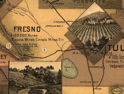
This map, circa1888 is a remarkable exercise in California boosterism.
http://www.loc.gov/resource/g4360.mf000063/
Details include a list of crops or products from each county, pictures of farms, scenery and cultural attractions, railroads and topography. Cities are notably not emphasized.
http://www.loc.gov/resource/g4360.mf000063/
 A nice touch at the top - the Sierra peaks.
 Also - "Big Trees"
There are additional maps showing average temperatures and soils. The soils map is full of cheery optimism about agricultural productivity - "some of this territory is doubtless arid lands. But portions of it once considered irreclaimable are now yielding enormous crops."

I especially like the bit in the lower left corner that shows how many other states can fit into California... 
...because it reminds me of that SCTV skit mocking 1970's Soviet propaganda. Diabolical laughter ensues as more countries are fit into Russia.
https://www.youtube.com/watch?v=1Zm6HzN5YVI
Argentina - "it looks like tiny sausage against a vast, colossal size of Mother Russia!"
BONUS VIDEO! (If the embedded video below disappears then click the picture above for video)

Note the geographical inaccuracy as he places Australia over Kazakhstan and refers to it as "Ukraine." 

Wednesday, April 29, 2009

Re-Imagining Cleveland

Cleveland, like many northeastern US cities, has been experiencing a steady population decline for decades. The estimated 2007 population is less than half of its 1950 population. An excellent article from the Planning Commissioners Journal highlights some interesting ideas the city's planners have for some of the empty spaces. These ideas include farms, community gardens, and restored wetlands among new commercial and residential districts. Kent State University's Cleveland Urban Design Collaborative (CUDC) has a great report entitled "Re-Imagining a More Sustainable Cleveland" that details many of these ideas. The report can be downloaded from their site, however it is a large file. There are lots of maps that if overlaid can be used to determine the best sites for the above uses. For example, here are maps of foreclosures and vacant land.


The map below on the left shows population loss in blue while the map on the right is the county's proposed"Greenprint."


The report has a nice overlay map showing different soil types to distinguish areas that are more suited to agriculture vs. areas that are better for wetland restoration. These are overlaid on top of existing parks and vacant areas (in dark brown).


Other useful overlays for these purposes are brownfields, estimated population trends and impervious surfaces. Some of these maps are from the Green City Blue Lake website while others are from the CUDC report. Below is a design concept from the report for land in areas around stream headwaters.

Population loss can be a tough pill for a city to swallow but if these ideas are carried out it could turn Cleveland into a model of a desirable urban community.

Thursday, November 29, 2007

Map of the Week #101 - Australian Drought Maps

Those of you who are regular readers of the Australian Crop and Livestock Report (my brother is one at least) published by the Australian Bureau of Agricultural and Resource Economics know that they have had a horrible drought over the last couple of years. While they have had some rain in November, the map on the left shows how dry things have been this Spring (yes it's Spring there and toilets flush the other way). The map on the right shows the effect on the wheat crop. You will probably want to click on them to be able to read anything.

Thursday, October 12, 2006

MOTW #47


Grasshopper hazard map by the USDA. Note that grasshopper population density is mostly opposite of human population density.

Thursday, July 20, 2006

MOTW #36

The USDA uses this map to monitor drought conditions. The map is updated frequently.