Showing posts with label USA. Show all posts

Wednesday, February 22, 2023

The Spread of Slavery in the United States

In September, 1861 the U.S. Coast Survey published this large map showing the enslaved population by county. It was "sold for the benefit of the sick and wounded soldiers of the U.S. Army."

The image above is from an article in Smithsonian. Here is a detailed view showing part of the Carolinas with the county names and enslaved populations.

The articles' author, Lincoln Mullen created a series of animations.

On his own page are some interactive maps where you can choose variables such as free African Americans and total population and choose your year from a slider at the bottom. This allows you to see the high slavery numbers in 1790 in places like eastern New York and Northern New Jersey.

Or see where free African Americans were clustered in different years.

Here is one showing all free persons by percentage from 1810.

You can explore on your own here and read more about the westward expansion of slavery here.

Thursday, November 3, 2022

Thirty Day Map Challenge 2022 - Days 1-3

November is back and that means another #30DayMapChallenge, making a map each day based on a given theme, For more background on the challenge see this post from last year. Here are the first three days as posted on my Twitter.

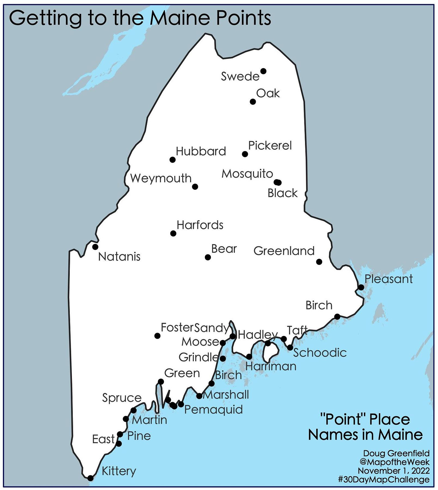
Day 1 - Points

The original points came from the Maine Geodata Library. However, these only included towns with “point” in the name which are not many. For example, there is no town called "Pemaquid Point" so it was missing. I got some additional names from various web searches. The inland points were particularly difficult to find-most of these are on lakes. In the final map some of the points got dropped by the auto-label function to reduce clutter, so this is not a complete list.

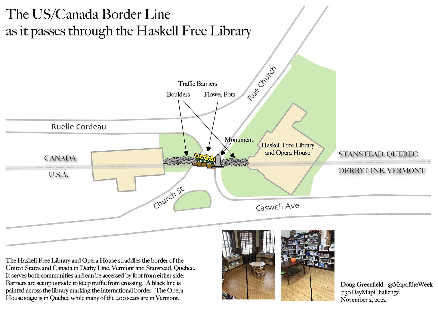
Day 2 - Lines

This is the most wordy map I’ve ever made. I’m not a huge fan of the overly information-dense National Geographic style maps because it’s just way too much to take in, but this map needs some explanation. I’ve been fascinated by the Haskell Free Library and how it straddles the US-Canada border. A few years ago I finally had a chance to visit it. I took the photos of the black line marking the border and generated the data myself as most of it did not exist from what I could find.

I had to drop my accuracy hangups to make the map more legible. Originally I had all 9 flower pots in their exact right locations. It was unreadable so I spread them out a bit but eventually found that I needed to get rid of a few to keep the map from being a messy jumble.

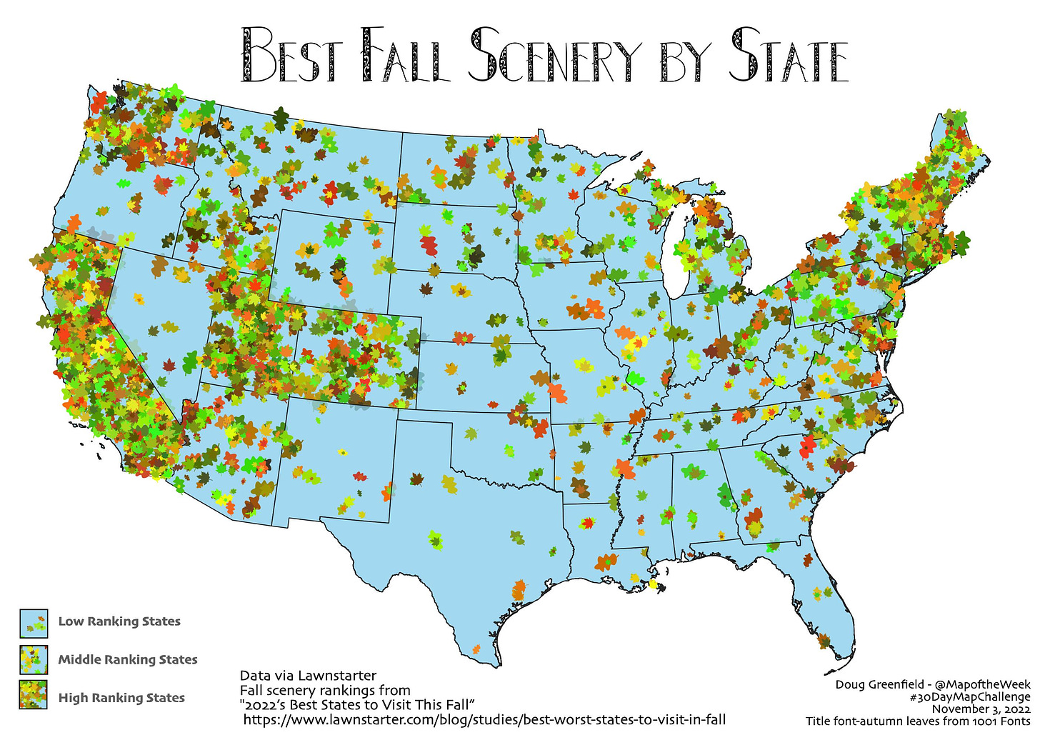
Day 3 - Polygons

While Lawnstarter is not necessarily the world’s foremost data site, sometimes you have to go where the data is. I was trying out this leaf coloring scheme with its random colors and angles so I looked for a fall foliage by state guide. I found a best “fall scenery” ranking by State from Lawnstarter 2022’s Best States to Visit This Fall  There’s an overall ranking but there is also one specific to fall scenery.

I had trouble coming up with an ideal density function in limited time so some of the larger states look a bit more sparse to the benefit of states like Delaware.

I’ll have many more of these to post throughout November.

Wednesday, August 10, 2022

Where Livestock Outnumber People

I just discovered Erin Davis and her site while looking for unrelated content. She's done some great work with maps and statistics including this map showing what counties have more livestock than people (data is from the USDA).

I love the big circle legend. It lets you dig into a complicated multi-variate color scheme so you can see that, for example the green areas (such as southwestern Wisconsin and northwestern Arkansas) primarily have a combination of cows (blue) and chickens (yellow) and not so many pigs. Black areas such as in Montana have more of all three than people.

 Scroll down the page and you can see the individual maps for each animal plus maps of counties with more goats, sheep and turkeys than people.

Finally, at the bottom is a map of the most common type of livestock by county.

For the entire map set go here.

Wednesday, July 6, 2022

Northern Expansion

I've seen plenty of map like this one, showing some ridiculous looking westward claims of US states and colonies before that.

via Library of Congress
If ridiculous seems like a strong word, just look at that South Carolina panhandle! What I've never seen before is this circa 1754 map showing some huge land claims to the north.
Sidney R. Knafel Map Collection/Leventhal Center
There is not much information about this map other than a simple title "An accurate map of the English colonies in North America, bordering on the river Ohio", and that it appeared in the Universal magazine of knowledge and pleasure. It's interesting to see New Jersey and Pennsylvania grabbing land in upstate New York, Maryland claiming much of Ohio, and Virginia reaching up towards Michigan. In some ways this makes sense given the north-northwesterly flows of the major rivers these colonies formed along, the Hudson, Delaware and Potomac.

I don't know anything else about this map or these claims but it's always interesting to see a different perspective on history.

Thursday, May 12, 2022

The Disapperance of Native American Land

Native American losses began at first contact with European settlers. "European colonization of the Americas, which began in 1492, resulted in a precipitous decline in Native American population because of new diseases, wars, ethnic cleansing, and enslavement." - via Wikipedia

Native Americans had mostly been driven out of the original thirteen colonies by the end of the American Revolution. The map below shows further land cessations between 1789 and 1816 in the "northwest" region.

via Getty Images
They were pushed even further westward into "strips of land stacked like cordwood" (quoted from Prairie Fires: The American Dreams of Laura Ingalls Wilder by Caroline Fraser p. 49). The designated Indian Territory (lands south of the Osages on the map below) was assigned to the "Five Civilized Tribes".

These tribes, the Cherokee, Chickasaw, Choctaw, Creek and Seminole were considered civilized because they had adopted Anglo-American practices such as Christianity, capitalism and in some cases the "civilized" practice of slavery. Despite being "civilized" they were still forced off their lands in the southeast and relocated westwards in the Trail of Tears.

The strip in southern Kansas was the Osage Diminished Reserve, an area left to them after signing many bad faith treaties. The rivers of their former land still bear the tribe's name.

Even after being removed from the rest of their land and granted this area of Kansas, it too became overrun with white squatters. These people included Charles Ingalls, father of Laura Ingalls Wilder. They settled on land they did not own and eventually drove the Osage out of Kansas entirely, forcing them to also relocate to Indian Territory. The tribe's base is now in northeastern Oklahoma.

Here is the full map above showing the lands assigned to "emigrant Indians" west of Arkansas and Missouri.

The Chickasaw after a long dispute paid the Choctaw for the westernmost part of their land. 

This map via Wikipedia illustrates the Trail of Tears beginning in the 1830's.

Some Cherokee had settled in northeastern Texas where they signed a treaty with Texas Republic President Sam Houston. In 1839 his successor backtracked on this treaty and sent militia to forcibly relocate them to Indian Territory. Here is a map of their final battle in Van Zandt County, via the Oklahoma Historical Society.

After the Civil War further incursions were made on Indian Territory with lands in the center of the future state ceded for potential white settlement. The western half of Indian Territory became Oklahoma Territory in 1890. Reservations in western Oklahoma were opened to white settlement leading to a series of land runs and drastically shrinking Indian Territory. Here is a map of Oklahoma and Indian Territories that year via Wikipedia. The thick red line divides the two.

Both territories sought statehood but in response to concerns from eastern politicians about creating two new western states they were combined into one state, Oklahoma, in 1907. Congress sought to dissolve the reservations as part of Oklahoma's statehood but the laws were vague and unevenly applied and has led to decades of uncertainty. In 2020 The Supreme Court of the United States, in the case of McGirt v. Oklahoma determined that much of the eastern part of the state remains Native American land. Though this case was primarily about jurisdiction of criminal cases, it has opened up questions about ownership, taxation, zoning and the enforcement of environmental policies.

A 1914 map submitted as part of the McGirt case shows the entire area that was post-1890 Indian Territory as Indian Reservations,

Image from Supreme Court Docket 18-9526 - Appendix p.33

making this by far the largest tract of Native American land in the country.

The future of this land will be determined through extensive negotiations between the tribes and state and federal authorities. For a deep dive into the Supreme Court's ruling see Indianz.com

Wednesday, March 30, 2022

Women's Suffrage in 1917

As a follow up to Women's Suffrage in 1908, here is an ad from 1917 showing how suffrage (the white areas*) had expanded through most of Canada and parts of the United States. 

The ad is from the National Women's Suffrage Publishing Company and asks how long the U.S. will lag behind Canada. For contrast here is the 1908 map again. Keep in mind that the color scheme is reversed.


*yes the white areas are actually sepia areas, OK.

Tuesday, March 8, 2022

Women's Suffrage in 1908

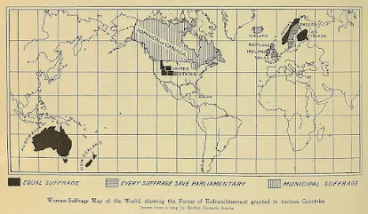
This map shows the international state of women's suffrage in 1908. It was originally published in Harper's Magazine and reprinted at ThoughtCo.

Full equal suffrage existed only in Australia, New Zealand, Norway, Finland and a handful of poorly drawn northwestern U.S. states. Finland also allowed women to run for Parliament. The "Municipal Suffrage" of Canada and Iceland meant women could only vote in local elections. The U.K. and Sweden vote in non-parliamentary elections.

This Wikipedia page gives more details. The page also mentions Latvia though not shown on the map. In many cases the right to vote was restricted for a time to married or property owning women. In Australia indigenous women were excluded from voting. It looks like Kansas is shaded in light gray though the Wikipedia page has that state granting women the right in 1912. Maybe it was being considered at the time. There was a gradual trickle of states between 1908 and 1920 when finally women were allowed to vote nationwide in the USA by the Nineteenth Amendment.

Wednesday, January 19, 2022

Pictorial Stamp Map

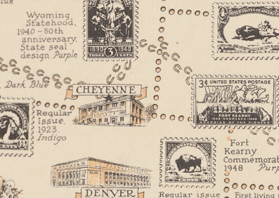
This map was created in 1947 for the 100th anniversary of the first United States postage stamp. Authored by Ernest Dudley Chase of Winchester, Massachusetts (one town away from me), it shows stamps that mark geographic locations across the United States.

The states are stamp-like, with perforations at the state lines and torn at the country and water boundaries.

Even Lake Okeechobee is perforated.

There is a brief history of postal delivery from the early Persian kings hovering over the Minnesota-Dakota border area. It includes the US Postal Service motto and seal at the bottom.

Facts about air mail hover over Texas.

The north arrow has the USPS sesquicentennial stamp in the middle and is flanked by postmarks from various locations including Winchester, Mass.

The Pony Express Route is detailed in horseshoes.

Along the top are a series of stamps showing educators, authors, poets, scientists, etc., while along three sides are various other commemorative stamps. The color of the stamps is listed because this appears to have been made with a two color press.

A little text area hovering over Dallas: "Postage stamps are beacon lights of history, monuments of heroes, gems of art, disseminators of universal knowledge, records of achievement, and mute witnesses to the rise and fall of empires." Heavy.

Friday, November 19, 2021

Thirty Day Map Challenge - Part 2

Here are the next batch of maps I've posted for the #30DayMapChallenge. The first ten maps are here.

Day 11 - Theme: 3D

For the 3D theme I attempted to recreate an exercise from my first cartography class back in the 1980's. That exercise was done using a pencil and graph paper. Unfortunately, I do not have my notes or remember the exact procedure. I did this one using GIS software instead. The map shows murder rates by state. Back then North Carolina was #1, now it's Louisiana. The map is "upside down" so that the higher southern states don't block the view of the lower northern states.

Day 12 - Theme: Population

This is a map of Arctic settlements done "firefly" style, which is fashionable these days in cartography circles.

Day 13 - Theme: Data Challenge 2: Natural Earth

Natural Earth is a set of publicly available data. It is a collaboration involving many volunteer NACIS members and cartographers around the globe. Nathaniel Vaughn Kelso and Tom Patterson led the effort. They have produced some beautiful topographic images of the world. The map was also inspired by a NACIS talk on indigenous place names. The topography and streams are from Natural Earth, while the place names came from Canada's Open Data site.

Day 14 - Theme: Map with a new tool

This one is a bit of a mess because I started doing a tutorial using R, a new tool for me, but I ran into some technical difficulties and then ran out of time. I never expected that Sunday, a non-work day might be the day that I run out of time. I had seem some recent Excel maps and made a blog post about this one. At the last minute decided to try one. Last Spring I tried my hand at a cross stitch map of Rochester, New York. This seemed like a natural fit for an Excel map since it is very grid-like. Instead of doing land use though, I tried doing one of those HOLC redlining maps from the 1920's. 

Lack of time forced me to go very low res. so the map ends up looking like not much at all.

Day 15 - Theme: Map made without using a computer. 

Several of the previous maps were hand drawn but I decided on a different approach here. This is a souvenir Pennsylvania cutting board stacked with coins representing the GDP of the metropolitan areas of the state. One cent = $1 Million. It's a nice, even formula but does not make the stacks high enough to really show the pattern well. Since it is helpful to see multiple angles, I created this mediocre video.

Day 16 - Theme: Urban/rural

This was mostly just an exercise in image manipulation to tease out the urban and rural areas by land cover. I picked Charlotte after looking for cities that might have an interesting looking pattern.

Day 17 - Theme: Land

While waiting in the San Diego Airport a few years ago, I noticed a display of Kumeyaay culture. I was unaware of these people as I suspect many are. There were a couple of maps which I later found copies of on a website dedicated to Kumeyaay culture. I find it interesting that their territory predates the US-Mexico border which has been imposed on their land. This is what the area looked like pre-border.

Day 18 - Theme: Water

This was just a fun exercise in grabbing some water data from northern Quebec and overlaying it on top of a cheesy tree pattern that I made just for this purpose. More art than map. The large lake in the west is Lac Couture, an impact crater.

Day 19 - Theme: Islands

I've always been fond of Christo and Jeanne-Claude's Surrounded Islands installation so I decided to map it. Buffering is one of the most common and basic GIS functions (ie. is this property within 200 feet of the river?), here was an example of a real world buffer.


More to come (I hope).

Wednesday, September 29, 2021

The State Hate Map

I try not to post too many of these maps as they are often gratuitously nasty and extremely unscientific. However, in the spirit of fun here is every state's least favorite state by Matt Shirley.

While your Instagram following is clearly not a statistically approved sample, it does seem to accurately reflect my experiences in many of these states. I very familiar with the anti-Massachusetts thing in New England and the PA-NY hatred of New Jersey. I also have some personal experience with the Missouri-Kansas and Ohio-Michigan animosities. I've even experienced South Carolinians hating on Ohio. 

As a "helpful" device, Reddit user u/ayitasaurus made an arrow version. It gets a little hard to read on the east coast (a different color arrow would help) but you can certainly see all the silly state rivalries. Some interesting trends include the linear hate chain from Minnesota to Tennessee and Florida hating itself.


-via Digg

Wednesday, September 8, 2021

Walking Into a New School Year

This odd graphic from the Biennial Survey of Education in the United States 1934-36 shows the number of school days per state.

The states appear to be marching off to school. In order to see if there's any pattern I tried making my own map. However, many states are not shown.


 Some other interesting graphics from the report show the states grabbing bags of money,

children lining up in the schoolyard by year,

and the percentage of students enrolled in private schools - overrunning the Northeast.

 The report is available here.