Showing posts with label minnesota. Show all posts

Wednesday, January 7, 2026

Overlooked Mapping Highlights from 2025-Part 2

Here are some more mapping highlights from the last year:

 5. Silk World War II escape maps

This is from an episode of a podcast called What’s Your Map featuring former cartographic researcher in the UK Ministry of Defence Barbara Bond

Top secret British intelligence agency the MI9 produced a series of maps on silk (and later rayon) designed to help soldiers evade or escape from capture. This map is of Danzig (Gdansk), where the Vistula River enters the Baltic Sea.


Escapees used their knowledge of these areas to direct others to Swedish ships where they would be safe to escape to that neutral country. Maps were printed on fabrics such as silk, which could be stitched into clothing or kept in a pocket and did not make any noise when folding or unfolding them. The maps showed where coal is loaded onto Swedish ships, the arc of light to be avoided, ditches where people could hide and the network of railroad tracks that would need to be traversed. More on these maps and on Bond’s career can be heard on the podcast.

6.  Mapping the Wikipedia Rabbit Hole

WhereWiki allows the user to enter any Wikipedia page and see all of its hyperlinked connections in any given area. When I first saw this, the keyboard player for the Cure had just died so I chose the band’s page and the area around Crawley, UK* where they were formed.


A click on any point brings you to the referenced page. The green dots are locations and the blue are people or groups.


*You can choose the default area (where you are now) or just about any other place on earth and you will likely find plenty of geographic links to whatever page you chose. 

-via Maps Mania


7. Smell Map of the Minnesota State Fair

Jake Steinberg, a cartographer and journalist for the Minnesota Star Tribune created a map of the smells of the State Fair. You can see the full map and article here but you might hit their paywall


8. Inundation Map of the Town of Guadalupe (1819)

Guadalupe, now part of Mexico City suffered a major flood in 1819. The entire area was in the basin of former Lake Texcoco and floods were a frequent occurrence


-Maps via Pedro Zurita Zaragoza on that great mapping site known as LinkedIn.

The map shows inundated areas in aqua tones. Two waterfalls shown at the bottom are breaches of the Guadalupe River.


Text in the legend describes how canoes were needed in the plaza and a note at the bottom states that the floodwaters receded “by virtue of the wise measures of His Excellency (the viceroy), thus preventing its spread to the capital.” Plans to drain the area took almost a century after this to be implemented and this was largely responsible for drying the entire region.

9. 12 Foot Wool Map Needs a New Home

 A group of up to 18 women in County Wicklow began making a 12 x11 foot knitted and crocheted map of Ireland in 2019. 


As reported by The Journal (Ireland). Most of the project took place at Carnew Community Care, a centre for older people. Now that it is finished they are looking for a place where it can be publicly displayed. This was from July. I have not been able to find any follow up on whether they’ve found a location for it.


 -via The Map Room


Wednesday, February 19, 2025

Mapping Prejudice

Mapping Prejudice is a project by a team of scholars and activists at the University of Minnesota. The project maps racial covenants, clauses that were inserted into property deeds to keep people who were not White from buying or occupying homes. 

The mapping page has an animation that show the growth of these covenants in the Minneapolis-St. Paul metropolitan area from 4 in 1910 to over 32,000 in 1963.

Or you can see all of them with their details. The green color does not stand out great again the gray background though.

There are also some static maps showing racial covenants in the area. This one does a good job of showing how they cluster around the Minneapolis city boundaries.

This is an ongoing process and you can volunteer to help find racial covenants in deeds and participate in community mapping sessions.


Wednesday, April 29, 2020

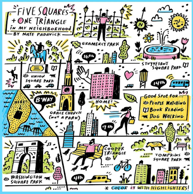
Mapping Your Neighborhood Under Lockdown

Bloomberg Company's CityLab and the New York Times have both asked readers to submit maps of their neighborhoods under lockdown. The Times one, via Instagram includes this map from Nate Padavick,
https://www.instagram.com/p/B_clPHJA__o/
and some directions on how to make it.

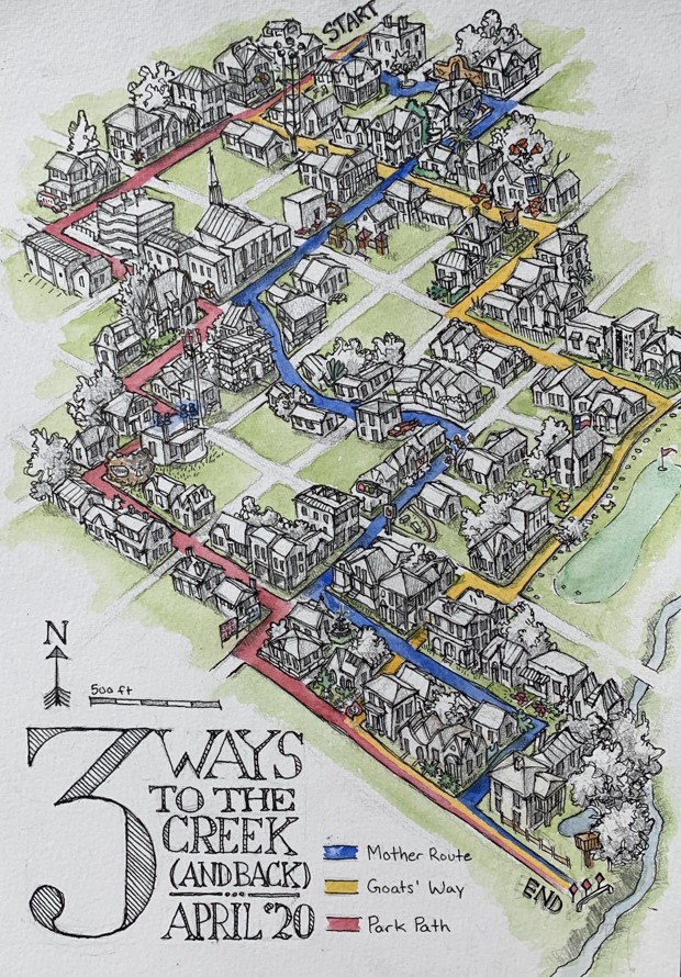
Here are some reader submissions that I like.

Three ways to the creek in Austin, Texas by Champ Turner
https://cdn.theatlantic.com/assets/media/img/posts/2020/04/Champ_Turner_Row_174/98f2ea959.jpg
Birding the Pandemic by Rick Bohannon of Minnesota.
https://cdn.theatlantic.com/assets/media/img/posts/2020/04/Screen_Shot_2020_04_17_at_4.23.58_PM/90b0eeffa.png
Santa Cruz de la Sierra, Bolivia is known as the City of rings for its network of Ring Roads. Augusto Javier León Peralta's shows his neighborhood "ring" incuding the route from home to the market and back. "We can even see some animals in the city that were not seen before"
https://cdn.theatlantic.com/assets/media/img/posts/2020/04/Screen_Shot_2020_04_24_at_10.52.06_AM/f0a6b3aff.png
Here is one from Calais via Twitter
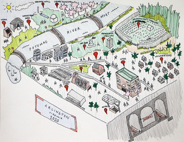
A map from Lauren Nelson of Arlington, Virginia showing the "moat" that the Potomac River has become.
https://cdn.theatlantic.com/assets/media/img/posts/2020/04/Lauren_Nelson_Row_81/4f5455341.jpg

Finally, one from the NY Times Travel Instagram- a nice, simple pen & ink from Emily Bouchard in Chicago.
https://www.instagram.com/p/B_iDBDOliuj/
For more from instagram click here, but you need to wade through a bunch of stupid, gorgeous photos to find the maps. For the more maps go to CityLab

Wednesday, September 2, 2015

Superior Wooden Bathymetry

Paul Meysembourg, a GIS lab manager at the University of Minnesota Duluth's Natural Resources Research Institute and one of my blog readers was inspired by the Wooden Bathymetry blog post to take his scroll saw and cut out Lake Superior.
He used GIS software to give it a high level of accuracy. In the words of the artist:
Being a GIS guy (about 24 years now, I was inspired to try and cut a much more accurate bathymetry map of Lake Superior since I live real close to it (Duluth, MN).   The ones I've seen are are very artistically done but "laughable" with regards to accuracy. Here's a picture of my just completed map. I massaged the DEM in ArcGIS and brought the individual layers into Photoshop to print them at actual cutting size.
Here's a colorized version.

More from the author
I jokingly will call this "My Old School, Green, Navigation Chart"  By the way, the actual dimensions are about 25w by 13h (the biggest I could get in my scroll saw).  Also, I stack cut them, so I have 2 more - I am going to donate one of them to my workplace to hang in the lobby and the other one I may try and sell, but I am not doing this for money.   Some details:  the frame is made from driftwood my son and I picked up last weekend from the shore in Superior, WI (there's a metric ton of it out there now after the big flood we had a few years ago).  There were about 40 island pieces (some really tiny ones) to cut and glue on for each one and I used seven layers of Birch plywood.  I left the guide paper on the top one before gluing it up but I actually prefer the look of the plain wood.
Last month (six months later) he gave me another update:
After that first attempt, even though I said I wasn't going to do another of Lake Superior,  I've completed another.  This time I stack cut 4 sheets at a time.  I also experimented with "pre-tinting" the whole sheets before cutting so the islands cut-out sections would be the same color.  I used water-based stain in increasingly darker shades.  I also upped the detail significantly since my scroll saw technique was much improved.  The problem with the increased detail was that now I had to keep track of about 90 island pieces (times 4) and then glue these pieces back into the correct location!  Some of these teeny pieces can easily get "vacuumed away" as I tried to keep the saw dust somewhat orderly.  It turns out this fine level of detail is making these more of art project instead of a woodworking project, in my opinion and I've never considered myself to be an artist.

Anyway, after all that work, they turned out rather nice.  I have since sold one that was hanging in a small local art gallery. I sold one on Etsy and I have one hanging in my family room and the remaining ones will probably be gifts.

I am planning on doing more, in the same fashion, but I just ordered a larger, hobbyist CNC router device and I am going to see if I can obtain the same detail level using fine router bits in solid slabs of wood. 

Wednesday, January 14, 2015

Big Ten Games of Thrones Map

Like many Americans, I spent way too much time Monday night watching the NCAA Championship football game. While not paying total attention, this commercial for the Big Ten Conference really jumped out at me. The commercial is called "Maps" and is based on the Game of Thrones intro (with the same music.)
It constructs a flyover of the US, starting at the Rose Bowl. As you pass by iconic buildings, stadiums and landmarks pop up from the landscape. Here is a tour using screen grabs from YouTube.

From the west coast you fly across the mountains to Nebraska, the current westernmost outpost of the conference.

Next comes Iowa, then Minnesota, then Wisconsin.
One of the most dramatic moments is watching the Chicago skyline pop up in front of the Northwestern logo. Note the theater references for Northwestern and Iowa. The mist coming off the Ohio River adds to the medieval theme.
The Michigan-Ohio State rivalry is about as big as it gets.
From there, it makes the jump to the east coast to cover the conference's recent acquisitions. Here are Penn State and Maryland with east coast icons such as the Capitol building, Washington Monument, LOVE statue and the Liberty Bell.
The flyover heads over the Atlantic and turns back to the west to include Rutgers the "birthplace of college football" (according to the ad) along with the NYC skyline and the ferris wheel at Seaside Heights, New Jersey. I like the reflections off the water.  
The full video is at the top - enjoy!

Wednesday, June 12, 2013

Bob Dylan's World

A couple of weeks ago Slate honored Bob Dylan's 72nd birthday with an interactive map of every place mentioned in one of his songs.

Many musicians would show a pattern based on where they are from. In Dylan's case the only pattern is the unusually high number of points in northern Minnesota. However, there are also lots of points in New Mexico, where he sometimes pretended to be from. 
From the text on the web page:
Bob Dylan’s music, it’s often said, happens in a world of its own—where the highway is for gamblers and you’re always 1,000 miles from home. It’s a surreal, ethereal realm, lawless but for chance, allusion, and rhyme.
You can pan and zoom as desired or use one of their choices at the bottom- World, U.S., Europe, Asia, NYC or New Orleans.


Wednesday, July 29, 2009

Map of the Week-Thinking Big in St. Paul

The Minnesota Historical Society is sponsoring an exhibit called "Minnesota on the Map" at the Minnesota History Center in St. Paul. The exhibit runs through September 7th and features four centuries of maps from the Society's collection. Below is an unusual example. Published by the St. Paul Board of Trade in 1871, it shows the "projected" railway system for 1900. The map was a response to an earlier map from that year published in the St. Paul Press. The Press map showed the "dominating influence of the St. Paul system" of railroads but displayed "extreme modesty" in "underrating the future of the Great Metropolis...."

The main detail that stands out is the St. Paul & London Inter-Continental Double Track Railway, featuring a "most magnificent" suspension bridge over the Atlantic Ocean.

Other details emerge when zooming in on the map such as the Sub-Oceanic tunnel under the Pacific to "Peek-in" that will be excavated by "gopher power" and the "Balloonic Route" to the North Pole. The text at the bottom details the need to move Minneapolis and the small town of Kandiyohi far to the north to accommodate the growth of the Metropolis. It also mentions that Duluth will be "wiped out entirely, as it deserves to be for having the temerity to exist."

Wednesday, April 1, 2009

Map of the Week - Fargo Flood Wiki

With record flooding ongoing, The Forum of Fargo-Moorhead has set up a "wiki" map for flood information. Anyone with minimal map skills can edit it but frivolous postings will be removed. Good idea but cartographically it's a bit problematic when the editor can choose any color or symbol they like for their posts.

I think the original idea was maybe for shelters to be white, animal shelters green, drainage problems blue, web cams light green and closures in red. However, without a legend or guidelines for posting it gets a bit muddy. Also, the numbers are confusing - click a 3 and you get 3 points. Why not just show them all?

Despite those little flaws it's still a nice, useful tool for the area.

This map to the left, also from the Forum shows all the mandatory evacuation areas - some of them are shown in pink on the wiki.

Fargo's logo seems a bit ironic at the moment but best of luck to the area residents - I hope the worst is over.

Thursday, August 2, 2007

MOTW #86

I've wanted to actually do a timely map of a newsworthy event for a while now so here are two maps from yesterdays horrible bridge collapse in Minneapolis. The first was taken from MinnDOT via wikipedia. The diagram map is from CNN.