Wednesday, January 29, 2020

Taste Atlas

Taste Atlas is a fascinating wormhole to be sucked into if you're into "foodways" as wonky geographers call it. You can pan and zoom all over the world to see what the local dishes are.
On one hand I like that certain cliches are avoided. In an example near to my heart, for Philadelphia they ignore the Cheesesteak* which you can get anywhere (though usually poorly made) in favor of the Roast Pork Sandwich, truly hard to find outside of southeastern Pennsylvania. On the other hand some of the choices seem like missed opportunities like they can't come up with something better than hot dogs to represent New York** or Cheeseburgers for Los Angeles. Then again after writing this and doing more panning and zooming, I found different items showing up in these places.
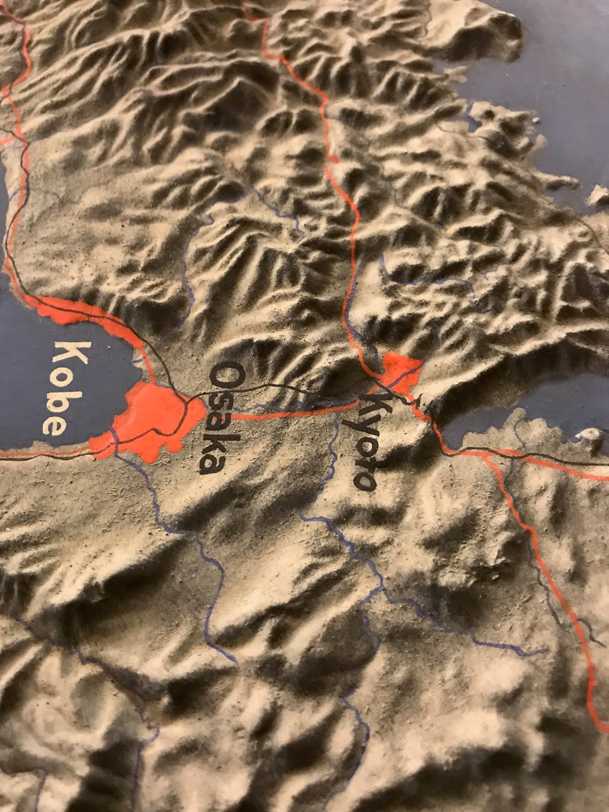
Here is part of South America.
Another option is to click a country, city or region to see what they eat there.
Click on the dishes to get descriptions, mouth watering pictures, suggestions of where to eat them with restaurant details and often recipes.
In the mood for Indonesian?
* Upon further clicking the Cheesesteak did appear, it's just not the first item to appear.
** Upon further clicking the Rueben did appear for NYC, it's just not the first item to appear.

Wednesday, January 22, 2020

The Top 100 Private Land Owners in the USA

The United States Government owns 640 Million acres of land (about 28% of the country's land mass). Of the privately held lands, 40 million acres (about the size of Florida) are owned by 100 individuals. This map from Bloomberg shows who these people are and where (most of) their land is.
https://www.bloomberg.com/graphics/2019-largest-landowners-in-us/
A zoom in shows you who these people are - a combination of investors, energy company owners, ranchers, media moguls, heirs and various other wealthy people. Here is the Texas Panhandle and northeastern New Mexico,
and southwestern Texas-the blue piece furthest west is owned by Jeff Bezos where one of his companies tests a reusable rocket.
Here are the top 10 landowners with the acreage (in the millions) they own.
Most of this land is in the western half of the country. Here are some holdings surrounding Yellowstone National Park.
There is not much action in the east, except for in Georgia, Florida and Maine where seven families collectively control a quarter of the state's land, including Subway (the restaurant, not the transportation option) co-founder Peter Buck.

Wednesday, January 15, 2020

Sea Turtle Threats

One of the best visualizations that I missed in 2019 was this one showing the threats to sea turtles in the Aegean Sea by Jonni Walker.
https://public.tableau.com/views/TheTurtle/Tester?:embed=y&:display_count=yes&publish=yes&:origin=viz_share_link&:showVizHome=no#1
The map has a strong National Geographic feel to it-packed with dense information, some of it interactive. One of the things that is amazing is that it was created using Tableau, a data visualization software instead of using traditional cartographic software, although Mapbox was used for some of the cartographic display.
Turtle hotspots are indicated "firefly" style in the bright blue. Below the National Marine Park of Zakynthos is highlighted. It is the first national park established for the protection of sea turtles in the Mediterranean. The airport on this island banned overnight flights because that is when the turtles lay their eggs and they are susceptible to the noise and light. 
One of the biggest threats to these turtles is plastic debris. They will ingest floating bags because they look like jellyfish to them. The graphics below the map area are interactive. You can hover over them for further information.
I also like the way he did the legend though some people think this kind of legend is hard to read. I've been criticized for using this kind of legend in a map but I think it's better to see the colors and symbols against the map background than stuffed into a white box.
It looks like there are supposed to be some controls for interactively changing the angle and orientation of the map but i have not been able to get them to load on my computer. This is a problem overall that the visualization s very large and difficult to load. You can explore it here but be patient with the slow loading.


Wednesday, January 8, 2020

Rubber Terrain Map of Japan

Last week I was at the New York Public Library Map Room and asked to see this rubber terrain map that was featured on their Instagram page in 2018.
I was surprised that it was n fact available for public viewing and that they were willing to fetch it for me and even let me (very carefully) touch it. They brought it out in a huge box that took up almost half of one of their large tables.
Below is the magic that awaits when you open the box.
It caused quite a stir as many visitors in the room began circling the table for their own looks. Here are some close up pictures from my phone.
This map is dated January, 1945 and was created by the Office of Strategic Services (predecessor to the CIA)'s Topographic Models Section at the height of the war with Japan. According to The Mapmakers Craft: A History of Cartography at CIA, many models were made from plaster. I'm not sure why they chose rubber for this one or even how it was done-possibly melted into a plaster mold? I have not been able to find much information on this map. Here are some more topographic details.

The line from Otaru to Sapporo and on where Hokkaido suddenly gets flatter.
The Korean volcanic island Quelpart, now Jeju.
Mount Fuji.
Tokushima on Shikoku island with the Yoshino River valley making a deep cut in the land. This picture and the next one I took for another perspective on the Seto Inland Sea, featured in a recent post showing a 20 ft long scroll map that I saw at the Osher Map Library.
Finally, a look at the ancient capital Kyoto and the modern Osaka-Kobe metropolis.

Thursday, January 2, 2020

Puposeful Wanderings in Pyongyang

While North Korea begins the year with lots of bellicose bluster here is Artist/cartographer Gareth Fuller's take on Pyongyang, the capital.
https://images.squarespace-cdn.com/content/v1/54e1eff4e4b006178716ee8b/1570883761694-006227M2NG8C7W6LGA1N/ke17ZwdGBToddI8pDm48kKBjrb5R1Q3hpVVXnHcTTzsUqsxRUqqbr1mOJYKfIPR7LoDQ9mXPOjoJoqy81S2I8N_N4V1vUb5AoIIIbLZhVYxCRW4BPu10St3TBAUQYVKcGKuCHgOviFVwLluJDzDVBipMaYKHb8kC-VgsgueAYivQzBU5hUVIxFjxkuDXwM3H/Gareth_Fuller_Drawing.jpg?format=2500w
The artist, who likes to go by just "FULLER" usually begins his work with a very thorough exploration of the places he maps. His "Purposeful Wanderings" is a series of kaleidoscopic maps of the places he has spent time. However in North Korea he was constrained to the government's rules and encouraged to marvel at their socialist wonderland. Here is the Party Foundation Monument,
https://fullermaps.com/artworks/pyongyang
the Ryugyong Hotel, a signature building of the city,
https://fullermaps.com/artworks/pyongyang
and their shuttlecock-like ice arena-kind of a sports mismatch.
https://fullermaps.com/artworks/pyongyang
For more on this project take a look here.