Showing posts with label toronto. Show all posts

Wednesday, April 22, 2026

Ethnic Diversity of Toronto

 Jeff Allen is a cartographer based at the University of Toronto and does work for their School of Cities. He’s created some interesting visualizations, particularly around language. Here is a page where you can choose from dozens of languages to see how their speakers are distributed across the Toronto and Hamilton metropolitan areas.


Above I’ve chosen five languages represented in different colors. While French and Spanish speakers appear to follow overall population trends (no obvious clusters) there are very clear clusters for Mandarin, Punjabi and Italian.

I tried a few random smaller languages to see if they had their own clusters, which they do. Khmer and Lao speakers cluster in the same Jane Street area while Yiddish (and Hebrew also) cluster along Bathurst Street. 


Another visualization traces the history or ethnic groups. Choose from over 20 languages and you get a scrolling story showing the distribution changes at various time periods going back to 1971 .

Here is Yiddish, showing the same pattern as in the previous map.

Branching out to other cities this visualization shows the English-French east-west divide in Montreal. The purple areas are the most bilingual, while yellow areas are where immigrants live and are less likely to speak either language.


You can see many more of his maps here.

Back to Toronto, here is a gorgeous, colorful map by Alex McPhee showing the most commonly spoken non-English languages across the city. The “small multiple“ maps across the bottom, showing the top languages are a nice touch. 


He has produced similar maps for Montreal and Saskatoon.


I’ll close with one more Jeff Allen map: Dogs of Toronto.


Wednesday, July 17, 2019

Grab Bag

Here's a bunch of random maps. They won't "change the way you see the world" like so many other clickbait-y sites claim. They're just kind of interesting, or pretty, or something. Click on the map for the original source and higher resolution.

Meat Production on Ranches - via Pearson Education though I lost the link.
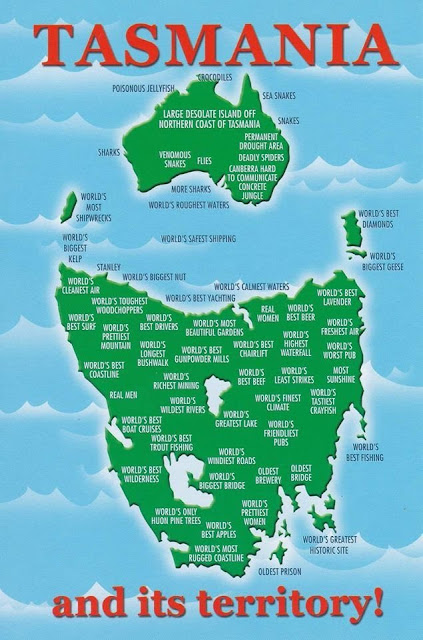
Tasmania's cartographic revenge - via Reddit
https://www.reddit.com/comments/auec0h

WestJet Destinations, 2000 featuring a Canada without Montreal or Toronto.
https://www.flickr.com/photos/erussell1984/45543438864

Proposed development of Toronto's industrial waterfront, 1910
https://static.torontopubliclibrary.ca/da/images/LC/maps-r-80.jpg
- via Toronto Public Library

Saloons, free theatre and "houses of ill fame" in Buffalo, 1893. If you're looking for this neighborhood, it's basically been torn down and replaced with expressways. Easy access from the Children's museum though.
https://imgur.com/a/7ZJ47DO

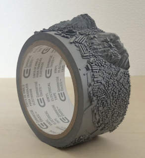
Geo-Eye (Mount Inasa), 2015 by Takahiro Iwasaki carved on a roll of vinyl electrical tape. Iwasaki is a Hiroshima-based artist. Mount Inasa is in Nagasaki.
https://www.artsy.net/artwork/takahiro-iwasaki-geo-eye-mt-dot-inasa
Where Europe and Asia would fit in North America climate-wise - via askthebirds
http://askthebirds.org/wp-content/uploads/2018/09/canada-physical-map-best-of-beautiful-nts-maps-canada-of-canada-physical-map.jpg
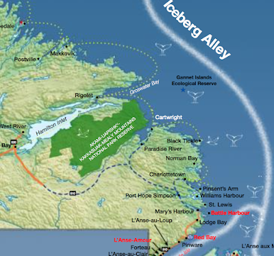
Tourism map - where to see whales, seabirds and icebergs in Newfoundland And Labrador - issuu.
https://issuu.com/newfoundlandlabradortourism/docs/whales_birds_bergs_map
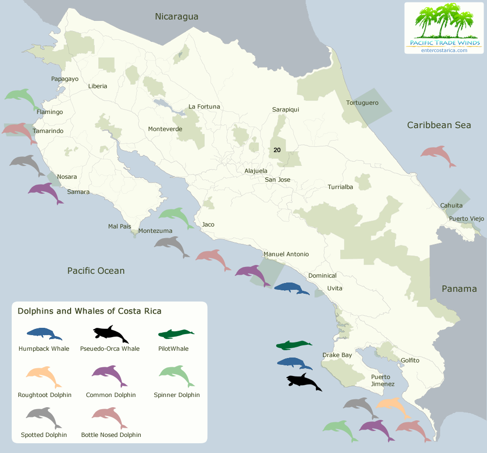
Whales and dolphins in Costa Rica - via Enter Costa Rica
https://www.entercostarica.com/images/maps/map-whales-dolphins-flat-1000.png


Wednesday, September 20, 2017

Time Maps

Mapbox has created this fantastic "map" - really a diagram showing web search results from the perspective of time, in this case walking time. The map is a concentric circle diagram with geography only preserved in the direction of each result.
In their own words Mapbox has "swept the physical world away completely, in favor of the time needed to move around it." The results are from Foursquare and are somewhat dubious as I will discuss.

I chose Rittenhouse Square in Philadelphia, a favorite spot since childhood. One nice feature was I just put in the name of the square, no city, state or any other info and it knew exactly where to go. I searched for ice cream, often problematic in that neighborhood because places seem to come and go quickly. Click on any spot and you get a walking route with directions.
You can click "Find me" to get your location or start searching an address. The address search is overly eager. I started to enter an address where I'll be going soon in upstate New York and it took me first to Birmingham, UK and then to Toronto before I could finish typing.
Of course, a map like this is only as good as the information behind it. When I did some searches of my neighborhood, I found quite a few businesses that closed several years ago while some places that are well over five years old did not appear.

For some details on how and why see the this Mapbox blog post.

Friday, October 28, 2016

Torontonian Map of Toronto

Next week the GIS-Pro conference opens in Toronto. To help people navigate their way to and around the area, here is a map from the locals.
http://imgur.com/r/TOmaps/4rTqyxx
Judging from this zoomed in view of the area, you can now take the subway all the way to Lake Simcoe for some weekend foliage viewing. It's also helpful that they built a diagonal road from NYC to Buffalo.
Also, they move the British Isles much closer for your convenience.
Hope this map helps you enjoy your stay!

Wednesday, April 1, 2015

Google Pac Man Cartography

The Google Maps Pac Man April Fool's map has been up for a while now and has been mentioned all over the web. They have transformed the world into a giant Pac-Man maze. I decided to take a look at some of the more interesting and/or well-known places on earth to play. Some of them look fantastic even if the street patterns are a bit vague at that close a zoom level. Enjoy!

I have always been really bad at Pac-Man. Here I am about to get eaten by Pac-Man bullies on the suburban Rochester, New York street where I spent much of my formative youth.
Getting mugged in Queens Park, Toronto, Canada.
The Battery, Manhattan, NYC
 Chased by Putin's thugs outside of Red Square, Moscow
Climbing up the mountain to get to Machu Picchu in Peru.
The Ginza area, Tokyo, Japan
Stupidly chasing my tormentors in Cabo San Lucas, Mexico
 Circling the Arc de Triomphe, Place de L'Etiole , Paris
Finally, getting a measure of revenge near the Royal Residence in Central Marrakesh, Morocco.


Wednesday, January 7, 2015

Toronto's Language Quilt

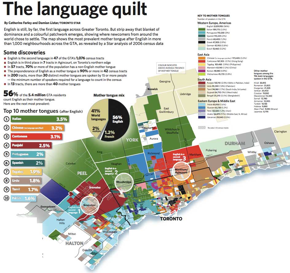
The Toronto Star published a set of maps in 2007 showing the second language (after English) for more than 1000 neighborhoods in the Greater Toronto Area. The map (based on 2006 Census data) is a nice, colorful illustration of where different immigrant groups chose to settle - although languages such as Spanish and Portuguese (and even Chinese to some extent) don't tell you much about where those settlers really came from. The original map is pretty large - here are some smaller images from Bricoleurbanism.
http://www.bricoleurbanism.org/wp-content/uploads/2007/12/gta-language-quilt_main-e.jpg

Particularly striking and unexpected (to me) is the number of Italians. Although many of the green neighborhoods are lower density suburbs creating a false illusion of dominance, Italian is still the largest
second language with almost three times as many speakers as French. The dull, generic gray color used for French (mostly in the far eastern part of the region) minimizes the visual importance of Canada's second language, whether intentionally or not.

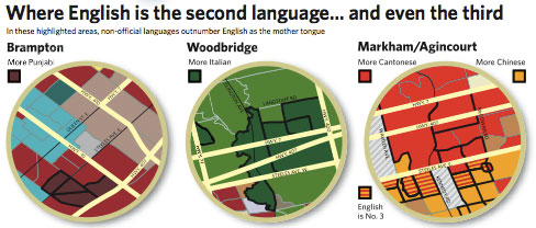
Three neighborhoods where English is not the first language are highlighted with circles and expanded on.
http://www.bricoleurbanism.org/wp-content/uploads/2007/12/gta-language-quilt_eng-2nd-e.jpg
I made a screen shot of the main urban area to show some of the patterns of diversity that are less apparent from the large map. These patterns include Greek (black) in the east, Portuguese (light blue) in the west and various eastern Asian languages, mostly east and north of downtown. There are also numerous French speaking areas, if I'm interpreting the generic gray correctly.
The entire map can be downloaded from the Star here.


Wednesday, April 10, 2013

Subways of North America

xkcd once again embraces their love of maps with Subways of North America. While I've seen similar subway map mashups, I've never seen them connected before.


These inter-city connections create some wonderful highlights. Here are some of my personal favorites:

The Cleveland Circle (Boston) to Cleveland shuttle - passing through West Trenton, this shuttle would be a nice easy way for me to leave work and go visit my Mom. West Trenton's location along Lake Erie just beyond South Harbor is also a bit curious.

The Green Line extension from Cambridge to Montreal - if it even makes it to Medford that would be remarkable.

The extension of the Market Street elevated subway line in West Philly/Upper Darby from 69th Street to Long Beach and LA.

The Rocky Mountain Tunnel (at sea level) connecting Chicago's O'Hare airport to Oakland.

A couple of extremely long subway tunnels from Atlanta and Miami to Mexico City.

The Puerto Rico submarine from Staten Island to San Juan and the connection from Jamaica (Queens) to Jamaica.

The Springfield Monorail connecting to nowhere, not even North Haverbrook.

There's lots of other things to explore including tunnels in the Caribbean,  "covertly repurposed" Amtrak lines, strangely renamed Red Line stations in Quincy, Mass. and a graveyard for passengers killed by closing doors - have fun exploring!

Thursday, April 4, 2013

Speaking of April Fools...

On a recent Air Canada flight I got to see a little Canadian TV, specifically This Hour Has 22 Minutes. They like to make fun of Toronto mayor Rob Ford who has a long history of saying dumb things. On a recent visit to Chicago someone told him they'd been to the part of Canada "across from Detroit" and Ford responded "Oh, Manitoba!" Actually Rob, it's your own province! 22 Minutes had a little map fun at his expense. Here is a screen shot of the Rob Ford's map of Canada via the Torontoist.


Thursday, September 27, 2012

The New IOS6 Maps

Any new mapping system is going to have glitches. It takes a long time and lots of user input to get to where google is and maybe Apple will always be a few years behind. In the meantime we can have lots of fun with their glitches. There is a page on Tumblr, The Amazing iOS6 Maps that collects these glitches.


Helsinki's Railroad Station as a park.

There are lots of melty pictures, a result of aerial and 3D image overlays. Here's a the Islington subway station in Toronto.


Other example include cities that have migrated, park expansion, missing water bodies and lost detail. Here is Minsk, a city of 1.8 million, with almost no roads and the city's center located outside the beltway.


Powell Butte in Portland, Oregon supersized.

Wilkes-Barre, PA moved inland after the flood.

Belgrade without rivers.

 There are dozens of additional pages of these images for your viewing pleasure. Just click the next button at the bottom of the page. Thanks to niece Olivia for discovering this page. I just got my new iPhone and will be setting it up later today so I have all this to look forward to. I'll leave you with this final parting shot.


Wednesday, August 22, 2012

The War of 1812 Board Game

A good way to commemorate the 200th anniversary of the War of 1812 is by playing the board game.
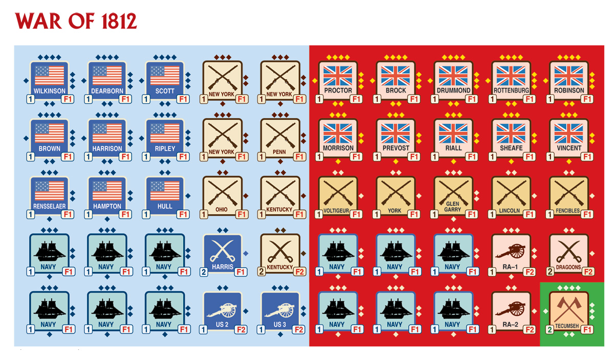
This is the map board


From the Columbia Games Web Page:

War of 1812 is an elegant strategy wargame depicting the Anglo-American struggle to control the Great Lakes and Canada.
War of 1812 sets up in five minutes and plays in 1-2 hours. This classic game has been enjoyed by thousands of gamers for over 30 years.
Unit types in this edition include artillery, cavalry, infantry, and navies. The map board is unchanged from previous editions.
This page also has a good summary of the war, mostly a listing of failed campaigns by both sides and the partial destruction of cities such as Buffalo, Toronto and Washington. The game strategy much like the war's is to concentrate your forces on one or two of the four Great Lakes fronts (Detroit, Niagara, Kingston and Lake Champlain) and attack early (in 1812-13) before the Napoleonic wars abroad wind down and the British forces receive major reinforcements. If you play the British side, try to hold out in a defensive posture until those extra forces arrive.

Here are some close up images from the board. The first one highlights Sacket's Harbor, New York where American naval forces were concentrated and where two attacks by the British were successfully repulsed.

Here is the western frontier where the war began with American forces crossing the Detroit River and invading Canada. British forces responded by driving them back and then surrounding Detroit.

These are the labels you stick on the wooden blocks to indicate who is where.
In the long run nothing really changed. Both Americans and Canadians decided that they were victorious. In the game version whoever can control the lakes and/or Quebec can rewrite history.

Friday, January 27, 2012

Indoor Living - Part 2

Commenter Matt pointed out that Toronto has an impressive network of (mostly underground) connections. In fact it is the largest underground shopping complex with 28 kilometers (17 miles) of shopping arcades. Other interesting facts about the network can be found here. Below is a map of the system from ygraph.


Montreal also has a large Underground City represented pink lines on this map.


Here is the Centre Eaton map.


Wikipedia has a comprehensive list of the world's major skyway and underground systems.