Showing posts with label asia. Show all posts

Wednesday, August 29, 2018

Aerosol Earth

NASA's Earth Observatory created this stunning image of aerosols - airborne particles and liquid droplets.
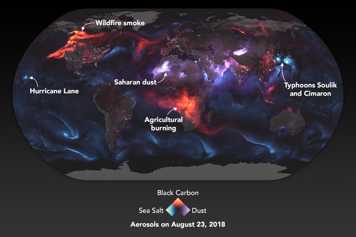
https://eoimages.gsfc.nasa.gov/images/imagerecords/92000/92654/atmosphere_geo5_2018235.png
These aerosols "range in size from a few nanometers—less than the width of the smallest viruses—to several several tens of micrometers—about the diameter of human hair. Despite their small size, they have major impacts on our climate and our health." - via NASA aerosol page

In the image above blue represents sea salt. The concentrated areas show major storms, particularly two cyclones off the coasts of Japan and Korea and a hurricane approaching Hawaii. Red indicates black carbon, mostly from agricultural burning in Africa and Wildfires. Purple is dust, mostly from deserts. Also included is a layer of white night light data to indicate urban areas. Here is the legend enlarged for emphasis.
The NASA page includes a zoomed in detail from southern Asia, emphasizing the deserts, cyclones and population centers of the area.
More from NASA here.

Wednesday, August 15, 2018

Rivers of Plastic

There has been a large increase in both the amount of plastic in the oceans and in public awareness of the issue. National Geographic and Nature have both done a good job of covering this issue. Cartographer John Nelson made a wonderful map, inspired by the rivers/mountains type of diagrams that I recently featured here, showing the three most contributing rivers in that style.
https://adventuresinmapping.files.wordpress.com/2018/08/threeprincipalriversofplastic.jpg
For better resolution click above - here is a detail from the Yangtze River.
I like how he managed to give this not only an old style look but also make the river colors and textures look a bit like plastic.  Also it is worth noting that the boxes on the bottom of each river represent the weight of about five cars, this weight is multiplied by the number of boxes EACH DAY.
For more on Nelson's map click here


National Geographic also recently published an excellent graphic story on this subject. Here are rivers with circled sized by level of contribution of plastics,
https://www.nationalgeographic.com/magazine/2018/06/the-journey-of-plastic-around-the-globe/
and here is a graphic view. This is just for Asia,
and here is the rest of the world.
Note that the scale on the two above images is close but not exact. To see these side by side scroll through the article.

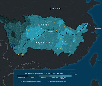
Finally, a map of the Yangtze basin showing the sources of mismanaged municipal plastic waste.
https://www.nationalgeographic.com/magazine/2018/06/the-journey-of-plastic-around-the-globe/


Tuesday, December 31, 2013

I Saw a Peutinger Map Replica at ISAW

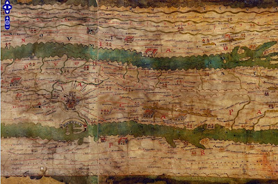
This weekend I was in New York City and had a chance to wander over to the Institute for the Study of the Ancient World (ISAW) to see their exhibit, Measuring and Mapping Space: Geographic Knowledge in Greco-Roman Antiquity.  The exhibit features a 1:1 scale digital replica of the Peutinger Map, the only known surviving world map from the Roman Empire. This is a medieval era copy of a map from Roman times housed at the Austrian National Library in Vienna. The map is over 22 feet long and only about 13 inches wide. The digital replica takes up one wall of the gallery. Here are some photos from my phone. 
The map is centered on Rome. Above are the roads radiating out of Rome, including the Appian Way. It is meant to show a schematic road network and the extent of the empire's control from the British Isles to India and Sri Lanka. The geography is highly distorted to fit the dimensions with the areas closer to Rome much larger and more accurate. Expanses of open water are reduced to narrow channels. Small cities are represented by twin towers while larger ones show temples and other complexes. The largest cities, Rome Constantinople and Antioch are shown with more elaborate symbols. Below is a section in Mesopotamia.
You can see these areas much more clearly on the ISAW map viewer. This allows you to pan and zoom around the entire map, except for the far western edge - missing from the original map. You can also add lines and text digitized from the original for clarity.
http://peutinger.atlantides.org/map-a/
Wikipedia also has a cleaned up high resolution image of the map. The missing western areas were reconstructed by Konrad Miller in 1887-88 and show up with a white background. The original parts of the map are shaded in yellow. The preview image below gives you an idea of the map's crazy dimensions.
http://en.wikipedia.org/wiki/File:TabulaPeutingeriana.jpg

The exhibit at ISAW only goes until January 5th, but hopefully the online resources will remain available.

Thursday, May 15, 2008

Map of the Week 125-Asian Disasters

It's been tough finding good maps of the earthquake area in China. The BBC wins out again with this map although the scale is a bit too zoomed in to get a good sense of the surrounding areas. You do get a sense of how close Chengdu, a city of about 4 million people, is to the epicenter and how severe the quake was there. You can click on the affected cities and get more information - or just scroll down on the same page.


One of the more tragic aspects of the China quake is how it has made many of us forget about the cyclone in Myanmar-Burma (Whatever you prefer to call it) where another city of 4 million Yangon-Rangoon (Whatever you prefer to call it) has been hit.
This is a set of before and after satellite images of Cyclone Nargis from the NASA Earth Observatory. The after image shows the extent of flooding as of May 5th using a combination of color and infrared light to clarify the floodwaters.
Anyway be thankful if you're not in one of these places and hopefully we'll all donate a little to help these people-it could be any of us next time.

Wednesday, October 5, 2005

MOTW #1

Map of the Week #1

Program Note: Map of the week has been an e-mail list since some time in 2005. This was probably not the first one but it is the first map after I decided to keep track of them.
Note 2: Most of these first 50 or so maps did not have comments and some of them are unattributed. I will try to give credit where due fr these. Hopefully nobody gets bent out of shape about that.

This is a map of Avian Flu courtesy of the UN World Food Program.