Showing posts with label technology. Show all posts

Tuesday, May 10, 2016

MIT's Innovation District

Last week the Boston Globe had a clever map of "The Kendall Network"  I posted it on Twitter but have not had a chance to mention it here. It accompanies an article celebrating the 100th anniversary of MIT's move from Boston to an empty warehouse district of Cambridge. For those unfamiliar with Boston, Kendall Square is the area adjacent to MIT and has recently seen a huge growth in tech companies.
http://www.bostonglobe.com/specials/2016/05/05/mapping-kendall-square-network/whKpe5VayFBBJJD8tsUMWP/igraphic.html
The printed circuit board analogy works great because of the somewhat ordinary (by local standards) street network. If this was Harvard, it would have been much more difficult to make this kind of map. The crazy Harvard Square street network there would have required some major schematic simplification. The Kendall Square area only needed minor adjustments. MIT is the chip that is driving the innovation around it. Nice work Globe graphics team!

Wednesday, January 27, 2016

Women in Cartography

Women in Cartography is an excellent exhibition at the Boston Public Library. It runs until March 27th. If you don't get a chance to visit in person you can view the exhibition online here. In December I got a chance to see it. Here are some of the highlights.

Physiographic Diagram of the Western Pacific Ocean - Marie Tharp and Bruce Heezen, 1971
Geologist/Cartographer Marie Tharp created the first map of the ocean floor. Originally this map was credited solely to Heezen, her research partner. It is displayed on the floor. Here is a picture I took looking down.
The numbers indicate depths of the sea bottom and height of undersea mountains. The colored areas are land, in this case the Hawaiian Islands rising from the depths of the Pacific.

Mappemonde Projetée sur l’Horizon d’Angers - Céleste Babin, 1839
This double hemisphere map was done by a student in Angers, France. The left hemisphere is centered on Angers and the right one on its antipode (opposite side of the earth.)
http://maps.bpl.org/id/19872
The detail below shows off some nice hand calligraphy and a view from Angers.
A General Map of North America …  - Mary Ann Rocque, 1761
Rocque carried on her husband's business after his death. This map was credited to "M.A. Rocque" obscuring (possibly intentionally) that it was produced by a woman.  
http://maps.bpl.org/id/12086

A New Map of ye Seat of War in Italy - Ann Lea and Robert Morden, 1701
Ann Lea also took over her husband's map business after his death. The map shows areas of northern Italy that were fought over between France and the Austrian Empire before Italian unification.
http://maps.bpl.org/id/15340

“Nationalities Map No. 1,” from Hull-House Maps and Papers … - Agnes Sinclair Holbrook, 1895
http://maps.bpl.org/id/19878
Hull House was a settlement house for female immigrants in Chicago. Holbrook, a house resident designed the map based on Charles Booth's income maps of London (previously mentioned in this post about my visit to Chicago's Newberry Library.) Other house residents helped her gather data for the neighborhood.
The Attack on Bunker Hill in the Peninsula of Charlestown the 17th of June 1775 - Mildred Giddings Burrage, 1926 
Burrage was a Maine-based artist. She created this map/scene using layers of Gesso to build up a sense of topography.
http://maps.bpl.org/id/19957

The exhibit concludes with a technology section including the following maps.

Lower East Ride: Adapting to Change - Maryam Khabazi, Designer, 2013
Created by Green Map NYC, this map highlights the impact of climate change and natural disasters such as Superstorm Sandy and shows resources to reduce energy consumption.
http://www.bpl.org/exhibitions/current-exhibitions/women-in-cartography/view-the-exhibition/women-in-cartography-33/


Making History - GIS and Women - Linda Loubert, PhD - 2014-
Dr. Loubert built this crowd-sourced webmap to document thousands of women working in the field of GIS.
http://arcg.is/1UE8onH
You can see the entire online map here or by clicking the image above. I know some of these people! GIS women rock!


Wednesday, November 9, 2011

The Web 2.0 Map

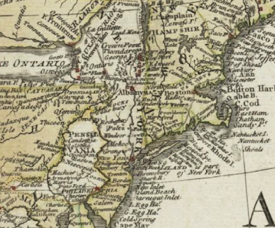
In the last couple of years I've seen many attempts to show the internet using a metaphoric map. Most of those attempts have not held my interest and left me confused. The Web 2.0 Map is also confusing (after all the web itself is a confusing place) but it captured my interest because it is attractive, well organized and interactive. You can pan and zoom and also click the icons for further information.


The map is like a Risk board with icons for the primary players in the industry. If you click on them you get a somewhat advertise-y description of each one. As you zoom in more companies appear on the map. It is built on Google's mapping API and is organized from north to south with the "Clouds of Infrastructure" then the "Oceans of OS and UI", the "Platform Plateau", a couple of continents to hold social networking, searching and payment and at the bottom a "Subcontinent of Advertising." There's also some good puns scattered about.

At the top of the map there are alternate views for "Movements" and "Data Layers." Movements is designed to show "how a handful of major actors in the Internet Economy are moving from their bases of power into other points of control across the map." At the moment this view doesn't appear to change anything. The "Data Layer" tab was built for the 2011 Web 2.0 Conference. This view represents eight major internet players as cities, with skyscrapers for different data categories such as social, location, search and and content.


  Each city has the same buildings at different heights so in the view above we see Twitter having interest data as its highest building, Facebook has tall buildings for social and wildcard (uncategorized) data, Google's tallest building represents search data and Yahoo's is content.

Confused yet? For a description of the main map see John Battelle's Web 2.0 Summit blog post. For a description of the Data Layer (or Data Frame) see his Searchblog post.

Wednesday, May 25, 2011

Satellite Images Reveal Lost Eqyptian Sites

A new satellite survey of Egypt using infrared sensors with submeter resolution has revealed thousands of tombs and settlements that are buried under silt in the Nile Delta region. A team, led by Egyptologist Dr. Sarah Parcak, Ph.D. is using the imagery to locate future excavation sites. The infrared band of the spectrum enables analysts to distinguish building materials from the surrounding soil. This image forms a streetmap of the ancient city of Tanis - a much larger city than many people expected to see.


Is that the world's first expressway cloverleaf in the northwest corner?

For a regional perspective use this BBC map.


The imagery also reveals where and when sites have been looted so authorities can be on the lookout for antiquities that appear for sale. More details and a video can be found on the BBC and a program, Egypt's Lost Cities will be aired Monday on BBC One. 

Thursday, February 7, 2008

Map of the Week 111- Anchors Away!

Last Wednesday off the coast of Egypt, a ship's anchor severed some cables limiting internet access to 75 million people, primarily in Egypt, India, Pakistan, Saudi Arabia and the United Arab Emirates. This has had significant impacts on the high tech economy in India and on western companies that have outsourced their tech support there. This story appeared in the Guardian along with the map below of undersea internet connections and lots of hand-wringing about the world's fragile infrastructure.


If you want an even more detailed map of the world's internet infrastructure and feel like spending $250 then take a click on the map below.