Showing posts with label ukraine. Show all posts

Wednesday, September 16, 2026

Another Day in Ukraine

I got this image off social media-I honestly can’t recall where it came from. It’s originally from Telegram and supposedly* shows just one day of attacks on Ukraine-September 12th, 2026.


*I use the term supposedly because I have no way to verify this map.

Here is one from September 15th via Telegram


Translation via Google - “Throughout the day, approximately 150 attack and jet-powered UAVs of various types were deployed to attack the Kyiv, Odesa, Cherkasy, and Kirovohrad regions. In the Kyiv region, warehouses and gas stations were targeted.“

I found an almost identical image to the first one on Dima Lazarchuk’s LinkedIn page with the following words:

“On weekends, some people wake up to birds singing outside their windows, some to the sound of the sea, and some to the rustling of autumn leaves.

In Ukraine, we wake up to the sound of russian drones flying in to kill us, and to the sound of our air defense trying to stop them.

Another weekend survived in Ukraine.

Another reminder to the world that russia’s war of aggression against Ukraine is still ongoing.”


Wednesday, April 29, 2026

Chernobyl Radiation Zone - 40 Years Later

This past Sunday marked the 40th anniversary of the Chernobyl Nuclear Disaster. Radiation was scattered across Europe but the worst of it was concentrated in the 2,600 square mile exclusion zone around Pripyat, the plant’s location. This area will be uninhabitable by humans for a very long time. Informal estimates range from 300 to tens of thousands of years. 

-Map via Reddit
Though a few people have returned to this area, it has mostly reverted to forest with a large wildlife population. This map via Wikipedia, from ten years after the disaster shows radiation accumulation across Ukraine, Belarus and parts of Russia.


Current radiation conditions are shown at SaveEcobot, a project that combines data about the state of the environment, pollution, and environmental protection tools.


These site indicators are published on the map without additional verification, so they are approximate. The average natural level in Ukraine is usually 0.08–0.30 μSv/h. The dark blue and purple locations have significantly elevated radiation levels. Here is a zoomed in version around Pripyat, with the exclusion zone shaded.


A click on the reading will give you a chart of measurements over the past week. This one is from the grounds of the power plant.


This site also monitors fires, water and air quality. I don’t think radiation is factored into the air quality measurements. 


You may also find a few hidden messages in these maps. I’d translate this one, but you might find it rude.


Wednesday, February 26, 2025

The Invasion of Ukraine

Ukraine was invaded by Russia three years ago. Since the new president of the United States is in full surrender to Putin mode and wants to blame Ukraine for starting the war, I am posting this map, from February 27, 2022. It is to remind anyone that needs reminding of who started this war.

via AP - source: VOA News
This one shows what Russia has gained (in red) in three years of war. Much of that area will likely be ceded to Russia if a “peace” deal is made without Ukraine.

via Institute for the Study of War


Wednesday, November 9, 2022

Thirty Day Map Challenge 2022 - Days 4 - 9


Yes, November is the month when I get to be self-indulgent and show off my #30DayMapChallenge maps so here come some more. The daily theme is listed after each day.

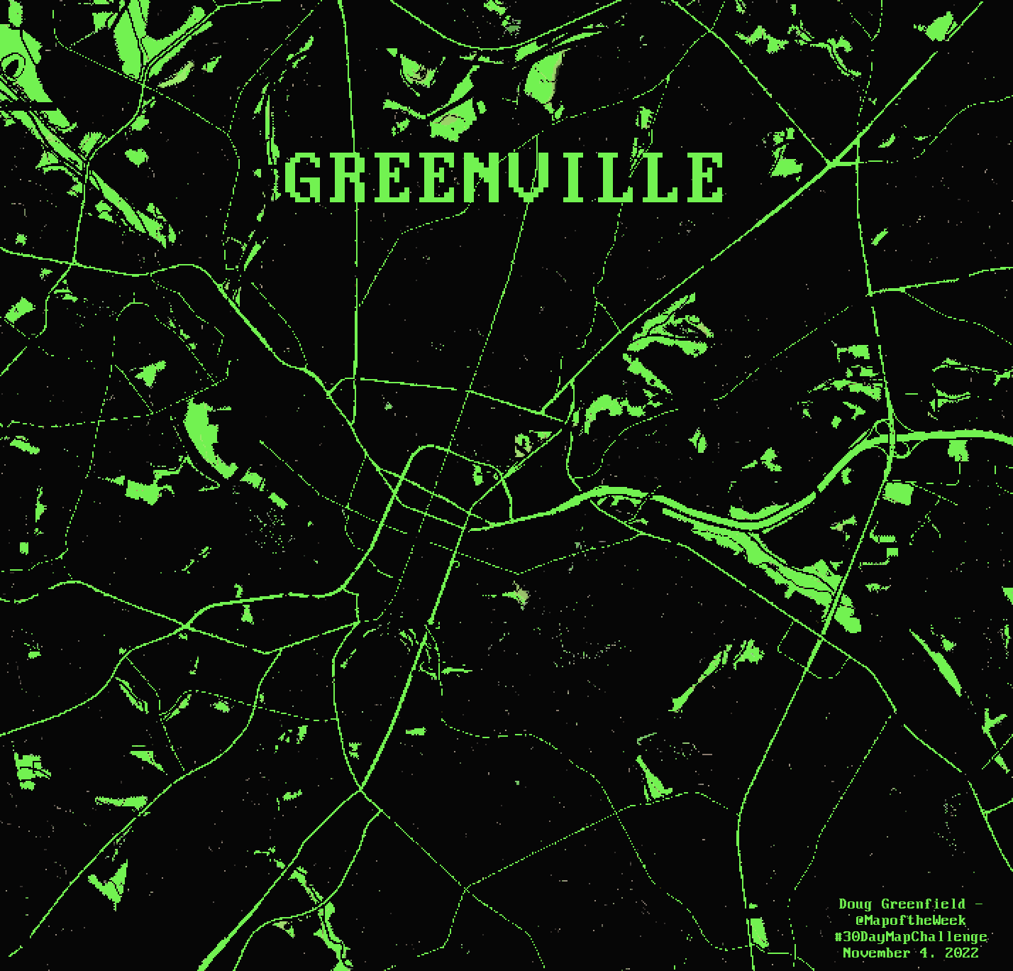
Day 4 - Green

For green day I made a map of Greenville, the one in South Carolina, giving it the 1980’s computer screen look. I brought down the resolution a bit for the pixellated feel and found a font from that era.

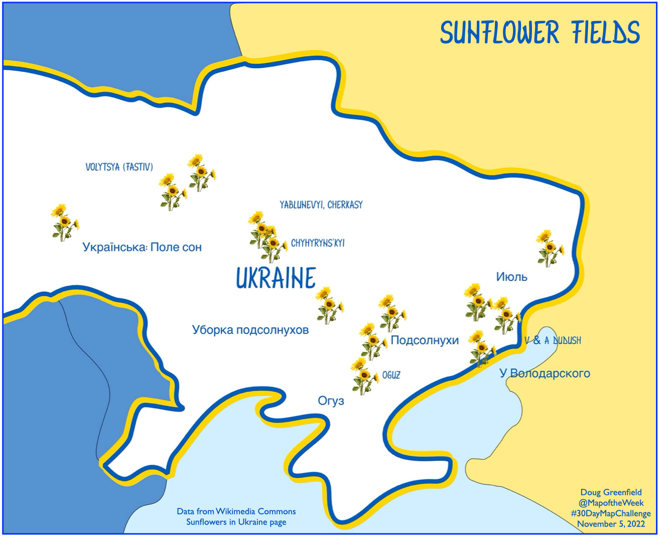
Day 5 - Ukraine

Locations of sunflower fields in Ukraine were taken from this Wikimedia Commons page. Most of the photos have location coordinates listed deep in their metadata. I used a caricatured country outline from Project Linework, except for Russia (not included in their data) which I drew my own coastline for.

Day 6 - Network

This was not my most successful idea but I’d been working on overlaying transit maps onto a cartogram (so the large urban areas have space). To be as objective as possible and keep this project from blowing up, I only used the “heavy rail” systems as listed by Wikipedia. The page lists 15 systems covering 12 metropolitan areas. I did not include San Juan, Puerto Rico because it’s not part of this cartogram. If I started including cities with “light rail” systems, I might need to add various suburban commuter systems and it would be a large slippery slope that I might never get up from. The cartogram was modified to remove some of the large empty area between Chicago and Los Angeles.

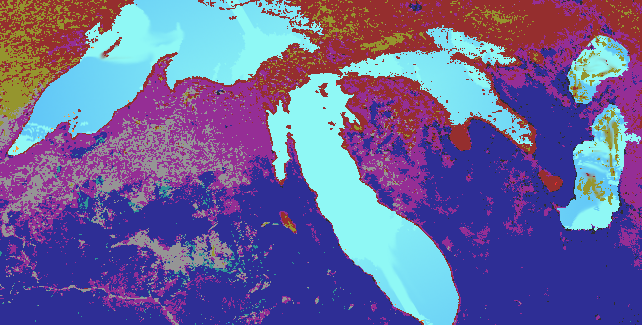
Day 7 - Raster

I may have “mailed this one in” a bit but I wanted to play with some color manipulations in GIMP. The original image came from this page from University of Michigan. I like the perspective.

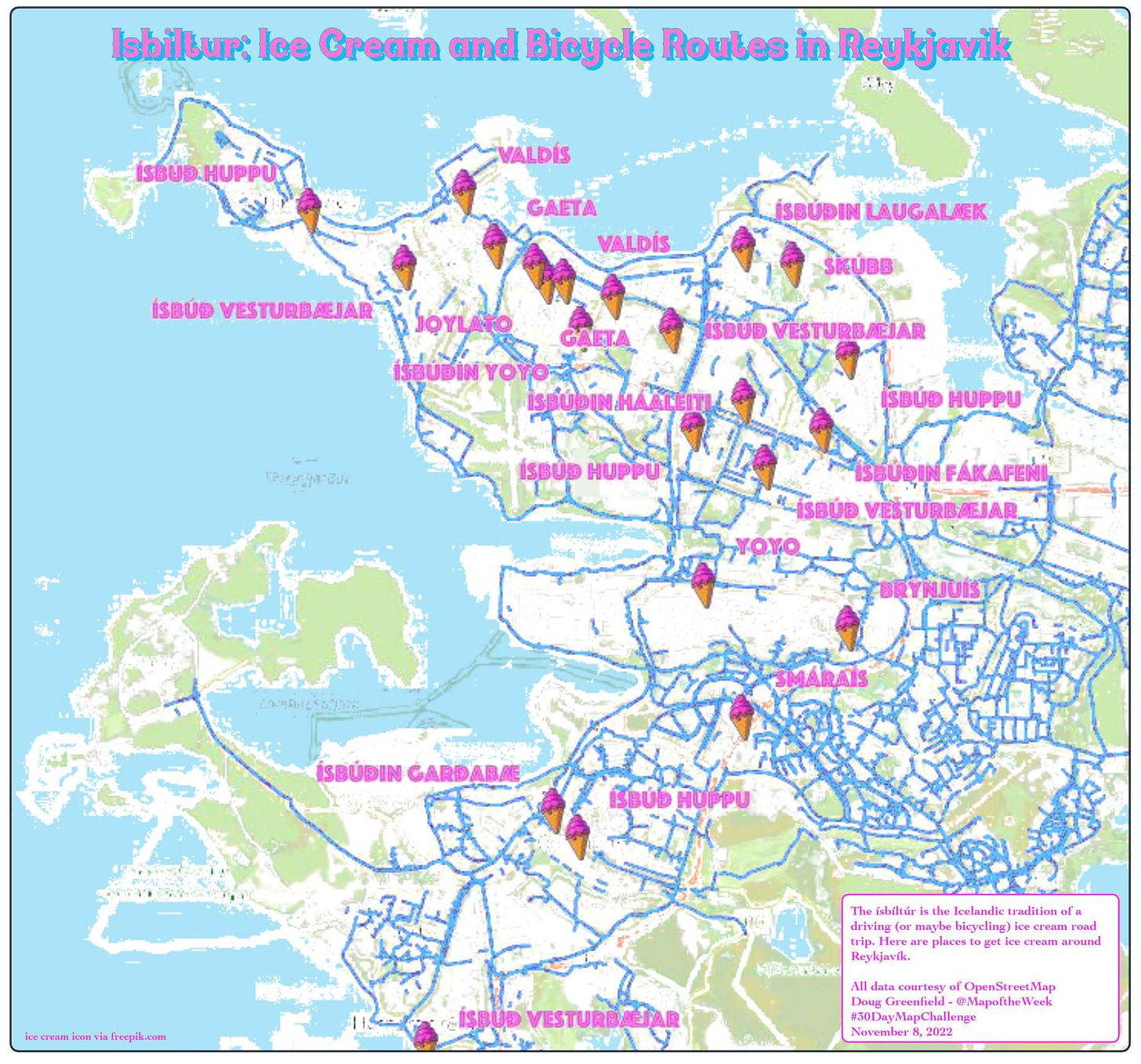
Day 8 - OpenStreetMap

OpenStreetMap is the Wikipedia of geodata. I grabbed some ice cream places and mapped the Ísbíltúr - Iceland’s ice cream road trip tradition. All data including the coastlines and parks are from OpenStreetMap.

Day 9 - Space
 

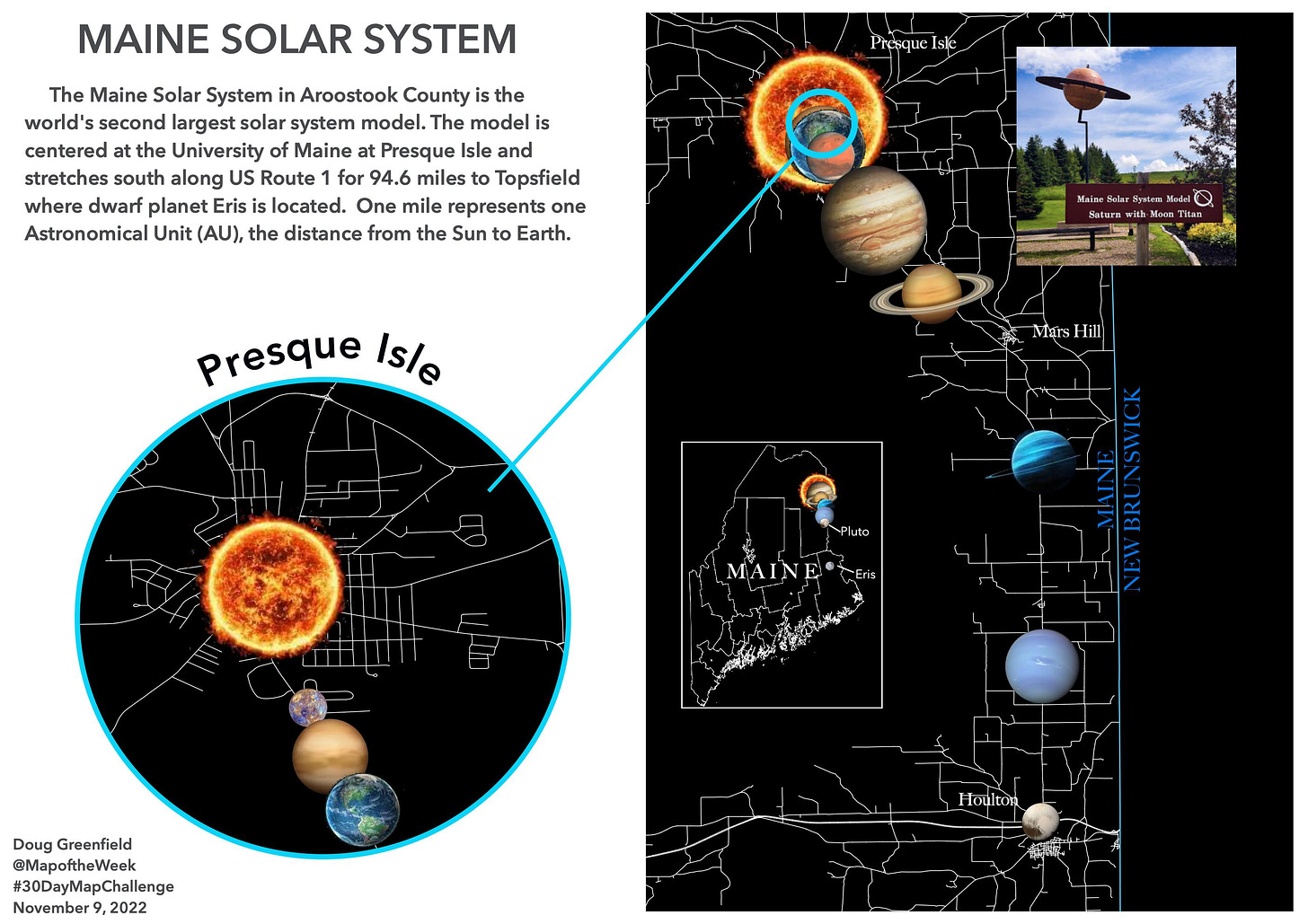
I’ve never been to the Maine Solar System in Aroostook County but I hope to see it some day. Here is a map showing where the planet models are located. More on the system here. The picture of Saturn in situ was taken from Google, user Amy Doucette.

Wednesday, May 4, 2022

My Family's Exodus from Ukraine

A few weeks ago some of my family members had a Passover seder. Passover is an exodus story. With huge numbers trying to leave Ukraine right now our thoughts turned to my own family's exodus from there. Rising antisemitism, employment restrictions and forced military service drove my family to risk everything to escape from Khotyn, Ukraine (then part of Austria-Hungary) and come to the United States. My great grandfather was the first to leave, in 1905. He traveled by steamship from Hamburg, Germany to Philadelphia. How he got to Hamburg is less clear but the shipping companies arranged for passengers to travel there by train with minimal harassment. I made a map of the trip based on railroad maps of that era, making assumptions about the most likely route across Europe.

There was no railroad in Khotyn at the time so they would have needed to travel the 30 kilometers to Czernowicz (not Cherivsti), probably in secret. My great grandmother followed with several children two years later. It must have been very frightening to leave everything behind to go to a place where they didn't know the language or how safe they would be. I'm sure today's Ukrainians are going through similar or worse horrors. Here is a second, less interesting map I made to complete the journey.

There is a story about my great grandmother going grocery shopping on her first day and not recognizing the house on the way back because the houses in South Philadelphia all looked the same. She had to walk up and down the street a few times before a neighbor came and helped her. If you see a lost refugee, They might need your help!


Wednesday, March 2, 2022

The War for Ukraine in Maps

I haven't thoroughly researched all media outlets but the maps from the Financial Times depicting the situation in Ukraine are the best I have seen. Click below to see a more readable version.

They are very subtle but effective without showing a large number of intersecting arrows or distracting explosion symbols. Here is their close up of the Kyiv region.

Finally, here is an elegant flow map showing the numbers of refugees and where they have been heading.

If you scroll down the page you can see maps from the last several days. It is interesting how little they have changed in the last few days despite all the carnage.


Wednesday, January 26, 2022

The Russian Military Buildup

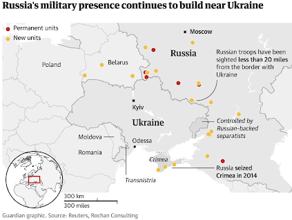
Here are a few maps to illustrate the recent arms buildup on the Ukrainian-Russian frontier.

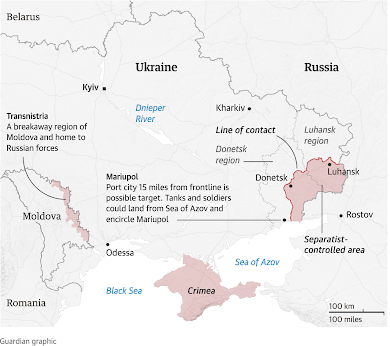
This, from Reuters via The Guardian shows new military units in orange. Switching the orange and red would have made more impact. The article describes the buildup as insufficient for a full scale invasion, and one more likely to result in a more focused attack on the eastern regions of Donetsk and Luhansk, possibly targeting the port city of Mariupol.

This is a map from last month via Foreign Policy. I have cropped it to better fit this window. The whole map can be seen here.

There is no legend but the reddish color of the diamonds refers to "hostile" units, the X inside oval refers to combined infantry and armored divisions and the number of x's refer to numbers of units. The map is from a "Ukrane Defense Official". There is a good page of NATO military map symbols on Wikipedia that summarizes several hundred-plus page pdf's.

Wednesday, December 5, 2018

Ukraine's Other Border Problem

Russia's annexation of Crimea and occupation of eastern Ukraine have been in the news lately with tensions between the countries escalating again. However, Ukraine is also facing agitation on their western border from Hungary. Zakarpattia Oblast, Ukraine's westernmost province has a large ethnically Hungarian population. The map below, via Euromaidan Press,  shows villages that have a Hungarian speaking majority (in orange) on their councils.
https://i2.wp.com/euromaidanpress.com/wp-content/uploads/2017/10/Hungarian_language3.jpg?resize=960%2C730
The Hungarian government, while publicly not seeking to control these areas, has been sending development money and encouraging autonomy for these regions. They have also been issuing Hungarian passports to people living in these areas and some residents have been pledging allegiance to Hungary. Russia has also been actively promoting Hungarian claims to the region. In return the Hungarian government is campaigning to lift EU sanctions against Russia for military aggression in eastern Ukraine. For Russia this is also part of a divide and conquer strategy for the region as a whole.

Prior to World War II, Hungary expanded its borders to include minority areas of all of neighboring states and many Hungarian politicians openly dream of reconstructing this "Greater Hungary"
https://i2.wp.com/euromaidanpress.com/wp-content/uploads/2017/10/hungary2.jpg
Ukraine has helped this instability by passing a language education law that is unpopular with the Hungarians. This spring Ukrainians will vote in presidential and parliamentary elections with the current government hoping to improve ties with the west while Hungary and Russia are hoping to wield their own influence on the country.

More information and maps can be found on Euromaidan Press, and recent commentary can be found on EU Observer.


Wednesday, June 8, 2016

Imperial Russian Trading Cards

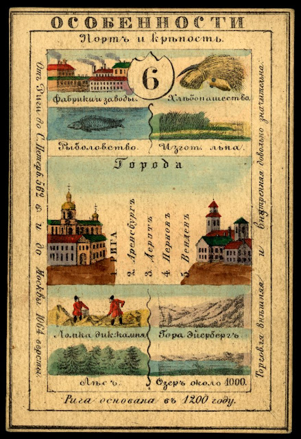
The Mid-19th Century Russian Empire was so large that it covered over 15% of the world's land area. It included a huge mix of ethnic, linguistic and religious groups. One way to show their imperial pride was to create sets of cards representing their many provinces. Here is Lifland Province (Latvia)
These cards listed principal cities, agricultural and industrial products. They also show coats of arms and local clothing styles. On the back side was usually a map.
The cards are from the National Library of Russia and The World Digital Library has put images of them online. They can be browsed from an interactive map that also has an overlay of a map of the Empire from 1827-the approximate time period of the cards. Click on the numbers to see the cards.
For example, Kamchatka
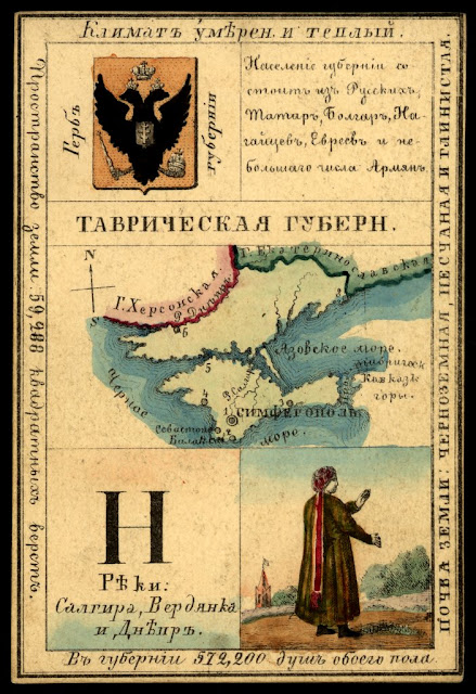
Here is Tavrich (Taurida) Province, including Crimea claimed then as it is again now by the Russians.
https://www.wdl.org/en/item/746/view/1/1/

https://www.wdl.org/en/item/746/view/1/1/
To browse the map. for more cards click here.

Thursday, March 12, 2015

How Ukraine Became Ukraine

The Washington Post has a pretty good map series titled "How Ukraine became Ukraine"
http://www.washingtonpost.com/blogs/worldviews/wp/2015/03/09/maps-how-ukraine-became-ukraine/?hpid=z4
Unlike some of their previous 40 Maps articles, this one explains the history of the region without the clickbait.
http://www.washingtonpost.com/blogs/worldviews/wp/2015/03/09/maps-how-ukraine-became-ukraine/?hpid=z4
Russian claims begin with the settlement of the Rus people in and around Kiev. Their trade routes with the near east went through the Crimean peninsula. Control of parts of the area has continuously shifted among the Mongols, Russians, Swedes, Turks, Hungarians, Slovaks and the Polish-Lithuanian Commonwealth.
http://www.washingtonpost.com/blogs/worldviews/wp/2015/03/09/maps-how-ukraine-became-ukraine/?hpid=z4
Under Soviet rule, much of the rural population was displaced or starved to death, Their settlements were replaced with native Russians, complicating the ethnic picture of the region. The complete text and map set can be seen here.

Wednesday, January 28, 2015

100 Years of National Geographic Maps

 In 1915 National Geographic created a new cartographic division, now known as National Geographic Maps.
http://en.wikipedia.org/wiki/National_Geographic_%28magazine%29#mediaviewer/File:1915NatGeog.jpg
A century's worth of highlights and challenges are detailed in Cathy Newman's article 100 Years of National Geographic Maps.  From Newman:
At this writing (the count is obsolete as soon as it is tallied), National Geographic cartographers have produced 438 supplement maps, ten world atlases, dozens of globes, about 3,000 maps for the magazine, and many maps in digital form.
Their first cartographer, Albert M. Bumstead invented a sun compass* and the Bumstead photocomposing machine that replaced hand lettering with photographic type. An example of some of their innovative approaches is this gorgeous map of the Himalayas, taken from a combination of high resolution photography from the Space Shuttle Columbia and aerial photography
http://news-beta.nationalgeographic.com/2015/01/150123-maps-mapping-cartography-history-national-geographic-centennial/
They were also the first to map both sides of the moon, including the side that is hidden from the earth.
http://news-beta.nationalgeographic.com/2015/01/150123-maps-mapping-cartography-history-national-geographic-centennial/
Here is a map showing many of Ukraine's place names that needed to be changed after the collapse of the Soviet Union in 1991.
http://news-beta.nationalgeographic.com/2015/01/150123-maps-mapping-cartography-history-national-geographic-centennial/

See the article for more maps and details about the past and future of National Geographic cartography.

* the sun compass was a type of watch with a pin that cast a shadow that when inclined at the correct angle would indicate which way was north based on the time and latitude. It was used by Admiral Byrd on his first flight over the South Pole in 1929.

Wednesday, August 20, 2014

Propaganda Map of Ukraine

Ukraine's National Security Information and Analysis Center puts out and updates these maps showing the situation in eastern Ukraine. Click to see a larger version.
http://mediarnbo.org/wp-content/uploads/2014/08/20-08_eng.jpg
There's a lot to like about this map. It is busy but they keep it legible by using clean fonts and symbols. The small circular locator map uses a mostly consistent color scheme though the Crimea color is not explained. The legend is also pretty good, though not everything on the map appears in the legend.

Now the bad parts. First there's the obvious language of propaganda. Regardless of how anyone feels about the politics there, the use of terms like "liberated" and "terrorists" dumbs down the map. Then there's the color problems. It's a cute idea to use the blue and yellow Ukranian flag colors to represent the area but it also makes for a communication failure, especially if you don't realize what they're trying to do. After all, most people outside of the region probably wouldn't recognize those as the flag colors. Instead it creates the illusion of two separate regions divided by a curiously straight line. Also, the locator map only uses yellow for this region. One could also ask why the flag colors do not extend to the rest of the country. I guess they are trying to spotlight the eastern oblasts and make sure you know in no uncertain terms that these are part of Ukraine. Also, the use of flags to represent the "liberated" settlements should make this color scheme unnecessary.

The territory controlled by the pro-Russian, or "terrorist" forces is also confusing. Why is some of the area outlined with a background color and some of it just lines or varying darkness? There are also unexplained blue and red arrows and differing flag sizes. I can guess what all of these items mean but I may be wrong.

I want to like this map because it attractively conveys a lot of information, but it needs work. Still, it's much better than this ugly thing.
pic.twitter.com/8kNE8GO6ZX

Wednesday, January 29, 2014

Ukraine's Messy Situation Inspires a Messy Map

Last week there was an article in the Washington Post titled This is the one map you need to understand Ukraine's crisis. The "one map" is actually two maps, both with fairly awful color and symbol choices.
First, there's the color scheme. The orange is fine but the blue is way too similar to the water. So similar that the Sea of Azov (between the Crimean Peninsula and the easternmost provinces) looks like a province that was won by Yanukoyvich. Looking from a distance you can see that he also won that huge southern region - oh wait, that's the Black Sea!

On top of this confusion, the author represents the areas of protests with diagonal lines that are so fat you lose the light-dark orange pattern of support for the "pro-Europe" party. He could have thinned these lines to make the map more readable. Better yet, since protests happen in isolated places a point symbol would illustrate them without confusing the color scheme. If you want to be dramatic, use a nice explosion symbol like this one.

Finally, there's Kiev. The black line pointing to it is the same color and angle as the government centers seized by protesters symbol, making it look like it's been seized. In fact, some government buildings in Kiev have been seized so maybe the author was trying to be ambiguous.

The second map is a linguistic map with the same color scheme. The article does succeed in showing that the political and linguistic divisions break along the same provincial lines. All other information is obscured by bad cartography.

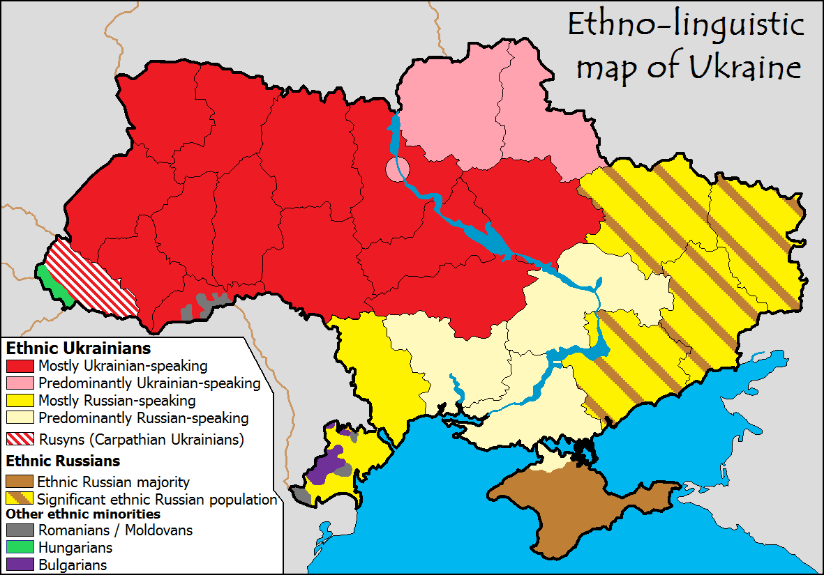
It's really too bad they did such a poor job with this because just last month the same author presented a similar series of maps that are much more legible. In an article with a similar title, This one map helps explain Ukraine's protests, he uses a similar election map but with a slightly better purple color scheme for the Yanukoyvich vote. This time the "one map" is actually three maps, two election maps and an "ethno-linguistic" map from Wikimedia Commons. The linguistic map does explain the divide nicely though the categories are a bit vague (predominantly vs. mostly vs. ethnic majority - huh?)