Showing posts with label texas. Show all posts

Wednesday, July 16, 2025

Flood Zone Exemptions for Camp Mystic

Last week’s devastating floods in central Texas killed more than two dozen people, many of them at Camp Mystic, a children’s camp for girls. The camp asked FEMA to change their flood maps after a 2011 revision placed much of the camp in a floodplain. FEMA responded by removing more than a dozen buildings from their flood zones in 2013 and then again in 2019 and 2020. Buildings outside of the 100 year flood zone (areas that tend to flood much more frequently than every 100 years) are exempt from needing flood insurance. They are also exempt from more stringent requirements such as elevating the buildings or shoring up their foundations. 

Here is a screen shot from FEMA’s map showing the “floodway” (the zone where water moves quickly during a flood) in the hatched colors and the 100 year flood zone in blue. This is where many of the girls were swept away by moving water. Some of the cabins were in the orange or unshaded areas which are not considered part of the flood zone.

 Another section further up Cypress Creek shows more clearly that many cabins are outside of the blue 100 year floodplain.


First Street, a climate risk modeling agency drew their own maps showing an increased risk of flooding for many of the cabins exempted from FEMA’s maps.

map from First Street, via KUT Austin

An excellent article from NPR's KUT affiliate in Austin shows these maps and provides links to letters of map amendment asking for exemptions of certain buildings.

Wednesday, June 19, 2024

Emancipation National Historic Trail

It took over two years for the Emancipation Proclamation to reach Galveston, Texas. Specifically June 19, 1965 hence the Juneteenth holiday. Galveston was the largest slave market west of New Orleans. The newly emancipated fled Galveston to Freedmen's Town and other parts of Houston that had large African American communities.

via Texas Highways
In 2019 the US House of Representatives passed the Emancipation National Historic Trail Act. This act would create the second National Historic Trail centered on the African American experience, after the Selma to Montgomery trail in Alabama. The map above traces the approximate route of this trail.


Wednesday, June 21, 2023

The Southern Underground Railroad

This map, via Smithsonian, shows the main passageways that the enslaved took southwards to freedom.

The southern Underground Railroad was less traveled and much less well documented, but Mexico after gaining independence passed strong anti-slavery laws. Even before that the Spanish government granted freedom to many who escaped to the south. When the United States passed the Fugitive Slave Act in 1850, Mexico refused to comply despite pressure from US diplomats. When Mexico lost Texas and large portions of other states to the United States as a result of the Mexican-American War, slavery was re-established in Texas and the Rio Grande became the crossing to freedom. - via Smithsonian


Thursday, August 25, 2022

Drought Conditions

Many years ago I did a quickie blog post showing NOAA's Drought Monitor. The maps have not changed much (except being a bit easier to read) but the conditions lately have been bad enough to warrant a look at the latest map. 

The dark brown shows areas of "exceptional" drought, a step above "extreme" drought. S and L are for short and long term effects, many areas show both letters.

This NOAA map shows how much rainfall is needed to make up for the drought. In many areas it is well over a foot.

While parts of the Dallas area got over a foot of rain in the last few days, that kind of heavy rainfall tends to drain quickly and not help the situation very much. Comparing last week's map there is only a small decrease in the size of the exceptional drought area. 


Wednesday, June 23, 2021

The Southern Underground Railroad

Mexico outlawed slavery in 1829. Texas fought for independence from Mexico in part to be able to reestablish slavery there. For those seeking freedom from Texas and other nearby states Mexico was a much closer destination than Canada. It was a much tougher trip than for those who went north without the support and protection available in free states. Most who tried to escape to Mexico likely never made it. Still Stephen F. Austin State University's Texas Runaway Slave Project has documented over 2,500 escapees.

Illustration by Erwin Sherman via Texas Highways 

Runaways may have been helped by Mexican immigrants, German settlers who were opposed to slavery and by their own skills at horseback riding. Crossing the Nueces Strip, the hot, arid land between the Nueces River and Rio Grande was particularly difficult but with a horse and a gun, it was possible. 

Once in Mexico there was still much adversity with few job opportunities, a language barrier and little local support. Still it was better than being enslaved. 

Without a major support network there are not established routes to map, just general flow patterns as seen on the map above. This map that commonly appears on the web shows a general flow southward through Texas in addition to the more commonly known routes.

via Pinterest

 More info at Texas Highways

Wednesday, October 28, 2020

The New York Times Covid-19 Site

 Much praise over the last six months has been lavished on the Johns Hopkins Covid-19 Dashboard. I have always found that site hard to read with too much information in one place. I find the New York Times graphics to be a huge improvement.

The color scheme is much easier on the eyes. One of the best things is that the data is by census tract (I'm pretty sure that's how it is aggregated) so you get a much better sense of where cases are. Also it keeps the mostly empty areas uncolored so the reader is not overwhelmed. Texas is a good example-you can choose any state to see maps and graphs. You can see how Hale County is considered a hot spot but within the county the cases are primarily around Plainview in the northeastern corner.

The graphs do an excellent job of showing the trends since March.

The state and territories are sorted by most cases per capita and you can see the difference between places that are having a huge uptick now (the Dakotas) versus ones that are having a second big wave (Guam, Utah, Idaho). It is also notable that Guam and Nebraska had much earlier first waves than Idaho and Utah.

Both these sites also offer the world view. It is interesting to see how the African countries have kept their cases very low, especially compared to Europe.


The "small multiple" charts are also a nice touch.

Much more to explore here.


Wednesday, January 22, 2020

The Top 100 Private Land Owners in the USA

The United States Government owns 640 Million acres of land (about 28% of the country's land mass). Of the privately held lands, 40 million acres (about the size of Florida) are owned by 100 individuals. This map from Bloomberg shows who these people are and where (most of) their land is.
https://www.bloomberg.com/graphics/2019-largest-landowners-in-us/
A zoom in shows you who these people are - a combination of investors, energy company owners, ranchers, media moguls, heirs and various other wealthy people. Here is the Texas Panhandle and northeastern New Mexico,
and southwestern Texas-the blue piece furthest west is owned by Jeff Bezos where one of his companies tests a reusable rocket.
Here are the top 10 landowners with the acreage (in the millions) they own.
Most of this land is in the western half of the country. Here are some holdings surrounding Yellowstone National Park.
There is not much action in the east, except for in Georgia, Florida and Maine where seven families collectively control a quarter of the state's land, including Subway (the restaurant, not the transportation option) co-founder Peter Buck.

Wednesday, September 5, 2018

Big D

Everything is bigger in Texas but Dallas just got really big according to this map at Winco Foods - via reddit.
By comparison - here are their store locations from their online map.
A closer up look shows that while they may have had fun with the  ridiculous exaggerations, their locations are also pretty awful. Duncanville is east (not west) of Arlington. Denton is not further west than Fort Worth and Carrollton is well to the west of McKinney. At least they got Lewisville sort of right.


Wednesday, September 9, 2015

Vintage Campus Maps for Back to School

Here are some interesting old college campus maps to get you into the back to school spirit.
https://www.flickr.com/photos/uwmadarchives/5959328294
Nice details including the florist, Tiffany Gowns and "Ye Olde Fashioned Tea Shoppe." Also, the Harley-Davidson Rent-A-Bicycle. Motorized bicycles?

2. Baylor University  - Among other details this 1939 map shows the supposed 5th Street divide between North and South Campus, a predecessor of the Bearlin Wall. For more details about the Baylor "Civil Wars" see this blog post.
https://blogs.baylor.edu/digitalcollections/files/2015/04/full-map-BU-1939-1jlovsw.jpg
Also - we have a newly painted bench!  And a fire plug!

3. Princeton- via the David Rumsey Map Collection 
http://www.davidrumsey.com/luna/servlet/detail/RUMSEY~8~1~278741~90051805:Princeton-University
This map was made in 1932 by J. Riegel, Jr.,Class of 1912. "Stick yer bun out!"

Wednesday, March 18, 2015

A Fresh New Six Pack of Maps

Spring beer season is back! A few years ago I posted some maps from the bottoms of beer packaging. Here are some new examples from my obsessive collection.
From California comes this dry, hoppy map from Anderson Valley Brewing. An extra malty monochrome color scheme adds a nice finish that smoothes out the jagged edges of the mountain roads.
This colorful map from Louisiana's Abita features floral notes and a complex coastline.
 Oregon's Full Sail uses some complex topography to balance out its simple map profile. Fruited plains accompany purple mountains gracefully. Good eye feel.
Shiner's complex geography pours into a smooth, straightforward map. A red star adds hints of location.
There are two ways to enjoy a Boulevard map from Kansas City. The outer more complex view gives way to a more blocky, local feel finished off with a large, red building.
This dark, chocolatey map comes from Avery Brewing of Boulder, Colorado. The deep cocoa malt is easily traversed by lighter milk-chocolatey passages. DO NOT use this map to find the brewery. They have moved out to the edge of town.


Wednesday, July 16, 2014

40 Maps That Won't Explain Anything-Part 4

This is the final (for now) installment of this series. However, there are so many of the "40 Maps That Will Increase Your Earnings and Change Your Life" pages out there now that I might be compelled to put out some bonus editions of these in the future.

It was pointed out to me that some of the maps in Part 3 actually explained things. I will try to fix that situation with less meaningful maps this time.

31. The Provinces of Bolivia
32. Darts being thrown at random provinces in Cambodia to illustrate PowerPoint Maps Online

33. Detail from the Austin Music Map - love that purple river!
http://austinmusicmap.com/
34. The Interstate 11 Corridor proposed to connect Phoenix and Las Vegas.
http://www.washingtonpost.com/blogs/govbeat/wp/2014/02/25/nevada-governor-wants-to-make-new-interstate-a-presidential-priority/
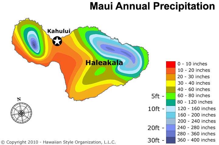
35. Psychedelic precipitation map of Hawaii. With a bonus Maui blowup.
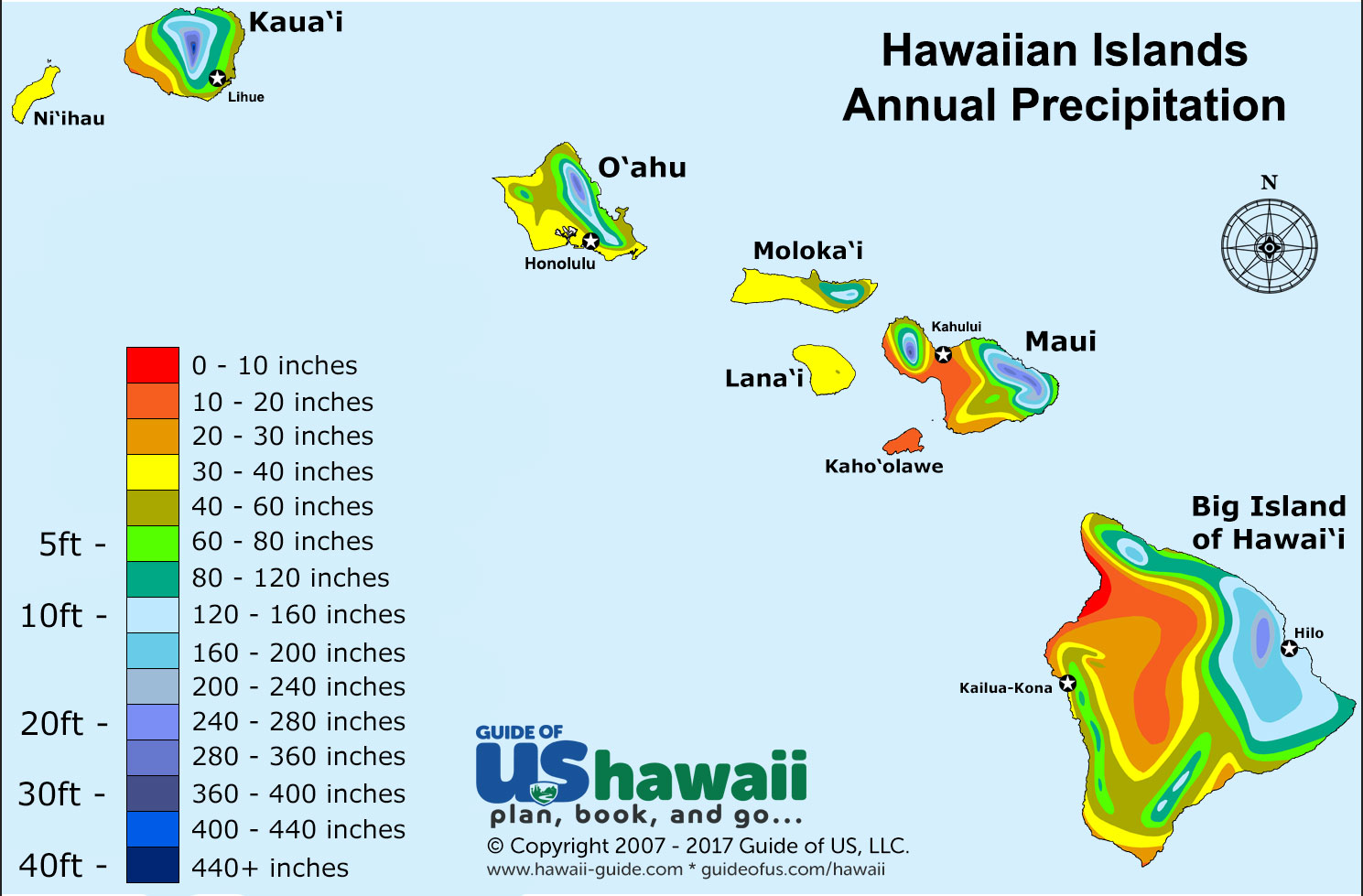
36. Hawaii refrigerator magnet from Shop in Paradise.
http://wwww.siphawaii.com/Prodimages/Magnet_Map_Hawaii_old_large_SIPhawaii.jpg
37. The High Sierra region from Visit California - I like their maps and we just visited this region.
38. World placemat for "bigger kids"  from the Reader's Catalog. Got cliches?
http://cdn.shopify.com/s/files/1/0067/8732/products/Placemat_World_1024x1024.jpg
Here's the Western Hemisphere zoomed in. Note the atrocious placement of New York City. Guess where this company is located? If their 646 area code is any indication they're based in New York City!
39. Speaking of New York City - here are the Trees of Prospect Park. On the Prospect Park page you can  click on a tree to get details and pictures, but then it would be a map that explains something so be careful!
40. Time to put this series to sleep with some White Comic Map bedding from Debenhams. If you zoom in on the image you'll see that the "map" is a series of comic book images.
http://int.debenhams.com/us/product/white--comic-map--bedding-set/306907936480/

Wednesday, October 30, 2013

What's Your State?

A recent study of America's mood by state, published in the Journal of Personality and Social Psychology, is featured in Time Magazine. There is a test you can take to see what state matches your personality. With all the discussion about introverted, neurotic people from the northeast, I figured I fit in perfectly but much to my surprise that wasn't the case.

Oregon????? I must have answered some of the questions more wishfully than truthfully. The regional patterns here are pretty clear and the article has interesting explanations for some of them. The west coast is clearly a separate region but I don't usually think of Arizona or New Mexico as part of that region and certainly not North Carolina. Texas is another odd one but they've seen lots of in-migration and immigration so maybe that state is more complex than the cliches suggest. Plus, according to another Time article and magazine cover, they are our future. Nice cover art!

http://content.time.com/time/magazine/article/0,9171,2154995,00.html?pcd=pw-magic

By the way, if you take the test and enter the default value (neither agree nor disagree) for each question, you end up with Texas. Have fun taking the test. You too may end up in an unlikely place.


Thursday, August 1, 2013

Highlights from Winterthur

Last week I went down to Delaware to see the Common Destinations exhibit at Winterthur. The exhibit is modestly sized but is an impressive collection of maps and related objects. I spent long enough in the gallery to cause my relatives to wonder about my sanity. The staff allows photography so I took pictures of some of the highlights.
 
This is a detail from "A chart of the Antilles, or Charibbee, or Caribs Islands, with the Virgin Isles" by Louis Delarochette from 1784. I like the elevation profiles of the various islands. Not a common feature on maps but this must have been pretty helpful to navigators.
 
Here is a map of the western hemisphere with the countries outlined in embroidery. The needlework was done by Mary Franklin of Pleasant valley, New York. The full map can be seen here.
 Here is a detail from the "Plan of the City of Philadelphia and Environs" (Varle, 1802) showing some proposed squares in "West Ville" that were never developed. These include a Market Square along the Schuylkill River and Washington Square (the square now known as Washington Square was originally called Southeast Square.) 
 The scale is in Perches, an old unit similar to a rod.
 
From the 1861 "Washington Map of the United States" by Maury. This is a large wall map with the counties colored. I like how in Texas and other plains states the counties end abruptly near the 100th meridian.
I was not able to take a good picture of this one but here's a highly detailed 1777 chart of Narragansett Bay - the image is from Martayan Lan, an antique map, globe and book dealer. 
For my own personal interest here's a map of Albany, where I went to school and also lived for a while. The map is not dated but is from the later 1800's and is credited to "Charles Magnus lith. New York." Washington Park was just a small square then. The Albany Medical center area was "Alms House Square" and there was a railroad ferry crossing the Hudson from "East Albany."
Finally, the fan from the promotional materials live and in person.

There's a lot more great stuff to see including revolutionary war satire, early British maps of a newly independent United States, surveying equipment, fashion accessories needlepoint maps. I didn't have enough time to photograph and catalog everything noteworthy. If I did this would be an extremely long post.