Showing posts with label cultural geography. Show all posts

Wednesday, June 6, 2018

The Evolving Japanese World View

Japan is known for a history of resistance to western contact and influence. As a result their knowledge of the rest of the world was slow to develop. The earliest "world" maps produced in Japan were Buddhist maps (nansenbushu) using a combination of geography and mythology.
https://www.tofugu.com/japan/japanese-cartophraphy/
The map above shows only China, Japan and India [source]. These maps were scaled by religious importance, rather than by distance so the geography is almost unrecognizable. India, the center of the Buddhist world takes up most of the map.

The first nansenbushu to show the entire world was a 1710 woodblock print by monk Rokashi Hotan.
https://files.tofugu.com/articles/japan/2011-04-07-japanese-cartophraphy/first-japanese-world-map.jpg
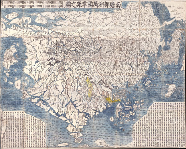
While still dominated by those three countries, this map shows various European countries as islands such as Holland (country of the red hair). Africa (Land of Western Women) and South America are shown as small islands while a piece of North America is connected to Asia by an Aleutian land bridge. By this time many western world maps had filtered into the country but these influences were either missed or were ignored by Hotan. Here is detailed look- the entire map can be browsed here.
https://www.geographicus.com/P/AntiqueMap/Nansenbushu-rokashihotan-1710
Matteo Ricci was a missionary who learned Chinese and made a map of the world in the Chinese language, readable to some Japanese. This influenced the Bankoku-sozu map, the first western style world map created in Japan. The version below is centered on Japan, oriented with east up and contains pictures of various ethnic groups.
The image above is a screen shot from The Evolution of Japanese Cartography by Olivia McCaffrey.
Nagakubo Sekisui, considered the founder of Japanese geography, made the above world map largely based on Ricci's map in 1785. Each continent has its own color while the unexplored Antarctica has a bold red outline. Here's a detail showing Japan (in the center of the world) and Korea.
Here is North America. California is shown as a peninsula because this map predates the theory of it being an island.
The entire map can be browsed at Barry Lawrence Ruderman Antique Maps, Inc, along with some interesting historical details. For example, Nagakubo's omitted ridiculous, prejudicial notes from the Ricci map about Japan while keeping similar notes about other places such as Brazil. "The inhabitants of this country do not build houses. They dig the earth and live in caverns. They like to eat human flesh, however they only eat men and not women. Their clothes are made from birds feathers."

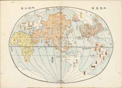
An 1834 map by Giko Yamazaki drawn as a sphere - via the Ephemera Assemblyman blog - this page contains many other maps from this era. California has now gained its status as an island.
http://assemblyman-eph.blogspot.com/2009/07/japanese-historical-world-maps.html
Here is a map by an unknown cartographer via All That is Interesting from 1853, just when Japan was being forced to open itself up to foreign trade. The geography is improving noticeably.
Finally, a Japanese World Map circa 1933 by mangaka (cartoon artist) Keizo Shimada.
The "cultural vignettes" are mostly benign, if a bit stereotypical, but the map also gives a sense of Japan's imperial  and military ambitions. Some detailed views-via eBay.
Here is Washington and British Columbia.


Tuesday, November 22, 2016

Tribal Nations Map

Thanksgiving is a time to honor Native Americans, who were here before most of us came over as undocumented immigrants. Aaron Carapella, a self-taught mapmaker from Oklahoma created Tribal Nations Maps. They feature the original names of hundreds of indigenous tribes throughout North America.
In many cases commonly known names of tribes, though in native languages, were given by European settlers. Sometimes these are derogatory names given by rival tribes such as Comanche, a Ute word meaning “anyone who wants to fight me all the time.*”  Carapella  researched the original names and added then to the maps.
There are maps for the continental United States, Canada, Mexico and Alaska. The level of detail varies quite a bit among regions. The Pacific Northwest is one of the most detailed areas.
The maps can be purchased on Carapella's web site. There is a also a high-resolution image on NPR's website.


* source - Encyclopedia Brittanica


Wednesday, September 21, 2016

Map Your Mind

Map Your Mind collects personal stories and memories of Utrecht in the Netherlands. People are encouraged to sign up, create a hand drawn card and share it with others.
http://www.mapyourmind.nl/map/t/sanne/
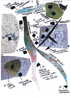
Maps are annotated with personal observations and artistic or local details
http://www.mapyourmind.nl/map/t/sanne/
Most are geographical representations with varying degrees of abstraction. The map above focuses on artistic representations of the Oudegracht Canal and various streets. The map below is a fairly accurate geographic representation of the canals, streets and railroads of central Utrecht. User Hannet has a good sense of geography.
Whereas De Map van Debbie is just an annotated Google map.

On the other hand some cards are not maps at all.
http://www.mapyourmind.nl/map/t/lara/
Contributors are encouraged to put a short legend below explaining the locations. The stories and explanations really help give life the maps.
http://www.mapyourmind.nl/map/t/anna/
 Some users like Jaap, however, prefer to let the map speak for itself.
These are fun to look at - the list of "mappen" can be found here.

Wednesday, August 31, 2016

Michigan's Gayest Square Mile

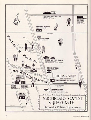
Many people think of suburban Ferndale as the gay part of Detroit. Like much of the population, the white LGBT community gradually moved north until they left the city altogether. However in the early 1970's the Palmer Park area was the center of gay culture and there still is a sizable African-American gay community in the area.
http://wdet.org/posts/2016/07/11/83429-curiosid-did-detroit-ever-have-a-gayborhood/
The above map via WDET, was originally featured in a 1972 travel magazine. There are some nice pictorial elements but unlike many pictorial maps, the accuracy does not suffer from these details. The radio station's CuriosiD page includes this map along with stories, audio and an interactive map showing the movement of gay culture since 1930.
If the gay community has largely moved to the suburbs then the above map suffers from not including those areas. The only clear pattern is a general spreading out from downtown. There is a cluster of activity in Palmer Park* but it does not stand out from other areas. The color scheme is also not great for visualization.

*Palmer Park is immediately north of the jagged shaped hole in the city that includes the independent cities of Hamtramck and Highland Park.

Wednesday, July 13, 2016

Theoretical Nation States of Europe

I came across this map recently showing the possible sovereign nation states of Europe. The full map can be linked here.
http://vader.joemonster.org/upload/rvz/1508659487a77c9pl.jpg
There's lost of fine detail with most of today's countries being carved up into smaller units.
Even smaller states such as Latvia and Lithuania are subdivided.
The map extends far enough east to include the ethnic jumble of the Caucasus.
They were able to find capital cities for most places, even tiny little Morpeth in Northumberland, but nothing for Basque Country.
Of course a map like this is by nature subjective and bound to upset people, especially those fighting for or against independence. Here are a few things I wonder about:

  • Is England really that divided?
  • Is Ireland really that united?
  • When did Athlone become the capital of Ireland?
  • What country includes the midlands of England - is it really part of the Isle of Man?
  • Is Occitania really that different from France?
  • Seems like northern Italy is divided into the medieval city states but not the South.
  • I think there are biases towards and against certain countries here but I don't want to speculate too much not knowing much about the origin of this map.


Wednesday, September 30, 2015

Africa Re-Imagined

Swedish artist Nikolaj Cyon created this map of what Africa might have looked like if it had not been colonized by Europeans.
http://www.cyon.se/#!alkebu-lan/ck0q
The map uses linguistic, natural and ethnic boundaries. The straight lines that the colonizers drew are conspicuously absent.
The map was cobbled together from various historical maps such as this one from the Geography Department at the University of Dakar.
Other non-traditional aspects of the map include the use of the Hijri Year (AH) from the Islamic lunar calendar, a scale in iterus (an ancient Egyptian unit of measurement), alternate names for the "Ikweta" and tropics, and the orientation  - south is up. For those of us in the northern hemisphere think of colder part at the top and maybe it will make more sense.

Also, note the treatment of Europe, or Frangistan. I think this is meant to show a reverse colonization, but it is not explained on his site.
There are lots of beautiful cartographic touches such as the water lines and the effective National Geographic-style shading of the boundaries. The traditional craft evoking map borders are also nice.

Cyon has an online presentation where you can see more details of the process.

Wednesday, July 8, 2015

The Continental Poverty Divide

This map is a bit old (1999) but shows some interesting patterns in wealth and poverty. It is part of the Centers for Disease Control's Maps That Make a Difference series. Among other things, it highlights a north/south "continental* poverty divide."
http://www.cdc.gov/dhdsp/maps/gisx/mapgallery/Concentrated_Poverty.html

The map also highlights outlier counties-places in the south with lower levels of poverty and in the north with higher levels. Outliers in the south mostly seem to be around large cities, mostly in the suburban counties. There are clear rings around Dallas, Atlanta and Nashville.

Northern outliers are more diverse. The most clear ones are the counties with Indian Reservations but there also seem to be concentrations in counties with colleges and military bases. Also, some of the larger cities show up such as Detroit, Milwaukee, Philadelphia and Baltimore. Partially this is a result of these cities being either independent counties, or taking up most of the county with much of their wealth concentrated in the adjacent suburban counties.

*It is US-centric to refer to this as a "continental" divide but given the demographics of Canada, Mexico and Central America, this may very well be an accurate description.


Wednesday, January 7, 2015

Toronto's Language Quilt

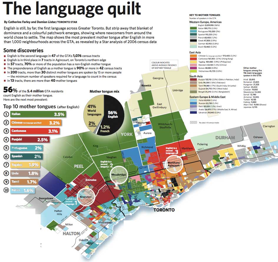
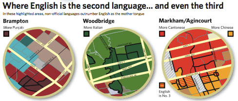
The Toronto Star published a set of maps in 2007 showing the second language (after English) for more than 1000 neighborhoods in the Greater Toronto Area. The map (based on 2006 Census data) is a nice, colorful illustration of where different immigrant groups chose to settle - although languages such as Spanish and Portuguese (and even Chinese to some extent) don't tell you much about where those settlers really came from. The original map is pretty large - here are some smaller images from Bricoleurbanism.
http://www.bricoleurbanism.org/wp-content/uploads/2007/12/gta-language-quilt_main-e.jpg

Particularly striking and unexpected (to me) is the number of Italians. Although many of the green neighborhoods are lower density suburbs creating a false illusion of dominance, Italian is still the largest
second language with almost three times as many speakers as French. The dull, generic gray color used for French (mostly in the far eastern part of the region) minimizes the visual importance of Canada's second language, whether intentionally or not.

Three neighborhoods where English is not the first language are highlighted with circles and expanded on.
http://www.bricoleurbanism.org/wp-content/uploads/2007/12/gta-language-quilt_eng-2nd-e.jpg
I made a screen shot of the main urban area to show some of the patterns of diversity that are less apparent from the large map. These patterns include Greek (black) in the east, Portuguese (light blue) in the west and various eastern Asian languages, mostly east and north of downtown. There are also numerous French speaking areas, if I'm interpreting the generic gray correctly.
The entire map can be downloaded from the Star here.


Wednesday, May 14, 2014

Your State's Third (or Second) Language

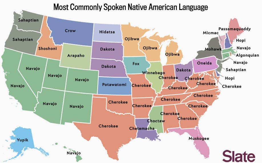
The American Community Survey shows that English is the most commonly spoken language in all 50 of the United States. This makes for a pretty boring map. Slate has a set of maps that dig deeper into the data to see what other languages are spoken. Spanish is the second most commonly spoken language in 43 states so that map is still not very interesting. However when you remove English and Spanish and look at the third (or second for 7 states) most common language things get more interesting.
http://www.slate.com/articles/arts/culturebox/2014/05/language_map_what_s_the_most_popular_language_in_your_state.html
This type of map should be taken with some caution as the numerical differences between languages may not be very large. Also one large urban area such as Detroit, with its large Arabic population can bias an entire state. If I had more time I could look this up but I would guess that not many Michiganders speak Arabic in the Upper Peninsula, or even north and west of Pontiac. Still, it's interesting to see how some of the original settlement patterns of the US have persisted (Navajo in the southwest, German in the midwest, and pockets of French, Italian and Portuguese in the east,) while other states show more recent settlement patterns such as Filipinos in California and Nevada, Vietnamese in Texas, Oklahoma and two other states, and Korean.

The article has several other maps showing the most common Scandinavian, South Asian and African languages. These are based on much smaller numbers so they're not as meaningful, yet there are still some regional patterns that emerge. More interesting is the map of the most common Native American language. The map mostly reflects original or sometimes forced settlement patterns, but also shows some long distance migration, particularly of the Navajos.
http://www.slate.com/articles/arts/culturebox/2014/05/language_map_what_s_the_most_popular_language_in_your_state.html
For more details and maps go to Slate.

Wednesday, April 9, 2014

Waffle House America

Last year Deadspin posted this map showing the Waffle House-IHOP version of the Mason-Dixon Line.
http://deadspin.com/map-do-you-live-in-ihop-america-or-waffle-house-americ-510668232
  mapsbynik has added to this geographical foodways discussion by mapping the density of Waffle Houses.
http://mapsbynik.tumblr.com/post/82053920556/waffle-house-density-by-quad-the-map-shown-here
The map was done by taking USGS 30x60 minute map quad sheets, overlaying them onto Google Earth, and extruding the height based on the number of Waffle Houses. More details and data by quad can be seen at mapsbynik's tumblr site. Atlanta is the home base for the chain so their dominance was expected, however the degree to which it towers above the rest of the country is truly impressive.

USGS quads are not a common unit for this type of mapping (counties would be much more typical) but the quads work nicely for the Waffle House data pattern. Because the Atlanta area is spread among numerous counties, a county map would spread the data out. This would result in more of a boring low rise edge city look than the towering skyscraper we get here.

Thursday, March 6, 2014

Cultural Regions of the Jerz

I've been having trouble finding the time to do a proper blog post this week so I'll just post this crude but colorful map of New Jersey. It went around facebook a few years ago but it's fairly new to me. Having been born where they filmed Clerks and having been to just about every corner of the Jerz, I have to say it's pretty accurate. Click once or twice to read the small print.
"New Jersey people they will surprise you
Cause they're not expected to do too much"
-John Gorka "I'm From New Jersey" - 1991

Thursday, January 23, 2014

New Provinces in Iraq?

Iraq's Shiite government has decided "in principal" to create three new provinces to address Sunni grievances, counter Kurdish expansion and possibly, to appease Christian and Turkomen minorities. I immediately looked for a map but there is none because the government has only described it in general terms. The idea is to create a province around Fallujah, and two others on the edge of the Kurdish regions, in the Nineveh Plain and around Tuz Khormato. Here is a map from the Public Intelligence Blog showing where these provinces might be.
The text on this map is tiny and weak on descriptions but the color scheme nicely illustrates the ethnic and religious areas and where they mix. The article describes the situation in more depth. The black outline is the area with Christian minorities that could compose the Nineveh Plain province while purple outlines the Turkomen minority areas including Tuz Khormato. Fallujah is the yellow star in the middle of the country. 

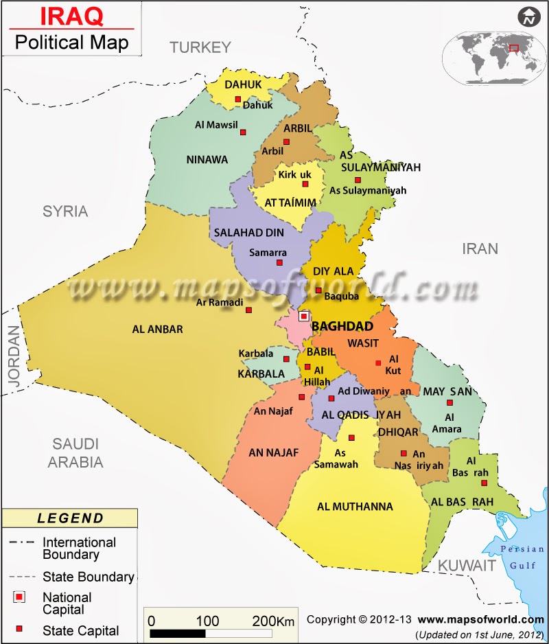
The map above does not show the current provinces. To get both the provinces and cities here's a map from Maps of the World. Fallujah is not shown because it is not a capital but it is near the bottom of the "f" in their watermark, between Baghdad and Ramadi. Nineveh is Ninawa on this map.
http://www.mapsofworld.com/iraq/iraq-political-map.html
Finally, for some classic sarcasm there's this map of the provinces of Iraq. The author showed an admirable respect for the actual provincial boundaries.
https://twitter.com/willJens/status/226247406939955200/photo/1


Wednesday, December 11, 2013

The Islamic World


Columbia University's Gulf/2000 Project was created as a service to scholars, journalists, politicians and other professionals working in the Persian Gulf region. The web site for this project contains some fantastic maps created by Dr. Mehrdad Izady showing population, religion, language and other divisions that affect the region.

His large map of the Islamic World is particularly striking. Many of the recent conflicts in the world have occurred along the boundaries of Islam and other religions such as in Mail, Nigeria, Central African Republic, Sudan/South Sudan, the Caucasus region and in parts of India and Pakistan.
http://gulf2000.columbia.edu/images/maps/Islamic_World_Basic_lg.png
The lower right corner of the map contains a 1907 map depicting the extent of the "Moslem World." The overall pattern is largely the same as today.

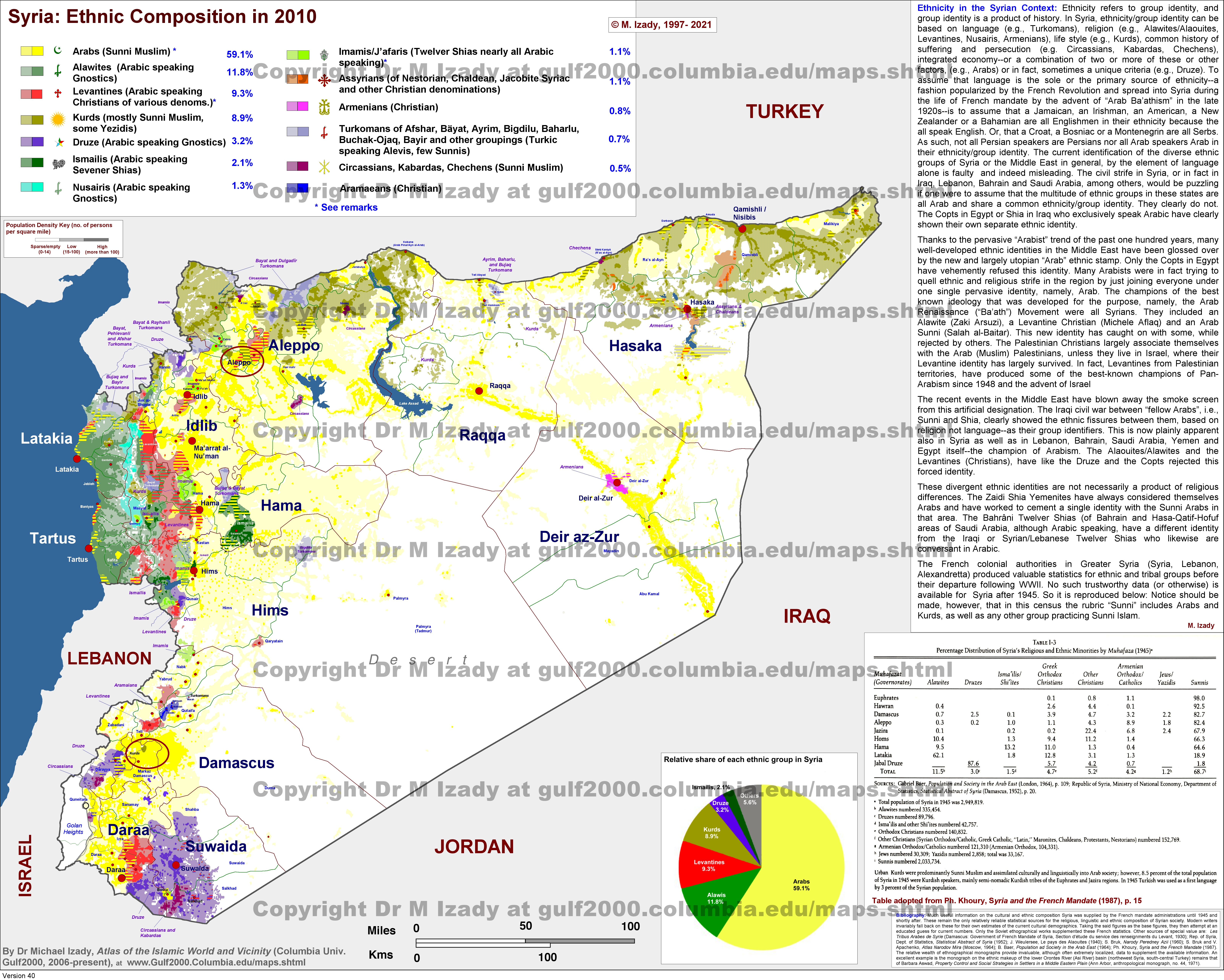
"Syria Ethnic Composition" is another very detailed map showing how diverse that country is. The text on the right describes how much of this complexity is lost when language is considered the defining ethnic characteristic. The commonly used "Arab" ethnic stamp glosses over these divisions but the current conflict in Syria has shown their significance. 
http://gulf2000.columbia.edu/images/maps/Syria_Ethnic_Detailed_lg.png

The maps page has many other highly detailed maps not just of the Gulf region, but the entire Middle East as well as parts of Africa and Asia. You can spend hours looking at these. I did. 

Wednesday, October 30, 2013

What's Your State?

A recent study of America's mood by state, published in the Journal of Personality and Social Psychology, is featured in Time Magazine. There is a test you can take to see what state matches your personality. With all the discussion about introverted, neurotic people from the northeast, I figured I fit in perfectly but much to my surprise that wasn't the case.

Oregon????? I must have answered some of the questions more wishfully than truthfully. The regional patterns here are pretty clear and the article has interesting explanations for some of them. The west coast is clearly a separate region but I don't usually think of Arizona or New Mexico as part of that region and certainly not North Carolina. Texas is another odd one but they've seen lots of in-migration and immigration so maybe that state is more complex than the cliches suggest. Plus, according to another Time article and magazine cover, they are our future. Nice cover art!

http://content.time.com/time/magazine/article/0,9171,2154995,00.html?pcd=pw-magic

By the way, if you take the test and enter the default value (neither agree nor disagree) for each question, you end up with Texas. Have fun taking the test. You too may end up in an unlikely place.


Wednesday, August 21, 2013

Corporate States and Booze States

A couple of months ago graphic designer Steve Lovelace posted this map of the Corporate States of America, subjectively showing the corporation that best represents each state.
There's a list at the bottom of his page so you can figure out the tiny states -  Rhode Island is Hasbro and Delaware is DuPont. The two things that are most interesting to me are that Wyoming is represented by a taco chain and that Starbucks trumps Microsoft.

Thrillist followed up with a booze map.

The map is said to represent the "biggest/most high profile liquor or beer companies" for each state. It's not clear how subjective these choices are but most of them are breweries. As someone that lives in the Northeast and drinks a variety of beer, I've never even heard of many of these nearby breweries such as Willimantic (Connecticut) and Hill Farmstead (Vermont.) Again the tiny states are tough to read but Delaware is Dogfish Head and Rhode Island is probably Narragansett because what else would Rhode Island be?

Who knew that Vodka was so big in the Southeast? Well, I didn't anyway. Also, I like the name of Oklahoma's beer! A little regional feud?