Showing posts with label food. Show all posts

Wednesday, June 17, 2026

Atlanta Soccer Map

Veazy Studio, previously featured here for the ATL Rap Map, has a new Atlanta Soccer Map just in time for that city’s World Cup hosting duties. 


The map took “just under 100 hours to create” and he does a convincing job of selling Atlanta as a soccer destination. Here is a detail of the east downtown area showing stores, fields and bars where people go to watch games - assuming FIFA allows them to be shown.


There’s also a list of Atlanta’s soccer “culture makers“


Bonus map section (!!!!!!!!) - my sister alerted me to Veazy’s Barbecue Map, which is how I discovered the soccer map.


The above image is not very readable but here is a detail from the Costco Connection.


Wednesday, March 27, 2024

Tacografical Maps

International Taco Day is coming up on Sunday, March 31st - not to be confused with National Taco Day in October. Here are a few maps to enjoy your tacos by. This one I've seen in several taquerias. It took a long time to find a version that is readable online (you may need to click on it to see it at a readable scale) but I finally Reddit came through for me.

 Expedia Mexico has another take on Tacography.

Here yet another Tacographic map found on Pinterest Japan.

Finally there is the Tacopedia, an encyclopedia of Mexican taco culture.


Wednesday, July 5, 2023

Protein Survey Map

While looking for unrelated items I came across this 1920's Protein Survey Map of Western Canada.

Wondering what any of this means, I did some research and discovered that protein refers to the gluten content of wheat. In the early 1900's flour mills began classifying their wheat based on protein content with premiums offered for the highest protein flour.

The map follows along the railroad lines because rail cars were tested for gluten content. The color scheme of this map is hard to follow but red is the highest protein content followed by blue. 

The map credits the chemists in addition to the Trade and Commerce Department minsters. I lost the original source of the above map but found this map from a few years later

with an even more detailed and confusing color scheme.

Here is the title block.
 

In a previous post I highlighted the Alphabet Railway. Here is a piece of that, with a few interruptions for pre-existing towns.

See the whole map here.

Monday, August 5, 2019

Terms of Sale

Laphams Quarterly created a nice map showing how words have evolved through centuries of trade.
Items documented include whiskey, cotton, ivory and tomatoes. As an example the word for tomato has its origins in the Nahuatl language. It spread to much of western Europe and Africa with a similar name. However, the Italians started calling it "golden apple" (pomodoro) and variations on this word spread to eastern Europe and central Asia as seen in the red arrows.
The map also documents the dual words for tea referenced in a previous blog post- variations on cha from land trade and te variations from overseas trade.


Wednesday, October 26, 2016

Land of Grated Cheese

This map hangs on the wall of my local cheese shop.
https://bolognauncovered.files.wordpress.com/2012/07/zona-di-produzione.jpg
It shows the "zone of production" for Pamigiano-Reggiano cheese. This includes the provinces of Parma, Reggio-Emilia, Modena and parts of Bologna and Mantua. The map has lots of nice quaint details but is also more geographically accurate than many pictorial maps.
According to Wikipedia, a combination of the morning's whole milk and the previous evening's skim milk are heated in copper vats, as in the detail above. The cheese is cooled, put into a wheel form and washed with brine. It is then aged for 12-30 months before it can be sold in town.
Or worn on your head -
- though Packers fans seem to prefer Swiss.

Wednesday, July 27, 2016

Chessey Factoid

Brie is not just a cheese but an historical region of France. The region roughly corresponds to today's Seine et Marne Department.
This cheese wheel from Formaggio Kitchen shows a faint map of the region. Here is a modern one with a similar color scheme - via Urbaliste.
http://www.urbaliste.fr/boutique/urbannuaires/urbannuaire-77.html
Here is a more legible map of the region via HotelsTravel.

Monday, June 27, 2016

Friday, May 13, 2016

Tastes of Sweden

A couple of months ago I featured the Flavors of Finland, a map/recipe mashup from Expedia. Now here's the Tastes of Sweden.

Taste of Sweden by ExpediaSE


The traditional provinces are all represented. From their outreach message:
 Due to Sweden's large North–South expanse, the variations between the local recipes and dishes are quite huge, and this piece enables you to explore these on a local level. What is even more special about the piece is the fact that it draws attention to both infamous and lesser known dishes and their rich histories so that in many ways it doubles up as both a test of our local culinary knowledge, and also a really cool education piece because we can click around the map in order to learn about each and every dish – including the likes of the Southern spit cake, salmon spring rolls from Västergötland, hare burgers from Medelpad, and even a lovely reindeer stew from Lappland.
Here is a lovely screen shot in case of page load problems

Wednesday, March 2, 2016

The Flavors of Finland

Sautéed Reindeer , Crucified Whitebait, Lingonberries - also Tarbread (a secret recipe) Explore the flavors of Finland with this interactive map from Expedia Finland.

Click the food picture to get a recipe-except for Tarbread ('cause it's a secret). The Lapskoussi recipe calls for "chopped swede" - hope that's not what it sounds like!

Wednesday, February 17, 2016

Culinary Horrors!

I mostly avoid posting stuff from the Atlas of Prejudice despite their popularity. Lazy cliches are fun but a bit predictable:
https://atlasofprejudice.com/the-american-world-c74f1e82bdfd#.o17bw8exn
However, I am quite fond of some of the maps listed under "Our Collective Eating Disorder"
For example, the Culinary Map of Europe According to Italy.
Beyond the delightfully ridiculous non-realistic concentric circles, there are other nice details like the names of the parallels and meridians. Also, the subtle digs at the US and China (didn't they invent pasta?)

The Culinary Horrors map is also fun, though I have no idea how accurate it is.
https://atlasofprejudice.com/our-collective-eating-disorder-4846eede37bd#.bqh789jc1
 Now back to my duck blood soup.


Wednesday, May 13, 2015

Time to Plant

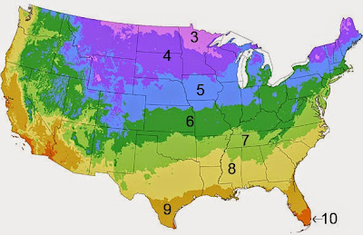
While bicycling to work last week I came across a gardening display outside the local grocery store with this map.
I pass this place all the time while driving and biking but only noticed it because I had to stop and make a bike adjustment. Sometimes you have to stop and look at the maps along the way. The early morning light conditions were pretty bad but I took a picture anyway.

The Burpee Growing Zone Map is based on the USDA's plant hardiness zones. I'm not sure what accounts for the subtle differences between the map above and the USDA one.
http://www.burpee.com/gardening/content/gygg/growing-zone/growingzoneinfo.html
For comparison I took a picture from the back of the seed packet. This is identical to the top map with a different color scheme and with pairs of adjacent zones combined. The map is the same for every seed packet whether vegetables, fruits or flowers. If you need more plant-specific dates you can enter your zip here
Here in the northeastern US it's time to start planting.
 

Wednesday, April 9, 2014

Waffle House America

Last year Deadspin posted this map showing the Waffle House-IHOP version of the Mason-Dixon Line.
http://deadspin.com/map-do-you-live-in-ihop-america-or-waffle-house-americ-510668232
  mapsbynik has added to this geographical foodways discussion by mapping the density of Waffle Houses.
http://mapsbynik.tumblr.com/post/82053920556/waffle-house-density-by-quad-the-map-shown-here
The map was done by taking USGS 30x60 minute map quad sheets, overlaying them onto Google Earth, and extruding the height based on the number of Waffle Houses. More details and data by quad can be seen at mapsbynik's tumblr site. Atlanta is the home base for the chain so their dominance was expected, however the degree to which it towers above the rest of the country is truly impressive.

USGS quads are not a common unit for this type of mapping (counties would be much more typical) but the quads work nicely for the Waffle House data pattern. Because the Atlanta area is spread among numerous counties, a county map would spread the data out. This would result in more of a boring low rise edge city look than the towering skyscraper we get here.

Wednesday, March 26, 2014

March Hot Dog Madness

Several years ago I featured the West Virginia Slaw Mapping Project, showing the regional pattern of hot dog preferences. As an update, the West Virginia Hot Dog Blog claims to have won last years National Hot Dog and Sausage Council March Madness style regional hot dog tournament.
http://wvhotdogs.com/slawbig.html
I will give them the benefit of the doubt but I could not find the above image or a winner listed on the Council's facebook page. They did make the final against the Coney dog. I used MapBox to create some geographical context for the contestants:

New York - As far as I can tell New York hot dogs are pretty ordinary but since New Yorkers think everything that comes from their city is special, it had to be on the list.


 Seattle - I don't know this for sure but I think this is a hot dog with cream cheese. They put cream cheese on everything up there. No wonder they lost in the first round.


     The famous West Virginia Dog. It is a "heavenly creation" that is topped with onions, hot sauce and usually cole slaw, though as the slaw mapping project shows, not in every county.


Georgia - I don't know this one but Delish, my source for this and the
Sonoran and KC dogs, describes an "Atlanta" dog. It's a hot dog with cole slaw. Sounds like they're copying West Virginia who they lost to in the first round. Nice Atlanta Flames logo in the poster =>


The Coney - This bit of geographical confusion is actually a Michigan thing. If you go to West Lafayette Boulevard in Detroit you will find a Coney Mecca of sorts. I know this is true because I've seen it with my own TV. The Coney (Coney Island style?) is slathered with chili, onions, mustard and cheese.


The Sonoran is a southwestern inspired dog from Arizona. The dog is wrapped in bacon and has jalapenos and pinto beans among other stuff. I've never had one but it has possibilities.


The Kansas City is a Reuben sandwich hot dog topped with caraway seeds to mimic the rye bread. Supposedly these are served at Royals games though I went to that stadium several times in the 1990s and never saw such a thing - maybe it had not been invented way back in the days of yore.


The Chicago dog. Basically you empty the contents of your refrigerator onto a hot dog. I had one of these at O'Hare airport. When I saw someone I knew from Chicago I asked whether the airport experience counted. After telling him the brand of meat served on the dog he assured me I had the real deal.


Oops, they forgot to include the famous Rochester White Hot and probably many other deserving regional varieties.

Saturday, October 19, 2013

Great American Menu?

This map, posted on Deadspin is getting lots of attention. It is accompanied by an article that is snarky, nasty, ignorant and pretty damn amusing. Many humor-challenged* people are commenting with the inevitable regional fights over who has better pizza and whether anyone outside of the Philadelphia area is qualified to rate cheesesteaks (they're not.)


The crappy color scheme represents the ranking categories. Blue is great, yellow good, red is "better than a finger in the eye" and black is "being hit by a car," a distinction reserved for Ohio. Nevada also gets a unique color for having nothing distinctively authentic. Whether it is fair to judge a whole state by one bad Cincinnati chili experience or not is open to (lots of) discussion as is everything else on this map. Enjoy the map and article and be sure to leave your angry comments like everyone else has.

*Many of the comments are actually pretty funny - some even intentionally so.

Wednesday, July 10, 2013

Grape Crate Map

My mother in law has a mounted copy of this vintage grape crate label in her cabin in Naples, New York.
Naples (at the bottom of Canandaigua Lake) is in the heart of the Finger Lakes wine country. There is no date listed but the label is from around 1900 and according to the Antique Label Company "was lithographed during a time when lead, cobalt and other compounds were often introduced as a part of the ink used to make the images brilliant, vivid and colorful."

Wednesday, July 3, 2013

Yelp's Word Map

The Yelp Wordmap has been making the rounds on numerous websites. There is a common spin about seeing "where the hipsters live" but there's much more to it than that. The map allows you to pick one of 14 cities and a number of search terms that appear in restaurant reviews. For example, the default choice; "hipster" in San Francisco.
The term "noodles" gives you a good sense of where the Asian restaurants are such as in Seatlle's "International District" just south of the original skid row - now Yesler Way.
Many of the search words are the same but a few are customized for the city represented such as hoagies in Philadelphia. The biggest cluster is in the Italian Market area of South Philly but there are lots of other hoagie enclaves. Hoagies are traditionally associated with Italian-American culture and those settlement patterns are reflected here.
Unfortunately Yelp's information does not go far enough out from the city center to include the Tacony Hoagie Trail but this map will guide you there.

For a European perspective there are the brasseries of Paris. There is not really much of a pattern here because just about every neighborhood has its own brasseries.
Choose a city and explore - or (depending on where you're from) be annoyed that Austin made the list while your much larger city didn't.