Showing posts with label pennsylvania. Show all posts

Wednesday, June 25, 2025

In 1977, the Kinney Shoe Corporation, in cooperation with the President’s Council on Physical Fitness put out a series of walking tour brochures for historical sites across the United States. Perhaps the idea was, walk more, wear down your shoes and buy some more.

Here is an example from Paterson, New Jersey, “America’s first great industrial city”. Alexander Hamilton saw the power potential of the Great Falls of the Passaic River, the second largest waterfall east of the Mississippi River.

The walks range from rustic, historic ambles (I chose this one for both personal history and because it’s near where I’m writing this from),

 to college towns,

 to downtown tours,

 museum and garden loops,

and finally to a “redwood grove near Santa Cruz”.

Along the way, you learn about the ghosts of F. Scott Fitzgerald, Thomas Mann and John O'Hara haunting the libraries and tap rooms of Princeton, Chicago's architecture, the friendliness of Woodstock, Illinois, miscellaneous redwood facts and that Scottsdale, Arizona has some of the "prettiest women".
 

Wednesday, November 27, 2024

The Salt Front

The salt front is the point where a river becomes too salty to be safe for drinking water. The front moves upstream from the river’s mouth as less freshwater flows downstream to dilute it. I’d never heard of a salt front until I read about it in a recent article in the Philadelphia Inquirer. The region’s severe drought in November caused this front to move significantly further upstream than the median monthly location.


On the map above, via the Delaware River Basin Commission (cropped for ease of reading), the pink area is the median salt front location and the pink arrow shows the normal location of this front in November, near Wilmington, Delaware. The blue arrow shows the location as of November 18, 2024. 

The DRBC monitors freshwater flows to keep the salt front from migrating too far upstream. This protects drinking water and industrial water intakes. There are major drinking water intakes for both Philadelphia and New Jersey at the blue box on the map. One way to keep freshwater flowing is to release water from various upstream dams.

The worst droughts were in the mid 1960’s-this shot from one of their videos shows the most upstream movement of the front on November 20, 1964,


and here is a still map showing more specifically the salt front’s furthest upstream location during the “drought of record”


Finally, here is a screen shot from the hydrologic conditions dashboard, showing conditions on November 23, 2024.


Friday, November 19, 2021

Thirty Day Map Challenge - Part 2

Here are the next batch of maps I've posted for the #30DayMapChallenge. The first ten maps are here.

Day 11 - Theme: 3D

For the 3D theme I attempted to recreate an exercise from my first cartography class back in the 1980's. That exercise was done using a pencil and graph paper. Unfortunately, I do not have my notes or remember the exact procedure. I did this one using GIS software instead. The map shows murder rates by state. Back then North Carolina was #1, now it's Louisiana. The map is "upside down" so that the higher southern states don't block the view of the lower northern states.

Day 12 - Theme: Population

This is a map of Arctic settlements done "firefly" style, which is fashionable these days in cartography circles.

Day 13 - Theme: Data Challenge 2: Natural Earth

Natural Earth is a set of publicly available data. It is a collaboration involving many volunteer NACIS members and cartographers around the globe. Nathaniel Vaughn Kelso and Tom Patterson led the effort. They have produced some beautiful topographic images of the world. The map was also inspired by a NACIS talk on indigenous place names. The topography and streams are from Natural Earth, while the place names came from Canada's Open Data site.

Day 14 - Theme: Map with a new tool

This one is a bit of a mess because I started doing a tutorial using R, a new tool for me, but I ran into some technical difficulties and then ran out of time. I never expected that Sunday, a non-work day might be the day that I run out of time. I had seem some recent Excel maps and made a blog post about this one. At the last minute decided to try one. Last Spring I tried my hand at a cross stitch map of Rochester, New York. This seemed like a natural fit for an Excel map since it is very grid-like. Instead of doing land use though, I tried doing one of those HOLC redlining maps from the 1920's. 

Lack of time forced me to go very low res. so the map ends up looking like not much at all.

Day 15 - Theme: Map made without using a computer. 

Several of the previous maps were hand drawn but I decided on a different approach here. This is a souvenir Pennsylvania cutting board stacked with coins representing the GDP of the metropolitan areas of the state. One cent = $1 Million. It's a nice, even formula but does not make the stacks high enough to really show the pattern well. Since it is helpful to see multiple angles, I created this mediocre video.

Day 16 - Theme: Urban/rural

This was mostly just an exercise in image manipulation to tease out the urban and rural areas by land cover. I picked Charlotte after looking for cities that might have an interesting looking pattern.

Day 17 - Theme: Land

While waiting in the San Diego Airport a few years ago, I noticed a display of Kumeyaay culture. I was unaware of these people as I suspect many are. There were a couple of maps which I later found copies of on a website dedicated to Kumeyaay culture. I find it interesting that their territory predates the US-Mexico border which has been imposed on their land. This is what the area looked like pre-border.

Day 18 - Theme: Water

This was just a fun exercise in grabbing some water data from northern Quebec and overlaying it on top of a cheesy tree pattern that I made just for this purpose. More art than map. The large lake in the west is Lac Couture, an impact crater.

Day 19 - Theme: Islands

I've always been fond of Christo and Jeanne-Claude's Surrounded Islands installation so I decided to map it. Buffering is one of the most common and basic GIS functions (ie. is this property within 200 feet of the river?), here was an example of a real world buffer.


More to come (I hope).

Wednesday, October 21, 2020

What Can We Learn From Orientation

This week's popular distraction on the geo-webs is an app that draws every street in a city (or other location) colored by orientation. Here is one of my favorite personal places, Philadelphia.

While seemingly just a meaningless distraction the colors do tell you something about settlement patterns. Settled on a part of the Delaware River that runs due south and then west, the major part of the city is along an almost north-south (red) grid. However most of the river flows at about a 45 degree angle and much of southeastern Pennsylvania is on a grid shaped by the river's direction (the purple and blue lines). In the outer parts of the city these grids collide creating some of the more interesting urban spaces in the city (IMHO). Here is the southeastern part of Pennsylvania. I expected to see more purple but there is still quite a bit in the northern regions of the metro area where I grew up.

Note that the app allows you to change the background color. For most of these images I set it to black because the roads show up more clearly. 

For a more meta view here is all of Pennsylvania.

I do not recommend loading an entire state as it takes a while and may overwhelm your computer (and their server).

Points of interest include the colorful twists and turns of the central valleys and ridges, the separately unique Lake Erie grid, and the holes in the northern forests where no roads run. As a different type of city Pittsburgh, one of the toughest cities in the country to navigate, is quite colorful. There are still many grid neighborhoods but they run at all kinds of angles, often at the whims of the rivers.

Pittsburgh-taste the rainbow!

For a suburban view, here is the area around my childhood home in Levittown, PA. The blue lines in the upper left corner are from a shopping mall parking lot.

Many cities in the western half of the United States strictly follow the township and range grid of the public land survey system. Often the downtown areas run at an angle either to follow a railroad or to accommodate an older grid system. Here is Denver. 

Denver-embrace the yellow!
As a proof of concept here are four other cities with a similar pattern.

I could go on about this for way too long but I'll end with an artistic mashup of some of the more interesting and colorful places I've explored in Philadelphia. You can explore you favorite places here.
 

Clockwise from top left - the art museum area, the effect of the Schuylkill River bends, roads curving around the airport runways, the way Roosevelt Boulevard breaks up the northeast grid, some curvy suburban colors, and a difficult to see Logan Circle.

Wednesday, April 22, 2020

Maps of Televsion Places - Part 1 of ?

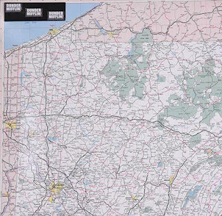
With much of the World's population under some sort of lockdown a lot of TV is being consumed. I was watching an old (they're all old) rerun (they're all reruns) of The Office the other night when I noticed this map on the wall.
https://auction.screenbid.com/view-auctions/catalog/id/105/lot/64031/
I had wondered about the frequent mention of these places - wait a minute, where's Stamford? Much more obvious is the giant Pennsylvania map in Michael's office. Both of these maps can be bought on Screenbid.
https://auction.screenbid.com/view-auctions/catalog/id/105/lot/64037/

https://auction.screenbid.com/view-auctions/catalog/id/105/lot/64037/
In past blog posts I have covered shows such as The Simpsons,
Bonanza,
and Batman.
These are just the ones I remember off the top of my head. There are probably more that I've covered over years of blogging. The world of television is full of maps of places both real and imaginary. One map the caught my attention a few years back but I never got around to featuring it. Here is Pawnee, Indiana from Parks & Recreation.
https://www.zmonline.com/media/16765487/ibn1uoxkhyorft0bng1_6ohucpxyhbx2dttvrzjdqkm.png
An article from New Zealand's zm shows how this map was taken from Christchurch.
https://www.zmonline.com/media/16765487/ibn1uoxkhyorft0bng1_6ohucpxyhbx2dttvrzjdqkm.png
 Here is the Land Use and Important Facilities Map of Pawnee.
https://i.pinimg.com/originals/16/85/a3/1685a34c43593e441aff2015765b4c36.jpg
Image stolen from Pinterest who stole it from Buzzfeed?
There are plenty more of these places to map (I could probably do an entire post on Westeros) and there will probably be future posts. Especially if we're all stuck inside for a couple more months.


Wednesday, September 25, 2019

Highlights from "Mapping a Nation"


This past Saturday I got to see Mapping a Nation: Shaping the Early American Republic at the American Philosophical Society in Philadelphia. The Museum space is small but they packed a lot into that space including maps, surveying instruments, original notes from the Lewis & Clark expedition and printing plates. The introductory text has some interesting takes on the history of the 18th and 19th Centuries describing maps as "battlegrounds" between European empires, Native Americans and colonists. "Even as mapmakers sought to represent a connected and united citizenry, maps reinforced the exclusion of many groups from full participation in the new nation."

Here is a plate from a history of the Lewis & Clark expedition. As usual with these exhibitions, apologies for the light reflections and inability to take better photographs.

A circa 1750 map by John Bartram shows the location of sea shell specimens he collected in the Appalachian Mountains, suggesting that the region was once underwater. He apologizes that the map is "clumsily done, -having neither proper instruments nor convenient time."

Here are a couple of maps of the Susquehanna River area of central Pennsylvania from 1757 originally drawn in chalk by Teedyuscung, a Lenape negotiator during a council in Easton, Pa. where several tribes agreed not to side with the French against the British in return for a promise that the British would not settle west of the Appalachians.

A detail from a map of Maryland and Virginia, 1775.
For credits, here is the cartouche.
There are  a couple of very detailed maps of Haiti during the time of the rebellions around 1799-1801. The United States intervened on behalf of the Haitians in order to protect U.S. trade. Unfortunately I did not make a note of the map's author or date.
The area around Jacmel where much of the fighting took place.
Finally, "Map of the Columbia to illustrate Ross's Adventures" just because I like the little singular puffy mountains.

The exhibit runs until December 29th and includes a three day conference in October.

Wednesday, August 28, 2019

Getting Personal at the La Jolla Map Museum

For a final post of my Spring visit to the La Jolla Map & Atlas Museum I want to spotlight a few maps that are interesting to me for various personal reasons.
Photo courtesy of the La Jolla Map & Atlas Museum
This map by William Faden shows the movements of George Washington's troops against the King's army in New Jersey in 1776 and 1777. Faden's 1777 map of Philadelphia hangs on my wall and part of it appears on the header image at the top. The New Jersey map has lots of bits of historical information but this less important detail in the southwest corner is what interests me the most.
My childhood home is at the bottom of the map, just a little south and east of Middletown (now Langhorne, but the surrounding area is still Middletown Township). We would often take the drive to Newtown to get ice cream and visit the stores. It was a nice country drive to a nice little town. Newtown is still a quaint olde towne but is now surrounded by a partial beltway and a sea of ugly (IMHO) housing developments. I like seeing this view of Pennsylvania before runaway development.

Woodblock map of Edo (Tokyo) ca 1840 from the Shogun period.
Photo taken at the La Jolla Map & Atlas Museum
I have always been fascinated with Japan and especially Tokyo. I also love woodblock maps and all the tiny details found within them.
There is a detail page on this map on the museum's web site.

I took this photo and then rotated the map, out of habit of wanting to see north up. The map is actually reverse "oriented" with west at the top. My rotation was a kind of accidental mistake but I've left it this way because it fits the blog dimensions better. Here is the description from the museum's page.

"beautiful woodblock map of Tokyo from the golden age of Japanese woodblock map printing. Combining the elements of traditional Japanese map-making: rice paper, woodblock printing, delicate application of colour, the inclusion of topographical views into the map proper, and all text seems to radiate from the centre of the map; with a more modern western-influenced directional orientation with north to the right of the image. "  
Here is a bird's-eye view of Avalon on Santa Catalina Island in southern California. I've never been there and I don't know exactly why this map speaks to me. It just looks like a warm, welcoming town nestled in among the mountains - probably with crazy high real estate prices.
Photo courtesy of the La Jolla Map & Atlas Museum
Downtown detail.
The map is surrounded by images both real and fanciful of seals, buffalo, mermaids and people having all kinds of recreational fun. Here is one showing the road signs.
This last item is of interest due to its uniqueness. It is a display case used by Folsom Brothers to sell real estate in San Diego.
The case folds closed like a suitcase to carry around. The map is a relief map showing the topography in detail.
Here is the handle just west of Point Loma