Friday, December 28, 2012

What I Missed in 2012

Another Atlantic Cities article (see previous post for maps of pop music) covers 2012's Year in Maps. Some of these I've seen and/or blogged about. Here are some good ones that I missed:

The metaphors map:

This map is made by detecting place name metaphors on Twitter such as "Peru is the Indiana of South American countries" or "Ukraine is the Ohio State University of European Countries" - huh?
Church vs Beer - another classic map from Floating Sheep, also based on twitter:


Bomb Sight - locating where each bomb fell in London during the blitz:

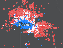
There's lots of other good ones, including economic segregation in Houston and other cities, rising sea levels in Boston, gun searches in NYC, a better election map than most I've seen and a map showing the Washington DC Metro's busiest stations. Click here for more.

Wednesday, December 26, 2012

The Geography of Pop Music, 2012

From The Atlantic Cities:
UCLA urban planning doctoral candidate Patrick Adler took a look at the geography of two lists of the year's best music: Pitchfork’s Top 100 Tracks and Billboard’s Hot 100 Songs.
Locations are based on the current residence of the artist - not necessarily their hometowns. For example Stratford, Ontario (Justin Bieber) misses out in favor of LA.

Here is the Billboard Hot 100. This chart reflects commercial success.


By contrast, the Pitchfork Top 100 reflects artistic merit according to music critics.


LA dominates the commercial list, but New York slightly edges it out among the critics. London is third on both lists. The critics don't seem to like country music very much as Nashville goes from second place on Billboard to nonexistent on Pitchfork. The article mentions the "globalization" of music several times but these maps still have a lot of empty space.

See the Atlantic Cities article for more "takeaways" and Adler's summary.

Monday, December 24, 2012

Competing Santas

This year you have two ways to follow Santa across the globe. There's the traditional NORAD tracker showing him in Malaysia right now,


or you can go with Google's Santa Tracker. This one has him in Indonesia at the moment.


Are there multiple Santa's or is he just really fast? It depends on your belief system, I guess. Happy Holidays!


Wednesday, December 19, 2012

OMG, The End is Nigh!

If the world in fact ends on Friday, I will look stupid for my disbelief. Then again, we'll all be dead so it won't really matter. Here are the "facts" with illustrations that are supposed to prove them.

Nibiru, or Planet X is entering our orbit! You can't see it and neither can any respected astronomer but it's really there!


 It's going to reverse the earth's magnetic poles and cause massive flooding of all coastal areas! This map showing the movement of the north magnetic pole proves it! These images are from Copernicus II.

The evil governments of the world are lying to us while building secret underground cities to hide in. These cities already contain advanced civilizations that previously left the earth's surface. Greg Jenner, a leading proponent of much of this stuff shows maps of an island in the arctic that may contain a passage to the underground.


A quote from Jenner "I cannot discount the possibility that mapmakers (belonging to secret societies) would purposely omit this geographical region known to have UFO activity." Yes, the deliberate omission of secret islands is a frequent topic at NACIS meetings.

There a connection to Atlantis too, why wouldn't there be? That ancient civilization was possibly destroyed by a previous appearance of Nibiru and the survivors scattered to the interior of Brazil, where they built this amazing tunnel system to their secret cities!

 Now you know where to go on Friday to join, if crazy stuff starts happening. Thanks to Greg Jenner and Copernicus II for their amazingly detailed research. Hopefully I'll be back next week.
 

Wednesday, December 12, 2012

12/12/12

Happy 12/12/12!


 Here are some maps and boring facts about highways designated as Route 12 - mostly from Wikipedia.

US Interstate 12 is one of the shortest major (one or two digit) interstates in the country running 85 miles along the north shore of Lake Pontchartrain all in Louisiana. It is a shortcut that takes you from Interstate 10 back to Interstate 10 avoiding New Orleans. The road is also officially called the Republic of West Florida Parkway, in honor of that short lived republic created from an 1810 rebellion against Spanish rule.


By contrast US Route 12 is an almost cross country route running from Detroit to Aberdeen, Washington, almost 2,500 miles. The photo on the lower left was taken near the intersection of Michigan Avenue and Cass, where Route 12 officially begins. This photo came from the US Ends, a web site for people like me who are obsessed with where roads begin and end. On the left is a map of the Grays Harbor area at the western end of Route 12.


South Korea's Expressway Number 12 is also called the 88 Olympic Expressway. It runs across the southern part of the country.


There's many other highway 12's listed on Wikipedia's List of highways numbered 12 inlcuding the following three non-US routes chosen because I like their route shields.


Finally realizing that I forgot the awesome Kansas sunflower route shields (despite K-12 being retired,) here is another set of US state route shields. Once again, Happy 12/12/12!

Wednesday, December 5, 2012

What Could Disappear

The New York Times recently put out these interactive maps showing what areas of various US cities could disappear from rising sea levels if they are not protected. The page is a bit alarmist because the map defaults to the most extreme scenario - a 25 foot sea level rise. This is the "potential level in coming centuries" not the "probable level in about 100 to 300 years." In the extreme view you can say goodbye to Miami, New Orleans, Norfolk, Atlantic City, and most of Souf Philly, Cambridge, Mass. and Charleston:

The 5 foot rise view gives a more realistic picture of what to expect in the coming century. This also gives a good picture of areas likely to flood in an extreme storm event. Here are some examples:

Miami looks mostly OK but Miami Beach is 94% gone and the western suburbs are also looking wet.
New Orleans is in trouble again. In fact the 5 foot model is not much better than the 25 foot (88% flooded in the city and surrounding areas in the next 100 to 300 years.)


Houston is dry but 68% of Galveston is under water.
Here's an animation I created for Savannah from present to the extreme followed by a side by side comparison between the 5 foot model and the 25 foot model.


Wednesday, November 28, 2012

The Geography of Pop and Country Hits

Early this year the good folks at Very Small Array did these maps showing locations in song titles of hit songs. The maps enable us to compare the geography of pop music (mostly urban) to that of country (Wolverton Mountain represent!)

Here are the pop hits. I'm not sure what Wiz Khalifa (as listed above the map title) has to do with this - he doesn't seem like the #1 hit type. Sorry the blogger templates won't let me post larger, more readable images but you're just a click away from the original content.


Here is country music.

While country hits are less international in scope they do get points for Japan and (apparently) multiple mentions of Waterloo. "Turning Japanese" wasn't a #1 hit? They must repeat song titles for each week they appear as a #1 hit. Are there really that many other songs about Folsom Prison?  How many country songs about Saginaw are there?

Thursday, November 22, 2012

A Thanksgiving Walk

I am walking the dog through Wynd's Woods - a name I didn't know before I saw the map.

Here's a close up of the map,


and a close up of the dog - pretending to be a good boy.

Happy Thanksgiving!

Wednesday, November 14, 2012

In Search of a Better Election Map

The Stanford Election Atlas shows election results by polling location. This reveals voting patterns that are not apparent when using the standard state or county maps. Unfortunately last week's election results are not currently mapped so we are looking at the 2008 presidential election.


The map still looks more red at a national scale than the vote actually went (due to the heavy clustering of urban polling locations) but it's not as unbalanced looking as the state and county maps. Two unfortunate aspects of this map are the Platte Carre projection (where Maine appears to be falling asleep from lack of interest) and the ESRI interface. I use ESRI interfaces enough at work to be frustrated with them. You can click on any point to get some detailed statistics and an ugly looking pie chart.

When you zoom in notable patterns emerge such as the cotton belt in the south that I've mentioned in a previous post. Most cities have the standard blue core surrounded by a ring of red. Good examples include Minneapolis and Pittsburgh.


Note the lines of blue along rivers and railroads radiating out from Pittsburgh. This patterns shows up even more clearly along the east coast Metroliner corridor.


However, some cities have a more notable geographic split. Examples of these are San Antonio and Phoenix. I don't know these cities very well but there are almost certainly ethnic/racial divides that explain these patterns. 


A similar divide occurs on a broader scale in the Carolinas where the non-coastal east is strongly blue and the central and western regions are more strongly red.

 There are other maps you can choose and specific maps for some of the swing states. Hopefully they plan on posting the 2012 results in the future and maybe they'll find a better map projection too. Also, maybe the next map will include Oregon, strangely omitted here. Must be that Stanford-Oregon football rivalry.