Showing posts with label boston. Show all posts

Wednesday, May 27, 2026

Boston in 50 Maps

The latest book in Belt Publishing’s 50 Maps series is Boston in 50 Maps. Living in the area and knowing author Andy Woodruff, I had the chance to attend the book launch at the Boston Public Library sponsored by the Leventhal Map Center. 

-Leventhal President Garrett Dash Nelson (left speaking) and Author Andy Woodruff (right)

As a non-native Bostonian Woodruff brings a refreshingly non-exceptionalist view to this book. While many Bostonians think their funny accents, sports crazed fans, history and food are unique in the world, he spotlights some truly uniquely Boston experiences. One of them is Storrowing, when larger vehicles, sometimes the moving vans of college students, get stuck or collide with the low clearance underpasses of the riverfront highways (including Storrow Drive) despite the many “CARS ONLY” signs.


A uniquely Boston historical event was the Great Molasses Flood of 1919 when a large tank burst spilling the sticky stuff all over the area and destroying buildings, wharfs and an elevated railway.


While many east coast cities were partially built by filling swamps, bays and rivers with land, a huge percent of central Boston was created this way.


What is most interesting to me is that these filled areas are also the ones with the highest risk of coastal flooding in the near future. This is best seen by comparing the white areas (areas with the least flooding risk) of the map above and the flood risk map below. In addition to the downtown peninsula, also note the South Boston/Dorchester Heights area, East Boston and Charlestown. 


One interesting experiment from Woodruff’s Bostonography site, was an online survey where respondents named and drew their neighborhoods. The overlays of these resulting in “consensus” neighborhoods as opposed to official city defined ones.


Neighborhood definitions can get controversial as I’ve discovered in my own work. Many people are proud to live in a certain neighborhood, and you don’t want to run afoul of them by telling them anything different. I know this from experience. The consensus map is as good a way of defining neighborhoods as I’ve seen. 

Boston is much more diverse than it often gets credit for. Part of the reason it is not seen as diverse is that most of the immigrant communities are far from where most tourists and business travelers go. This is part of a “small multiples” image showing some of the most common immigrant clusters in the region.


Here is one final Boston quirk. In Philadelphia, a square is just that - a square shaped park. In New York City it is sometimes a square but often a triangle where Broadway intersects a major avenue. In Boston a “square” is usually a haphazard intersection of many roads, often without a park. Woodruff creates a nice small multiples look at the squares of Boston. Here is a small piece of the larger graphic to give a sense of all the different shapes.


Other maps of local interest include unbuilt highways, discontinued transit lines, fall foliage, ducklings,  Smoots, and most importantly proximity to Dunkin’. If you crave more buy the book.

Wednesday, April 12, 2023

America's First Subway Map

The first subway in the United States was built in Boston. The tunnel ran along Tremont Street,  a chaotic mess of streetcars, horse-drawn carriages and pedestrians. The tunnel was built to route the streetcars underground to ease congestion. Here is a plan of the original subway tunnels.

via Leventhal Map Center

The plan involved building a tunnel from North Station to the Boston Public Garden with two portals (where the streetcars emerge from underground) at the southwest end, one at the public garden and another along Tremont Street a few blocks south of the Boylston Street Station. 

This detail shows the latter of those portals, the Pleasant Street portal. Green lines indicate above ground sections while red lines are underground.

The streets in many parts of this plan are unrecognizable as they have fallen victim to various rounds of urban redevelopment. This portal was discontinued in 1962 and was buried underground. The disused tunnel still exists. Here is a detail of Boylston Station showing how the line to the south has to make its way underneath the line that curves to the west (west is up on this plan) making a sub-subway.

A plan showing the progress as of August 15, 1897 (a couple of weeks before its opening) is available from Boston in Transit.

The legend on this map is complicated and hard to translate but the text gives an idea of when various sections were completed.

These subway tunnels are still in use today, part of the MBTA Green Line. For a while this was part of my daily commute to work. The old tunnels are a bit claustrophobic and creepy but they still work!

Wednesday, December 4, 2019

Atlas of Boston History

https://pressblog.uchicago.edu/2019/09/12/calling-all-bostonians.html
Via University of Chicago Press
 My wife bought me a copy of the newly published Atlas of Boston History for an anniversary gift. Editor Nancy Seasholes has enlisted a great team of cartographers, historians, planners and even economists to put together a well written and illustrated history. While it is tempting to take photos of some of my personal favorite maps and diagrams, in honor of copyrights I will stick to what is shown on their look inside pages. Sorry for the mediocre image quality.
http://www.atlasofbostonhistory.org/look-inside#pid=1

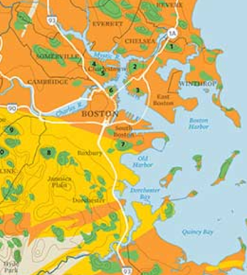
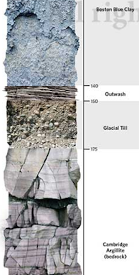
The book progresses through history so a good start is the geologic setting. The two main colors represent two types of bedrock in the basin, Cambridge Argillite and Roxbury Conglomerate or Puddingstone. The green shapes are drumlins, glacial deposits smoothed into small hills. I really like the diagram below showing the layers of (mostly) glacial deposits from different eras, some from river or undersea deposits and a top layer of where the swamps and bays were filled in. This page also shows buildings and other features made from these rocks.
http://www.atlasofbostonhistory.org/look-inside#pid=1
Here is a map showing the conflicts with the Natives of the area during "King Philip's" War.
http://www.atlasofbostonhistory.org/look-inside#pid=2
Boston in the Revolutionary War era.
http://www.atlasofbostonhistory.org/look-inside#pid=3
Here is a part of a map showing the Abolitionist Movement in the first half of the 1800's.
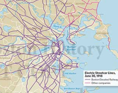
Some transit maps - the streetcar lines,
http://www.atlasofbostonhistory.org/look-inside#pid=7
and the subway or elevated lines from 1918.
http://www.atlasofbostonhistory.org/look-inside#pid=7
Finally, here is Boston's "racial dot map" for 2010, showing a city with a majority non-white population.
http://www.atlasofbostonhistory.org/look-inside#pid=11
Lots more to see here. A nice holiday gift for the Bostonophile in your life.

Wednesday, November 6, 2019

Boston's Proposed Railway Expansion, 1945

I found this pictorial map on sale as a poster. It's an ambitious expansion plan of the Boston Electric Railway Company from 1945.
https://upload.wikimedia.org/wikipedia/commons/6/6c/1945_BERy_extensions_map.jpg
The map is full of nice pictorial details of station layouts, road configurations and some buildings. Black lines were existing railways, some of which are gone today like the Washington Street elevated line.

Colored lines are proposed extensions, some of them have been built as either subway lines, commuter railroads, or a combination of the two. Here is the Airport-Lynn extension part of which is now the MBTA Blue Line.
Notably not built is the East Watertown-Arlington line that would have stopped a couple blocks from my home. However,  a commuter line did serve the Arlington section as well as Lexington and Bedford. This line gradually declined and was finally knocked out by a snowstorm in 1977. Today it is a bike path.
Not shown is the 1980's extension of the Cambridge Subway, now the Red Line.
Parts of this plan are still being built such as the Green Line extension through Somerville.
This map can be purchased at the MBTA Gift Shop.

Thursday, January 10, 2019

The Great Molasses Explosion

January 15th will mark the 100th anniversary of the Great Molasses Flood. In Boston's North End, a tank filled with molasses burst sending a wave of molasses up to 25 feet high through the streets at 35 miles per hour and knocking buildings off their foundations.

Here is a simulation on YouTube of the flow. User ingomar200 factored in topography, building heights and the size of the tank to create this. He shows the velocity contours later in the video.
This is from a 1917 Bromley Atlas showing the area-via the Boston Planning & Development Agency.
Molasses was used in the manufacture of munitions, The tank is the blue circle. It was conveniently located near the docks and next to the elevated railway that was partially destroyed by flowing molasses. The tank was constructed in haste and inadequately.

21 people and many horses were killed. Some city blocks were flooded to a depth of 2-3 feet. Cleanup of the area took weeks and the harbor was brown for months. Victims brought a successful class action suit against the owners who tried to use fear of terrorism to avoid punishment, claiming that anarchists had placed dynamite in the tank.

Here is the Boston Globe from January 16, 1919 - via the Boston Public Library's flickr page.
and their diagram of the area.
 https://www.flickr.com/photos/boston_public_library/4901511527/in/album-72157624622085789/

Wednesday, September 12, 2018

Boston's Highway Dreams

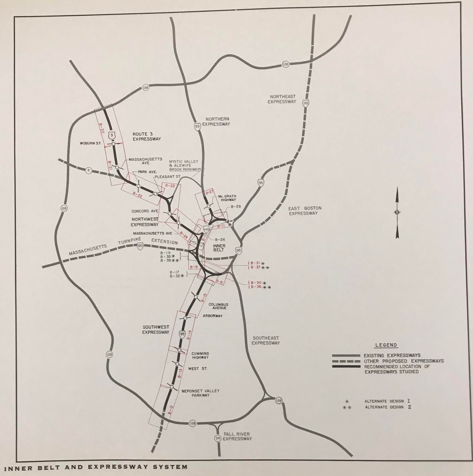
Recently I went to a meeting at the public library in Medford, Massachusetts. With some time to kill beforehand, I browsed their map collection and came across this atlas put out by the state (excuse me, Commonwealth) in 1962.
It shows the existing and proposed highways. Here is an optimistic assessment of the reduction in travel times that would result from the proposed expressways.
The green lines are the travel times in 1945 while the red lines are the forecasted times in 1975 after the highway system was expected to be complete. Dotted gray lines are the proposed highways, most of which were never built due to a combination of powerful local opposition and budget constraints. Note how the red lined areas expand along these corridors. With or without expressways the notion of getting downtown within 15 minutes from most of the area below is very quaint.
The plans included a central ring, the Inner Belt or Interstate 695, that was to be built through neighborhoods of Boston, Brookline, Cambridge and Somerville. There were also proposals for a northwest expressway connecting Route 3 to I-695 and one for the Southwest Corridor alignment of Interstate 95.
Much of the housing along the Southwest Corridor was cleared for the highway by the time the project was cancelled. This land was repurposed for a linear park with a transit route for the MBTA Orange Line and Amtrak's Northeast Corridor. Yes, the Southwest Corridor became part of the Northeast Corridor. Here is a detail showing an area of Roxbury that would have been traversed by I-95.
I'm not sure what the orange-green color scheme is for but it clearly shows how the neighborhood would have been split - like an Atlantic Record.

Here is the interchange between 95 and the Inner Belt. This map has south at the top so it's disorienting. Even more so because so much of this neighborhood was wiped out without the highways being built.
Finally, a detail that hits close to home because it is close to my home - the never built Northwest and Route 3 Expressways.


Wednesday, June 20, 2018

Public Libraries of Massachusetts

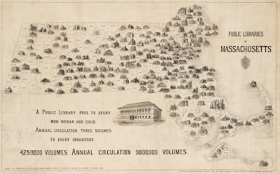
Across the street from my office is a public library, where a copy of this map (circa 1904) hangs.
https://collections.leventhalmap.org/search/commonwealth:wd3761121
The library is a modern building so it is not on the map, but many of these libraries are still standing and in use today. That includes the Boston Public Library, shown on the bottom of the map, which houses the Norman B. Leventhal Center, which has this map in its digital collections.
The map beautifully illustrates each library. Above is the library in Arlington, near my house and also near the home of the map's author - "designed and drawn with pen and ink by George Hartnell Bartlett (author of 'Pen and Ink Drawing'). Arlington, Mass." 
So to recap, this map hangs in a library near my office but that library is not ON the map. It does show my (and the author's) home library which still looks the same except for an addition, and also shows the Boston library (which still looks the same except for an addition) where a copy of the map is located. So it's a circular thing. Now that we've cleared that up enjoy some classic old libraries from Worcester County.
The diversity of architectural styles is fun. Some of them are just mere Cape Cod style houses,
like this one, about as far from the Cape as you can get in the state. Others look like Greek temples or haunted houses.

Here's one from a town that no longer exists - it was flooded to create a reservoir so that when you visit the Leventhal Center, you can get a drink from the "bubbler" there.
The text at the bottom of the map reads
"A public library free to every man woman and child. Annual circulation three volumes to every inahbitant. 4,250,000 volumes. Annual circulation 9,000,000 volumes."

Tuesday, May 10, 2016

MIT's Innovation District

Last week the Boston Globe had a clever map of "The Kendall Network"  I posted it on Twitter but have not had a chance to mention it here. It accompanies an article celebrating the 100th anniversary of MIT's move from Boston to an empty warehouse district of Cambridge. For those unfamiliar with Boston, Kendall Square is the area adjacent to MIT and has recently seen a huge growth in tech companies.
http://www.bostonglobe.com/specials/2016/05/05/mapping-kendall-square-network/whKpe5VayFBBJJD8tsUMWP/igraphic.html
The printed circuit board analogy works great because of the somewhat ordinary (by local standards) street network. If this was Harvard, it would have been much more difficult to make this kind of map. The crazy Harvard Square street network there would have required some major schematic simplification. The Kendall Square area only needed minor adjustments. MIT is the chip that is driving the innovation around it. Nice work Globe graphics team!

Wednesday, January 27, 2016

Women in Cartography

Women in Cartography is an excellent exhibition at the Boston Public Library. It runs until March 27th. If you don't get a chance to visit in person you can view the exhibition online here. In December I got a chance to see it. Here are some of the highlights.

Physiographic Diagram of the Western Pacific Ocean - Marie Tharp and Bruce Heezen, 1971
Geologist/Cartographer Marie Tharp created the first map of the ocean floor. Originally this map was credited solely to Heezen, her research partner. It is displayed on the floor. Here is a picture I took looking down.
The numbers indicate depths of the sea bottom and height of undersea mountains. The colored areas are land, in this case the Hawaiian Islands rising from the depths of the Pacific.

Mappemonde Projetée sur l’Horizon d’Angers - Céleste Babin, 1839
This double hemisphere map was done by a student in Angers, France. The left hemisphere is centered on Angers and the right one on its antipode (opposite side of the earth.)
http://maps.bpl.org/id/19872
The detail below shows off some nice hand calligraphy and a view from Angers.
A General Map of North America …  - Mary Ann Rocque, 1761
Rocque carried on her husband's business after his death. This map was credited to "M.A. Rocque" obscuring (possibly intentionally) that it was produced by a woman.  
http://maps.bpl.org/id/12086

A New Map of ye Seat of War in Italy - Ann Lea and Robert Morden, 1701
Ann Lea also took over her husband's map business after his death. The map shows areas of northern Italy that were fought over between France and the Austrian Empire before Italian unification.
http://maps.bpl.org/id/15340

“Nationalities Map No. 1,” from Hull-House Maps and Papers … - Agnes Sinclair Holbrook, 1895
http://maps.bpl.org/id/19878
Hull House was a settlement house for female immigrants in Chicago. Holbrook, a house resident designed the map based on Charles Booth's income maps of London (previously mentioned in this post about my visit to Chicago's Newberry Library.) Other house residents helped her gather data for the neighborhood.
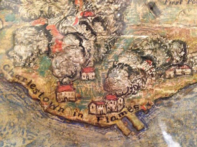
The Attack on Bunker Hill in the Peninsula of Charlestown the 17th of June 1775 - Mildred Giddings Burrage, 1926 
Burrage was a Maine-based artist. She created this map/scene using layers of Gesso to build up a sense of topography.
http://maps.bpl.org/id/19957

The exhibit concludes with a technology section including the following maps.

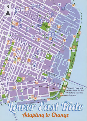
Lower East Ride: Adapting to Change - Maryam Khabazi, Designer, 2013
Created by Green Map NYC, this map highlights the impact of climate change and natural disasters such as Superstorm Sandy and shows resources to reduce energy consumption.
http://www.bpl.org/exhibitions/current-exhibitions/women-in-cartography/view-the-exhibition/women-in-cartography-33/


Making History - GIS and Women - Linda Loubert, PhD - 2014-
Dr. Loubert built this crowd-sourced webmap to document thousands of women working in the field of GIS.
http://arcg.is/1UE8onH
You can see the entire online map here or by clicking the image above. I know some of these people! GIS women rock!