Wednesday, December 20, 2023

Where Your Christmas Tree Comes From

A recent map on maps.com (an Esri run map site) by Joshua Stevens shows where Christmas trees are grown.

The data is from the U. S. Department of Agriculture. Each tree shaped spike represents a county. The most significant areas are in Oregon and North Carolina. If you click on the map you can activate a magnifier to play with.

The text below the map tells about the environmental advantages of natural trees over artificial ones though it feels a bit advertise-y. You can also read about the history behind the tree traditions and learn how to start your own tree farm. What's sadly missing from this map is the most important Christmas tree farm (to many people anyway) - the one that Taylor Swift grew up on.


Wednesday, December 13, 2023

Headwaters

When I see a river, I often think about where it comes from and where it goes. I started a mapping project showing this for the Northeastern United States. For the level of detail needed it was necessary to choose a manageable area so I chose where I've lived almost all of my life. Here is the view at full zoom.

This project was done using Felt, a nice package for collaboration or in this case merely making an interactive map. There is some subjectivity here; what are the most important rivers and where are the headwaters. The second one can be problematic because most rivers have many branches. This is especially true of the Susquehanna, with its north, south and west branches. On this map as you zoom in, the detail increases and the locations shift to indicate the many possible headwater locations.

For example, the Susquehanna River (North Branch) is considered to start at the outlet of Otsego Lake in Cooperstown, New York. However, there are numerous creeks that flow into that Lake from all directions. In this case I chose to show the two northernmost creeks.

This fall I drove through northeastern Pennsylvania and was hoping to see the point where the headwaters of the Genesee and Allegheny Rivers (flowing in opposite directions) come within a few hundreds of feet of each other near Gold, PA. Maybe it's not as impressive as the areas of the Himalayas where several of the world's most major rivers flow in parallel valleys,

but it's much more accessible to me. Unfortunately a construction detour and a wrong turn sent me in a different direction. 

I made another version that shows the river mouths in red. Again, this can be subjective, especially in the case of the Allegheny which really flows all the way to the Mississippi (or the Gulf of Mexico depending on the definition of mouth). 

Explore the map here.

Wednesday, December 6, 2023

Humpback Whale Migration

The Arctic University of Norway leads the Whaletrack program to map Humpback and Killer Whale migrations. 

Whales are tracked as they travel thousands of miles from the Barents Sea in the Arctic where they feed to winter breeding breeding grounds in the Caribbean Sea. The map above (posted on Flickr) beautifully illustrates the paths of various tracked whales. I like how the (unspecified) map projection shows a more or less direct great circle-like route across the Atlantic to the coast of Norway and then to the Svalbard Archipelago. 

There is also an interactive map where you can choose individual whale tracks and see dates.

More on the Whaletrack project can be found here.


Thursday, November 30, 2023

Thirty Day Map Challenge 2023-Days 24-30

The final installment of this year’s 30 Day Map Challenge. 

Day 24 - Black and White


I had no thoughts ahead of time on this one. I wanted to do something with raster data and the easy, quick thing (this often requires taking the easy and quick route) was to grab the Natural Earth dataset that I already have (used for Day 21) and play with the lighting and contrast to create this nice looking map of the Canadian Maritime provinces (excluding Newfoundland).

Day 25 - Antarctica

I had been working on a ggplot (an R software package, Wyoming on my Day 9 map) tutorial and knowing Antarctica Day was coming up decided to try it. I had also recently been to a talk about using Chat GPT for making maps so when I wasn’t satisfied with my result asked it to write me some ggplot code.

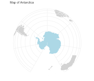
My first ChatGPT map!
It’s quite simple but I got exactly what I asked for. However when I asked to add the territorial claims of various countries, it pointed me to some data that is not available and when I got my own data (with help from Chat GPT) I was not able to add it correctly so I went back to QGIS to help me make this map.


I was hoping to convey a sense of fatuousness about these claims. I outlined the UK claim in blue dashes because it overlaps with so many others. Argentina (overlapping Chile, Brazil and the UK) was accidentally deleted from the map.

Day 26 - Minimal

I’ve enjoyed this category in past years though this is probably not a very literal definition of minimal. Various ideas came and went when my map started looking like one of those Portolan Charts of old so I went with it.


I started out with a other water bodies but Lake Erie seemed to meet the criteria best so here it is.

Day 27 - Dots


Massachusetts town centroids. This was a bit of an experiment to see what drawing only the points would look like for a state with a very unique shape. Many years ago I worked for the state Commonwealth and I still had some data floating around. I don’t know about other people but this map plays tricks on my eyes. I see outlines even though there are none.

Day 28 - Is this a chart or a map?

Some maps should just be shown as charts and that is the central idea of this prompt. Instead of delving into that, with limited time I recycled a jokey thing I put on Twitter years ago with a few modifications. The original tweet was about Pennsylvania’s width by longitude, here is the chart (map).


I followed it up with the Vermont/New Hampshire one. The Delaware maps I made this month were another take on this idea.

Day 29 - Population


Here is a good learning experience. China has a large number of cities with populations over 2 (actually 10, keep reading) million. Most of them are unknown to people in the western world. Any one of these cities would be in the top 5 in the United States by city population. The metropolitan area populations might be more comparable but still by that measure most of these cities would be in the top 10. I realized after making this map that my population figures are out of date and there are actually 17 cities with a population over 10 million (via Wikipedia, 2021 data). Some of these cities have come close to doubling their population since the 2010 census, which is probably where the figures on this map came from. If (or when) I have the time, I should remake this map with the current figures. 

Day 30 - My favorite…

I struggle a bit with picking favorites - there’s usually multiples for any category and they change frequently. One of my favorite things in the world is chocolate so here is a map titled “The Chocolate Mountains of Africa”


These are cocoa harvesting areas from Earthstat. I used the magic of GIS to show the areas as if they are mountains and then did a little photoshopping to improve the colors. About 60% of the world’s chocolate is produced in two neighboring countries; Cote d’Ivoire (Ivory Coast) and Ghana (source). This is not well conveyed on this map unfortunately.

Wrap Up

That’s it for another year. A few days into the challenge I posted this to my social media accounts:

"The #30DayMapChallenge stages of denial: 

I will not participate in this year's #30DayMapChallenge

OK, but I won't take it too seriously Maybe I'll only do a few of them 

Ok, but I'm not going to lose sleep over this 

It's 4 AM and I'm thinking about hexagons 😵‍💫"

After a while I got into a nice rhythm with this and I will really miss making a map every day. I’m not sure what will happen when I wake up tomorrow confronted with the emptiness. Maybe I’ll sleep better. Anyway, thanks for reading a month of self-indulgent posts (lots of sentences beginning with “I”) and next week it will be back to hopefully more meaningful content.

 Apologies for the uneven fonts and text colors in some of these posts. This old platform has been giving me formatting fits lately. I've tried to keep the colors and the fonts consistent but in a post this large it's very hard to do.


Friday, November 24, 2023

Thirty Day Map Challenge 2023-Days 17-23


Another week of 30 Day Map Challenge Maps…

Day 17 - Flow

Probably the intention here was to have people make maps of the flow of surface water or air or traffic but I decided to make a flow chart instead.


A vaguely interesting look at the trip home I had to make many times as a graduate student at the University of Kansas. Take the longer route through the hills or stick to the direct path through some remarkably dull, flat scenery (my opinion-some people appreciate flatness). If you get off the interstates those parts of Illinois and Indiana are probably much nicer to look at but highway blandness coupled with unremarkable terrain makes for one sleepy drive. The southern part of Indiana is quite a bit nicer to drive through as are Kentucky and West Virginia.

I used Felt and their extract tool to get the state outlines and then break them apart. The outlines are a bit caricatured but I like that look for this purpose.

Day 18 - Atmosphere


What’s in the atmosphere? Pollutants. What is a primary atmospheric pollutant? Ozone. What is one of my favorite names for a neighborhood? Ozone Park in Queens, New York. The map is mostly reproduced from earth.org.

Day 19 - 5 minute map


Just a quick map drawn with colored pencils on graph paper. If you look closely there’s a mistake on the west side of town!

Day 20 - Outdoors

 We usually spend a week or more of summer in the Midcoast region of Maine so for the outdoors theme I chose boat launches. This map might even be useful to me next summer!

Day 21 - Raster


Here is another lost learning opportunity. I work infrequently with raster data and could have spent some time learning some new tricks. Time intrudes though so here is an image from the Natural Earth dataset with tweaks to the colors, transparency and blend modes. I like what happens in the mountains of Pakistan.

Day 22 - North is not always up


Rehashing the (sort of ) joke from Day 13 but oriented towards the Orient (specifically Jerusalem) like the maps of old. This is a terrible mismatch of antique style and modern map but so be it.

Day 23 - 3D

Lacking a better idea I took the Delaware joke one step further. When busy traveling for a major holiday one needs to economize on data.