Thursday, October 31, 2019

Witches and Ghosts

Here are some maps for your Halloween enjoyment. First, a clickable map of witches in Scotland. This is a map of the Witchcraft Survey Database, a list containing records of all of the recorded accused witches in Scotland from 1563 – 1736. There are maps showing locations of trials, deaths and detentions of accused witches.
The map can be filtered by gender, occupation and social class. You can also change the map for a more historic look.
 This Is Halloween is a project from Jonah Adkins showing locations of the two major pop-up Halloween stores in pink and green with a nice spooky font.
Zoom in and the circle become Pac Man ghosts - spooky!
Finally, Haunted NJ - via Reddit
https://www.reddit.com/r/newjersey/comments/akosf1/haunted_nj_sites/


Wednesday, October 23, 2019

Mapping Inequality

Mapping Inequality, an online archive of maps and documents by the Home Owners' Loan Corporation (HOLC), is a collaboration of four universities housed at the University of Richmond. The HOLC is the federal agency created out of the Great Depression that helped stabilize the economy, but also brought the racism of the times into housing policy through the creation of security maps. These maps graded neighborhoods from A to D based on the perceived security of mortgages. Here is an example from Decatur, Illinois from their site.
https://dsl.richmond.edu/panorama/redlining/static/decatur.jpg
Green areas have an A grade ("best"), blue is B ("still desirable"), yellow C ("declining") and red D ("hazardous"). Yellow and red areas became difficult places to get mortgage financing and thus made home ownership extremely difficult, creating or exacerbating wealth disparities that remain in place today. Areas with high immigration or minority populations were often given low grades for that reason alone. A brief look at the introduction will show some of the prejudicial language used in describing neighborhoods throughout the country.

In addition to a vast archive of these maps for most major cities in the country they also have a map view where you can go to an area and see the maps. My favorite part is the zoomed out view where you can see the cities with graduated circles colored to show percentage of each city that was graded by color.
There were very few green areas but the cities with more diversified economies had a higher proportion of blue, while major manufacturing centers such as Detroit have much larger yellow and red areas. In the Midwest, Omaha, Minneapolis and St Louis had many areas considered desirable while Sioux City and Kansas City were mostly "hazadous" places.
Zoom further in and the scanned, georeferenced maps appear.

When you zoom all the way to the neighborhood level, you can see the individual (often xenophobic) descriptions of neighborhoods.


Thursday, October 17, 2019

Fantastic Fall Foliage Maps

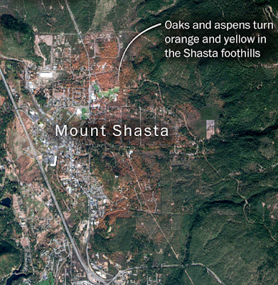
Cartographer Lauren Tierney and graphics reporter Joe Fox created some wonderful maps for a Washington Post article, Fantastic Fall Foliage...and where to find it. Here are the dominant colors seen in different areas with explanatory text.
https://www.washingtonpost.com/graphics/2019/national/fall-foliage-atlas/
The non-colored areas could use an explanation. The map is followed by a section showing various leaves and how they change, then by an animation of the color change geographically. The changing leaf color on the timeline as it moves to November is a really nice touch!
https://www.washingtonpost.com/graphics/2019/national/fall-foliage-atlas/
The final part has some details satellite images via Descartes Labs showing various detailed locations.
https://www.washingtonpost.com/graphics/2019/national/fall-foliage-atlas/
All in all a beautifully done piece - read more here- or click any image above.

Thursday, October 10, 2019

Gang Injunctions Map-Los Angeles

The controversial practice of gang injunctions, in which individuals or entire gangs can be restricted from associating with friends or even family members in certain neighborhoods, has been blocked for now in Los Angeles. Over the last few decades the city has enforced injunctions against 79 gangs encompassing some 8,700 people - via the Los Angeles Times.

The injunctions, while credited by law enforcement officials with helping limit gang activity, are controversial because they can affect individuals who are not involved in any gang activity. Those affected have not had a way to challenge these restrictions in court and can be subjected to unnecessary harassment.  The LAPD has a set of maps on their web site showing the neighborhoods affected by injunctions. Here is the citywide map.

http://assets.lapdonline.org/assets/pdf/COLUMBUS%20STREET%20GI%20gang_injun_citywide_85x11.pdf
These injunctions have been common throughout California. Here are maps from Anaheim,
https://www.ocregister.com/wp-content/uploads/migration/mgq/mgqzp7-mgqzh4anaheimganginjunctionarea.gif?w=620
and Long Beach, both via the Orange County Register,
https://www.ocregister.com/wp-content/uploads/migration/n3b/n3bkul-b781285758z.120140331142400000gm01j596f.4.jpg?w=1024&h=670


Wednesday, October 2, 2019

The Secret Life of a Highway Interchange

Living in Eastern Massachusetts means for many people trudging up and down Rt 128-Boston's dreadful (but necessary?) beltway. Much of it is also part of I-95, an interstate highway that I have lived within a few miles of for most of my life. To get to most places by car or bus from my home requires traveling eastbound on MA Route 2, then heading south on Rts 95/128. I travel the northwestern leaf of this cloverleaf exchange on a regular basis (more often as a passenger than a driver) and have often wondered about the life within - so I drew a map.
Drawn with colored pencil, I made a separate overlay of the text for fear of ruining it. I used various sources of aerial photography such as Google and Apple as drawing aids. Most features are real but I'm not sure about the swamp. I have vague memories of seeing it (maybe on a wet day) but am not sure it's still there. Fairy shrimp are a species that live in vernal pools, a subject I've mapped in a past job. These are swamps that are dry for much of the year. A swamp trapped inside a highway junction is what inspired this project.

As I've looked more over the years, I have found many other points of interest. The concrete pad at the north end seems to grow and shrink and change configurations. There is a sign for Outfall 1 (though it might say 11, it's hard to read at highway speeds), some raised beds with no obvious purpose and abandoned tires seem to come and go. There are also a few stands of mature trees, even more extensive than what I've drawn, that may harbor some very interesting life within.

If you click on the map, you can see a larger, more clear version. If you click on "Location" below, you will get the Google Maps view of the place. What's hiding in your local highway interchange?