Tuesday, November 25, 2014

College Football Fan Map

The New York Times Upshot recently added College Football to its collection of fan maps.
http://www.nytimes.com/interactive/2014/10/03/upshot/ncaa-football-fan-map.html?action=click&contentCollection=The%20Upshot&module=RelatedCoverage&region=Marginalia&pgtype=article&abt=0002&abg=1&_r=0
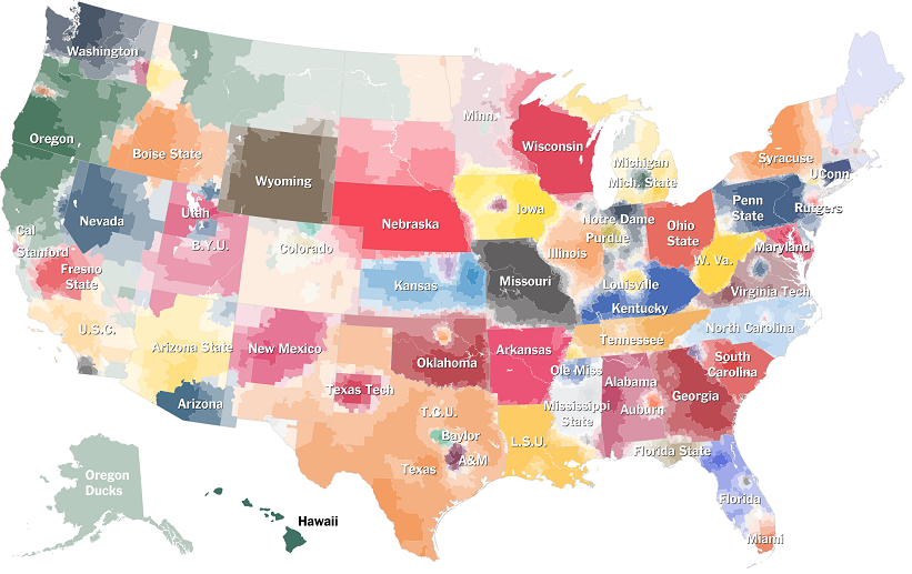
I like how faithful the boundaries are to the state borders. Even in Kansas where they have a reciprocal arrangement with Missouri for in state tuition and plenty of students from Missouri, the boundary is pretty precise.

Using the university colors is a nice touch but it also has the effect of overemphasizing the red schools. What really jumps out here is Nebraska, Wisconsin and Ohio State, whereas Oregon's impressive reach into California, Montana and Alaska fades info the background. The other problem with the college colors is when you have similar adjacent colors. It's especially hard to distinguish Alabama and Georgia here. South Carolina and Auburn are also in the same color family.

I also like the small pockets of fandom for the lesser state schools such as Michigan State, Kansas State, Iowa State and that little university in Virginia whose relative lack of football success has made Virginia Tech the overwhelming choice of most of that state.   

The Upshot did a related map showing where college football is the most popular.
http://www.nytimes.com/2014/11/08/upshot/the-places-in-america-where-college-football-means-the-most.html

While I'm not convinced that the Facebook "like" is the most reliable measure of our culture, it does make for an easy data set and results in a clear pattern. If this map was done in a grey scale, reversed out and overlaid on top of the first map, you'd get a picture of not only who people like but how strongly. I'd do it if I had time but work beckons.


Wednesday, November 19, 2014

Misleading Buffalo Snow Maps

As we prepare to spend Thanksgiving with my wife's family in western New York, here are some maps of what we could be in for. This one, posted on Flowing Data a few years ago does a nice job of showing the lake effect snowbelt south of Buffalo. But there are problems...
http://flowingdata.com/2007/09/27/misleading-map-of-buffalo-snow/
Green implies that the rest of the area including Buffalo (inside the dashed box) is not so bad. However, a look at the legend shows that green is up to 80 inches a year and the yellow that appears in many of the suburbs is 90-100 inches. Chautauqua County people may consider 80 inches to be minor but for the rest of us this color choice is terribly misleading.

The map also may need an update as parts of the region are getting half their average this week.
http://lintvwwlp.files.wordpress.com/2014/11/wivb-snowfall-map.jpg
 Be "4 Warned" - this is another misleading map. How much snow will we see in Rochester? Apparently nothing even though family members tell us otherwise. The dropoff from 18-24" to nothing at the Livingston-Wyoming county line is remarkable as is the sudden lack of snow in Erie County, Pennsylvania. No data and no snow are not the same thing so don't treat them the same.

Thursday, November 13, 2014

Inversia

Sometimes a poorly colored map makes it difficult to distinguish land and water. What if they were reversed?  "Swap dirt and water" and you get Inversia.

http://www.worlddreambank.org/I/INV.HTM

Of course, it's not that simple. Creator Chris Wayan lays down a series of ground rules. For example, the most shallow ocean areas would become depressions that would fill up with rain water. This results in a series of lakes and seas in the middle of the oceans. These are important to the ecosystem of Inversia because the oceans have become large deserts due to coastal mountains blocking rainfall. The lakes provide much needed water sources for life here.

There are still Andes Mountains and a trench along the west coast of South America but reversed. The Great Lakes have become the Great Isles. Hawaii and the Azores are Seas and the Mariana Trench is now the world's highest mountain range. The web page is full of well thought out descriptions of the life, climate and ecology of Inversia. Enjoying exploring!


Wednesday, November 5, 2014

Election Maps Elsewhere

Those of us in the USA will be seeing many election maps over the next few days. In the interest of not being every other site, here are some maps of other important elections that have happened this year in large countries that we (myself included) pay much less attention to than we should.

Brazil
http://i.imgur.com/pcXhscv.png

In last month's election, incumbent president Dilma Rousseff won both rounds. The map above shows her vote in the runoff election in red and challenger Aecio Neves in blue. On the right is a cartogram - areas proportional to population. Usually cartograms do a better job of showing results but in this case it's actually more difficult to see that she won than the conventional map. I suspect it's due to the strength of support Rousseff saw in the areas she won.

This map uses a gray neutral color instead of the purple we often see in our red-blue maps. This makes for a clearer distinction of areas. Author Diogro Melo does a nice job listing his sources, even for the colors.  He also has a link to the code used to create the cartogram.

India
http://upload.wikimedia.org/wikipedia/commons/e/e6/Indische_Parlamentswahl_2014_Parteien.svg

India had a major parliamentary election in the spring and the BJP with it's allies (the National Democratic Alliance) won a major victory over the Congress party and their allies. A huge number of parties in India would normally make for a colorful map, but in this case it is mostly BJP orange. Congress allies are shown in shades of blue. A cartogram would have shown much more blue with many of the small blue areas being large cities - more colorful, yet uglier as cartograms tend to be.

Indonesia

The world's fourth most populous country had its third presidential election. Twelve parties formed two coalitions with Joko Widodo's coalition winning.
http://en.wikipedia.org/wiki/Indonesian_presidential_election,_2014#mediaviewer/File:2014IndonesianPresidentialElectionMap.png
 The red/crimson (what?) color scheme used on Wikipedia is unconventional and barley works. Widodo's winning coalition is red, Subianto and Harvard University are crimson. The geographic pattern is basically Sumatra vs. elsewhere. This map would probably be more interesting with more parties, instead of just the two coalitions. Like, for example, the 2009 Election
http://en.wikipedia.org/wiki/Indonesian_legislative_election,_2009#mediaviewer/File:2009_ElectionsIndonesia.png

Afghanistan

Less populous but also important is Afghanistan. Their election suffered from violence, accusations of fraud and a lack of good maps. Here is the best map I could find.  
http://russiaeasternrepublic.files.wordpress.com/2014/06/afghanistan-electoral-map.jpg

Votes for Ashraf Ghani, the declared winner are shown as green proportional circles. Votes for Abdullah Abdullah (the candidate so nice they named him twice) are in purple. The trouble is in making out a pattern underneath the noise of the heavy colors representing ethnicity. A simple dulling of the ethnic colors and/or brightening the circles would help see the relationship between these patterns. Even better would have been to choose colors for the circles that are clearly different from the ethnic colors.

Egypt also had a presidential election. I have not been able to find maps, probably because el-Sisi won 97% of the vote*. I suppose the map would look like this. 

* 97%? A bit above the credibility threshold?