Showing posts with label los angeles. Show all posts

Wednesday, July 23, 2025

The New Yorker Cover and its Imitators

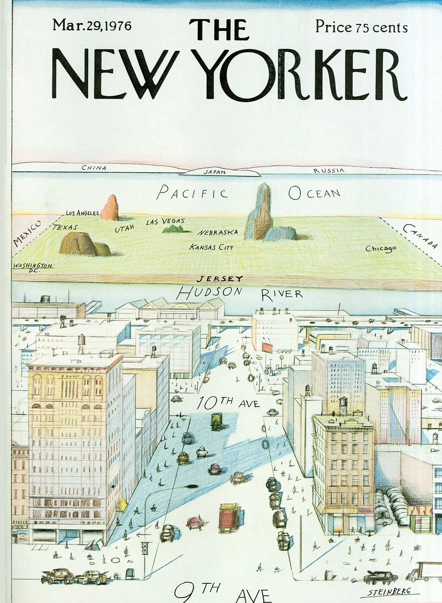
 In 1976, Saul Steinberg illustrated this famous cover for the New Yorker.

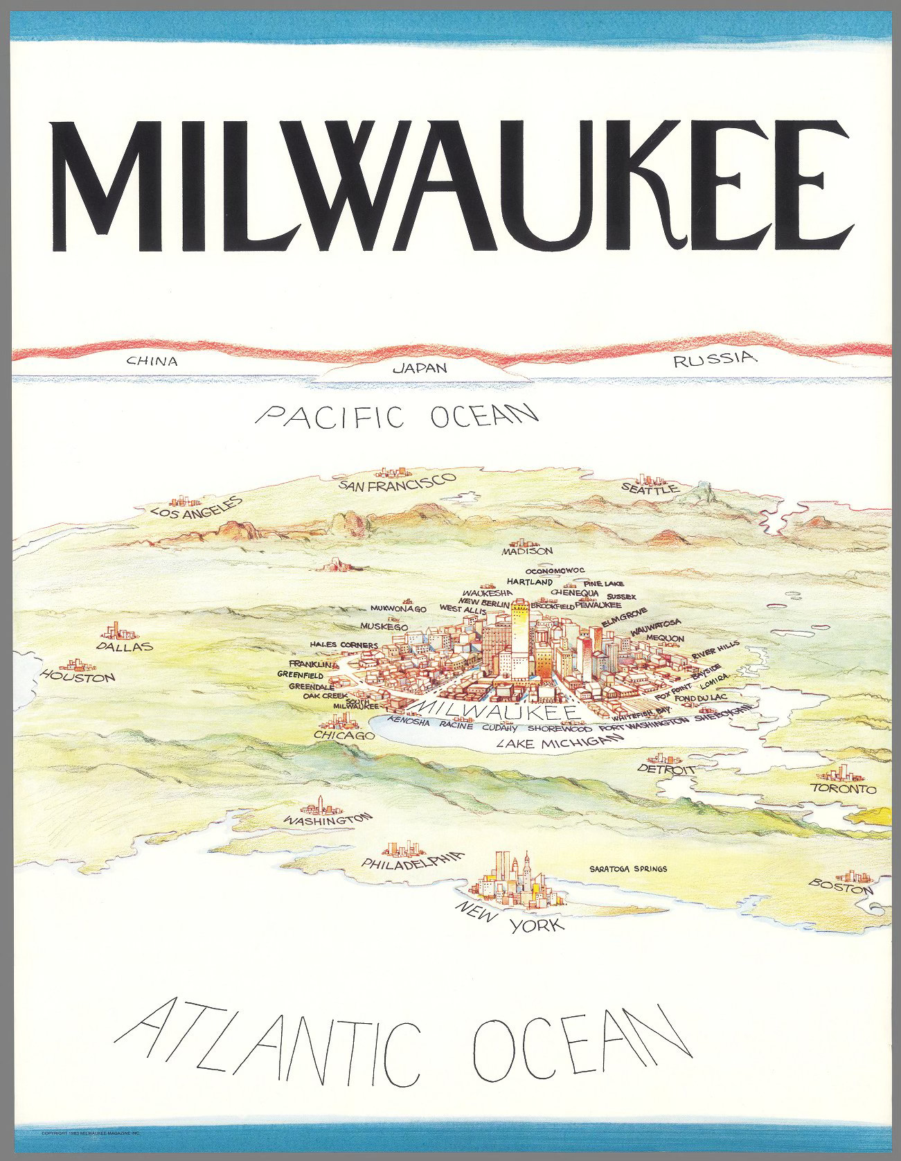
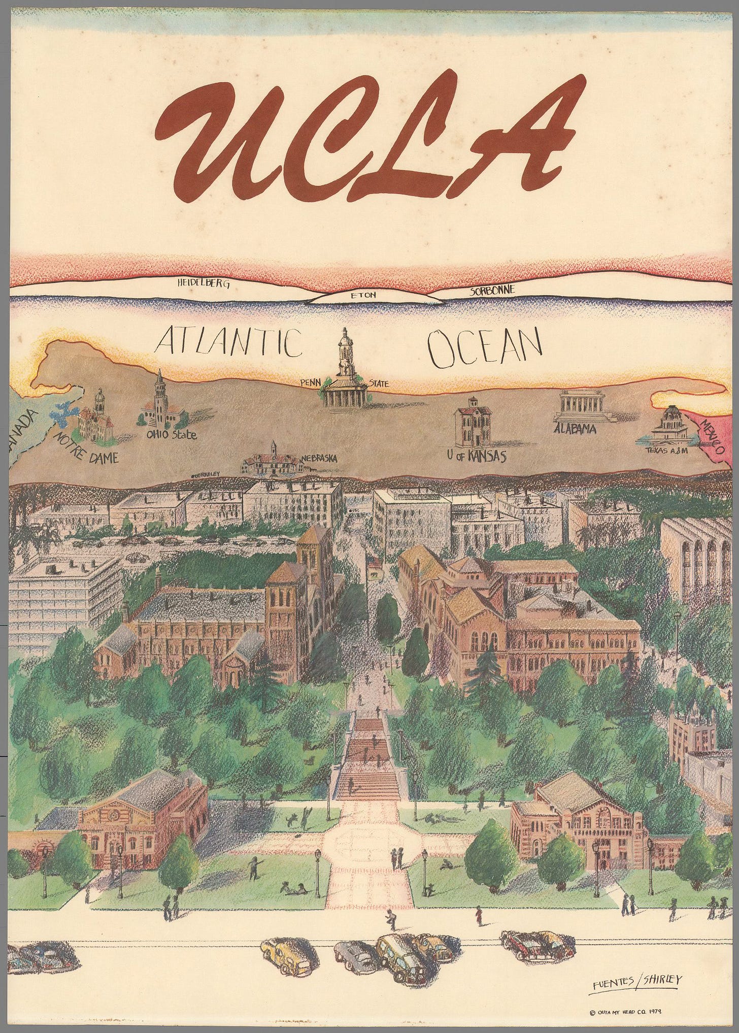
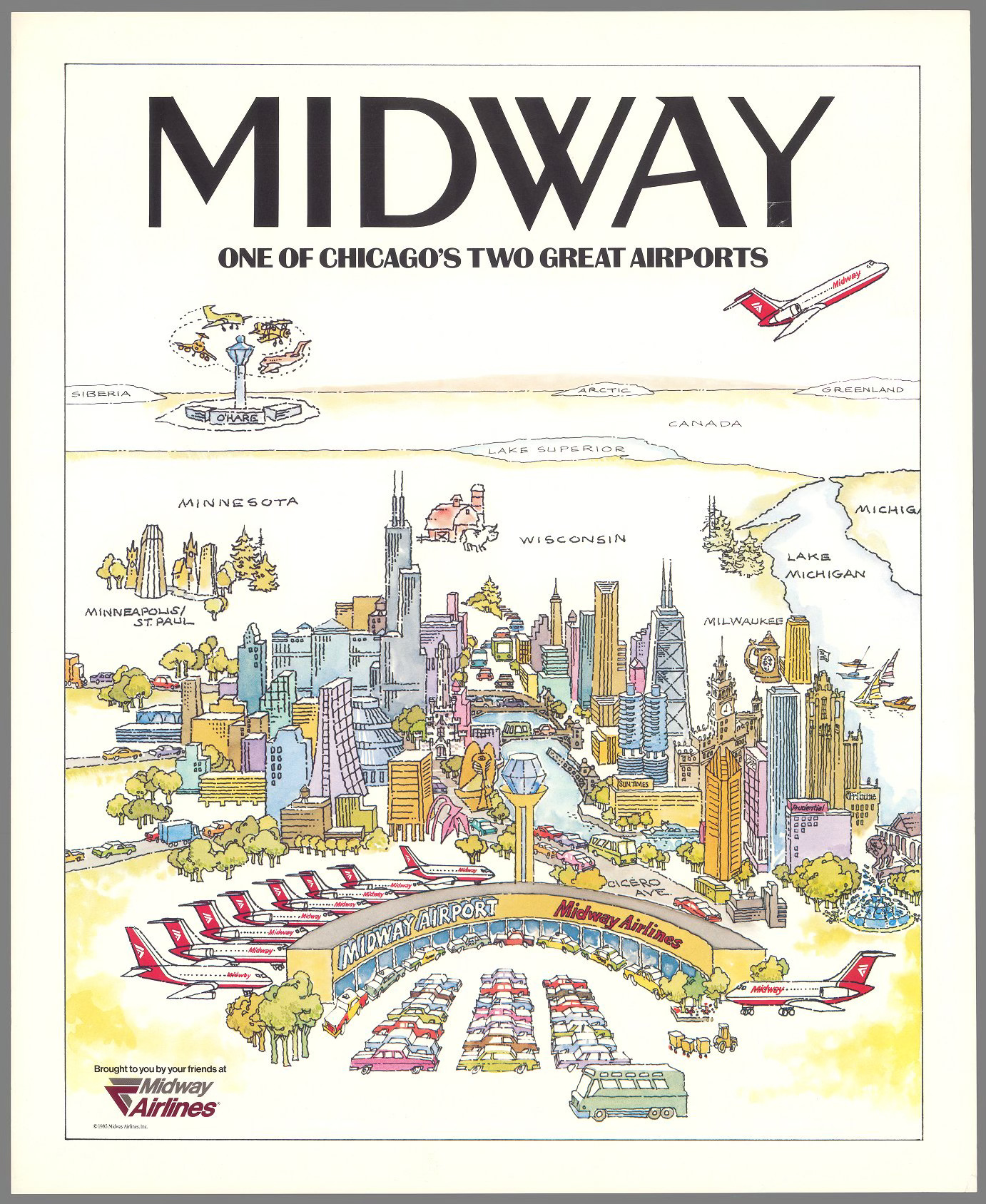
The humorously exaggerated myopia of a “typical“ New Yorker led to many imitations across the world. I found a bunch of examples on the David Rumsey Map Collection when looking for something completely unrelated. Here is Milwaukee. 

Interestingly this version has a foreground as well as a background. It also features a better sense of geographic accuracy than the original though the China-Japan-Russia bit is basically duplicated. Look at tiny little Chicago! Saratoga Springs is an interesting addition though its location in Connecticut is a bit off.

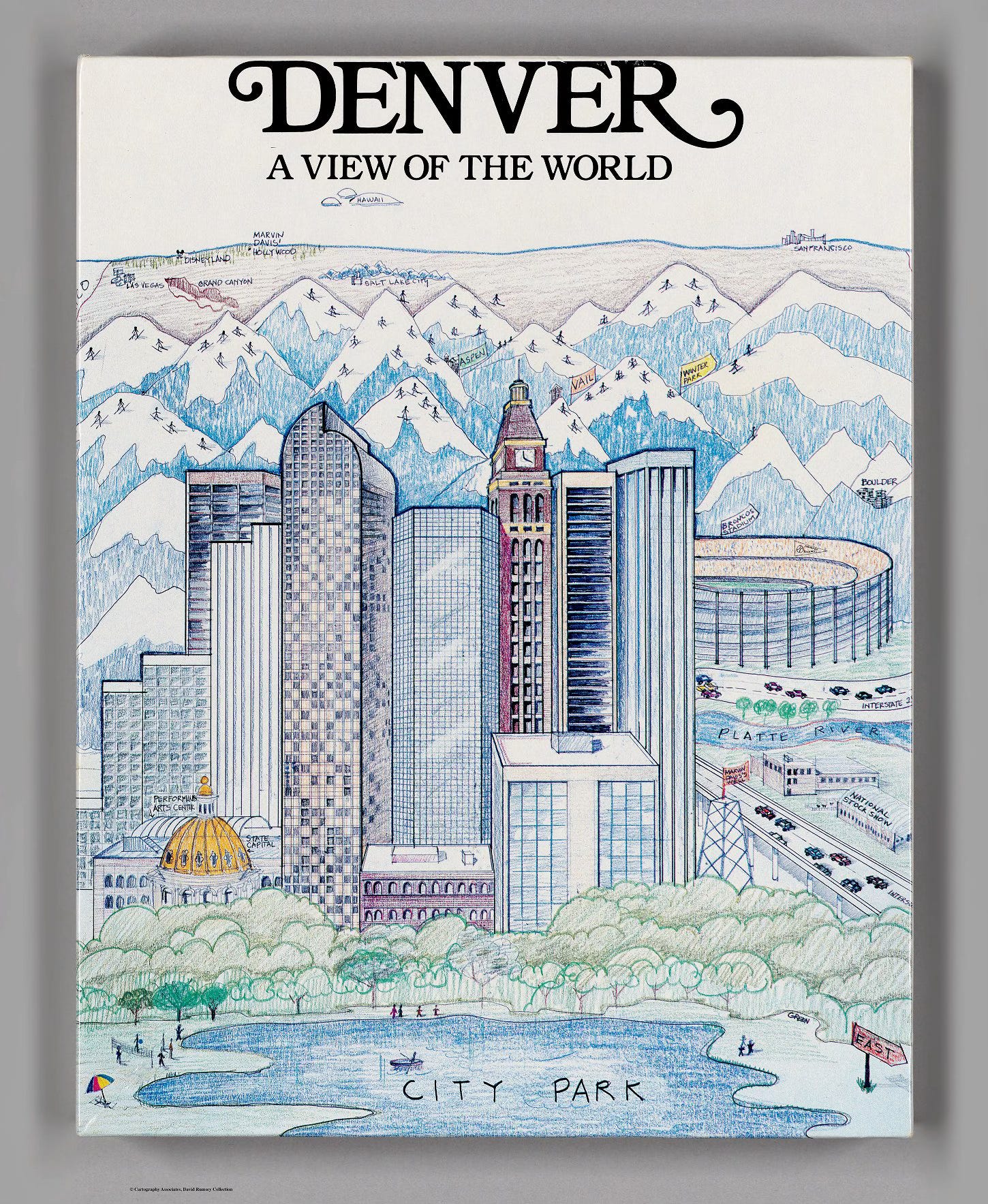
 Here is another example with mountains and skiers.

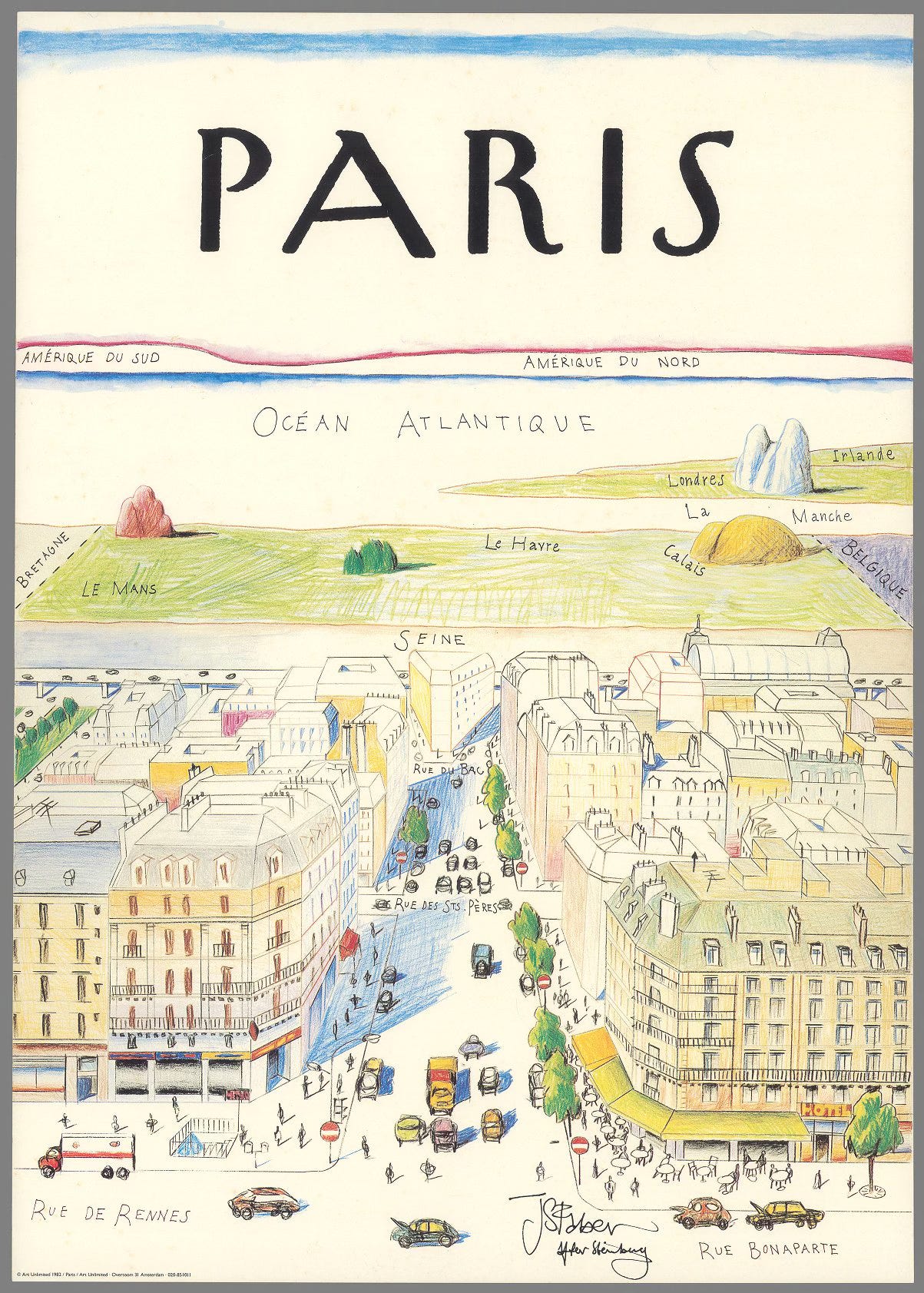
An international perspective, looking westward from Les Deux Magots.

Here is a looking east perspective. This one shows rival colleges. Perhaps ones with better geography departments as the distant locations of Heidelberg and Eton are flipped.

This one is probably my favorite. “One of Chicago’s two great airports“ exaggerating the centrality of Midway while implying that you need to travel almost to Siberia just to get to the chaos of O’Hare Airport.


Thursday, October 6, 2022

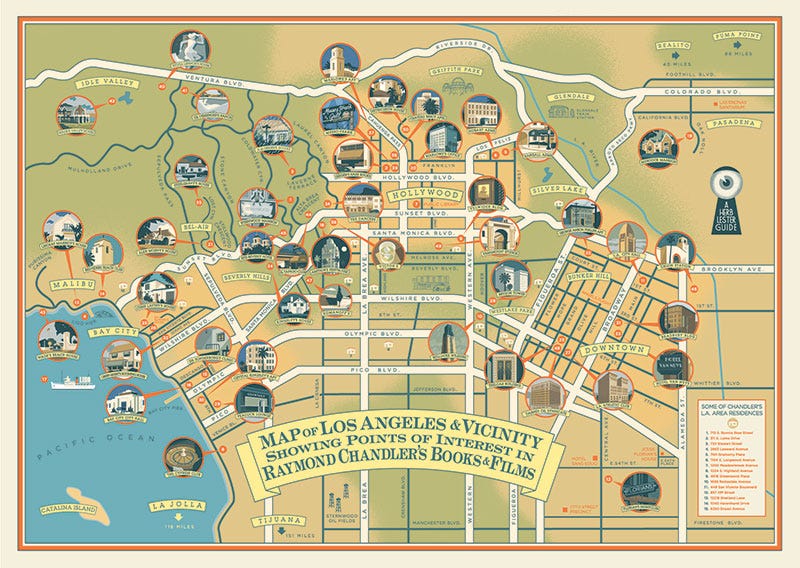
A Collection of Raymond Chandler Maps

I'm not really a fan of detective novels so all I previously knew about Raymond Chandler is from the Robyn Hitchcock song "Raymond Chandler Evening". The pavements are all wet, there's a body on the rails, he's not the reassuring type, etc. I've since learned that his work is so geographically detailed that it has inspired at least three maps of Los Angeles.

The above map, titled "Shamus Town" refers to the author's use of "Shamus" to mean cop or sometimes detective. This seems to be just a pictorial map from that era with a different title block. Originally drawn by Karl M. Leuschner, it was published in 1932 by Metropolitan Surveys of Los Angeles. Then modified to be a "Raymond Chandler Mystery Map" in 2014 by Loren Latker who runs the Shamus Town web site dedicated to Chandler. I have not found anything different other than the title. The original can be seen here via LA Magazine. The original can be seen here via LA Magazine. Here is the title block.

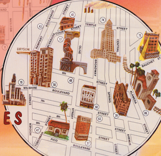
The second map is from Aaron Blake Publishers, 1985-1987.

It features blow-up circles for areas covered in the novels: Downtown, Hollywood, Santa Monica (sometimes aliased as Bay City), Lake Arrowhead and Mexico. 

There is a number key on the right listing locations by book. Some addresses are in italics suggesting his desire to disguise locations. These are listed after the actual locations. The map is "thoroughly researched" but "some places no longer exist, others never existed ... the exact placement of still others remains debatable."
These bubbles allow the size of important areas to be enlarged but even within the bubbles there are major distortions like placing Malibu immediately next to Santa Monica on a straight coastline. I like the electric look of the Beverly Hills area that connects the Hollywood and Santa Monica bubbles. The Shamus Town site has a nice feature where you can click on a section of the map and get both a blow-up of that area and the relevant text from the sidebar.
 
More recently historian Kim Cooper collaborated with Herb Lester Associates in the U.K. to create this "guide to Chandler's world and that of his noble alter-ego, the private detective Philip Marlowe. It mixes locations from the books, the films and Chandler’s personal life. There’s the crummy dive where Moose Malloy went looking for Velma (Farewell, My Lovely); the actual lounge where Marlowe and Terry Lennox ordered gimlets (The Long Goodbye); the top-floor suite where oil executive Chandler got his priceless education in how a dirty, sun-drenched city really operated. It’s an insider's guide to the city Chandler knew, and can still be visited today."

It can be purchased here and more details about the map are available on Electric Lit. Here is a not much higher resolution detail via heflinreps.

Wednesday, April 20, 2022

Mapping the Indigenous Diaspora

The Comunidades Indigenas en Liderazgo (CIELO), a non-profit advocacy organization, in conjunction with UCLA created a story map called We Are Here, showing the indigenous diaspora of Los Angeles. This is to counter the "statistical genocide" the US Census creates by lumping these groups under the broad Hispanic/Latino classification. This erases their cultural differences, including 30 different unique groups speaking over 17 indigenous languages. The map shows the locations of these language speakers by color.

Clicking on a zip code brings up a pie chart of the language speakers.

Unfortunately the colors of the pie chart are not the same as those of the map leading to confusion. On this graph the K'iche speakers are yellow but on the map they are green. On this chart they are blue.

The tabulation by zip code also creates confusing dot effects on the map where the shapes of more dense zip codes are emphasized. This graph within the story map shows the universe of languages on the maps.

The organization aims to get the public agencies of the City and County to recognize and provide translation services for these languages. Here is a translation card for the Guatemalan regional dialects - there is a separate card for Mexican regions.

As you scroll through the story map you get videos and map content showing the locations of festivals, conferences and organizations that aim to teach the cultural traditions.

The story map is on view at the Mixpantli: Contemporary Echoes exhibit of Los Angeles County Art Museum (LACMA)

Wednesday, July 1, 2020

Sea Level Rise-Coming to a City Near You

Conspiracy of Cartographers has a series of maps showing what will be underwater in various cities after 215 feet (66 meters) of sea level rise. Keep in mind that this is "end point" sea level rise and not anything we would see in our lifetimes. A recent page highlights new maps of Philadelphia,
https://conspiracyofcartographers.com/2019/10/12/philadelphia-sea-rise-map/
and Washington, DC.
https://conspiracyofcartographers.com/2019/10/12/washington-dc-sea-rise-map/
Both maps show similar patterns with the central cities completely flooded and the land being mostly peninsulas in the hilly north and western suburbs. There are also some nice puns.
In Philadelphia, Hunting Park becomes Fishing Park, University City becomes Irreversibly Pity, Wayne Junction, Drain Junction, and Northern Liberties is now Northern Fisheries.

Other maps have been done for cities in the U.S., Australia and England as well as a few larger regions. Here are Cascadia,
 The Palm Springs-Coachella area of California,
an almost completely waterlogged Brisbane,
and Los Angeles, featuring one of my favorite puns- the Ex-LAX airport.


Thursday, October 10, 2019

Gang Injunctions Map-Los Angeles

The controversial practice of gang injunctions, in which individuals or entire gangs can be restricted from associating with friends or even family members in certain neighborhoods, has been blocked for now in Los Angeles. Over the last few decades the city has enforced injunctions against 79 gangs encompassing some 8,700 people - via the Los Angeles Times.

The injunctions, while credited by law enforcement officials with helping limit gang activity, are controversial because they can affect individuals who are not involved in any gang activity. Those affected have not had a way to challenge these restrictions in court and can be subjected to unnecessary harassment.  The LAPD has a set of maps on their web site showing the neighborhoods affected by injunctions. Here is the citywide map.

http://assets.lapdonline.org/assets/pdf/COLUMBUS%20STREET%20GI%20gang_injun_citywide_85x11.pdf
These injunctions have been common throughout California. Here are maps from Anaheim,
https://www.ocregister.com/wp-content/uploads/migration/mgq/mgqzp7-mgqzh4anaheimganginjunctionarea.gif?w=620
and Long Beach, both via the Orange County Register,
https://www.ocregister.com/wp-content/uploads/migration/n3b/n3bkul-b781285758z.120140331142400000gm01j596f.4.jpg?w=1024&h=670


Tuesday, June 11, 2019

Pictorial Maps from the La Jolla Map Museum

In one of my final posts from my March visit to the La Jolla Map & Atlas Museum, I will show some of their large collection of pictorial maps. They just opened a new room dedicated to these maps including many by Jo Mora, an artist and photographer originally from Uruguay who moved to California, the subject of many of his pictorial maps.
Photo taken at the La Jolla Map & Atlas Museum

Photo taken at the La Jolla Map & Atlas Museum
More on the map above can be found in a previous post.

Another popular collection of pictorial maps is the "Hysetrical Map" series by the Lindgren Borthers.
Photo taken at the La Jolla Map & Atlas Museum
This one is titled "A Hysterical Map Of The Mother Lode Where California Was Born and Hell Was Raised." It's full of jokey details such as "Gold is often found in sand but so is spinach" and "An ass covered with gold has more respect than a horse with a pack saddle." There are also maps of Yellowstone and the Grand Coulee Dam featured on the museum's web page.

A 1963 tourist map of southern California grandiosely titled "Ride the Roads to Romance along the Golden Coast thru the Sunshine Empire of Southern California" shows historic trails emanating out for Los Angeles City Hall,
Photo courtesy of the La Jolla Map & Atlas Museum
to charming mountains, orange groves and historic missions.
Photo courtesy of the La Jolla Map & Atlas Museum
The edges of the map show natural and historic vignettes.
Photo courtesy of the La Jolla Map & Atlas Museum
Harrison Godwin's 1927 map of San Francisco ("where the sun never scorches and the water never freezes") is one of the most detailed pictorials packed with facts, figures, "whimsical vignettes" and transportation info.
http://lajollamapmuseum.org/maps/map-san-francisco-showing-principal-streets-and-places-interest
I was not able to get a good up close photo but here is a screen shot via the David Rumsey Map Collection.
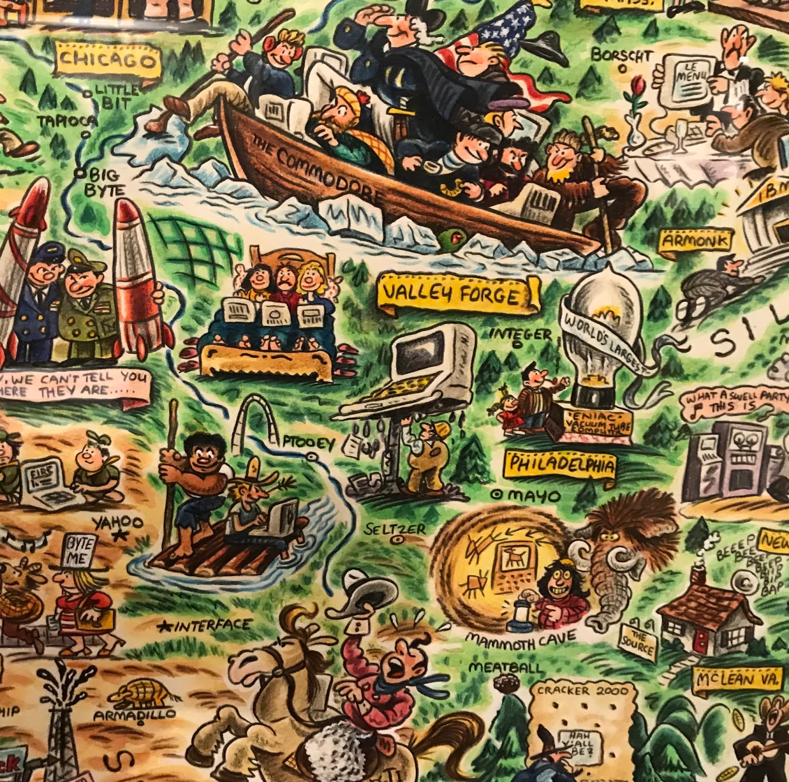
For a slightly more "modern" take here is the "Digital Deli Map of Personal Computer America" by illustrator Rick Meyerowitz, most famous for his work for National Lampoon. The map highlights Silicon Valley culture.
The bottom of the map contains a list of highlighted companies.
Highlights include a hiker in the Cascades carrying a large PC on his back with the screen reading "You are lost" and people in hot tubs looking at their computers. Here is part of the less important and therefore compressed eastern two thirds of the country.


Wednesday, January 23, 2019

The Cost of Water

I found this map created by the Los Angeles Bureau of Power and Light in 1922 via the Cornell University Library's Persuasive Maps collection.
https://digital.library.cornell.edu/catalog/ss:19343636
It appeared on the back of an electric bill and was meant to explain the cost of water. There is a chart of water rates comparing LA favorably to other cities. I like the title "Why Not Free Water? Because of the Cost." It does a good job of breaking down the costs of the 250-mile aqueduct and distribution system.

I stumbled across the map above while looking for the one below. It appeared in some marketing materials and makes a nice modern contrast to the Cost of Water map. It is a different era but the water issues are even more urgent.
https://www.nycwatershed.org/about-us/overview/croton-catskilldelaware-watersheds/
New York City's water system delivers over a billion gallons of water each day to 9 million residents. The length of the aqueducts and reach of the system is impressive - 1,972 square miles of drainage systems flowing into an aqueduct that crosses the Hudson River. That's a lot of cost for water- think about that next time you leave the faucet running.

Wednesday, February 14, 2018

Look North

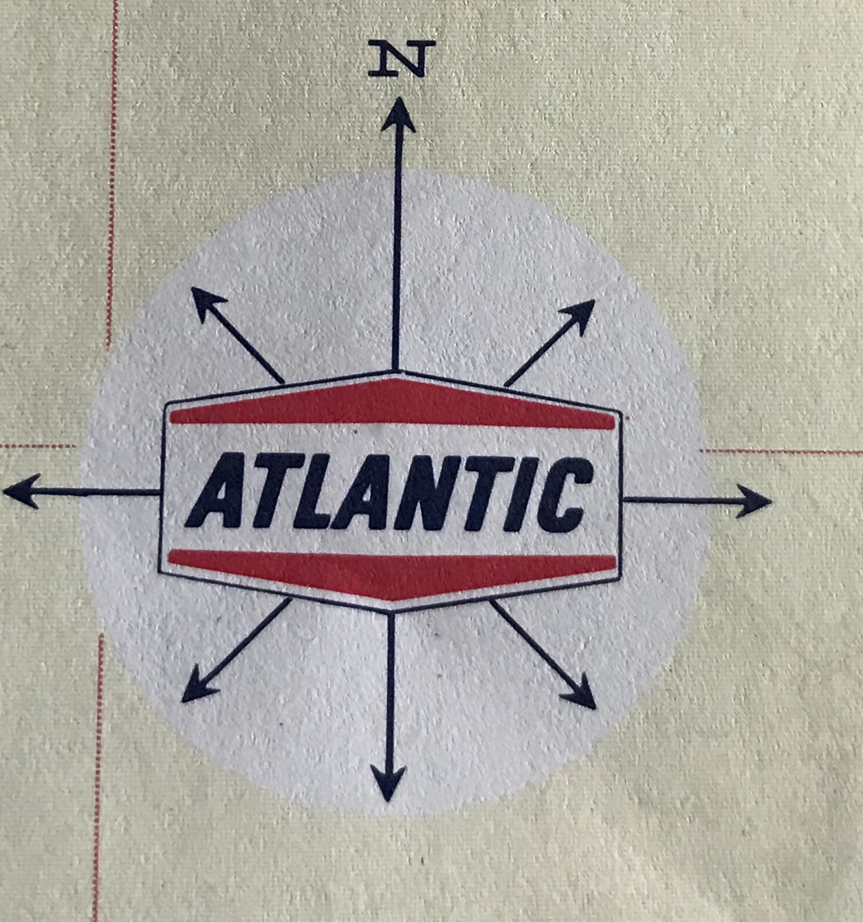
Going through my recently acquired road maps, I was intrigued by the many different north arrows. Many are gas stations maps-the work contracted out to map publishing companies such as Rand McNally and H.M. Gousha. Oil companies put their names on the map and often their logo on the north arrow.
Here's an example from the Gulf "Richmond Tourgide" - their cutesy misspelling, not mine. Rand McNally produced this map. Here are some more:


Flying A Service Metro D.C. Street Map- Gousha.


Cities Service - I don't know who they were and it was hard to get a clear picture of their logo. This is from their Maine map (Bangor inset). You can see the H. M. G. Co. (Gousha) text.


Before Arco, there was Atlantic - From a Tampa-St Petersburg map-Rand McNally


American - Greater Miami Street Map and Mobil Travel Map of the San Fernando Valley, California - Rand McNally


Two Gousha's - one from the Hertz/American Express Chicago map and one from their own branded New Orleans city map.


AAA's maps used this globe north arrow. They liked to put them in the water.


Here is one from Rand McNally's Los Angeles map. It appears on the LAX airport inset. This map looks very different stylistically from the rest of the map and the Thomas Brothers north arrow explains why.

The other sections of the map all have this dull, understated e.e. cummings- style "n"


Some state tourist agencies.
Maryland - I don't love Maryland's schizophrenic flag, but I like how they incorporated it into their north arrow.


Virginia - very detailed.


Montana-now that's a quality north arrow!


Best of all - South Dakota with its compass ring showing where the needle would point at the center of the state. Two rings, one for true distance and one for magnetic variation, plus the state seal!
 Here are some more