Showing posts with label switzerland. Show all posts

Wednesday, August 7, 2024

Summer Light Reading 2024

Here is another installment of what is becoming an annual summer tradition. Just like the light beach reading, here is some light map reading. Not much to comment about, just some maps and related items I like.

First of all since the Olympics are in Paris, a nice papercut map you can enjoy, or buy here.

A very colorful map from Wikimedia Commons showing the different sections of the Rhine River. As one reader pointed out it looks like a water quality map and probably is as river quality tends to get worse as more cities and farms downstream dump pollution into them.

A map of things to do in New England. I copied a portion and highlighted some of my favorites such as "loafing", "sleeping under blankets" and "doing nothing".

Transit map of Kaohsiung on Taiwan. There are some great station names like Dream Mall, World Games and Oil Refinery Elementary School.

A screen shot from Yahoo Japan that I like for no specific reason.

Finally, Tsunami Generating Earthquakes. I think this originally came from some social media site that was once known as Twitter. Maybe from the U.S. Geological Survey.

OK, back to your beach read.

Wednesday, February 26, 2020

Hidden Goodies in Swiss Topo Maps

The Swiss Office of Topography (Swisstopo) has long been creating the most beautiful and meticulously created maps anywhere. A wonderful new article in the American Institute for Graphic Art's Eye on Design is titled  For Decades, Cartographers Have Been Hiding Covert Illustrations Inside of Switzerland's Official Maps.
https://eyeondesign.aiga.org/for-decades-cartographers-have-been-hiding-covert-illustrations-inside-of-switzerlands-official-maps/
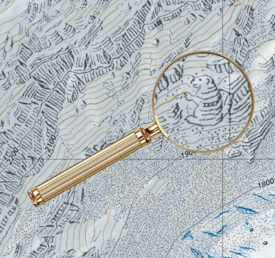
Cartographers at the office have been putting images like this marmot on their maps as an inside joke or possibly as a way to escape the strictures of such cartographic rigor and the level of concentration demanded of it. Most of them are removed when discovered by proofreaders but some elude discovery for years. Here is a nice fish hiding in a nature preserve.
https://eyeondesign.aiga.org/for-decades-cartographers-have-been-hiding-covert-illustrations-inside-of-switzerlands-official-maps/
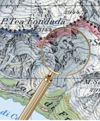
A hiker making his way among the mountain peaks just across the Italian border. The cartographer may have drawn it in part to fill in details they were missing from the Italian geographical services.
https://eyeondesign.aiga.org/for-decades-cartographers-have-been-hiding-covert-illustrations-inside-of-switzerlands-official-maps/

Here is a spider.
https://eyeondesign.aiga.org/for-decades-cartographers-have-been-hiding-covert-illustrations-inside-of-switzerlands-official-maps/
Many more nice examples and details can be seen here.


Tuesday, July 11, 2017

Tactile Atlas of Switzerland

I enjoy making fun of the sometimes cultish nature of the Esri User Conference. However, among the over-hyped items there is a really useful map for the visually impaired on display.
Created by Anna Vetter of Esri Switzerland, the map uses minimal and well separated details so the user can feel their way around the country without being confused with too much conflicting information. More good pictures from Twitter can be seen here,
and here, where you can see it in action at the conference.
Esri has put together a nice online version of the map. You can't feel it but you can pan, zoom and get the visual idea.
http://www.arcgis.com/home/webmap/viewer.html?webmap=651b04a8ad3940aaa7ae47a2e0fbabfe
The legend shows the wonderful simplicity of the maps.


Wednesday, March 22, 2017

Swiss Peaks

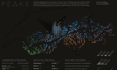
Peaks is a visualization of Swiss mountain peaks by Raphael Schaad, a designer at the MIT Media Lab.
https://raphaelschaad.github.io/peaks/
He uses four colors to distinguish the language (there are four official languages in Switzerland) of each name. In addition to color (hue) he also uses lightness (value) to represent height. The highest peaks are almost white making the language more difficult to determine. As you hover over a peak, you get the name and height of each one.
There is an About this Visualization link you can click to get some insight into Raphael's design process. Here is a quote about the stories he looks to tell.
The first narrative explores the impact language has on naming (e.g. Romansh’ names have much wider reach than the region this language is spoken in), the second story shows common names (similar to almost every U.S. state having a Springfield), and the third one highlights three colors as common origins for names. Each of these narratives is also interactive and tied to the central map.
 I like way he presents the legends,
and the supplemental language details.


Wednesday, October 19, 2016

Favorite Maps-Part 3

 Swiss topographic maps have set a standard for cartographic excellence since 1838.

Since the early 1960's these maps have been based on the pioneering relief shading of Eduard Imhof.
Imhof employed the concepts of natural vision where colors of nearby objects are brighter than more distant objects. In the case of a map (from an overhead perspective) the higher elevations get the brightest colors, while the lowest elevations are a grayish blue tint. The map is illuminated obliquely from the left side and is enhanced by contour lines and rock drawings.

 The online interactive version seamlessly integrates raster information (scanned paper maps) with vectors (geodata) to the extent that it is often unclear which you are seeing. As you zoom out, the map seemlessly changes scale, while retaining its beauty.


I am also fascinated with the way they generalize features - as you zoom out buildings and other shapes simplify, merge and eventually disappear. Click below for a more legible image.
You can wander through the Swiss mountains here and/or purchase paper maps here.

Note - this is the last of the "Favorite Maps" series for now but I may have additional installments in the future.