Showing posts with label city planning. Show all posts

Thursday, April 20, 2023

Parking Lot Map

 The Parking Lot Map is a project of the Parking Reform Project, an organization dedicated to climate action, safer streets and housing affordability. The map explores how much land in the central area of the major cities of the United States is dedicated to parking. On average 20% of land is dedicated to parking (this does not include the land dedicated to streets and highways). In Columbus that number is 27%.

The map interface is simple and effective-red parking lots on a gray background. There is a pick list where you can choose a city. Some cities have a "view more" button where you can get zoning details. Here is a map of the Columbus Parking Overlay District.

At the bottom is a graph ranking the cities.

The bottom entry is Arlington, Texas with 42% of its downtown dedicated to parking. The lowest non-suburban city is Las Vegas with 32% of its land as parking. 

Some people would argue that a parkable downtown is a good thing and the cities at the bottom should be considered the best places but charming old European cities like Paris aren't universally loved for their ease of parking. 

The best cities on the list tend to be older ones built out before cars. Washington D.C. only dedicates 3% of its downtown area to parking.

However there are plenty of exceptions. Detroit, the motor city, dedicated 30% of its downtown to parking.


Wednesday, September 14, 2022

King Charles III-Urban Planner

Britain's new King has a strong interest in urban planning. In fact he helped design a "new urbanist" town, Poundbury, just outside of Dorchester in Dorset. Here is a photo, via Flickr, of an in situ map of the town as it was in 2008. Click for better readability.

from Flickr user Anne

The town's traditional architecture gives it an (artificial) old-time feel while embracing principles of sustainability such as use of local materials, renewable energy sources like biomethane, and energy efficient designs.

Image via Duchy of Cornwall

A 2016 article in the Guardian begins with this quote: "Poundbury, the Prince of Wales’s traditionalist village in Dorset, has long been mocked as a feudal Disneyland. But a growing and diverse community suggests it’s getting a lot of things right."


This image from planner Léon Krier shows how much of the plan had been completed (in black) as of 2013.

via Architect Magazine

Here is a somewhat dulled image of the master plan showing land uses.

via DorsetRoads

The streets are designed to slow traffic and the walkability index is high according to Space Syntax,

however "the progressive attitude to cars hasn’t curbed habits: a survey conducted at the end of the first phase showed that car use was higher in Poundbury than in the surrounding rural district of West Dorset. The free-for-all parking policy, meanwhile, has turned many of the streets and squares into a car park for Dorchester shoppers." - Guardian, 2016

The town is scheduled to be completed in 2025 and a look at Google Maps suggests it is getting close.


Thursday, December 14, 2017

People Mapping With Street View

In a recent article in Places Journal, geographer Richard Campanella used Google's Street View images to document the rebounding population of New Orleans after Hurricane Katrina devastated the city. He created a grid throughout the city and counted the number of people visible on Google's images in 2007 and 2016.
The legends on these maps are hard to read at this size but darker colors means more - in this case people. Here are bicycles.
What these maps show is not so much population as "public space occupancy"-people are walking down the street, sitting on their front steps, sitting at outdoor parks and cafes, and riding bikes. The percentage increases here are quite a bit higher than the population and tourist increases in the city. This suggests a more vibrant city where improvements to infrastructure have encouraged more people to occupy the public space. Campanella takes care to point out that not all of this occupation of public space is from happy gentrifiers. There is a cost in the displacement of:
"lower-income residents-who, we should remember, occupied streetscapes in their own way, with elders on stoops and children playing in the streets. (Rare is the sight of either in the French Quarter today.) It’s also important to note that some of the patterns in these maps do not represent people contentedly occupying the public space, but rather relegated there."
A by product of gentrification is an increase in graffiti, as seen proliferating in the same neighborhoods.

The article suggests that public space occupancy is an important and overlooked consideration in urban planning. It also shows that Street View data, while very imperfect can and should be used, possibly with automated processes to enumerate these phenomena.

Wednesday, April 15, 2015

Detroit-Block by Block

National Geographic has a wonderful map showing population density by block. The dense areas have a vibrant color scheme, while the blocks with the highest level of abandonment are shown with the colors of the encroaching prairie.
http://www.nationalgeographic.com/taking-back-detroit/explore-detroit.html
The level of detail is impressive. However, the dull gray colors for non-residential and mixed use areas give a sense of deadness to some of the most vibrant areas of the city. The parks color also gets lost in all this detail. 
Below the map several highlighted neighborhoods (outlined in red above) are detailed with buildings outlines and photos.
There are also profiles and interviews of residents who are seeking to turn the city around. The article forgoes the larger business community (whose contributions have been detailed elsewhere) to focus on these residents.


Wednesday, July 18, 2012

1940s New York

The 1940 U.S. Census records were recently released by the National Archives. With a little work you can find any street (that existed in 1940) and see the census forms. They tell you the names, ages, occupations, salaries and state or country of birth for all residents. I was able to locate my mother and her family in South Philly. My father grew up in the Bronx and though I couldn't find him (his parents briefly lived in New Rochelle, NY), I was able to track down other members of the family at the apartment we used to visit in my youth.
The Center for Urban Research at the City University of New York (CUNY) has placed a 1943 market analysis of New York City online to give context to these census records. The page, Welcome to 1940's New York, has interactive maps and profiles for each neighborhood in the city.

Above is Highbridge, my father's neighborhood in the Bronx. The colors give an indication of wealth (based on rent and other expenditures) with the blues and greens at the low end and the oranges and reds at the high end. My dad's block is green, at the lower end of the spectrum.

The descriptions are also worth a read. "Highbridge is a heavily populated and good residential district." The "new and better buildings" are along the Grand Concourse, and the retail outlets "while small, are of a good class...." It makes me wonder how they would describe the African Movies Mall.

In the case of neighborhoods with a greater diversity of wealth, such as Greenwich Village, they added purple and yellow to the top of the wealth chart.


The description of Greenwich Village as "not a neighborhood of artists and writers" where "remodeling has changed many of the bohemian haunts" and it's popularity among "business couples" makes for an interesting early take on gentrification.

The interactive map overlays the demographic profile for every neighborhood, giving an overall impression of the geographic patterns of wealth and poverty, much of that unchanged today.


Thursday, December 22, 2011

The "Greatest Grid"

Yesterday I made a trip to the Museum of the City of New York to see The Greatest Grid. This exhibit celebrates the 200th anniversary of the Commissioner's Plan of 1811 that established the city's grid system. The exhibit is full of historic maps and the centerpiece is the Commissioners Plan Map of 1811 laid out on a glass covered table.


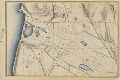
The grid was placed over the more sparsely settled areas above North Street (now Houston) without regard to the city's topography, water features or existing houses. Villages such as Harlem were eliminated to make room for straight streets. Houses that stood in the way (or even near the way) were demolished or moved. There is a section of the exhibit showing how houses were moved to accommodate the grid. This map from the exhibit's web site is one of many that show the land before the streets were built with the grid superimposed in light gray.


The exhibit starts with a video loop of residents proudly stating their address along the grid eg."125th and First!" After spending hours gawking at the maps you can go upstairs and see The Unfinished Grid, a collection of future design speculations resulting from a call for ideas from the Architectural League of New York. Many of these designs revolve around ways to break free from the grid's restrictions.

This collection of maps, photographs, newspaper clippings and other artifacts is very impressive and well worth a visit if you are in the New York metropolitan area. It runs through April 15th, 2012. The museum is located on the grid, at 5th and 103rd.

Tuesday, July 19, 2011

Detroit - the Woodward Plan

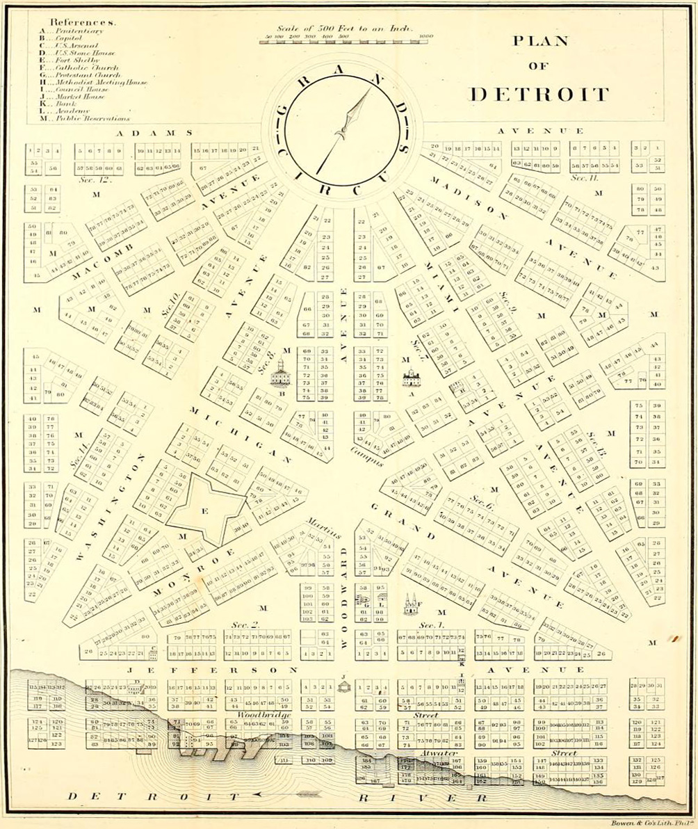
There's a lot of good cartographic content on flickr. I was looking for something else on a flickr group titled The Paper Cites- Speculative and Unbuilt Structures, when I came across this image from a user who calls himself whitewall buick. It shows the "Governor and Judges' Plan" for Detroit after the1805 fire destroyed the city. This plan was based on L'Enfant's plan for Washington DC with a series of plazas and wide boulevards radiating outwards. The shaded area is what was actually implemented.

According to the poster, the remaining areas grew haphazardly because the city was not given the authority to force private landowners to subdivide their land according to the plan. Unfortunately much of the content on flickr is poorly attributed and he does not give much more information.

Here is a map the current street network (and what was ruined) from Detroit Yes! I suspect this map is a bit out of date because it does not show the Campus Martius Park (see below.)


Michigan Territory Chief Justice Augustus B. Woodward proposed a plan of hexagonal blocks with the Grand Circus as the central point.


The Campus Martius, a few blocks south of the Grand Circus, is the point of origin for Michigan's coordinate system of roads that includes the Seven and Eight Mile roads located at those distances away.

Here is a photo of the point of origin marker. Campus Martius Park has recently been redeveloped into a very popular city park with fountains, performance spaces and an ice skating rink.