Wednesday, September 29, 2021

The State Hate Map

I try not to post too many of these maps as they are often gratuitously nasty and extremely unscientific. However, in the spirit of fun here is every state's least favorite state by Matt Shirley.

While your Instagram following is clearly not a statistically approved sample, it does seem to accurately reflect my experiences in many of these states. I very familiar with the anti-Massachusetts thing in New England and the PA-NY hatred of New Jersey. I also have some personal experience with the Missouri-Kansas and Ohio-Michigan animosities. I've even experienced South Carolinians hating on Ohio. 

As a "helpful" device, Reddit user u/ayitasaurus made an arrow version. It gets a little hard to read on the east coast (a different color arrow would help) but you can certainly see all the silly state rivalries. Some interesting trends include the linear hate chain from Minnesota to Tennessee and Florida hating itself.


-via Digg

Wednesday, September 22, 2021

A Critique of the New SEPTA Map

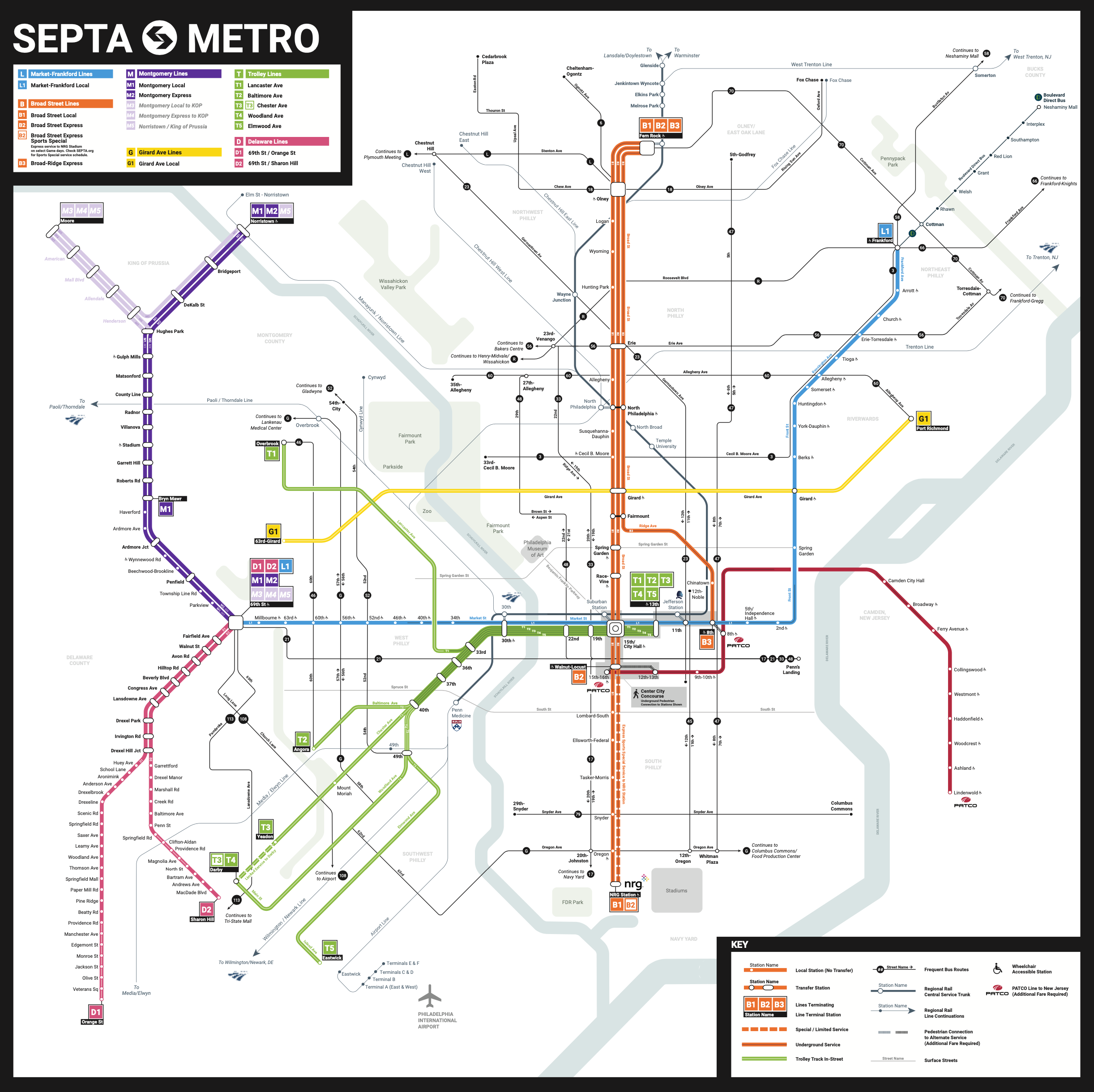
A recent article in Bloomberg discusses how SEPTA, Philadelphia's transit authority is trying to improve wayfinding including creating a new map with new nomenclature. While most of you probably don't care about SEPTA, I navigate this system almost every time I visit my Mom so this is personal.

The system is very difficult to map, complicated by subways, both elevated and underground, commuter trains, buses and various types or trolleys, some running along streets, others with their own dedicated rights of way. Additional complications come from the many different agencies that run lines through the area such as Amtrak, PATCO and New Jersey Transit. While trying not to go full negadelphia on here, the more I look at this map the less I like it. 


My first big complaint is this triple line representation. It creates a lot of unneeded visual clutter to just show local and express routes separately. The current map. does just fine with one line.

I'm also not impressed with the new nomenclature. Naming lines based on the county they serve M1, D1, etc seems arbitrary, especially given how county lines cut across otherwise uniform suburban areas. Then using "T" for trolley lines, but giving the Girard Avenue trolley a separate letter and color? I could go on a rant about the "L" for what used to be the "MFL" too but I'll spare you. Also, there's an "L" bus line to add to the confusion. Why doesn't PATCO get a letter designation? Finally, is it really necessary to have G1, L1 if there is only one line? I would remove the "1" to keep it simpler.


Also, notice the mess created at 69th St Station by separating local and express lines.

The complete lack of visual prominence of the heavily used regional rail lines is also not good. I get how they create a lot of clutter on the current map but they went too far the other way. I'm OK with making the more frequent rail lines more prominent but one of the problems here is that the less prominent lines are almost indistinguishable from the seemingly random* occasional street. See how the width changes at Penn Medicine** below and then compare the thin line below it with Spruce Street.

Getting back to the multiple line representation, take a look at how it makes the green subway-surface lines way more prominent. I don't know what the ridership data shows but I usually think of the blue line as being the most used/important line here.
A few more complaints before I finish. The wheelchair accessible symbols are almost invisibly small. They want to show accommodations for disabilities while making it hard on those with vision issues. Does the "express sports special service" really need a separate line given how infrequently it runs? I also don't like how tiny the dots are on the non-transfer subway stops.
I'm all for changing the map and even the line names where it makes sense but so far this new map is not an improvement. I hope they can get to something better.


* I understand why they chose the streets they did to include but by only having a couple of non-transit streets, it gives those decisions a random feel.

** I could really go on a rant about corporate station names but that is a decision SEPTA made without consulting me. Jefferson Station is particularly bad as the name says little about its location to anyone not very familiar with that part of town. This is also one of the busiest and most tourist-y. stations in the city. Also, if you're visiting from out of town and want to see your sports team (most likely) beat us, you're just supposed to know to head to "nrg"

Wednesday, September 15, 2021

Columbus O

I love this map dearly and could have sworn I already put it on this blog but I can't find any record of it.

The audacity of it all! A world centered on a giant "Columbus, O."


In one sense this is just simply a type of polar azimuthal projection map centered on Columbus. Perhaps the uncredited publishers in 1902 did not have any more an imperial intent than that. I prefer to think this as some good old over the top boosterism. I like the very oversized Scioto River and the bold language of the title.

Though coal fields and gas fields are prominent in the title, they are a little subdued on the map.
Also, the 70 mile radius seems wrong until you realize that each blue circle is another mile and notice how much they bunch up at the edges, where the towns are maybe a bit less "tributary" to Columbus.

The inner city detail is nice too.

There do not appear to be any additional details about who made this unusual map and for what purpose, but it's fun to explore and you can do that here

Wednesday, September 8, 2021

Walking Into a New School Year

This odd graphic from the Biennial Survey of Education in the United States 1934-36 shows the number of school days per state.

The states appear to be marching off to school. In order to see if there's any pattern I tried making my own map. However, many states are not shown.


 Some other interesting graphics from the report show the states grabbing bags of money,

children lining up in the schoolyard by year,

and the percentage of students enrolled in private schools - overrunning the Northeast.

 The report is available here.

Wednesday, September 1, 2021

Differing Personal Maps of Denver

For a recent article in the Denverite, multimedia artist Kevin Beaty drew a variety of "mental maps" based on interviews with neighborhood residents.


Many of the maps focus on the Five Points neighborhood, an area that has shifted from various European immigrant groups, to a predominantly African-American neighborhood, to an area seeing significant gentrification. The neighborhood was once known as the Harlem of the West. The map above was based on 1950's era recollections of the area from brothers Ralph and Charles Dabney. They grew up there eating pig ear sandwiches and visiting their father at the firehouse.

It is interesting to see how the maps change with the age, race, economic status and occupation of the residents. Here is Beaty's map rendering from Yvette Freeman, a younger Black resident.

By contrast here is a map from white resident Heather Dalton, who has spent time in the neighborhood but probably did not grow up there.

Finally, here is a rendering of a developer's take on the neighborhood.

For many more maps see the Denverite.