Showing posts with label hand drawn maps. Show all posts

Wednesday, July 31, 2024

More Maps and Views at the British Library

Here is another installment of maps on display at the British Library - part 1 can be found here.

Estate Map by Margaret Bowles, 1659

Apologies for the dark and shadowy picture, the display hall is not brightly lit. Margaret Bowles was an English cartographer whose surviving maps are rare. Her husband and a team of surveyors took measurements of this estate and she transformed the data at reduced scale to make this map. It was made for the estate's managers and is one of the earliest depictions of an English rural landscape.

Mapping Mountains in Wales, 1838

From the library's description: "In the 1830s, Britain’s Ordnance Survey sent surveyors to Northwest Wales to verify data that had been gathered two decades earlier. This is one of the resultant hand-drawn maps, showing the mountainous region of Snowdonia. Its author Thomas Budgen (active 1822-1856) used various drawing techniques to illustrate relief, including close parallel lines known as hill-shading and sketched details of rock formations. At the same time, other surveyors were beginning to experiment with contouring, the relief depiction that is widely used today. Information from this map was incorporated into an engraved map published in the Tower of London from 1838.

My phone picture is not very high resolution but here is a close up to show Budgen's style of relief depiction.

Gilbert and Ellice Islands Separation Stamp
 

In 1976 the Gilbert and Ellice Islands, a British colony in the Pacific Ocean were separated and eventually became the independent nations of Kiribati and Tuvalu. There is a large image of this map-centric commemorative stamp hanging in this exhibit and also,

a separation of the separation stamp! Here you can see the text separation layer of the artwork displayed on top of the rest of the stamp.


Thursday, November 16, 2023

Here is another week of work for this month’s 30 Day Map Challenge.

Day 10 - North America


I’ve been looking at a tree identification guide and was inspired by the map in the book. I also thought this would be a nice time to get out the watercolor pencils. The colors didn’t blend as much as hoped-I probably didn’t use enough water or the right kind of paper.


Day 11 - Retro


Going for the 1950’s geography textbook look hopefully with some success.

Day 12 - South America

These animals have overlapping ranges so I highlighted the ones with the smallest ranges. Alpacas (in the wild) live mainly in the high mountains. This map features my first ever llama north arrow.

Day 13 - Choropleth

Choropleth is a somewhat map jargon-y term referring to discreet areas, usually classified in some way. For example, election maps. Usually there would be many areas classified into categories so choosing a state with only three counties and one for each category doesn’t really make this a true choropleth.

Day 14 - Europe

This was an experiment in playing with a space theme and showing some discreet countries that don’t have much in common other than being at the edges of the continent.

Day 15 - OpenStreetMap

I went with my default Openstreetmap mode of finding some random item (gas stations) and picking a random location. This could have been a much better learning opportunity as there are many other ways of working with this huge data set and I really do need to learn more about it. However, life intrudes and I didn’t have the time so I chose a quick subject and location. The logos are from the six most prevalent gas station brands.

It turns out Paraguay has the most per capita gas stations of any country in South America for various reasons (source) so this map is almost unreadable. I also learned that Petropar is the country’s national oil company while Petrobras is a Brazilian company.

Day 16 - Oceania

 Every other continent gets a day this year so why not Oceania? Here are the roads via the Globio Roads database. I’m not sure why the network in New Zealand is so much denser than anywhere else but there it is. I like the way you get a basic population and country shape map by showing roads and nothing else.


Wednesday, July 20, 2022

Summer Light Reading

Here is a grab bag of maps I enjoy. I don't have much insight or commentary to add-let's just appreciate them!

SAS Airlines Map, 1965

via Airline Maps Tumblr
 

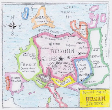
A "Belgocentric" map of Europe

via StrangeMaps

Melbourne Trams to the Beaches -Vernon Jones, 1930

available at the Transit Maps store

Vernon Jones was a printmaker who apparently did some work for the government of Victoria, Australia. I have not been able to find much information about him online the maps are truly a work of art. He used some really nice text styles too. Here is a detail from Trams to the Racecources, River and Zoo.

also from the Transit Maps store

New Jersey Lighthouses.

While on vacation at the Jersey Shore last year I took a picture of this map, hanging inside the Cape May Lighthouse.

Automobile Routes to Atlantic City sponsored by the Rudolf Hotel. I lost the original source of this one.

Hand drawn personal map of Detroit by 'jide Aje-not to scale! This is part of an exhibit/research project by Detroit Research.

via Detroitography

Walkway Over the Hudson - drawn by Maria Rabinky illustrating the bike/pedestrian rail trail bridge over the Hudson River in Poughkeepsie, New York.

The hand drawn cliffs are a really nice touch. Here's the whole map, complete with mountains and biplanes.

More to come....

Wednesday, April 27, 2022

The Quarantine Atlas

Two years ago, at the beginning of the current pandemic, Bloomberg CityLab asked readers to map their life under quarantine. They displayed many maps, some of which were featured here on a previous blog post. Last week they published over 65 of these maps as The Quarantine Atlas.

While the publisher's page does not show any examples, there are quite a few on this Bloomberg page as well as many other maps not in the atlas. Here are a few that I like.

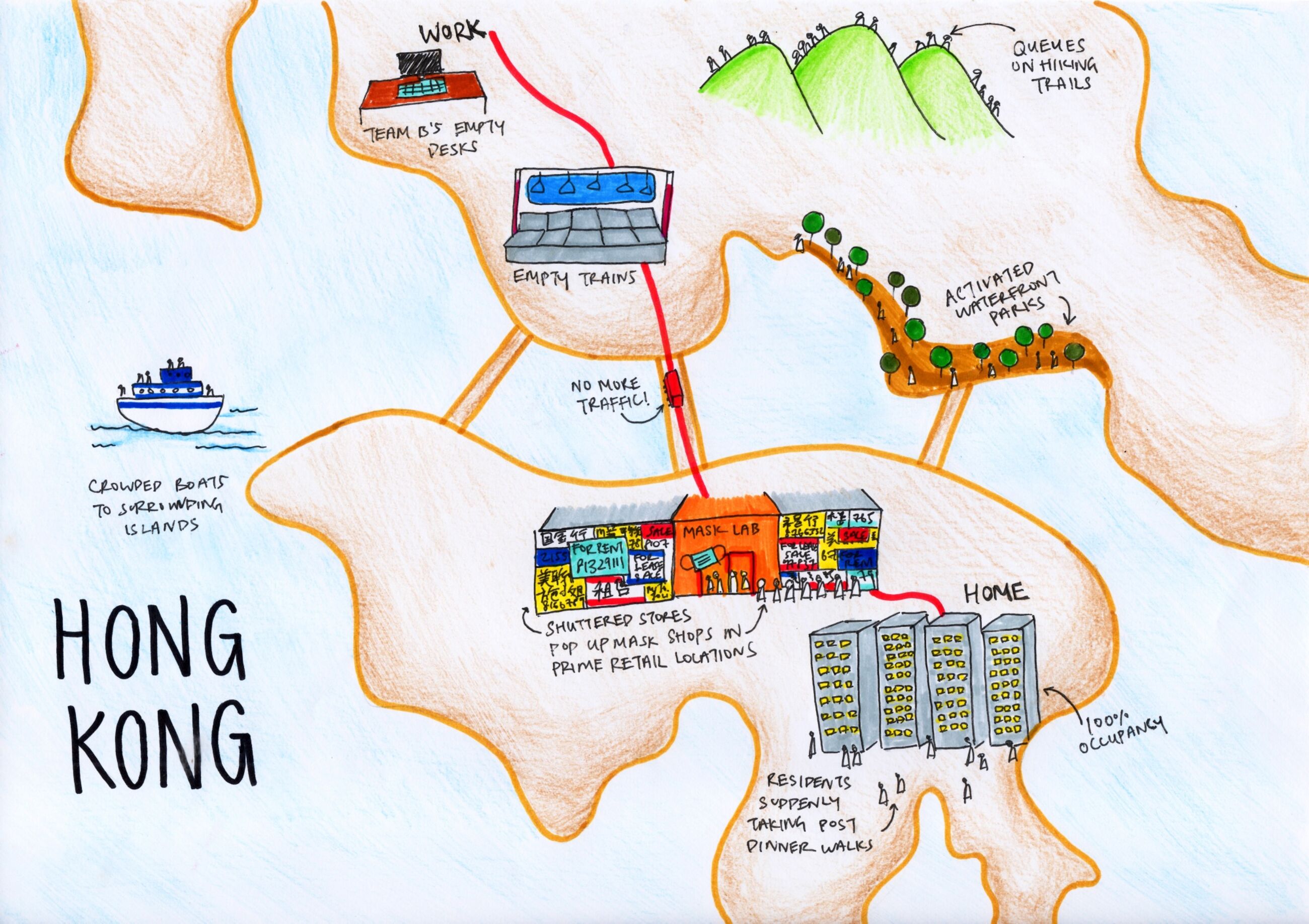
Tiara Lui - Hong Kong

Nice job showing the commute and pandemic disruptions to the city.

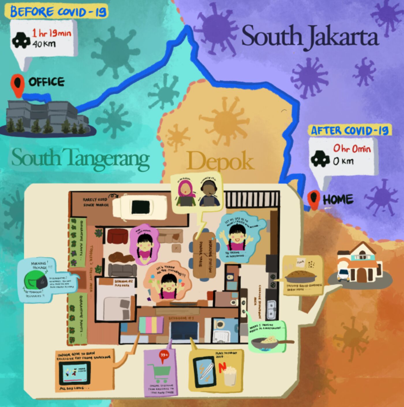
Nabilla Nur Anisah - Depok, West Java, Indonesia 

Many of the maps show floor plans of the residence as that is where people are stuck. I like this one because it contrasts the home life with the three hours of commuting to an office in South Tangerang.

Alfonso Pezzi - London transformed. Everything is delivered home including entertainment and work.

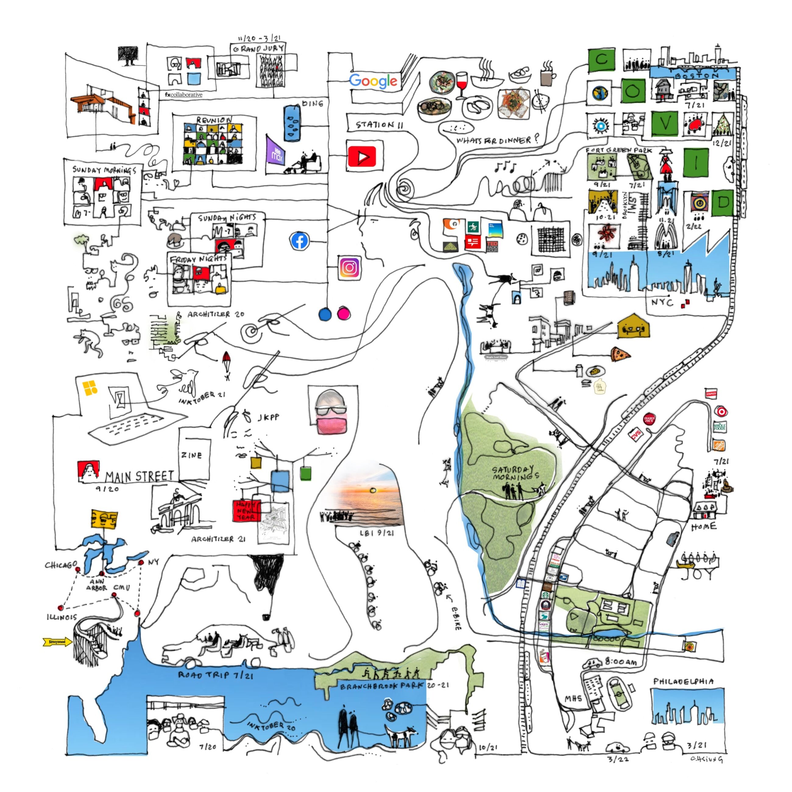
Finally here is one that did not make the atlas but I like all the intersecting geographies; floor plans, the local park, the drive to school, various road trips to nearby cities and then out to Illinois.

Carol Hsuing - Millburn, New Jersey


Wednesday, April 6, 2022

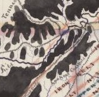
Alabama Coal & Iron Sketch

I found this charming map looking through the University of Alabama's impressive online map collection.

William Atkinson, 1872

I love the way the coal looks like spilled ink. Let's appreciate it up close.

There are lots of charming hand drawn details such as the railroad tracks and city symbols. One of the most charming things about this map is its inaccuracy. The coast of Florida dips south way too soon, as does Mississippi. Nashville is too far south. Even parts of Alabama are off. The coastal part is too wide and a bit off too. The border with Florida is too straight and the whole state seems a bit short. In an age of digital maps using common databases, this stuff is refreshing.


Wednesday, February 23, 2022

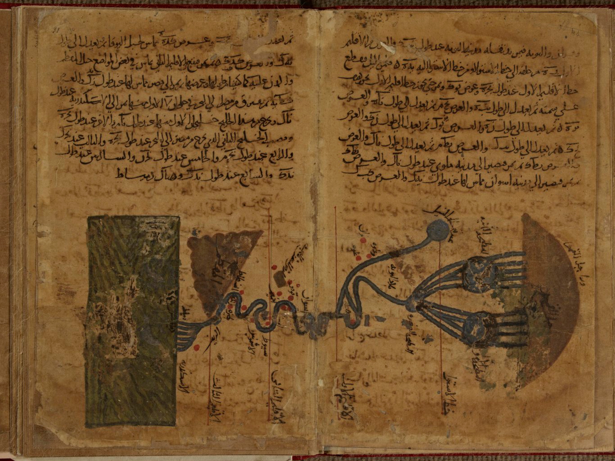
Al-Khwārizmī's Geography

Persian polymath Muḥammad ibn Mūsā al-Khwārizmī (c. 780-c. 850) had a huge influence on the development of algebra, the Hindu-Arabic numeral system, astronomy and cartography. His Kitāb Ṣūrat al-Arḍ (description of the Earth) was a major reworking of Ptolemy's Geography correcting much of his data for The Mediterranean Sea, Africa and Asia. Here is the earliest known map of the Nile River from that work,

some nice details of the origins and branches of the river, 

and the delta where it meets the Mediterranean.

The only surviving copy of this book is in the Strasbourg University Library in France. The copy is in bad shape and parts are almost illegible. Though latitudes and longitudes of thousands of places appear the world map is missing. Historian Hubert Daunicht reconstructed this map, the only copy I can find is this low resolution version from Wikipedia, showing the Indian Ocean.

For fans of "World Music" a band called Guess What named an album Al-Khawarizmi (with a slight spelling difference). The cover includes an early Islamic world map in the lower corner.

A previous post on this blog has a partial explanation of some of the elements of this map.


Wednesday, November 10, 2021

Thirty Day Map Challenge - Part 1

 Several years ago Finnish cartographer Topi Tjukanov began the Thirty Day Map Challenge and it has run every November since. The idea is to create a map every day of November based on a theme he posts at the start. These maps are posted to Twitter using the hashtag #30DayMapChallenge. There have been some wonderfully inspiring maps created in this process. I had never participated before this year, correctly assuming it would take up a major part of my time and energy. 

As in other years, I had no plans to do this but on November 1st I suddenly found myself making a map and it took off from there. At the risk of being a self-indulgent show off here are the first 10 maps. As of right now I don't have an online portfolio so here is a place for me to post them. I'm hoping to continue on this challenge but time will tell if I make it to the 30-day mark.

Day 1 - Theme: Points

I'd been working on a general "where I've been" map and I got to thinking about places I've spent the night. I looked at a few states that either didn't seem interesting or had too many uncertainties when I settled on Ohio. I've been working on my weak artistic skills. This was drawn in watercolor pencils by hand while looking at a map of the state.

Day 2 - Theme: Lines


 I don't really like the song "Every Day is a Winding Road" by Sheryl Crow, but somehow it got stuck in my mind and I set out prove it. I used various mapping services such as Google, Bing, Apple and OpenStreetMap to illustrate examples of streets around the world named for the days of the week. One of the tricky parts was finding streets that are in fact "winding."

Day 3 - Theme: Polygons

Points, lines and polygons are the main building blocks of maps so each one gets a day. DC seemed like a good polygon city. I used Opendata DC to get my points. I removed some tiny triangles and it's possible I missed a few circles and squares. There are many rectangular parks that I didn't include because they don't have "square" in their name. I almost forgot about the Ellipse! 

This was a mixed media project. I made and printed a map using QGIS annotated it with pencils and put a little watercolor into the rivers.

Day 4 - Theme: Hexagons


Hexagons are a popular way to represent grids these days. Studies show that certain patterns are easier to detect with a hexagon grid than a square grid. They are particularly popular with election maps but I was looking to do something a little more creative. Not many things in nature are hexagonal. Bee hives use that shape but that kind of map has been done by many others.  While looking for inspiration, I discovered that some of Annie's Snack Crackers are hex shaped, including their saltines and cheddar crackers. I decided to use them as my hexagons.

    So where is a place that has both salt and cheese production? I settled on upstate New York, knowing where some of these places are located. The salt areas are mostly based on an old map I found showing salt deposits, mostly in the southwest. I also know of a couple of salt facilities from my travels so I put those in. I used the term "more likely" to cover the uncertainties but some of those hexagons in the southwest should probably be cheese. The cheese areas were determined by a combination of dairy farm maps and places I know that make cheese.

Day 5 - Theme: Data Challenge 1: OpenStreetMap


For the uninitiated, OpenStreetMap (OSM) is like Wikipedia meets Google Maps. Content is all user generated and it is freely available to use. Despite having contributed to OSM in the past, I don't have a lot of experience using the data so this was definitely a learning exercise. I knew that you can get things like businesses out of it so I tried a query on business names. For some reason, the first word that came to me was "monkey" so I grabbed all businesses with monkey in the name. After seeing an empty South America, I decided to add Spanish and then to make it a bit more objective I grabbed the other three of the world's top languages. In the process this became as much of a linguistic map as anything. 

There are many translation issues here. French and Spanish have different masculine and feminine words and the Spanish words (mona, mono) are contained within many other words and names. My Hindi translation must have been especially off since all my results came from outside of India. Anyway I did what I could here.

Day 6 - Theme: Red

Getting personal here. This is a map of the town where I was born. I was nervously waiting my turn to perform some music on Zoom and parlayed that energy into drawing. Like #1 I tried this completely freehand, while looking at Apple Maps. I've only been through Red Bank as an adult on a train so I don't know the place at all. Someday I hope to visit. The river west of downtown is very wrong and there are other mistakes. Also the map monster and train station were poorly done.

Day 7 - Theme: Green 

Staying in the realm of the personal, Rittenhouse Square is around the corner from my grandmother's former building. As a child I enjoyed playing here, especially with the goat statue. I also lived in the area briefly as an adult. I'd been thinking about how the same places look in different map services so I made an animation of the square using Apple, Google, Bing, Mapbox, Carto, Esri, Stamen, Mapquest, OSM and the philly.gov web site.

Day 8 - Theme: Blue

I started out trying to get a list of blueberry names using the Day 5 OSM theme but the results were not great. Next, I tried using the Google Maps API but also had issues with that. Finally, I found an embedded Google Map from travel-mi.com. I wasn't planning on a Michigan focus but because the data set was there I went with it. I already had a blueberry symbol from my What They Drop on New Years Eve map so I was good to go!

Day 9 - Theme: Monochrome

I thought one of those solar potential maps would look good in monochrome but I'm not sure it works. I also thought that light should be more sun but usually darker means more so this ends up being a bit counterintuitive. I also was not really able to get the subtle gradations of grays with a watercolor pencil. I probably should have tried charcoal instead. I don't trust my drawing abilities to do a complicated outline like this freehand. I traced it right off the computer screen. The rest was done freehand, making it "charmingly inaccurate". 
 

Day 10 - Theme: Raster

I made a very low resolution version of a satellite image of Australia. Then I made a fuzzy version. I couldn't decide which I liked better so I made an animation: blocky vs fuzzy


Though this challenge has taken up way too much of my time and thinking process, it has also been a creative inspiration and a great learning experience so far. I'm looking forward to some of the upcoming challenges with a touch of dread but also excited to take them on.

Wednesday, November 13, 2019

Twenty Foot Japanese Scroll Map

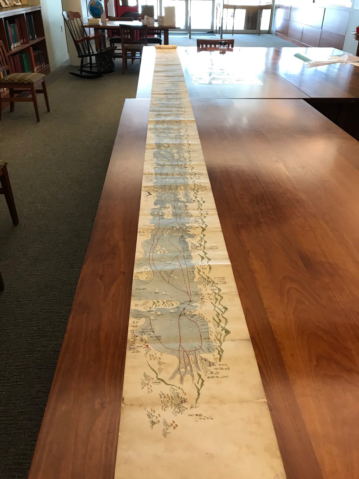
This past summer I took a trip to the Osher Map Library. Among the many wonders I saw there was this 20 foot long scroll map of Japan's Seto Inland Sea.
This is what the map looks like rolled up.
Here are some close-up views. Some of the geography is difficult to reconcile with today's coast but the map appears to be looking westwards from Osaka Bay.
Details include mountains, shrines and navigation routes.


Here is a description of the map on the Osher web page.
"This Japanese scroll stretches over twenty feet, detailing the coasts and landscapes, castles, shrines and towns. Japanese maps tended to be much larger than European maps of the same era. Many of them were designed to be laid out on wooden floor mats. Created for the purpose of tracking economic activity by region, it notes the annual taxes for each community. It also notes Nagasaki as the only port available to Dutch and Chinese traders. This hand drawn map was crafted in the traditional, pictorial style, known during this period as ezu; the mountains, rolling hills, villages, fortresses, temples, are highly stylized."
The entire map can be browsed here. Here is a view of the entire map in one shot.
https://oshermaps.org/browse-maps?id=17833