Showing posts with label brazil. Show all posts

Wednesday, June 22, 2022

Isolated Tribes of the Amazon

Indigenous advocate Bruno Pereira and journalist Dom Phillips were recently murdered on an expedition in the remote Javari (or Yavari) Valley in westernmost Brazil. They were studying and working to protect isolated indigenous tribes. These are tribes that do not want contact with the outside world. They are under threat from illegal fishermen, religious missionaries who want to convert them, dieases, drug trafficking, and the large scale destruction of the Amazon by agriculture and logging, along with a right wing government that is actively promoting those interests.  There are 28 conformed isolated tribes in Brazil, 10 in the Javari region, and possibly as many as 86 nationwide.  

The above map is from El Pais. Due to some technical problems I can only shows the western half at a good enough resolution to be able to read the text. Here is the map's legend,

and the entire map at a less readable resolution.

Pereira and Phillips were killed by a local fisherman on the Rio Itacoai while heading north to the town of Atalaia do Norte. A map from Uol News shows the area where they were last seen.

There is a good, detailed summary of the threats to these tribes in El Pais.

Wednesday, August 2, 2017

Where to See the Best Eclipse Maps

It's not about where to go to see the upcoming eclipse (August 21st, 2017) -it's where do you see the best maps that interests me. The Great American Eclipse site is a good starting point. They feature very detailed maps showing how much time the total eclipse will last.
https://static1.squarespace.com/static/53c358b6e4b01b8adb4d5870/53eee705e4b0b80451132d74/53eee74be4b0880c7d4f6c09/1408166076430/SouthCarolina_Central.jpg?format=1500w
Above is the area around Columbia, South Carolina where some friends of mine (and possibly me but that is unlikely at this point) are gathering. I'm not sure why they want to drive 30 miles to get an additional 10 seconds of eclipse time but maybe it's better watching it over Lake Murray. Hopefully they get a sunny day-chances are much better of that in Nebraska or Wyoming.

This site features maps of the nation, for each state, drive time maps, videos of the path, lots of highly detailed maps like above and statistics. You can also buy "Occupy Totality" T-shirts. I like their logo too.
Here is a simple nationwide map from the South Carolina State Museum via the Columbia Total Eclipse Weekend site.
http://totaleclipsecolumbiasc.com/wp-content/uploads/2017/04/solar-eclipse-map-2017.jpg.png
The Washington Post has a great page where you can scroll down and follow the eclipse's path. Here are two screen shots of Oregon.
 Also Carhenge, because Carhenge is awesome.
Teams of students under the Eclipse Ballooning Project will be sending up high altitude balloons with cameras across the country to live stream the event. You will be able to watch here.
Rexburg online (Idaho) has a nice simple state map.

You can see where future eclipses will be from Scientific American. Their interactive graphic works nicely for small countries...
...but gets unwieldy for larger ones.
There are probably many other good graphics. You can look up at the sky or look online for more maps. If you are in the USA and you miss this one, there will be another one in seven years. Click the picture for more details.
https://www.greatamericaneclipse.com/april-8-2024/


Wednesday, August 24, 2016

The Human Impact

Via - National Geographic
A new study published in the journal Nature Communications, based on satellite imagery and other data from 1993 and 2009 maps the human footprint in those years. The good news is that the human footprint has not grown in direct proportion to population or the economy. However, some of the most intense pressure on the planet is being felt in places with the highest diversity of plant and animal life.
http://news.nationalgeographic.com/2016/08/human-footprint-map-ecological-impact/

The above map shows the current footprint with the least impacted areas in blue and the most impacted in yellow and red. The map below shows the change in our impact on the planet between 1993 and 2009. Some of the wealthier areas have seen improvements but many of these are also areas that are already highly impacted.
http://news.nationalgeographic.com/2016/08/human-footprint-map-ecological-impact/
The National Geographic article discusses how we can help save our biodiversity by focusing protection efforts on species-rich areas such as the Amazon Basin that are seeing significant impact. There are also links to the Wildlife Conservation Society's interactive maps where you can see the current footprint and change for any chosen area.
http://wcshumanfootprint.org/HF2change/
In the above change map areas of increasing pressure on the environment are in red and decreasing pressure is in blue. Areas not colored have seen little change. Much the Midwestern farming areas have seen decreasing pressure while the red areas include outer suburbs and areas of resource exploitation such as natural gas fracking. Africa has seen a great increase in pressure in the semi-arid Sahel region. Europe has a bit of and east/west split with the east seeing increasing pressure.
The other interactive map includes a slider where you can compare the human impact in 1993 and 2009 as shown here in southern Brazil and Uruguay.
http://wcshumanfootprint.org/HF2swipe/
These maps can be explored further by clicking on them or at this link.

Wednesday, March 30, 2016

Strange and Secret Totalitarian Capitals

This past Sunday was the 10th anniversary of Napyidaw, Burma's new capital. I did a post about how the country suddenly moved its capital far into the hinterlands with no explanation and under much secrecy. Much of the city is strangely empty according to those few outsiders who have visited. Totalitarian regimes like to keep their geographic knowledge to themselves. Another example is North Korea's Pyongyang.
http://blogs.loc.gov/maps/2016/03/north-koreas-enigmatic-capital-pyongyang/?loclr=twmap
Unlike Napyidaw, Pyongyang has a long history of settlement but because North Korea was closed off to foreigners after the Korean War, little is known of its recent development. An article from the Library of Congress, Geography and Maps Division shows some of the rare maps available outside the country including this guide for tourists attending a 1989 youth festival.
http://blogs.loc.gov/maps/2016/03/north-koreas-enigmatic-capital-pyongyang/?loclr=twmap
The map is surrounded by pictures meant to highlight power and modernity.
More from the Library of Congress article:
Those who manage to enter the city are chaperoned and follow a strict itinerary; the practice serves to perpetuate both curiosity and mystery. Fortunately, geographic knowledge of the city has been growing by way of satellite imagery. Satellites, however, can only depict but cannot describe. 
 Click for for the full article.

Another country that like Burma suddenly moved its capital to the far northern hinterlands is Kazakhstan. In 1997 they moved the capital from Almaty to the small city of Akmola and then renamed the place Astana, "the capital" in Kazakh. Moving the capital allowed the government to centrally plan a monumental capital city, one full of strange modern architecture.
http://s593.photobucket.com/user/kiraneg/media/Astana_Map_Test_Axis_3.jpg.html
The map above, though hard to read details the top ten architectural wonders of the city in blue. Those wonders are listed on this page, and include the Baiterek Tree of Life (below) as well as the world's largest tent, serving as a mall and entertainment complex and also includes a river, park and beach.
Here is a picture via CNN of the modernistic capital complex.
http://www.cnn.com/2012/07/13/world/asia/eye-on-kazakhstan-astana/
Despite being the world's second coldest capital and being surrounded by many hundreds of miles of mostly empty grasslands, the city does have more life than Napyidaw. It is also much less secretive. Here is a cartoon-ish map of one of the business districts north of downtown, itself a ways north of the capital complex.
http://www.intermovex.kz/images/a_map_en_b.jpg
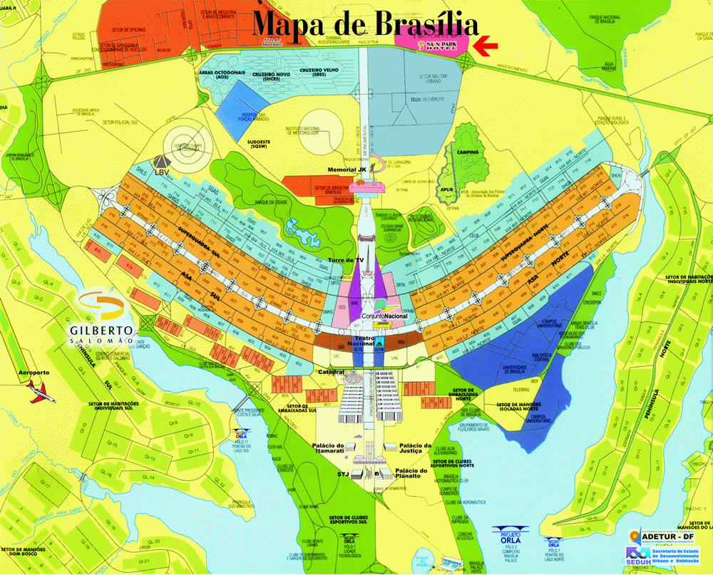
Lastly, I've always wanted to show some maps of Brazil's capital, Brasilia. While not the product of a totalitarian state, it is also a highly designed landscape created from a mostly blank slate. The design is meant to look like a giant bird or airplane. It looks cool on maps and aerial photos. On the ground, however it's a pretty bleak landscape. Here is the original plan followed by a map.
https://en.wikipedia.org/wiki/Bras%C3%ADlia#/media/File:Brasilia_-_Plan.JPG

http://www.viagemdeferias.com/mapa/plano-piloto-grande.gif
Here is a night shot from the International Space Station via Wikipedia.
https://en.wikipedia.org/wiki/Bras%C3%ADlia#/media/File:Bras%C3%ADlia_from_space.jpg
Like these other capitals, they favor modernistic architecture.
https://en.wikipedia.org/wiki/Bras%C3%ADlia#/media/File:Bras%C3%ADlia_Catedral_Metropolitana_noite.jpg
On the ground however, it does not look like a warm, inviting place.
https://sidewalkcity.files.wordpress.com/2010/08/brasilia-img_1564.jpg

Wednesday, May 27, 2015

The World Blueprinted

Philadelphia Data Scientist Lauren Ancona has created a blueprint map of the world. Mapbox enables you to create and cover the world in a style. In Philadelphia, she added extra details from city's open data site.
When you reach the city's edge the level of detail drops off a bit.
However, because Mapbox uses OpenStreetMap data, you can go anywhere. There's a remarkable level of detail in most urban areas. For example, Rio De Janeiro.
 
Kathmandu has seen a great increase in mapping detail thanks to the Humanitarian OpenStreetMap Team. Importantly, you can see where the Baskin Robbins is.
 
The lack of detail in many places makes it tough for wayfinding. I could not clearly find the place I helped map in Nepal a few weeks ago but it is  somewhere around here.
Of course, it looks nice when you're zoomed way out too!


Wednesday, November 5, 2014

Election Maps Elsewhere

Those of us in the USA will be seeing many election maps over the next few days. In the interest of not being every other site, here are some maps of other important elections that have happened this year in large countries that we (myself included) pay much less attention to than we should.

Brazil
http://i.imgur.com/pcXhscv.png

In last month's election, incumbent president Dilma Rousseff won both rounds. The map above shows her vote in the runoff election in red and challenger Aecio Neves in blue. On the right is a cartogram - areas proportional to population. Usually cartograms do a better job of showing results but in this case it's actually more difficult to see that she won than the conventional map. I suspect it's due to the strength of support Rousseff saw in the areas she won.

This map uses a gray neutral color instead of the purple we often see in our red-blue maps. This makes for a clearer distinction of areas. Author Diogro Melo does a nice job listing his sources, even for the colors.  He also has a link to the code used to create the cartogram.

India
http://upload.wikimedia.org/wikipedia/commons/e/e6/Indische_Parlamentswahl_2014_Parteien.svg

India had a major parliamentary election in the spring and the BJP with it's allies (the National Democratic Alliance) won a major victory over the Congress party and their allies. A huge number of parties in India would normally make for a colorful map, but in this case it is mostly BJP orange. Congress allies are shown in shades of blue. A cartogram would have shown much more blue with many of the small blue areas being large cities - more colorful, yet uglier as cartograms tend to be.

Indonesia

The world's fourth most populous country had its third presidential election. Twelve parties formed two coalitions with Joko Widodo's coalition winning.
http://en.wikipedia.org/wiki/Indonesian_presidential_election,_2014#mediaviewer/File:2014IndonesianPresidentialElectionMap.png
 The red/crimson (what?) color scheme used on Wikipedia is unconventional and barley works. Widodo's winning coalition is red, Subianto and Harvard University are crimson. The geographic pattern is basically Sumatra vs. elsewhere. This map would probably be more interesting with more parties, instead of just the two coalitions. Like, for example, the 2009 Election
http://en.wikipedia.org/wiki/Indonesian_legislative_election,_2009#mediaviewer/File:2009_ElectionsIndonesia.png

Afghanistan

Less populous but also important is Afghanistan. Their election suffered from violence, accusations of fraud and a lack of good maps. Here is the best map I could find.  
http://russiaeasternrepublic.files.wordpress.com/2014/06/afghanistan-electoral-map.jpg

Votes for Ashraf Ghani, the declared winner are shown as green proportional circles. Votes for Abdullah Abdullah (the candidate so nice they named him twice) are in purple. The trouble is in making out a pattern underneath the noise of the heavy colors representing ethnicity. A simple dulling of the ethnic colors and/or brightening the circles would help see the relationship between these patterns. Even better would have been to choose colors for the circles that are clearly different from the ethnic colors.

Egypt also had a presidential election. I have not been able to find maps, probably because el-Sisi won 97% of the vote*. I suppose the map would look like this. 

* 97%? A bit above the credibility threshold?


Wednesday, December 19, 2012

OMG, The End is Nigh!

If the world in fact ends on Friday, I will look stupid for my disbelief. Then again, we'll all be dead so it won't really matter. Here are the "facts" with illustrations that are supposed to prove them.

Nibiru, or Planet X is entering our orbit! You can't see it and neither can any respected astronomer but it's really there!


 It's going to reverse the earth's magnetic poles and cause massive flooding of all coastal areas! This map showing the movement of the north magnetic pole proves it! These images are from Copernicus II.

The evil governments of the world are lying to us while building secret underground cities to hide in. These cities already contain advanced civilizations that previously left the earth's surface. Greg Jenner, a leading proponent of much of this stuff shows maps of an island in the arctic that may contain a passage to the underground.


A quote from Jenner "I cannot discount the possibility that mapmakers (belonging to secret societies) would purposely omit this geographical region known to have UFO activity." Yes, the deliberate omission of secret islands is a frequent topic at NACIS meetings.

There a connection to Atlantis too, why wouldn't there be? That ancient civilization was possibly destroyed by a previous appearance of Nibiru and the survivors scattered to the interior of Brazil, where they built this amazing tunnel system to their secret cities!

 Now you know where to go on Friday to join, if crazy stuff starts happening. Thanks to Greg Jenner and Copernicus II for their amazingly detailed research. Hopefully I'll be back next week.