Showing posts with label demographics. Show all posts

Monday, August 10, 2026

An American Mosaic

Yesterday’s New York Times showed a big map on the front cover with several pages of other maps from U.S. census data. An American Mosaic shows how people identify their ancestry. 

Image via New York Times - I’ve manipulated it to add the legend. 

There are maps that accompany the article as well as an interactive map where you can find dig deeply into any area of the country. Here is greater Atlanta with a census tract in the southeast part of the city highlighted.

Here is the colorful southern California mosaic with a “Mexican” Santa Catalina Island.

One interesting aspect of the interactive algorithm is how when you’re zoomed way out the less common ethnicities show up,

but then disappear as you zoom in favoring the more common ones.

I have not fully taken the time to appreciate all of these yet. I would like to point out the map that annoys me though.

How do descendants of the British Isles get to be called “American”? Perhaps they self identify as such but so do I. My ancestors came here to escape persecution in Eastern Europe and were happy to shed their Russian or Ukrainian or Polish identities to consider themselves American. People from the British Isles were not the first ones here if anyone need reminding of that. Anyway I’ll get off my soapbox and end with this map from the article showing the national origins as they were in 1776. Enjoy exploring here.


Wednesday, April 28, 2021

Congressional Reapportionment

 The New York Times featured this map the other day showing the states that will gain (green) and lose (yellow) population from the just released 2020 Census data.


What is lacking from the article is a mp showing the current (2010 census) number of seats. I found this Tableau visualization, however the red-blue color scheme makes it difficult to compare the two.

via Overflow Data


I recolored this map and animated it for better comparison. Some of the shapes between the two cartograms are different but they are similar enough. If I had more time and better skills it would be more readable but it's the best I can do for now.


Wednesday, April 1, 2020

Data Atlas of the World

Carrie Osgood, data designer and owner of CLO Communications has created the Data Atlas of the World. Her unique signature of representing countries as circles, mostly sized by population provides an interesting perspective. The images below have been shared with kind permission by Carrie Osgood; This work is licensed under a Creative Commons Attribution-NonCommercial-NoDerivatives 4.0 International License. Examples include a map of languages,
© Carrie Osgood | CLO Communications | DataWorldAtlas.com
and religion. Christianity is blue, Islam green, Hindu reddish brown, and Buddhist orange. Yellow is other, and gray is atheist/agnostic.
© Carrie Osgood | CLO Communications | DataWorldAtlas.com
These maps are available via a subscription service. Here are a couple more examples that she has kindly provided me with. Note that due to both screen limitations and by request from the publisher these maps are only partially shown.
Here are some more -  the world sized by size!
© Carrie Osgood | CLO Communications | DataWorldAtlas.com
Income inequality via the Gini Index. Blues are more equal, reds are the most unequal.
© Carrie Osgood | CLO Communications | DataWorldAtlas.com
I really like this population change map.
© Carrie Osgood | CLO Communications | DataWorldAtlas.com
Each concentric ring represents another time interval and the orange and red ones show future projections. Blues are 1960, then 1975, greens are 1987 and 1999, and yellow is 2011. Projected values are for 2025 (orange), and reds for 2040 and 2060. It gives an excellent sense of when each country grew or will grow the most.
Other maps include economic factors, quality of life measures such as access to drinking water, and change in life expectancy.
There are also environmental factors such as carbon dioxide emissions per capita,
© Carrie Osgood | CLO Communications | DataWorldAtlas.com
and percentage of people living at sea level.
© Carrie Osgood | CLO Communications | DataWorldAtlas.com
You can see previews of most of the maps and sign up for a subscription here

Wednesday, June 28, 2017

Worldwide Urbanization

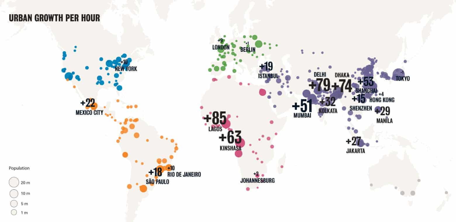
In 2015 The Guardian posted a couple of interesting maps highlighting the trends of urbanization. By 2050 the world population is expected to be 70% urbanized. Here is a map showing how many people are added each hour to the world's large cities.
https://i.guim.co.uk/img/static/sys-images/Guardian/Pix/pictures/2015/11/19/1447951960277/6feee86c-cf4f-45ea-a3bc-e21de6c1fe2e-2060x1003.jpeg?w=780&q=20&auto=format&usm=12&fit=max&dpr=2&s=bdd964404817092bf812e4484766999c
The data is from the London School of Economics Urban Age program. The map is a bit hard to read. Numbers are sized by city growth, making lower growth cities like London hard to read. Since the dots are already sized by number they could have kept the numbers all at a readable size. Also using a different color for each continent is somewhat pointless. Nevertheless the data is interesting-Lagos gains 85 new residents every hour while Rio only gains 10.
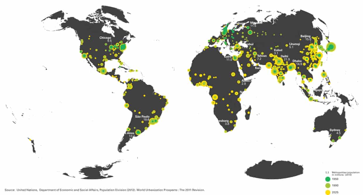
The map below shows past and projected growth by time period.

https://i.guim.co.uk/img/media/8969e81e3b29dbcc0a6059dd7c2ff39b9f962e51/23_480_3228_1732/master/3228.jpg?w=620&q=20&auto=format&usm=12&fit=max&dpr=2&s=9837146295d0c8aaf4331c7d1734efbe
Green cities saw most of their growth occur by 1950 while the more yellow ones are currently seeing the most growth. Some cities, particularly in India have a more mixed pattern of concentric circles showing steady growth throughout past and future decades. These maps are a bit hard to read at this size. If you click on them, you can see larger sizes. Here is a detail from the map above showing Europe vs South Asia and East Africa.
For much more on the urban footprint, environmental impact, economic development and land use see The Guardian

Wednesday, July 8, 2015

The Continental Poverty Divide

This map is a bit old (1999) but shows some interesting patterns in wealth and poverty. It is part of the Centers for Disease Control's Maps That Make a Difference series. Among other things, it highlights a north/south "continental* poverty divide."
http://www.cdc.gov/dhdsp/maps/gisx/mapgallery/Concentrated_Poverty.html

The map also highlights outlier counties-places in the south with lower levels of poverty and in the north with higher levels. Outliers in the south mostly seem to be around large cities, mostly in the suburban counties. There are clear rings around Dallas, Atlanta and Nashville.

Northern outliers are more diverse. The most clear ones are the counties with Indian Reservations but there also seem to be concentrations in counties with colleges and military bases. Also, some of the larger cities show up such as Detroit, Milwaukee, Philadelphia and Baltimore. Partially this is a result of these cities being either independent counties, or taking up most of the county with much of their wealth concentrated in the adjacent suburban counties.

*It is US-centric to refer to this as a "continental" divide but given the demographics of Canada, Mexico and Central America, this may very well be an accurate description.


Wednesday, February 18, 2015

The World's Megacities

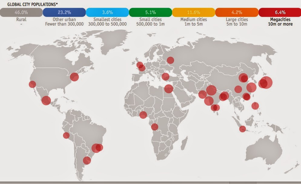
The Economist has a bubbly interactive map/video of the world's megacities (those with a population of 10 million or more) from 1950 to 2030. According to these population figures, from the United Nations, nearly 9% of the world's population will be living in 41 megacities by 2030. The video is a bit slow because it cycles through every year for the 80 year time period. Here are some stills from now, then and the future.
Megacities are shown as red proportional circles. In 1950 (above) there were only two megacities, New York and Tokyo. Today (2015) there are numerous megacities, mostly in Asia. 
By 2030 the most noticeable growth of cities will be in Africa.
The UN data are usually for metropolitan areas, including suburbs, but some of the populations are listed for the "city proper." These inconsistent figures provide good ammunition for the complain-y comments at the bottom of the page. 

You can search a city or click on one for a graph showing that city's population curve.The vertical line indicates the chosen year, in this case 2014.
Beware of the constantly changing y-axis when comparing cities.
You can also click the legend at the top to turn on or off size categories of cities. So if you want to only see the megacities of 2015, you get this.
The UN has its own version of these maps. They're not as flashy but they shade the countries by percentage of urban population which is a nice touch.
The smaller circle sizes create less drama but the map still effectively tells the same story.

Wednesday, May 14, 2014

Your State's Third (or Second) Language

The American Community Survey shows that English is the most commonly spoken language in all 50 of the United States. This makes for a pretty boring map. Slate has a set of maps that dig deeper into the data to see what other languages are spoken. Spanish is the second most commonly spoken language in 43 states so that map is still not very interesting. However when you remove English and Spanish and look at the third (or second for 7 states) most common language things get more interesting.
http://www.slate.com/articles/arts/culturebox/2014/05/language_map_what_s_the_most_popular_language_in_your_state.html
This type of map should be taken with some caution as the numerical differences between languages may not be very large. Also one large urban area such as Detroit, with its large Arabic population can bias an entire state. If I had more time I could look this up but I would guess that not many Michiganders speak Arabic in the Upper Peninsula, or even north and west of Pontiac. Still, it's interesting to see how some of the original settlement patterns of the US have persisted (Navajo in the southwest, German in the midwest, and pockets of French, Italian and Portuguese in the east,) while other states show more recent settlement patterns such as Filipinos in California and Nevada, Vietnamese in Texas, Oklahoma and two other states, and Korean.

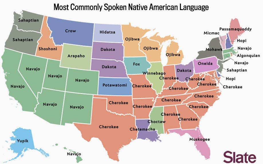
The article has several other maps showing the most common Scandinavian, South Asian and African languages. These are based on much smaller numbers so they're not as meaningful, yet there are still some regional patterns that emerge. More interesting is the map of the most common Native American language. The map mostly reflects original or sometimes forced settlement patterns, but also shows some long distance migration, particularly of the Navajos.
http://www.slate.com/articles/arts/culturebox/2014/05/language_map_what_s_the_most_popular_language_in_your_state.html
For more details and maps go to Slate.

Wednesday, February 6, 2013

The Newberry Library-Part 3

In addition to the vast holdings that can be accessed in the map room, the main sections of the library also have a treasure trove of maps on the walls and in the stacks. I had the opportunity to examine and photograph their prints of the remarkable "Maps Descriptive of London Poverty, 1898-9" by the British philanthropist Charles Booth.  These maps are part of a 12 volume set in which he colored in each block of a set of Ordnance Survey maps from 1897.

The information for each block was gathered by social investigators who followed policemen on their beats. The comments of the police officers were combined with their own personal observations.
The color scheme is described by Booth as follows:
Black: Lowest class. Vicious, semi-criminal.
Dark Blue: Very poor, casual. Chronic want.
Light Blue: Poor. 18s. to 21s. a week for a moderate family.
Purple: Mixed. Some comfortable others poor.
Pink: Fairly comfortable. Good ordinary earnings.
Red: Middle class. Well-to-do.
Yellow: Upper-middle and Upper classes. Wealthy.
From the above map you can see that Victoria Street was quite well off while very close by Great Peter Street was in the lowest two classes.

It appears, from this detail around Blackfriars Road in South London that the main streets were "well to do" areas, but there was lots of poverty along the back streets and alleys. The middle classes apparently didn't mind living by the lunatic asylum.
Below is another section on the edge of Regent's Park. I chose this partially uncolored section to show the wonderful detail of the old Ordnance Survey maps.
The London School of Econmics has an interactive version of these maps. You can scan zoom and pan to any section of London and see what it looked like in 1898.

Wednesday, July 18, 2012

1940s New York

The 1940 U.S. Census records were recently released by the National Archives. With a little work you can find any street (that existed in 1940) and see the census forms. They tell you the names, ages, occupations, salaries and state or country of birth for all residents. I was able to locate my mother and her family in South Philly. My father grew up in the Bronx and though I couldn't find him (his parents briefly lived in New Rochelle, NY), I was able to track down other members of the family at the apartment we used to visit in my youth.
The Center for Urban Research at the City University of New York (CUNY) has placed a 1943 market analysis of New York City online to give context to these census records. The page, Welcome to 1940's New York, has interactive maps and profiles for each neighborhood in the city.

Above is Highbridge, my father's neighborhood in the Bronx. The colors give an indication of wealth (based on rent and other expenditures) with the blues and greens at the low end and the oranges and reds at the high end. My dad's block is green, at the lower end of the spectrum.

The descriptions are also worth a read. "Highbridge is a heavily populated and good residential district." The "new and better buildings" are along the Grand Concourse, and the retail outlets "while small, are of a good class...." It makes me wonder how they would describe the African Movies Mall.

In the case of neighborhoods with a greater diversity of wealth, such as Greenwich Village, they added purple and yellow to the top of the wealth chart.


The description of Greenwich Village as "not a neighborhood of artists and writers" where "remodeling has changed many of the bohemian haunts" and it's popularity among "business couples" makes for an interesting early take on gentrification.

The interactive map overlays the demographic profile for every neighborhood, giving an overall impression of the geographic patterns of wealth and poverty, much of that unchanged today.


Wednesday, November 30, 2011

American Migration

Forbes has a very nice interactive map showing migration within the USA. Click on any county and you can see where people are coming from (in blue) and where they are leaving for (in red.) Hover over a county to get the specific numbers. Clicking the year under the bar chart will give you the figures from that year.


Data is from the IRS and a more detailed description can be found here. You can see the effects of the housing bubble when comparing 2005 to 2009 in certain cities, especially Las Vegas which went from mostly blue to an almost even split. The per capita income figures are also shown for each county. This shows that many cities and other areas are exporting wealth and importing poverty. Click the map above and explore.
Wednesday, May 18, 2011

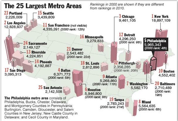
We're Number 5!

As children, we knew our city was the fourth largest and that it would always be that way. Then in 1990 something awful happened-Houston moved ahead of us. Still, we could take solace in the fact that our metropolitan area was number 4 and Houston only got ahead by swallowing up a bunch of suburbs. Now that the Census 2010 verdict is in we are number 5 on all counts and just barely hanging on. These maps from the Philadelphia Inquirer illustrate our angst.

 Dallas? Are they counting by number of parking spaces?


Using county based metropolitan areas creates some size anomalies and makes the maps look a bit goofy. Riverside? Why do they even get their own metropolitan area? It looks like they're including San Bernardino county also, making for one huge skyscraper that is mostly desert.

The north facing perspective also means losing San Francisco and Baltimore behind their larger "neighbors" but if you flipped it around you'd lose San Diego so something had to give. Of course all of this seems pretty insignificant when compared with the largest cities in the world. A little perspective goes a long way.

Wednesday, April 27, 2011

Map of the Week-US Population Change

It's that time again when redistricting claims much of my time at work. I don't work directly with the overall US population figures, but I've been exposed to lots of ugly, poorly designed maps showing population change across the country. This map from Brookings Institute Demographer William H. Frey is one of the better ones though it's not clear if he's using the final 2010 Census figures or one of the estimates.


The resulting patterns are fairly predictable and consistent with previous decades. The ring around Minneapolis nicely exemplifies the exurban migration that may finally be starting to ebb a bit. The continuing growth of areas with the poorest access to fresh water is not really news but shows up clearly.

What is interesting is how many counties are losing population. The population loss in the Great Plains is old news but the huge number of counties in the less than 10% loss category is surprising. Unfortunately the pattern is lost a bit by the dull color choice for that category.

Wednesday, January 26, 2011

Map of the Week-What's in a Surname?

The latest issue of National Geographic includes this interesting map showing the most common last names (according to phone directories) by state.

The map is color coded by origin of surname with the most common blues indicating the United Kingdom (England, Scotland and Wales.) By clicking the map above you can zoom to a more readable level of detail. Here is the north to northeast part of the country.


Way up in Maine there are some French (via Canada) names. New England has some Irish names, New York and New Jersey have Spanish and a touch of German in Pennsylvania. Out in the Upper Midwest the brown Scandinavian and orange Germanic names are much more common.

Now for a short critique: By only using the most common names, a level of diversity is missed. For example, Asian names appear almost exclusively in California and Hawaii. The lack of state boundaries makes some distinctions difficult although the map looks cleaner without them. The by state format also has the effect of pushing the New York metro area Hispanic names out into the central part of the state where they are probably less common. Finally, a cartogram would have been more appropriate for this presentation, especially given the need to fit an equal number of names into each state. This format required most of New England to be considered as one state. A cartogram would have helped solve that and some of the other problems.

Tuesday, December 21, 2010

Map of the Week-Census Preview

Last week the New York Times put out this nice interactive map showing some of the latest data released from the Census Bureau. The dot maps are the most interesting. They nicely illustrate patterns of race:


and income:


The entire country is covered so you can zoom, pan or choose a location. If you zoom too far in you lose the patterns a bit and also get some misleading information because each dot represents multiple people, not individual households.


 To really see the patterns of segregation, zoom out.


Here's a larger city with a more diverse breakdown.


The income map reveals the inner city income holes that are prevalent in older cities like Baltimore, but less so in Washington D.C. where there is much more inner city wealth.


If you zoom out a ways the dots seem to follow county boundaries. Zooming in arranges them in a more realistic pattern. I'm not sure what algorithm produces that result.


Happy Holidays and may your next year be filled with new census maps!