Showing posts with label africa. Show all posts

Thursday, August 13, 2026

Follow up on the U.S. Africa Map Fiasco

I recently highlighted the embarrassingly bad map shown by the U.S. State Department in a post. The American Geographical Society just posted their response with the title State Department Africa Map Fiasco: Geography Matters. So Does Africa.The article was written by Dr. Lee Schwarz, former Geographer of the U.S. Department of State - a position also know as the GOTUS (Geographer of the United States). This position has been empty for a while. I just want to highlight a few quotes and this map from the BBC, that I had not seen before. It does a good job of showing exactly where the mistakes are.


The article states that while maps occasionally have errors “the fact that this map made it to the light of day may be more reflective of failures and shortcomings in our institutions charged with representing U.S. foreign policy than a cartographer’s slip of the pen.” Continuing “It points to a breakdown in basic oversight and, more troublingly, an assumption that no one would notice—or that it wouldn’t matter if they did.“ While Africa’s well known problems may be the first impressions westerners have it is also “home to over 1.5 billion people, thousands of languages, critical mineral resources, and some of the world’s fastest-growing economies. It is a continent central to global supply chains, climate policy, technological innovation, public health, migration, and international security. Africans are pioneering digital financial services, producing globally recognized entrepreneurs, expanding renewable energy, negotiating free-trade agreements, and flexing their muscles in international institutions.” 

There’s much more to read in the article plus a call for posters for their upcoming National Geography Awareness Week symposium Geography 2050: Africa Shaping Tomorrow.

Wednesday, August 5, 2026

U.S. Map Mislabels Every African Country

 At a global AIDS conference the U.S. State Department showed this map of Africa. 

-map via Reuters, reformatted to better fit the page.

Every country is incorrectly located and indicated with ridiculous shapes. Nigeria, where the US has troops deployed is shown in the middle of the Sahara desert and about twice its actual size. 

The Reuters article mentions a visible artificial intelligence watermark indicating it was made with OpenAI. It does bear similarities with other AI-generated maps, particularly the bulbous Ghana-Côte d’Ivoire mashup that points to southwestern Africa and the Cameroon dot going nowhere. The color scheme is awful too. A perfect example of bad AI meeting geographic illiteracy in an incompetent, uncaring government. 

Tuesday, December 30, 2025

Overlooked Mapping Highlights from 2025-Part 1

Many people are putting together their best of lists for 2025. I don’t have time to stay on top of all map content so rather than a best of, here is a list of inetersting map-related posts I’ve missed this year. Due to content length restrictions, I will break this into two separate posts so here is Part 1.

  1. Overthinking about vertical writing of Hangul labels on maps - Here is a wonky problem I have never considered in my cartographic career. Hangul is the Korean alphabet. In a system that can be written vertically or horizontally, how do you orient your text on the vertical (north-south) roads? Author Hanbyul Jo surveyed her Korean friends for a preference. When no clear preference emerged, she turned to Korea’s main map services, who approach the problem differently.


    I reformatted the maps above from the original post for ease of comparison. It may be a little difficult for westerners to interpret but you can clearly see how the number 12 is written differently. Next, she turned to paper maps with the conclusion that maps that mixed Hangul with Chinese characters tended to label these road vertically, while maps in pure Hangul went horizontal. 


The map above (Seoul City Map -Seongji Publishing, 2024) appears to be in the latter category. Mainly I’m showing it because it’s a nice looking map. While the author remained on the fence she considers maps with the vertical text “a precious example of two writing styles naturally mixed together”.

  1. A North Korean Atlas

While on the subject of Korea, Miguel from A Cartographer’s Tale acquired an electronic copy of a North Korean atlas from the early 2000’s. It is fascinating. The narrative is that the Communists won the Korean War and the country is united, as in this physical map of Korea.


Maps of other countries are shown in various colors but they chose gray for “enemy” countries such as the United States and Japan. Here is the United States, because it’s the country I know best. What are the red lines? Roads, railroads or just random lines connecting cities? They appear to loosely follow rail lines. Also, the city locations are odd. Note the major city in central Oregon, Perhaps that’s Portland but if so the location is way off. Is the furthest Northeast dot also Portland? The text is different.

The ocean current maps are nice though a bit hard to follow.


You can see many more of these maps at A Cartographers’s Tale.

  1. A Sketch of Isle Royale

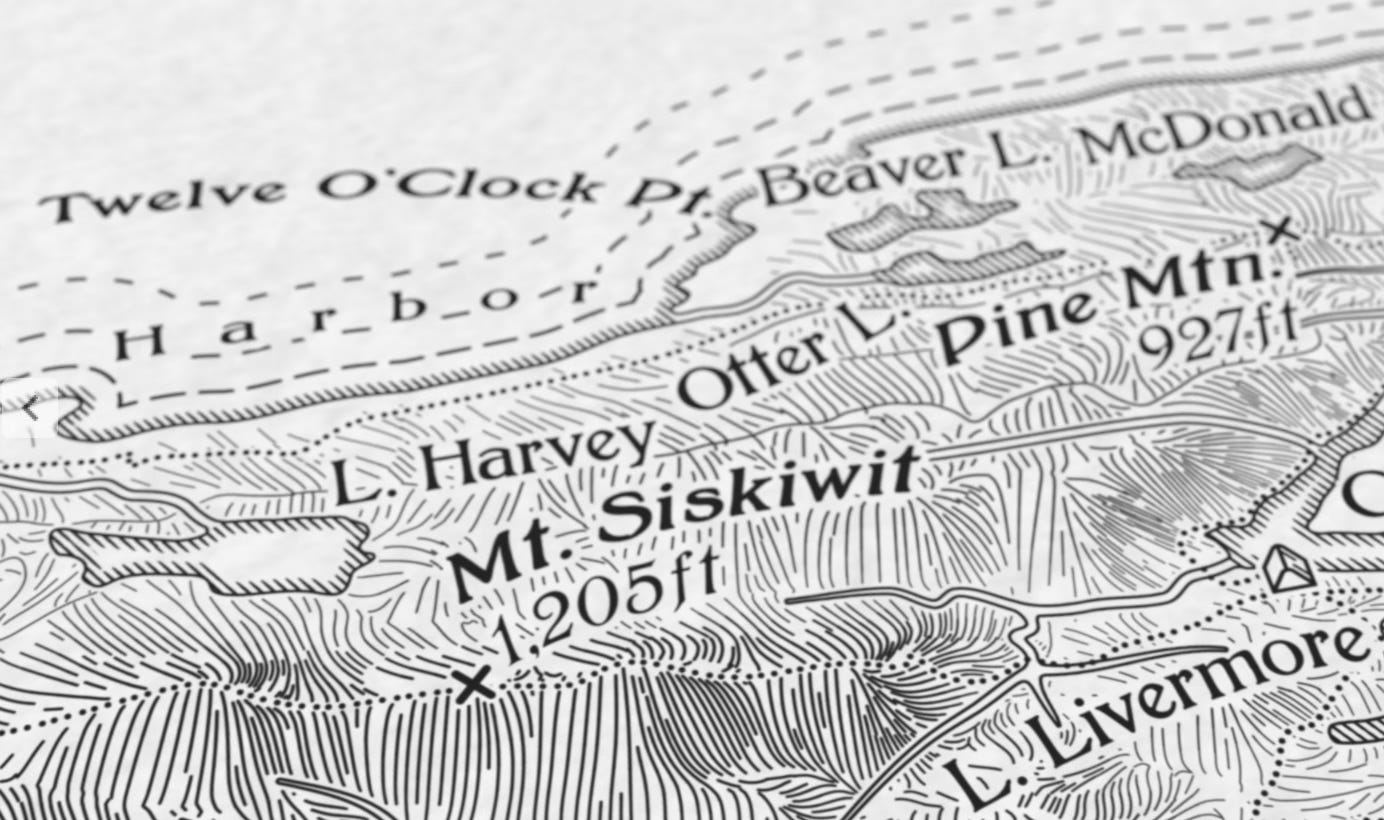
Daniel Huffman, who has always been generous about sharing his mapmaking techniques, made his first National Park map. It is a beautiful sketch of Isle Royale in Lake Superior.

The map uses a plan-oblique view, a hybrid between a bird’s-eye style view and an overhead (typical of most maps) view. If you’re interested in technique or want to buy a copy you can do so here.

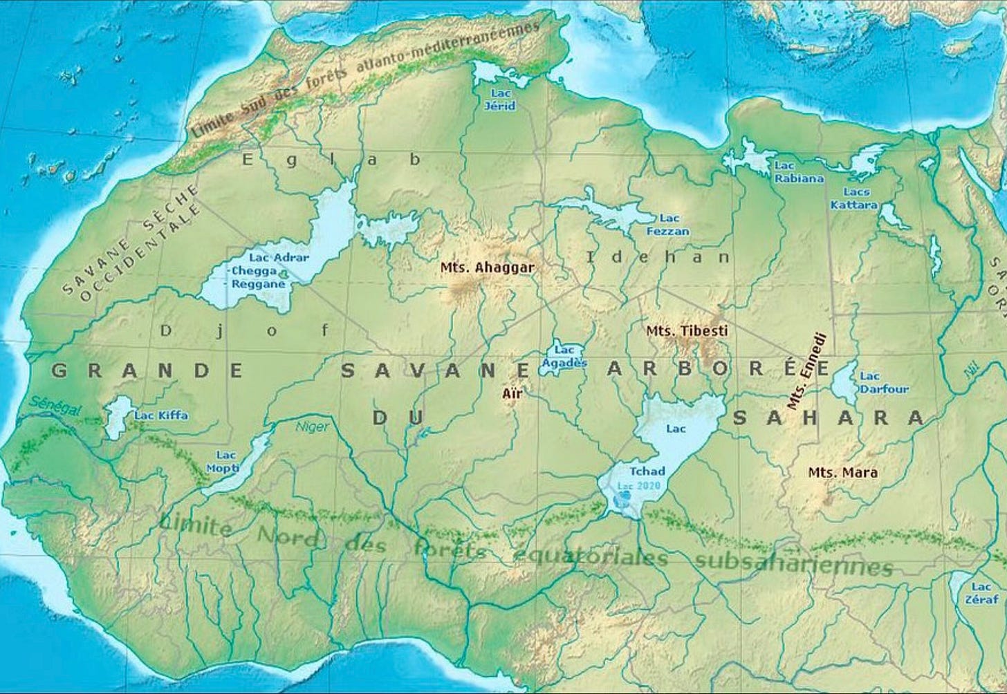
  1. The Sahara Desert and its Lakes

From that well known map site, Instagram comes this map showing northern Africa when it was a much more humid place, full of rivers and lakes. Aside from a few oasis towns, Lake Chad is about the only surviving water body and it is drying up.

This map came from Alex Vicente Conde who posts “bizarre maps” under @egm_bizarros. Translated into English from the author’s text: “This is what North Africa and the Sahara looked like 8,000 years ago at the height of the African Humid Period. 🙂 Subfossils of fish and other creatures that inhabited these lakes can still be found there today.”

More highlights to come, probably next week.


Wednesday, February 23, 2022

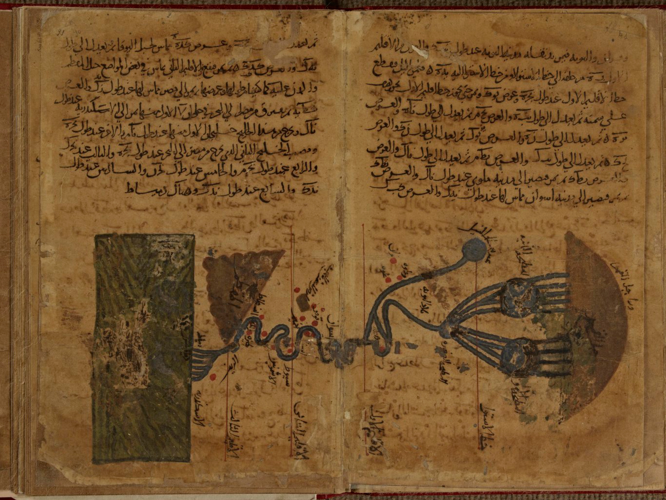
Al-Khwārizmī's Geography

Persian polymath Muḥammad ibn Mūsā al-Khwārizmī (c. 780-c. 850) had a huge influence on the development of algebra, the Hindu-Arabic numeral system, astronomy and cartography. His Kitāb Ṣūrat al-Arḍ (description of the Earth) was a major reworking of Ptolemy's Geography correcting much of his data for The Mediterranean Sea, Africa and Asia. Here is the earliest known map of the Nile River from that work,

some nice details of the origins and branches of the river, 

and the delta where it meets the Mediterranean.

The only surviving copy of this book is in the Strasbourg University Library in France. The copy is in bad shape and parts are almost illegible. Though latitudes and longitudes of thousands of places appear the world map is missing. Historian Hubert Daunicht reconstructed this map, the only copy I can find is this low resolution version from Wikipedia, showing the Indian Ocean.

For fans of "World Music" a band called Guess What named an album Al-Khawarizmi (with a slight spelling difference). The cover includes an early Islamic world map in the lower corner.

A previous post on this blog has a partial explanation of some of the elements of this map.


Wednesday, February 10, 2021

Shifting Place Names in Africa

This map from PisseGuri82 shows place names that are no longer in the same location as the current country.

According to this page they do not overlap "at all" though that is only true for the pre-colonial kingdoms. Some of these countries are remnants of previously larger kingdoms. For example, Guinea is named for the Gulf of Guinea which the modern day country does not border. Benin was a kingdom based in Nigeria with Benin City, Nigeria as its capital. Many of these names were either imposed by colonial powers or chosen when the countries became independent.


Wednesday, June 10, 2020

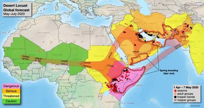
Mapping the Locust Swarms

Locusts have been deviating crops in Africa and South Asia in the worst attack in decades. This map, via Business Insider India shows where the swarms are and where they are heading.
The article is full of disturbing photos (if you don't like locusts) and details some interesting efforts to drive them away such as beating thalis (small hand drums) or playing loud music. A silver lining is offered in that these locusts are a healthy food option for birds and fish (people not mentioned) and can be profitable to those who catch them.

Wednesday, October 3, 2018

The Wealth of African Cities

Africa's economy is growing rapidly as are its cities. Population projections for 2100 show Lagos. Nigeria becoming the world's largest "megacity" with a population reaching over 88 million. This video shows the predicted top 20 cities in 2100, the top three will be in Africa. A map, via Visual Capitalist shows where private wealth is concentrated on the continent.
http://www.visualcapitalist.com/map-cities-hold-africas-wealth


Wednesday, March 28, 2018

New Hobby Part 2

Here's a color pencil map of West Africa I recently did based on the Times Atlas of the World.
By the time I got to the easternmost countries, the accuracy started to come off the rails. Ghana is way too narrow and I had to bend Benin to make it meet the corner of Niger. Here is a hastily done annotated version.
While gaining context it loses some of charm of the original. I might try to hand annotate it at some point.

In my previous post on this subject, I stated that I haven't done any hand drawn maps since childhood. However, I recently was cleaning up and found this watercolor painting I did in a college class. It was drawn from an atlas. I did this so long ago I don't remember the source but I think it was National Geographic. There was a page about the tectonic forces that created Pennsylvania's ridge and valley system with this map showing Blue and Second Mountain cutting through the Susquehanna River valley north of Harrisburg.

Tuesday, February 20, 2018

The Changing Geography of Wakanda

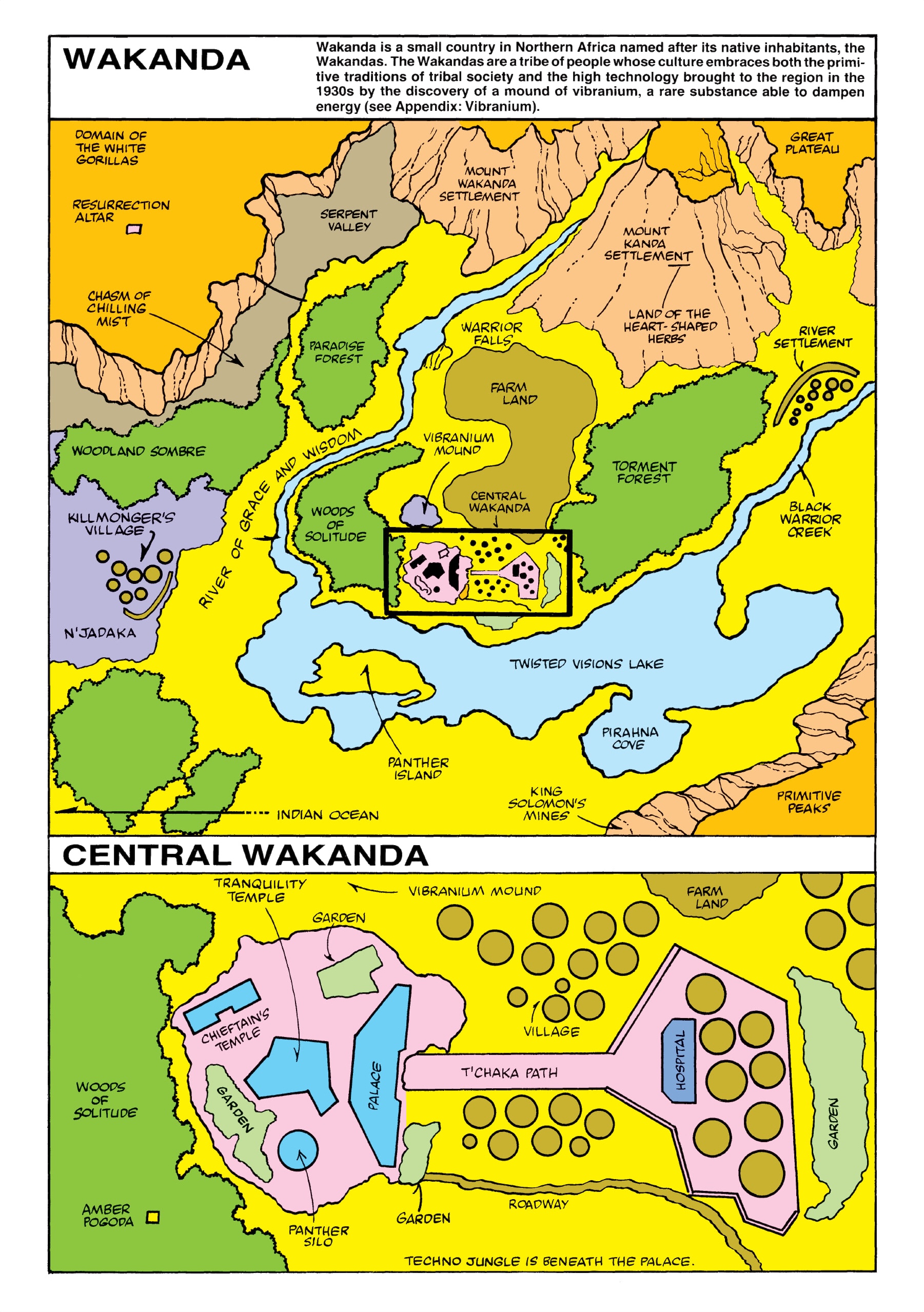
Black Panther is a huge Hollywood hit set in the fictional country of Wakanda. The lead character has been through many iterations since his first appearance in Marvel Comics in 1966, as has his country. Wakanda is the most scientifically advanced country in the world. Isolation has enabled it to resist colonization and to develop its own independent technology. 

The first map, from Jungle Action Volume 2 #6, shows the Atlantic Ocean in the lower left placing Wakanda near the west coast of Africa.
https://vignette.wikia.nocookie.net/marveldatabase/images/3/33/Wakanda_from_Official_Handbook_of_the_Marvel_Universe_Vol_1_12.jpg/revision/latest?cb=20160509081608
A couple of episodes later the map was re-presented "with new details." The Atlantic Ocean was removed, probably to place Wakanda more in East Africa. Killmonger's Village is no longer a coastal settlement. There is an arrow in the bottom left of the map pointing to the Indian Ocean. There is speculation that they "flipped" the map (south is now up).
This became the definitive version of the map for decades. In 2008, Marvel published its Atlas of Fantastic Places giving a precise location of Wakanda and neighbors between Ethiopia and Kenya.
https://peterslarson.com/2016/05/14/the-fictional-nation-of-wakanda/
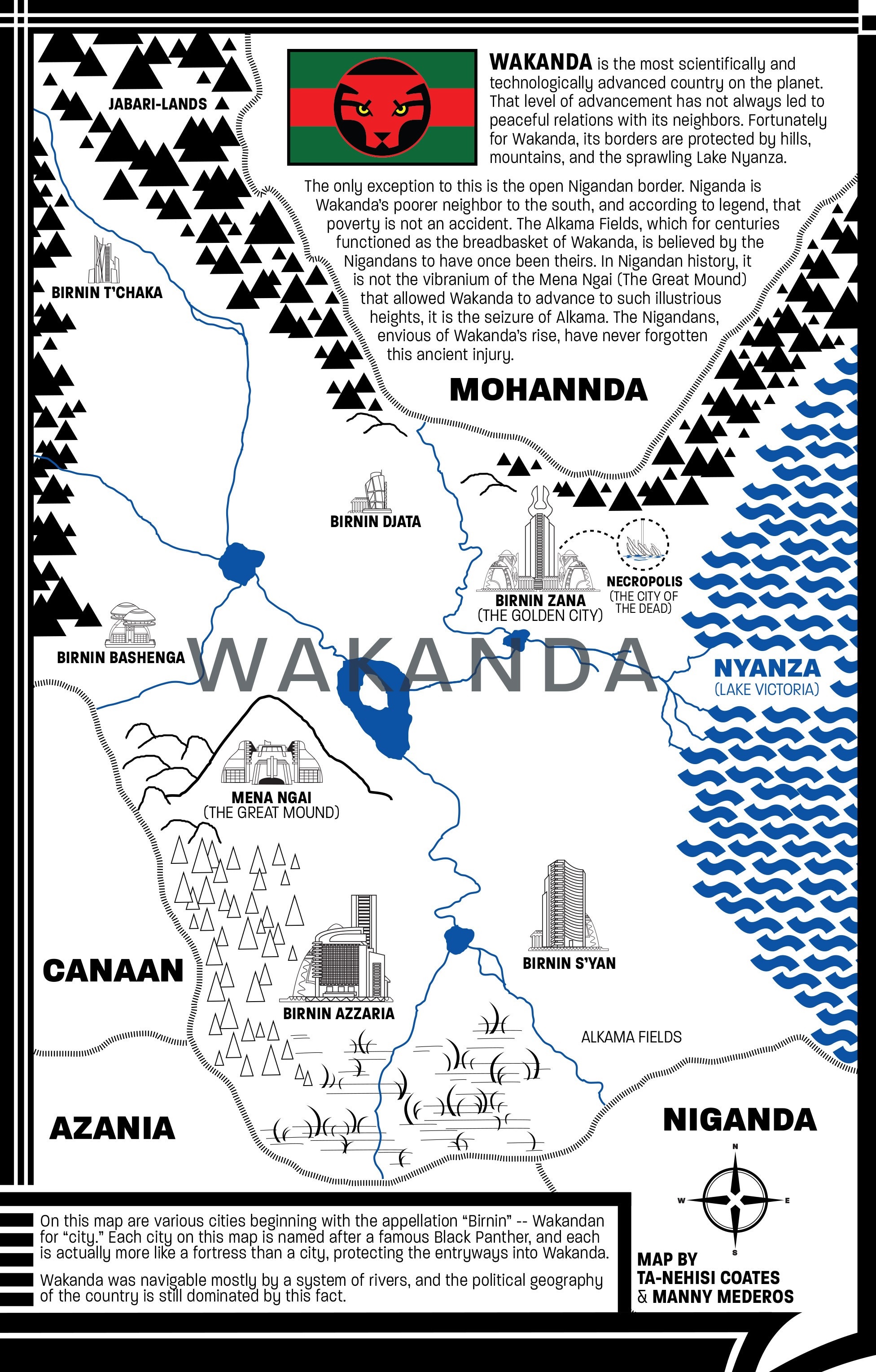
In 2016, a new version of the comic was written by Ta-Nehisi Coates. He drew a couple of new iterations of the map placing it on the western shore of Lake Victoria.
https://www.theatlantic.com/notes/2016/04/the-world-of-wakanda/479466/
The map above was created in Photoshop. Coates discusses his process in this article from The Atlantic. A later, more detailed version was done by Coates and Manny Mederos.
https://vignette.wikia.nocookie.net/marveldatabase/images/c/c5/Wakanda_from_Black_Panther_Vol_6_4_0001.jpg/revision/latest?cb=20160727172642
In the recent movie Captain America: Civil War, Wakanda appears to the northwest of Uganda, close to the location from Marvel's atlas. Here is a screenshot via comicbook.com
http://media.comicbook.com/2018/02/wakanda-1085186.jpeg
The current movie has it slightly to the southwest of the Coates map bordering on Rwanda's Lake Kivu. The image below is from Marvel's Black Panther: The Art of the Movie

Wakanda's location in Africa revealed in art book
Where will it move next?

Wednesday, November 15, 2017

Water: An Atlas

Guerilla Cartography is an organization that uses creative and artistic mapmaking to foster collaborative knowledge and promote cooperative ideas towards today's major problems. They created an excellent food atlas. Their second one, Water: An Atlas is being printed and should be ready to ship by the end of November. You can pre-order a copy here. They were nice enough to send me some sample pages. Here are a few details from some of the maps.
The map above is from a page titled "Water Availability for Food Security in African Cities" It looks at the challenges of a rapidly growing and urbanizing continent. City dots are sized by population and major cities have an outer circle divided into three colored sections indicating whether water and wastewater are separated and whether the city has a master plan for managing each.

There is also a diagram of the water cycle and a graph running diagonally down the page showing the availability of improved water (dark blue) wastewater treated (gray) and water consumption (the bars underneath) in daily liters per person.
Here is a small version of the page to show how these graphics fit together.

Another map was a commission from the Scotland Environmental Arts Festival by Andrew McAvoy showing the area with a focus on the water courses.
The hand drawn map is presented at three different scales. Above is the larger Southern Uplands region, while below is a detail around Morton Castle, the festival site with suggested exploring routes.
More maps and photos from the festival can be seen here.

Finally, "Pink Salt Lakes" maps out water bodies that are colored pink due to two types of reddish algae.
The map has a kind of checkerboard pattern with pictures of some of the lakes interspersed. Below is a picture from California's South Bay Salt Ponds-I once flew over these and wondered why they looked so weird.
Australia has many pink lakes including one named Pink Lake.

Tuesday, December 6, 2016

The CIA is Watching Elephants Too

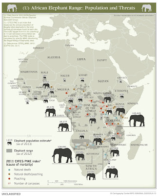
The US Central Intelligence Agency (CIA) recently declassified a bunch of their maps. You can see them on their flickr page. The most strikingly unusual one is this map of elephant populations in Africa.
https://www.flickr.com/photos/ciagov/30249979363/in/album-72157674854391962/
The map is dense with information, yet fairly easy to interpret. Each country is given a 2013 population estimate with an elephant sized accordingly. Elephant range is shaded in gray and places where dead elephants have been found are color coded by the 2011 CITES index-a ratio of natural deaths to deaths by poaching. Areas with heavy poaching have red dots. However, the map might benefit from proportional dots  - below the dot for the 31 deaths is the same size as the dots representing 1.
They also have a well done map showing ivory smuggling figures and destinations based on seizures.
https://www.flickr.com/photos/ciagov/30885483595/in/album-72157674854391962/


Wednesday, August 24, 2016

The Human Impact

Via - National Geographic
A new study published in the journal Nature Communications, based on satellite imagery and other data from 1993 and 2009 maps the human footprint in those years. The good news is that the human footprint has not grown in direct proportion to population or the economy. However, some of the most intense pressure on the planet is being felt in places with the highest diversity of plant and animal life.
http://news.nationalgeographic.com/2016/08/human-footprint-map-ecological-impact/

The above map shows the current footprint with the least impacted areas in blue and the most impacted in yellow and red. The map below shows the change in our impact on the planet between 1993 and 2009. Some of the wealthier areas have seen improvements but many of these are also areas that are already highly impacted.
http://news.nationalgeographic.com/2016/08/human-footprint-map-ecological-impact/
The National Geographic article discusses how we can help save our biodiversity by focusing protection efforts on species-rich areas such as the Amazon Basin that are seeing significant impact. There are also links to the Wildlife Conservation Society's interactive maps where you can see the current footprint and change for any chosen area.
http://wcshumanfootprint.org/HF2change/
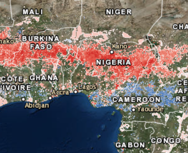
In the above change map areas of increasing pressure on the environment are in red and decreasing pressure is in blue. Areas not colored have seen little change. Much the Midwestern farming areas have seen decreasing pressure while the red areas include outer suburbs and areas of resource exploitation such as natural gas fracking. Africa has seen a great increase in pressure in the semi-arid Sahel region. Europe has a bit of and east/west split with the east seeing increasing pressure.
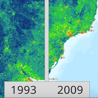
The other interactive map includes a slider where you can compare the human impact in 1993 and 2009 as shown here in southern Brazil and Uruguay.
http://wcshumanfootprint.org/HF2swipe/
These maps can be explored further by clicking on them or at this link.

Thursday, July 28, 2016

Greenbar Africa

 When I was a child, my dad would bring me computer drawings from work on greenbar paper. An early computer map of Maryland that appeared in Cartographic Perspectives reminded me of those drawings.
http://cartographicperspectives.org/index.php/journal/article/view/cp81-monmonier/1441
I began to wonder how I could re-create such a map using modern GIS tools. It turned out to be remarkably easy. Here it is again, enlarged a bit.

Wednesday, September 30, 2015

Africa Re-Imagined

Swedish artist Nikolaj Cyon created this map of what Africa might have looked like if it had not been colonized by Europeans.
http://www.cyon.se/#!alkebu-lan/ck0q
The map uses linguistic, natural and ethnic boundaries. The straight lines that the colonizers drew are conspicuously absent.
The map was cobbled together from various historical maps such as this one from the Geography Department at the University of Dakar.
Other non-traditional aspects of the map include the use of the Hijri Year (AH) from the Islamic lunar calendar, a scale in iterus (an ancient Egyptian unit of measurement), alternate names for the "Ikweta" and tropics, and the orientation  - south is up. For those of us in the northern hemisphere think of colder part at the top and maybe it will make more sense.

Also, note the treatment of Europe, or Frangistan. I think this is meant to show a reverse colonization, but it is not explained on his site.
There are lots of beautiful cartographic touches such as the water lines and the effective National Geographic-style shading of the boundaries. The traditional craft evoking map borders are also nice.

Cyon has an online presentation where you can see more details of the process.