Thursday, May 31, 2018

Iceland in Maps

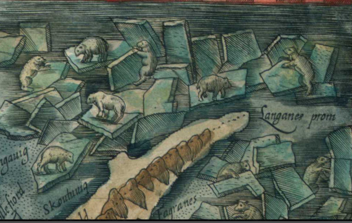
A few days ago I was in Iceland. They like their maps there. Here are some examples.
They post maps along the side of the roads and where entering towns. Above is one near the Þingvellir National Park. The one below, in Stokkseyri, shows the extent of the largest lava flow on earth (since the ice age) - stopped finally by the ocean.
A 3D model of the Snæfellsness peninsula in the visitors center at Snæfellsjökull National Park.
Monument to Jules Verne's Journey to the Centre of the Earth - the book's descent begins at the volcano above,
but the nearby monument has a hole (next to the wooden pole) where you can start digging. The sign below lists distances through the earth - the second distance is along the surface.
A map of the continental plates at the Bridge Between Continents near the Keflavik airport.
The bridge crosses a chasm formed by the separation of the plates. The rock walls on either side are the two continental plates.
Of course, I also accumulated many paper maps. Here was our most used map - the Islandskort series from Fixlanda.
Geothermal pools in the Reykjavik area.
Finally, here is a beautifully detailed map from Iceland's Geodætisk Institut that I bought at the Reykjavik Flea Market. The map is dated 1990 but the survey date is 1920.
I have lots of great scenery pictures too but the maps are the real highlights.

Friday, May 25, 2018

Update to the last post

I'm having technical difficulties on the road so here's an update via Twitter

Wednesday, May 23, 2018

This Map of Iceland Has it All!

This map of Iceland*, part of the Theatrum Orbis Terrarum** by Flemish cartographer Abraham Ortelius has all kinds of interesting stuff going on.
https://myndir.islandskort.is/map/Kortgerd_Abrahams_Orteliusar_10/Islandia_30/650/2012-04-25-09-29-38.jpg
From wonderfully detailed volcanoes,
to fantastic sea creatures with descriptions in the text keyed to letters.
This description is from a listing on Barry Lawrence Ruderman Antique Maps. Some versions of this map have the letters next to them and some do not.
H. The largest kind of Whale, which seldom shows itself. It is more like a small island than like a fish. It cannot follow or chase smaller fish because of its huge size and the weight of its body, yet it preys on many, which it catches by natural cunning and subtlety which it applies to get its food.
This map includes an early explanation of how polar bears arrived, drifting on sea ice.

In the right of this image are tree trunks that after some violent storms have been "torn off by their roots from the cliffs of Norway, tossed to and fro, and surviving many storms, finally cast upon and coming to rest at this shore."
The title block - differently colored in different versions.
In the lower right is a dedication to the "Illustrious and powerful Frederic the Second, King of the Danes, Norwegians, Slavs, Goths etc., his most merciful Majesty."
The level of detail of this map indicates that although it is credited to Ortelius it was probably drawn by an Icelander, most likely Gudbrandur Thorlaksson who mapped the island in the early 1600s. His list of churches and fjords was used and there is much local knowledge that is unlikely to have come from Ortelius.

There are several versions of the map online, the images above are from the following:

Barry Lawrence Ruderman Antique Maps - this page has the translations I used and some good historical context.

Islandskort

Wikimedia

*Where I am currently staying.
** "Theatre of the World" - considered to be the first modern world atlas.

Wednesday, May 16, 2018

Canadian Checkerboard - Part 3

Here is my final Canadian Homesteading map. Moose Jaw Land District.
It is not as colorful as the Northern Alberta map but is similarly effusive about the quality of the land.
Like the previous map each grid cell is a square mile section.
There is not much topographic change here so the "mountains" really stand out.
This map was accompanied by a Saskatchewan Railway Guide
One of the interesting things about this is the ads along the edge for sheaf loaders, livestock brokers, mattresses and overalls.

The back of the map has a yellow detailed map showing ownership of quarter sections around Hodgeville. 
 The apparent purpose of this map is to advertise gopher poison.
 "$276,000 worth of grain sown on the land in this map was destroyed by gophers. My own Gopher Poison will save this year's crop. Get a package either from your council or dealer. Cheapest poison obtianable when you count results. Made only by ANTON MICHELSON COMPANY, Ltd, Winnipeg."


Wednesday, May 9, 2018

Santiago Wins the Cup!

There are more Canadian Homesteading maps but I'm taking a break this week to share some exciting news for Santiago residents and loyalists - you won the Transit Maps World Cup! Here is the winning map.
http://transitmap.net/image/162074391045
Some delicious downtown detail.
It's a clean and simple map but more than that, it benefited from a huge push on social media. A quote from the Transit Maps article.
Without a doubt, this win was engineered by a huge social media blitz within Chile which mobilized a large number of people to vote for “their” map. I don’t really think that the Metro itself was entirely responsible for this, as the groundswell of support started more organically than that and only spread to the Metro Twitter account in full for the semi-final and final. The Chilean Ministry of Transportation also got involved, and even the Mayor of Santiago tweeted about it. If that wasn’t surreal enough, Channel 13 produced a four-minute news report about the final result, and the tournament also got coverage in local press. No other city came close to matching the passion and word-of-mouth that Santiago produced, though Vancouver and Sao Paulo also had some good social media efforts.
I thought this competition had turned into a bit of a popularity contest but I didn't expect this result. Here are the final brackets.

more on the competetion here

Wednesday, May 2, 2018

Canadian Checkerboard-Part 2

Last week's post featured a map of Alberta, Saskatchewan and Manitoba showing lands available for homesteaders in 1918. Here is a much more detailed map of Northern Alberta, beginning a bit south of Edmonton. Grid cells are 1 mile square sections.
Here are some detailed views.

The meanings of the categories in the legend are a bit unclear to me but the lightest orange are lands reserved for soldiers. These are mostly in the northern and western parts of the province. The middle orange are lands the are "finally disposed of" meaning they have been claimed and are being actively used as homesteads, schools or other. The red squares are "unpatented (entered for, sold or reserved)" - possibly meaning that a claimant is working on establishing a homestead. The uncolored (white-ish with some yellowing of the paper) areas were surveyed and available (my assumption) to be entered as homesteads.

These maps also show parks, timber berths, coal seams, tar sands, borings for oil and gas and grazing leases.
As seen below, most of the land in and around Edmonton has been transferred to private owners.
There is a lot of unsurveyed land (another assumption based on no grid lines) but the map comments seem to be trying to sell people on the virtues of these lands with comments about the high quality of the water, soil and potential for industry.


I'm ready to move here!