Wednesday, September 25, 2019

Highlights from "Mapping a Nation"


This past Saturday I got to see Mapping a Nation: Shaping the Early American Republic at the American Philosophical Society in Philadelphia. The Museum space is small but they packed a lot into that space including maps, surveying instruments, original notes from the Lewis & Clark expedition and printing plates. The introductory text has some interesting takes on the history of the 18th and 19th Centuries describing maps as "battlegrounds" between European empires, Native Americans and colonists. "Even as mapmakers sought to represent a connected and united citizenry, maps reinforced the exclusion of many groups from full participation in the new nation."

Here is a plate from a history of the Lewis & Clark expedition. As usual with these exhibitions, apologies for the light reflections and inability to take better photographs.

A circa 1750 map by John Bartram shows the location of sea shell specimens he collected in the Appalachian Mountains, suggesting that the region was once underwater. He apologizes that the map is "clumsily done, -having neither proper instruments nor convenient time."

Here are a couple of maps of the Susquehanna River area of central Pennsylvania from 1757 originally drawn in chalk by Teedyuscung, a Lenape negotiator during a council in Easton, Pa. where several tribes agreed not to side with the French against the British in return for a promise that the British would not settle west of the Appalachians.

A detail from a map of Maryland and Virginia, 1775.
For credits, here is the cartouche.
There are  a couple of very detailed maps of Haiti during the time of the rebellions around 1799-1801. The United States intervened on behalf of the Haitians in order to protect U.S. trade. Unfortunately I did not make a note of the map's author or date.
The area around Jacmel where much of the fighting took place.
Finally, "Map of the Columbia to illustrate Ross's Adventures" just because I like the little singular puffy mountains.

The exhibit runs until December 29th and includes a three day conference in October.

Wednesday, September 18, 2019

Mapping the Nuclear Fear

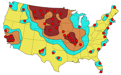
I've lived in many different places in the United States and one thing that people in every place seem to have in common is the belief that their region is a primary nuclear target. I came across this map on a Reddit thread that I can no longer locate. The thread was full of anecdotes from all over the country of people being told that their town was one of the top targets of the Soviet Union back in the Cold War days.
The map is from the Federal Emergency Management Agency (FEMA) and dated September, 1990. Though I lost the thread, it was posted by Daniel Reetz. Here is the caption
Reddit is full of these kinds of maps and threads. Some of the maps are based on out of date information and show decommissioned sites. Here is a typical example of one of these maps showing two different scenarios - the black dots are mostly military installations while purple triangles are population centers. The comments are filled with people who are either proud to live in a targeted area or sad that their town isn't important enough to nuke. 
https://external-preview.redd.it/XRkc93B75o_newgXSZwdVV2Lwnkcnqvpc0wvmOowtu4.jpg?auto=webp&s=aed5129645baeadf7887451dbb9d69cf247a69f9
Here is another map focused on the military installations with the colors representing fallout areas.
https://www.reddit.com/r/MapPorn/comments/1ym41m/femaestimated_primary_targets_for_soviet_icbms/
Here are evacuation routes for St Louis County via Reddit- this assumes an attack on downtown when there may be various other targets throughout the city and county.
https://external-preview.redd.it/FQoRGhom7-6tOP8YnQjScrRz-7JXidJ42YQkCH5ajQY.jpg?auto=webp&s=3164854ad6e731a9d8d7723b76312100405baa83
Of course, the United States was not the only place threatened. Here is a scary map of a 1970 Warsaw Pact plan for attack on northwestern Europe - highlighting the Copenhagen region of Denmark, via War is Boring.
Australia too-click for link.
https://antinuclear.net/2014/10/18/us-spy-facilities-at-pine-gap-and-nurrungar-are-targeted-by-russian-nuclear-missiles/
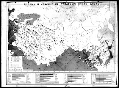
Here is a very detailed map of places in Russia (and Manchuria) targeted by the United States in 1945.
http://blog.nuclearsecrecy.com/wp-content/uploads/2012/05/1945-Russian-and-Manchurian-Strategic-Urban-Areas.jpg
This map is from the Nuclear Secrecy blog, a blog that also features Nukemap, where you can choose your bomb and location and see where the  extent of destruction. There are more recent maps showing the primary targets in Russia that I am not authorized to show (though you can Google them) - mostly production facilities for various metals and oil refineries.

Here is a communist propaganda map showing Russia encircled.
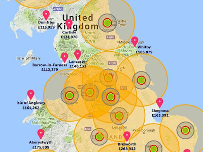
Finally here is a real estate agent's map of where it is safe to buy real estate in the event of an all out nuclear attack on the U.K.'s to 20 cities - via the Shropshire Star.
https://www.shropshirestar.com/news/viral-news/2017/08/11/an-estate-agent-has-drawn-up-a-map-showing-the-best-places-to-avoid-nuclear-fallout/
See you in Lancaster, or Aberystwyth.


Wednesday, September 11, 2019

Deaths in the Desert

Since 1999 over 2000 people (probably even more since this source is a few years old) have lost their lives crossing the desert in southern Arizona. Traditional border crossings have been closed off forcing many migrants to cross in desert areas - places where the government thought the harsh conditions would deter people from crossing. These deaths have been documented by the Tucson Samaritans, a group dedicated to saving lives
http://www.tucsonsamaritans.org/uploads/5/5/9/6/5596304/2015-2016-whole-area_orig.jpg
 Here is a closeup of the Ajo sector for a better idea of the terrain.
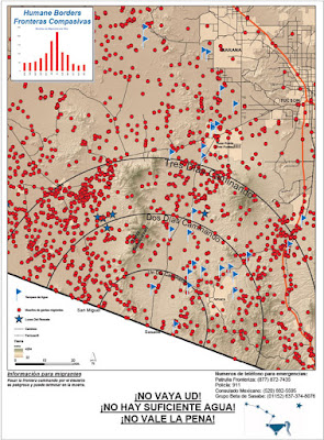
Humane Borders, another group of volunteers trying to save lives, made posters for distribution on the south side of the border warning potential undocumented migrants of the dangers they face trying to cross through the desert on foot. The text in Spanish at the bottom translates to “Don’t do it! It’s hard! There’s not enough water!” The posters include estimated walking times from various entry points, as well as the sites of migrant deaths and the location of water stations.
https://www.humaneborders.org/wp-content/uploads/sasabe_poster_913_2016.jpg
They also created maps showing deaths that include location of water stations, rescue beacons and land ownership,
as well as an interactive map where you can look up names and filter deaths by location, year, land type or cause. Here are deaths from exposure.
A closeup of an area near the Organ Pipe Cactus Wilderness gives a good sense of how bleak the landscape is.
A click on the points helps to humanize each death-something many of our politicians are unwilling to do.


Wednesday, September 4, 2019

Monochrome Mapping

Cartographer Daniel Huffman hosted a monochrome mapping competition on his blog. He posted the results yesterday. Keep in mind that monochrome does not necessarily mean black and white. It refers to two colors, usually a foreground color (often black) and a background color (often white) with shades (ie. grays) of in between color. In the case below the foreground color is green with a pink-ish background.
Sarah Bell - Inland Northwest Washington Art Deco Map
Here are some of my favorites. Click on them to see the maps in their entirety.
https://somethingaboutmaps.files.wordpress.com/2019/08/cl.jpg
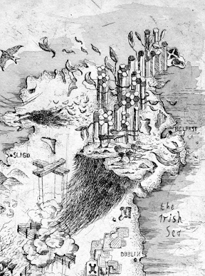
Ireland by Alex Hotchkin. Some of the details are a bit fanciful and I'm not sure what those stone (?) formations are north and west of Belfast. Here is a bit of the southwest.
https://somethingaboutmaps.files.wordpress.com/2019/08/cl.jpg
For a more computer produced but still beautiful look here is an Appalachian Trail fold out shelter map by John Nelson and Erich Rainville using a blue-white color scheme.
https://somethingaboutmaps.files.wordpress.com/2019/08/ak-1.jpg
Here is a map of Iturup, one of the Kuril Islands by Heather Smith. The hand drawn topographic shading is particularly nice.
http://www.heathergabrielsmith.ca/maps/html/iturup.html
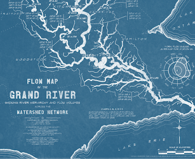
A flow map of the Grand River in Ontario by Warren Davison done blueprint style.
https://somethingaboutmaps.files.wordpress.com/2019/08/ah.jpg
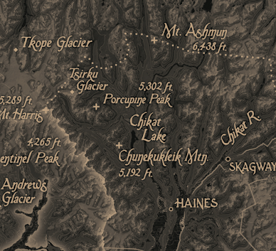
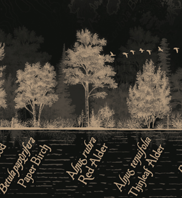
Finally this brown (bistre) and black map of Alaska's Tongass National Forest by Evan Applegate, Matt Strieby, Aiyana Udesen, and Ezra Butt.
https://somethingaboutmaps.files.wordpress.com/2019/08/ce.jpg
The map faeturse a diagram of the trees of the area at the bottom,
https://somethingaboutmaps.files.wordpress.com/2019/08/ce.jpg
and this nicely done locator map, accompanied by colorful text such as "glaciers hemorrhaging water so blue it hurts your teeth to even look upon't...." It also contains a plea to "write some checks" to prevent the "moribund timber industry" from knocking down more of the old growth forest.
https://somethingaboutmaps.files.wordpress.com/2019/08/ce.jpg

Other highlights include a stunning relief map of Peru, a hand drawn historic map of Paris and a "wealth topography" of LA. To see the full range of maps go here.