Showing posts with label north carolina. Show all posts

Wednesday, December 20, 2023

Where Your Christmas Tree Comes From

A recent map on maps.com (an Esri run map site) by Joshua Stevens shows where Christmas trees are grown.

The data is from the U. S. Department of Agriculture. Each tree shaped spike represents a county. The most significant areas are in Oregon and North Carolina. If you click on the map you can activate a magnifier to play with.

The text below the map tells about the environmental advantages of natural trees over artificial ones though it feels a bit advertise-y. You can also read about the history behind the tree traditions and learn how to start your own tree farm. What's sadly missing from this map is the most important Christmas tree farm (to many people anyway) - the one that Taylor Swift grew up on.


Wednesday, August 31, 2022

Correctional Facilities Shouted Out by Petey Pablo

I've been following the Hip Hop Map Project for a while but don't think I've posted anything from it. This is a map of all the correctional facilities in North Carolina mentioned by Petey Pablo in Raise Up. Admittedly the main reason I like it is for the innovative use of handcuffs as point symbols.

for a slightly more legible version click here
His music is full of geographic references though he says them so fast it's hard to keep on top of them all. Anyway, if you really want to dig into it there's a list of all the places mentioned on the project page.

Thursday, September 20, 2018

Earth Animations

Earth is a project from Cameron Beccario showing a wide range of climatic conditions that can be animated. Here are the winds animated from Hurricane Florence as it made landfall on September 14th.
At the same time an even more intense Typhoon Mangkhut battering the Philippines.
You can choose to look at air or ocean currents, waves, water and air temperatures (at different heights)  and various other factors. You can even switch map projections. Here are ocean waves using the Waterman Butterfly projection,
and ocean currents in the North Atlantic, looking very Van Gogh-like.
Data are from various global sensors, the geographic data comes from Natural Earth. The visualizations are created in the browser using javascript programming. The color schemes are intuitive enough that no legend is required. Here is the three hour precipitation accumulation over North Carolina from the hurricane.
Another option is the probability of seeing an aurora.
Explore more here


Wednesday, August 1, 2018

Pirates of the South Atlantic

This map is from imgur. Like so many things on that site, there are no credits. I like the exaggerated rivers and goofily drawn state boundaries.
[Map] Pirates of the South Atlantic and their flags

Wednesday, December 16, 2015

The Atlas of Design II

Last year the North American Cartographic Information Society (NACIS) published Volume II of the Atlas of Design. I looked at some of the online content, was very impressed and then stupidly forgot about it. This year with the holidays coming, I hinted to my wife that I might know of a nice Hanukkah gift. She took the hint and this fantastic book landed in our doorway. There's too much awesome to do it all justice but here are a few samples of what's inside. Note - since these maps are copyrighted, I only reproduced pieces that are already available on the Atlas site.

1. "The Road from Madison..." by Andrew Umentum
http://atlasofdesign.org/two/
This map chronicles a bicycle trip from Umentum's home in Madison, Wisconsin to New Orleans and then back again via Detroit. It is presented as a series of strips, inspired by Jon Ogilby's 1675 atlas of England and Wales - example here.

I love the details he brings out to give the map life. Also the way the lack of state boudaries and south(!) arrows force you to see these places from a different perspective. Rather than divide us, the states merge together into one continuous landscape.

2. "Map of the Beijing-Shanghai High-Speed Railway" by Dong Zheng
http://atlasofdesign.org/two/
Inspired by pre-modern Chinese maps that were primarily intended to be paintings, the map uses a birds-eye view. The modern railroad and buildings blend harmoniously with the ancient landscape and built environment.

 3. "The Heart of Canyonlands National Park" by Tom Patterson
http://atlasofdesign.org/two/
This was an exercise in using Terrain Texture Shader to generate improved hillshading. The author was inspired by Bradford Washburn's Grand Canyon map and by Swiss topo map techniques and shows that beauty can be found in cartographic algorithms.

4. "The Family Farm" by Alex Hotchin
http://atlasofdesign.org/two/
I love a good hand drawn map and this one tells a story of a particular place. Where exactly this is is not clear. The stories have no personal meaning outside of the author's family, yet he still makes you care about this place.

5. "The Asheville Map" by Bruce and Nora Daniel
http://atlasofdesign.org/two/
This fold-out paper map can also be found and purchased online. The base colors are unique (beige roads!) and were inspired by the colors of the nearby Blue Ridge Mountains. The map is artistic yet much more easily readable (and more accurate) than those touristy maps you often get when traveling.

There are many more maps here - 32 in total. Some are made by people I know. The range of techniques and styles is impressive. Most of them beautiful, all interesting in their own way. The previews don't do the maps justice and since in many cases they are not available online I guess you need to buy the atlas to see the full maps. If you're looking for a nice holiday gift for a map fanatic (or even casual map gawker) check it out.


Thursday, September 17, 2015

The Carolina Gold Rush

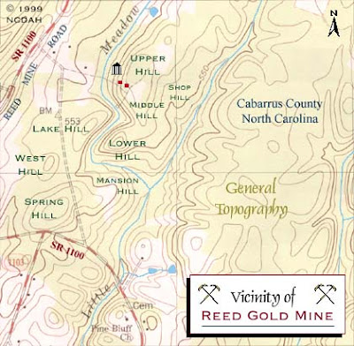
The first gold rush in the United States was in North Carolina. The Reed Gold Mine in Cabarrus County, east of Charlotte, was the site of the first documented gold find.

John Reed was a modest farmer when his son discovered a yellow rock in the Little Meadow Creek in 1799. They used it as a door stop for three years until a jeweler from Fayetteville identified it as gold. He offered $3.50 to buy it (a week's wages at the time but only a tenth of one percent of its value) to the unaware farmer. After being duped Reed started mining the creek bed. Within a year, a slave named Peter had found a 28-pound nugget.
http://www.nchistoricsites.org/reed/map2.htm
Reed and his partners were primarily farmers and did their mining in the off-season. As they found more gold they became quite wealthy and mining on the site expanded greatly. The map above shows the mine shafts in blue and houses in red that eventually populated the site.
http://www.nchistoricsites.org/reed/map1.htm

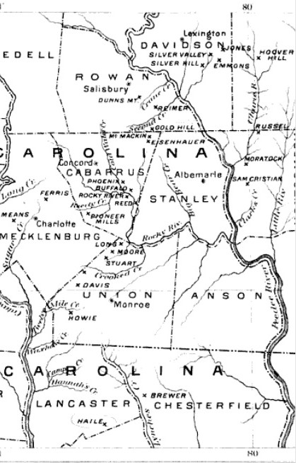
This discovery set off a wave of mining in the early 1800's in what came to be known as the Carolina Gold Belt. North Carolina led the nation in gold production until 1848 when it was eclipsed by the California Gold Rush.
https://en.wikipedia.org/wiki/Carolina_Gold_Rush
The Reed Gold Mine is now a state historic site with historical mining equipment and guided tours of the tunnels-more details can be found at North Carolina Historic Sites.

Wednesday, November 14, 2012

In Search of a Better Election Map

The Stanford Election Atlas shows election results by polling location. This reveals voting patterns that are not apparent when using the standard state or county maps. Unfortunately last week's election results are not currently mapped so we are looking at the 2008 presidential election.


The map still looks more red at a national scale than the vote actually went (due to the heavy clustering of urban polling locations) but it's not as unbalanced looking as the state and county maps. Two unfortunate aspects of this map are the Platte Carre projection (where Maine appears to be falling asleep from lack of interest) and the ESRI interface. I use ESRI interfaces enough at work to be frustrated with them. You can click on any point to get some detailed statistics and an ugly looking pie chart.

When you zoom in notable patterns emerge such as the cotton belt in the south that I've mentioned in a previous post. Most cities have the standard blue core surrounded by a ring of red. Good examples include Minneapolis and Pittsburgh.


Note the lines of blue along rivers and railroads radiating out from Pittsburgh. This patterns shows up even more clearly along the east coast Metroliner corridor.


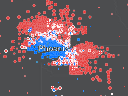
However, some cities have a more notable geographic split. Examples of these are San Antonio and Phoenix. I don't know these cities very well but there are almost certainly ethnic/racial divides that explain these patterns. 


A similar divide occurs on a broader scale in the Carolinas where the non-coastal east is strongly blue and the central and western regions are more strongly red.

 There are other maps you can choose and specific maps for some of the swing states. Hopefully they plan on posting the 2012 results in the future and maybe they'll find a better map projection too. Also, maybe the next map will include Oregon, strangely omitted here. Must be that Stanford-Oregon football rivalry.

Wednesday, October 3, 2012

"Dangerous" Mapmakers

The October 2012 issue of the Atlantic has an article by Robert Draper about redistricting called The League of Dangerous Mapmakers.The article profiles experts at drawing maps to the advantage of their political party. It also discusses how GIS software has enabled amateurs to get in on the action, often with messy or even counterproductive results. An example being the messy situation in Texas that cost that state an early primary, highlighted here in January. The illustrator (uncredited, possibly the author) had some fun with the districts.


Thursday, October 20, 2011

Boylan Heights and the Poetics of Cartography

Denis Wood's recent book Everything Sings: Maps for a Narrative Atlas is featured on Places, an online journal of design. In the 1970's and 80's he began working with his students on a "narrative atlas" of the Boylan Heights neighborhood in Raleigh, North Carolina. These maps are unique in that they remove the usual street patterns to reveal the bare details. His map of jack-o'-lanterns from this series was featured here on a Halloween post a couple of years ago.  The Places feature has a slideshow of some of these maps. Here are a couple of examples:

Fences

Traffic Signs

Porch Ceiling Colors


The Places feature includes Wood's eloquent descriptions of the creative process. Here is a quote about making the "Pools of Light" map:
 The usual “efficient” map would have located everything on the street onto a single sheet — that is, different marks for lamp posts, fire hydrants, street signs, trees. Our inefficient map concentrated on a single subject, and, rather than lamp posts, it brought the pools of light into view. No legend, no north arrow, no neat line, none of the usual apparatus. At last, a modernist feel!

That’s when I knew we could write poems in maps, and I began thinking seriously about a poetics of cartography.
 A few more maps:

Intrusions Under the Hill - water, sewer and gas lines


Barking Dogs

Other maps include a map of power lines titled "Squirrel Highways", a mailman's delivery route, a diagram of the distance and direction that rent money travels to absentee landlords, wind chimes, viewsheds, and a bunch of others. The slideshow can be seen here.

Wednesday, October 27, 2010

Mapping Municipal Inequity

The Cedar Grove Institute for Sustainable Communities uses GIS map overlays to demonstrate patterns of municipal discrimination against minority and low income residents. They began working in North Carolina with neighborhoods that were either targeted with undesirable projects such as highway bypasses or were ignored when building water or sewer services.

The map below is from Moore County in south central North Carolina. The brown area is Jackson Hamlet, a predominantly African American community. The red lines show the boundaries of the affluent golfing and retirement communities of Aberdeen, Pinehurst and Southern Pines. The dark lines are sewer mains.


Jackson Hamlet is surrounded but excluded from these areas meaning that they do not have sewer or garbage service from any of those towns and must rely on the county sheriff for police protection, rather than on the closer municipal police stations.

While the three towns have annexed land in other directions, they have all avoided Jackson Hamlet and demographically similar communities. The residents of these places have relied on septic systems, private trash haulers and/or burning garbage while in some cases watching the garbage trucks cut through their streets to get to the neighboring, more affluent towns.

In recent years the Institute has expanded its work nationwide. They helped residents outside of Zanesville, Ohio win almost $11 million in damages for years of unsuccessful requests for municipal water service. While the city expanded water service to newer, further away developments, African American residents in the Coal Run neighborhood were required to haul water from the water plant or pump it from contaminated wells.

This map shows how water lines were built to specifically serve the white residents of the neighborhood and played a vital role in the settlement.


The images above and some of the material came from an excellent article in Miller-McCune.

Wednesday, October 28, 2009

Map of the Week- Pumpkins!

Denis Wood, an artist and cartographer has co-written several books on mapping, most notably "The Power of Maps" and "Making Maps." Since the 1970's he has been working on a "narrative atlas" of Boylan Heights, his neighborhood in Raleigh, North Carolina. While the atlas has not been published, there are excerpts on the "Making Maps" blog. One of the most well known of these is his jack-o-lantern map.

The map shows the locations of jack-o-lanterns using an image of each one. The lack of any other detail challenges the idea of this being a map. The author aims to break down boundaries between mapping and art and to focus on the patterns rather than on the specific locations that would be apparent if the streets were included.

Thursday, October 16, 2008

Map of the Week-Holy Smokin' Smokies!

Outrage GIS produces recreational maps for the southern Appalachian Mountains. They have developed a trail atlas of the Great Smoky Mountains and give you an interactive look at the bird's eye view that appears in this atlas. Just use the little pan and zoom tools at the bottom to explore. Complete with fog for some extra realism!