Showing posts with label pictorial maps. Show all posts

Wednesday, July 23, 2025

The New Yorker Cover and its Imitators

 In 1976, Saul Steinberg illustrated this famous cover for the New Yorker.
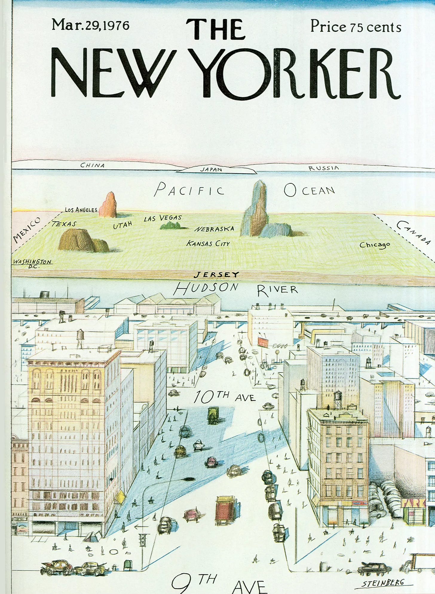
The humorously exaggerated myopia of a “typical“ New Yorker led to many imitations across the world. I found a bunch of examples on the David Rumsey Map Collection when looking for something completely unrelated. Here is Milwaukee. 
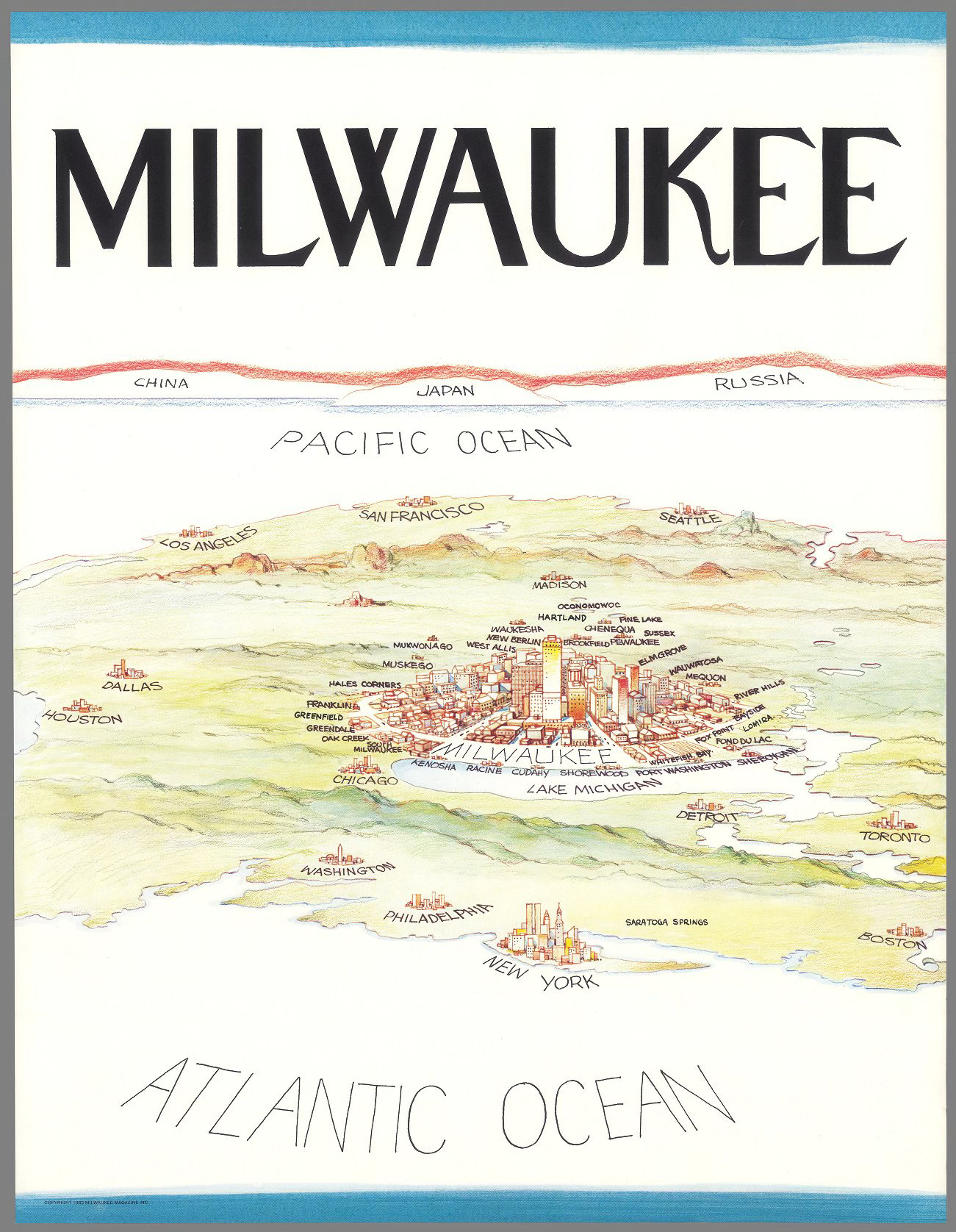
Interestingly this version has a foreground as well as a background. It also features a better sense of geographic accuracy than the original though the China-Japan-Russia bit is basically duplicated. Look at tiny little Chicago! Saratoga Springs is an interesting addition though its location in Connecticut is a bit off.

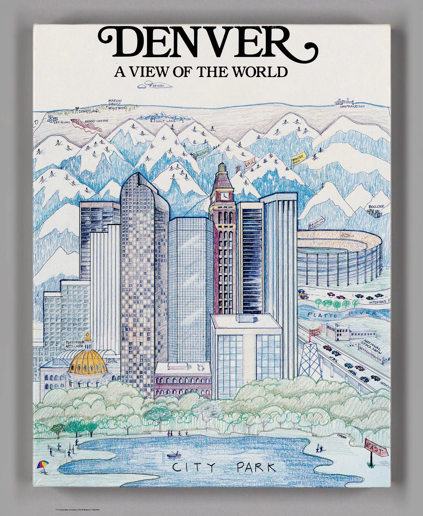
 Here is another example with mountains and skiers.
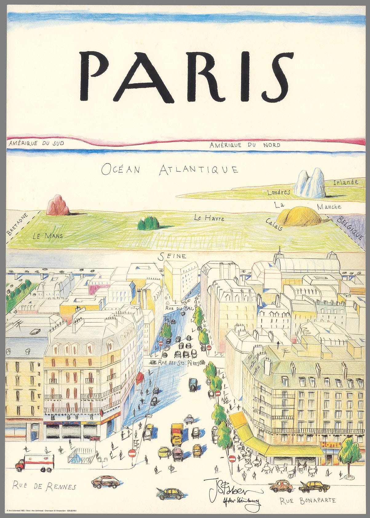
An international perspective, looking westward from Les Deux Magots.
Here is a looking east perspective. This one shows rival colleges. Perhaps ones with better geography departments as the distant locations of Heidelberg and Eton are flipped.
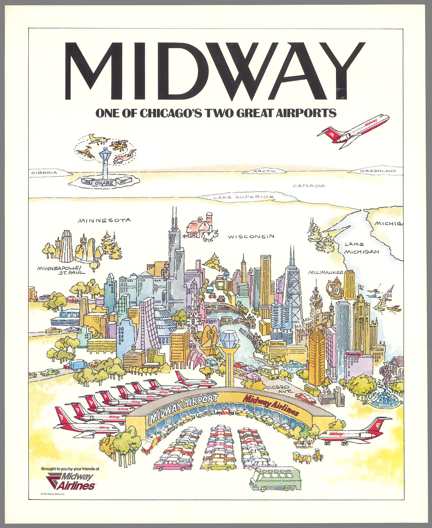
This one is probably my favorite. “One of Chicago’s two great airports“ exaggerating the centrality of Midway while implying that you need to travel almost to Siberia just to get to the chaos of O’Hare Airport.

Wednesday, April 30, 2025

Mapping The Surf

Malin and Mizen is a company that makes specialty maps like the California Surf Map 

 I love the wavy lines and details showing ideal wind and swell directions, coordinates, shark sightings, etc. The hand drawn details on the land are also very nice. 


The company is named for Malin and Mizen Head, the northernmost and southernmost points in Ireland. Here you can see North Malin from the Irish Surf Map. 


They make maps for different sports, history and beer and wine. Here is part of the Irish Pub Map. The x indicates where hot food is available. 


Here is some detail from the California Vineyard Map, the letters indicate grape types and the other symbols are for visiting and tasting information. 


There are also many swimming and golf maps. 


Other surf maps include Australia with its varied topography. Kangaroos and ostriches dot the land. 


Finally, closer to home (for me) is New Jersey. 


Wednesday, October 4, 2023

Seoul Maps

I found this nice collection of maps of Seoul, South Korea's largest city and capital from theSEOULlive. This is a website/magazine of Korean culture that "focuses on unraveling the hidden jewels of Seoul that can only be found with rumination." 

Unfortunately these maps are shown at a fairly low resolution so the details are hard to read. The maps vary from the purely pictorial,

to themed maps such as "Literature",

 "Mountain",

a map of medical facilities titled "Cure",

"Night",

and this schematic map with the river straightened out highlighting urban farming.

There is no easy link to the entire collection but you can browse them by clicking the Seoul Map dropdown at the top of theSEOULlive page and choosing the entries for 2017-2020.


Wednesday, July 12, 2023

Pictorial Bird's Eye Map of Banff

Here is a really nice pictorial map of Banff, showing the mountains, rivers, railroads and hotels. 


 Mountains are listed with their elevations.

A quiet corner at the end of Lake Minnewanka,

and some sky above the ice field.

Browse the whole map here.


Wednesday, December 22, 2021

Recreational Map of the Berkshire Hills

I'm spending a couple of days in the Berkshires in western Massachusetts. In the hallway where I'm staying hangs this pictorial poster map.

Produced in 1939 by the Berkshire Hills Conference, it is full of nice details as you look closer.

Here is the corner locator map, designed to look like a book with a charmingly misshapen Massachusetts.

The dark, woodsy marginalia makes the world outside of Berkshire County look spooky,

even with the happy sun shining on it,

while inside county limits people are happily golfing and fishing.

Finally here is an art deco north arrow plus mileages to other places so you don't get lost.
Wednesday, May 5, 2021

Hysterical Map of South Carolina

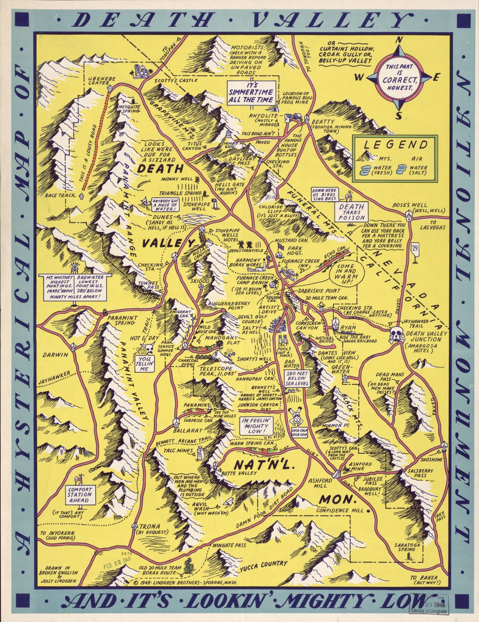
Not to be confused with the Lindgren Brothers maps (one is featured on this blog post) this "hysterical map" predates them a bit. 

This map was drawn by Irving Geis (born Geisburg), a New Yorker with family roots in South Carolina. He spent time in that state as an art student before becoming a scientific illustrator. The map first appeared in the 1932 edition of the University of South Carolina's yearbook. The above image is from a much later third edition. The original had less color but more prohibition jokes - note the liquor bottles lining the 12 mile coastal limit.

Image via Barron Maps

Like the Lindgren maps, these maps are full of puns and caricatures that might not hold up very well today. I'm not sure what the Iodine issue is in the image at the top but it was in the cows and the vegetables. Some nice touches include the magnetic/pathetic north arrow,

the ancestor worshiper, "not dead (unfortunately)",

and the non-angel in the upper left corner.

The scale of the map is listed as 5 miles to the gallon and the politicians are sleeping outside the Capitol Building in Columbia. You can view the third edition here. 

It is not clear how much the Lindgren Brothers may or may not have taken their ideas from this map but they are very similar-as seen here.


Wednesday, April 15, 2020

Joe Talbot's Frisconian Field Guide to San Francisco

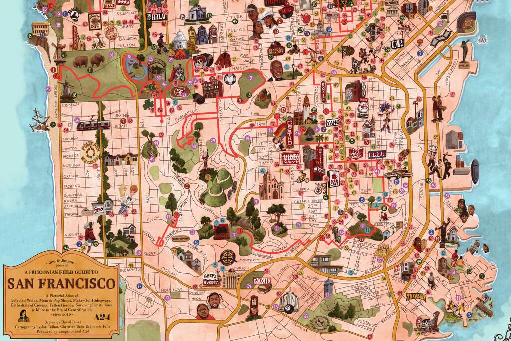
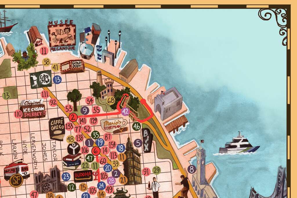
Joe Talbot, director of the Last Black Man in San Francisco, created this charming map - via SFGATE
https://s.hdnux.com/photos/01/10/26/04/18964755/3/1024x1024.jpg
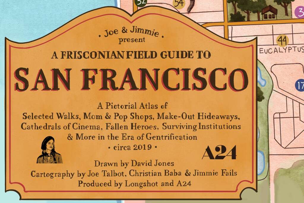
The idea was to capture what places have been priced out and what still exists. Here is the title block.
https://s.hdnux.com/photos/01/10/26/04/18964742/3/1024x1024.jpg
Here are some details.

https://s.hdnux.com/photos/01/10/26/04/18964743/3/1024x1024.jpg
Here lies the ghost of a football stadium as people in hazmat suits dump  green stuff into the bay.
All these pictures were lifted from SFGATE where you can read and see more details.

Wednesday, February 19, 2020

Rand McNally, The Early Years

Rand McNally is a giant in the world of cartography, dominating the US market during the pre-internet era and still producing maps and road atlases as well as being a player in the fleet management, connected vehicle and educational markets. The company began as a printing shop in Chicago in 1856. According to company lore (via Wikipedia) the business survived the Great Chicago Fire by burying two printing machines in a beach on Lake Michigan.

In the 1860's they began printing railroad timetables and in 1872 produced their first map as part of their Railroad Guide.
https://www.raremaps.com/gallery/detail/19350/rand-mcnally-and-cos-new-railway-guide-map-of-the-united-st-rand-mcnally-company
The Library of Congress has some nice examples of their early maps. Before they developed a standardized look their maps had all kinds of creative details. This giant finger, for example, is kind of awesome.
https://www.loc.gov/item/98688734/
This map, Colonists' and emigrants' route to Texas has some wonderful townscapes, though I'm not sure how accurate they are or were at the time.
https://www.loc.gov/item/79691569/
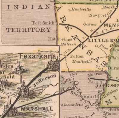
What I really like though is this transition from a traditional continental-scale railroad map to the larger scale pictorial map of Texas right at the border.
https://www.loc.gov/item/79691569/
Texas is a REALLY BIG state! Here is what the whole map looks like.
https://www.loc.gov/item/79691569/
Galveston, with its steam ship lines.
https://www.loc.gov/item/79691569/
 One final detail of this map that I like is the water lines.
https://www.loc.gov/item/79691569/
Here is some really nice topographic and road detail from their 1877 northern Black Hills map.
https://www.loc.gov/item/2011589611/
The map features illustrations along the sides including this classic stereotype.
https://www.loc.gov/item/2011589611/
The company began producing atlases in 1876. "Printed in colors from plates secured by letters patent, producing the clearest typographical effect of any known engraved plates." Here is a sample from the 1878 Business Atlas, later known as the Commercial Atlas & Marketing Guide. The maps are beginning to show a standardized style.
https://www.loc.gov/item/2011588339/
In the pre-auto age these atlases emphasized the railroads (the dark lines). The current Road Atlas, shows motor vehicle routes while not showing railroads at all.
https://store.randmcnally.com/rand-mcnally-2020-road-atlas.html