Showing posts with label england. Show all posts

Wednesday, January 7, 2026

Overlooked Mapping Highlights from 2025-Part 2

Here are some more mapping highlights from the last year:

 5. Silk World War II escape maps

This is from an episode of a podcast called What’s Your Map featuring former cartographic researcher in the UK Ministry of Defence Barbara Bond

Top secret British intelligence agency the MI9 produced a series of maps on silk (and later rayon) designed to help soldiers evade or escape from capture. This map is of Danzig (Gdansk), where the Vistula River enters the Baltic Sea.


Escapees used their knowledge of these areas to direct others to Swedish ships where they would be safe to escape to that neutral country. Maps were printed on fabrics such as silk, which could be stitched into clothing or kept in a pocket and did not make any noise when folding or unfolding them. The maps showed where coal is loaded onto Swedish ships, the arc of light to be avoided, ditches where people could hide and the network of railroad tracks that would need to be traversed. More on these maps and on Bond’s career can be heard on the podcast.

6.  Mapping the Wikipedia Rabbit Hole

WhereWiki allows the user to enter any Wikipedia page and see all of its hyperlinked connections in any given area. When I first saw this, the keyboard player for the Cure had just died so I chose the band’s page and the area around Crawley, UK* where they were formed.


A click on any point brings you to the referenced page. The green dots are locations and the blue are people or groups.


*You can choose the default area (where you are now) or just about any other place on earth and you will likely find plenty of geographic links to whatever page you chose. 

-via Maps Mania


7. Smell Map of the Minnesota State Fair

Jake Steinberg, a cartographer and journalist for the Minnesota Star Tribune created a map of the smells of the State Fair. You can see the full map and article here but you might hit their paywall


8. Inundation Map of the Town of Guadalupe (1819)

Guadalupe, now part of Mexico City suffered a major flood in 1819. The entire area was in the basin of former Lake Texcoco and floods were a frequent occurrence


-Maps via Pedro Zurita Zaragoza on that great mapping site known as LinkedIn.

The map shows inundated areas in aqua tones. Two waterfalls shown at the bottom are breaches of the Guadalupe River.


Text in the legend describes how canoes were needed in the plaza and a note at the bottom states that the floodwaters receded “by virtue of the wise measures of His Excellency (the viceroy), thus preventing its spread to the capital.” Plans to drain the area took almost a century after this to be implemented and this was largely responsible for drying the entire region.

9. 12 Foot Wool Map Needs a New Home

 A group of up to 18 women in County Wicklow began making a 12 x11 foot knitted and crocheted map of Ireland in 2019. 


As reported by The Journal (Ireland). Most of the project took place at Carnew Community Care, a centre for older people. Now that it is finished they are looking for a place where it can be publicly displayed. This was from July. I have not been able to find any follow up on whether they’ve found a location for it.


 -via The Map Room


Wednesday, July 31, 2024

More Maps and Views at the British Library

Here is another installment of maps on display at the British Library - part 1 can be found here.

Estate Map by Margaret Bowles, 1659

Apologies for the dark and shadowy picture, the display hall is not brightly lit. Margaret Bowles was an English cartographer whose surviving maps are rare. Her husband and a team of surveyors took measurements of this estate and she transformed the data at reduced scale to make this map. It was made for the estate's managers and is one of the earliest depictions of an English rural landscape.

Mapping Mountains in Wales, 1838

From the library's description: "In the 1830s, Britain’s Ordnance Survey sent surveyors to Northwest Wales to verify data that had been gathered two decades earlier. This is one of the resultant hand-drawn maps, showing the mountainous region of Snowdonia. Its author Thomas Budgen (active 1822-1856) used various drawing techniques to illustrate relief, including close parallel lines known as hill-shading and sketched details of rock formations. At the same time, other surveyors were beginning to experiment with contouring, the relief depiction that is widely used today. Information from this map was incorporated into an engraved map published in the Tower of London from 1838." 
My phone picture is not very high resolution but here is a close up to show Budgen's style of relief depiction.

Gilbert and Ellice Islands Separation Stamp
 

In 1976 the Gilbert and Ellice Islands, a British colony in the Pacific Ocean were separated and eventually became the independent nations of Kiribati and Tuvalu. There is a large image of this map-centric commemorative stamp hanging in this exhibit and also,

a separation of the separation stamp! Here you can see the text separation layer of the artwork displayed on top of the rest of the stamp.


Wednesday, July 3, 2024

An Appreciation of Ordnance Survey Maps

I spent some time in May at the British Library randomly looking at atlases and maps, some of which will be featured here in upcoming weeks. They have a huge collection of Ordnance Survey atlas books of 1:1056 scale (1 inch = 88 feet) map sheets. While these maps are primarily black lines on white paper, their beauty lies in the remarkable detail.

Note: these maps are in great shape, with fairly pristine white paper. My phone has a tendency to darken maps when I photograph them. I could have brought back the actual color by adjusting the brightness and contrast but I kind of like the old-timey sepia look of these images.

Here are the gas tanks at Kennington.

Here is some nice detail of the railroad infrastructure at the Nine Elms Works, near the Battersea Power Station.


 The only color I saw in any of these is in the water bodies.

One of my favorite places is the Greenwich Observatory, right on the Prime Meridian.

Finally, a little more detail in Greenwich Park showing the Queen's Oak and Bower and the old Magnetic Observatory.


Thursday, April 6, 2023

The Liverpool Overhead Railway

I found this cool strip map of the Liverpool Overhead Railway, the first elevated electric railway in the world. It opened in 1893 and was dismantled in 1957 because the company could not afford to make the necessary repairs. This map is dated "c1938".

via Flickr

According to the Flickr page, the map was folded into three and placed in a guide booklet. Here is a detail of the downtown area.

The railway served the docks but also billed itself as a "scenic tour" as you could see into the docks from above.

The map is adorned by flags of the various shipping lines and some facts about the railway and dock system. There were 70 docks served by the railway. As a nice touch there's also an arrow at the northern end pointing you to "Sunny Southport"

Wednesday, January 4, 2023

Huge Lego Model of the Lake District

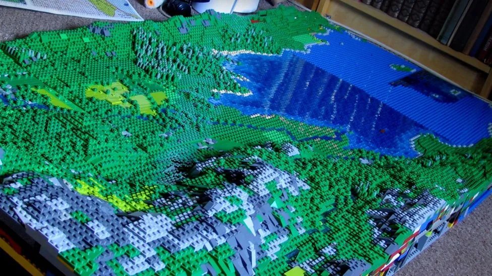
Artist Jon Tordoff has made a 100 square foot, 200,000 piece (so far) Lego model of England's Lake District.

via Getty Images
 The model began as a pandemic recreation map of Buttermere, his favorite spot. 

"Now I've come over the Honister Pass, up Borrowdale and I've got Derwent Water heading towards Keswick now in the next valley," he said.


The model will be displayed at the Belper Library in Derbyshire (just north of his home in Milford) on January 6th and 7th.

All quotes and images taken from this BBC article where you can read more.


Wednesday, September 14, 2022

King Charles III-Urban Planner

Britain's new King has a strong interest in urban planning. In fact he helped design a "new urbanist" town, Poundbury, just outside of Dorchester in Dorset. Here is a photo, via Flickr, of an in situ map of the town as it was in 2008. Click for better readability.

from Flickr user Anne

The town's traditional architecture gives it an (artificial) old-time feel while embracing principles of sustainability such as use of local materials, renewable energy sources like biomethane, and energy efficient designs.

Image via Duchy of Cornwall

A 2016 article in the Guardian begins with this quote: "Poundbury, the Prince of Wales’s traditionalist village in Dorset, has long been mocked as a feudal Disneyland. But a growing and diverse community suggests it’s getting a lot of things right."


This image from planner Léon Krier shows how much of the plan had been completed (in black) as of 2013.

via Architect Magazine

Here is a somewhat dulled image of the master plan showing land uses.

via DorsetRoads

The streets are designed to slow traffic and the walkability index is high according to Space Syntax,

however "the progressive attitude to cars hasn’t curbed habits: a survey conducted at the end of the first phase showed that car use was higher in Poundbury than in the surrounding rural district of West Dorset. The free-for-all parking policy, meanwhile, has turned many of the streets and squares into a car park for Dorchester shoppers." - Guardian, 2016

The town is scheduled to be completed in 2025 and a look at Google Maps suggests it is getting close.


Wednesday, February 17, 2021

Polish Phonetic Map of Britain

This map was recently featured in an episode of Map Men covering Soviet cold war cartography. It shows southeastern British place names spelled phonetically to teach would be Polish invaders how to pronounce them.

The map was originally put on Twitter by former Economist researcher Alex White but the original tweet appears to be gone. The image above is via The Sun. Some fun names include Saufend-on-Sji (Southend-on-Sea), Hejstynz (Hastings) and Byszeps-Stofed (Bishops Stortford).

A bit shocking to think about perhaps but it makes for some nice wall art


This version was created by Maple Tea based on the original version.


Wednesday, August 5, 2020

The Origins of the Stonehenge Stones

Where the stones that make up Stonehenge's megaliths came from has long been a subject of curiosity and debate. These stones do not exist in the immediate vicinity and needed to be transported from a significant distance. A new article in Science Advances traces their origins using "geochemical" analysis. 50 of the 52 sarcens (the megaliths that make up the primary architecture of the site) were found to share a consistent chemistry and by inference came from a common site. A detailed analysis of a core sample from the sarcens puts this origin at the West Woods, 25 km north of the site - Number 6 on this map.
Note: I carved up the original image (4 maps) to make them more legible in this format.

The smaller "bluestones" at the center of the site have been previously traced to Wales.
The map below shows the sampling sites. There is some confusion in the article as the footnotes are numbered similarly to the maps. It took a few readings to realize that 7-8 and 9-10 below are sampling sites unrelated to footnotes 7-9 and 10. I thought I had found a major cartographic blunder; confusing Wales with southwest England. It turned out to just be my own confusion.


Wednesday, September 18, 2019

Mapping the Nuclear Fear

I've lived in many different places in the United States and one thing that people in every place seem to have in common is the belief that their region is a primary nuclear target. I came across this map on a Reddit thread that I can no longer locate. The thread was full of anecdotes from all over the country of people being told that their town was one of the top targets of the Soviet Union back in the Cold War days.
The map is from the Federal Emergency Management Agency (FEMA) and dated September, 1990. Though I lost the thread, it was posted by Daniel Reetz. Here is the caption
Reddit is full of these kinds of maps and threads. Some of the maps are based on out of date information and show decommissioned sites. Here is a typical example of one of these maps showing two different scenarios - the black dots are mostly military installations while purple triangles are population centers. The comments are filled with people who are either proud to live in a targeted area or sad that their town isn't important enough to nuke. 
https://external-preview.redd.it/XRkc93B75o_newgXSZwdVV2Lwnkcnqvpc0wvmOowtu4.jpg?auto=webp&s=aed5129645baeadf7887451dbb9d69cf247a69f9
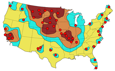
Here is another map focused on the military installations with the colors representing fallout areas.
https://www.reddit.com/r/MapPorn/comments/1ym41m/femaestimated_primary_targets_for_soviet_icbms/
Here are evacuation routes for St Louis County via Reddit- this assumes an attack on downtown when there may be various other targets throughout the city and county.
https://external-preview.redd.it/FQoRGhom7-6tOP8YnQjScrRz-7JXidJ42YQkCH5ajQY.jpg?auto=webp&s=3164854ad6e731a9d8d7723b76312100405baa83
Of course, the United States was not the only place threatened. Here is a scary map of a 1970 Warsaw Pact plan for attack on northwestern Europe - highlighting the Copenhagen region of Denmark, via War is Boring.
Australia too-click for link.
https://antinuclear.net/2014/10/18/us-spy-facilities-at-pine-gap-and-nurrungar-are-targeted-by-russian-nuclear-missiles/
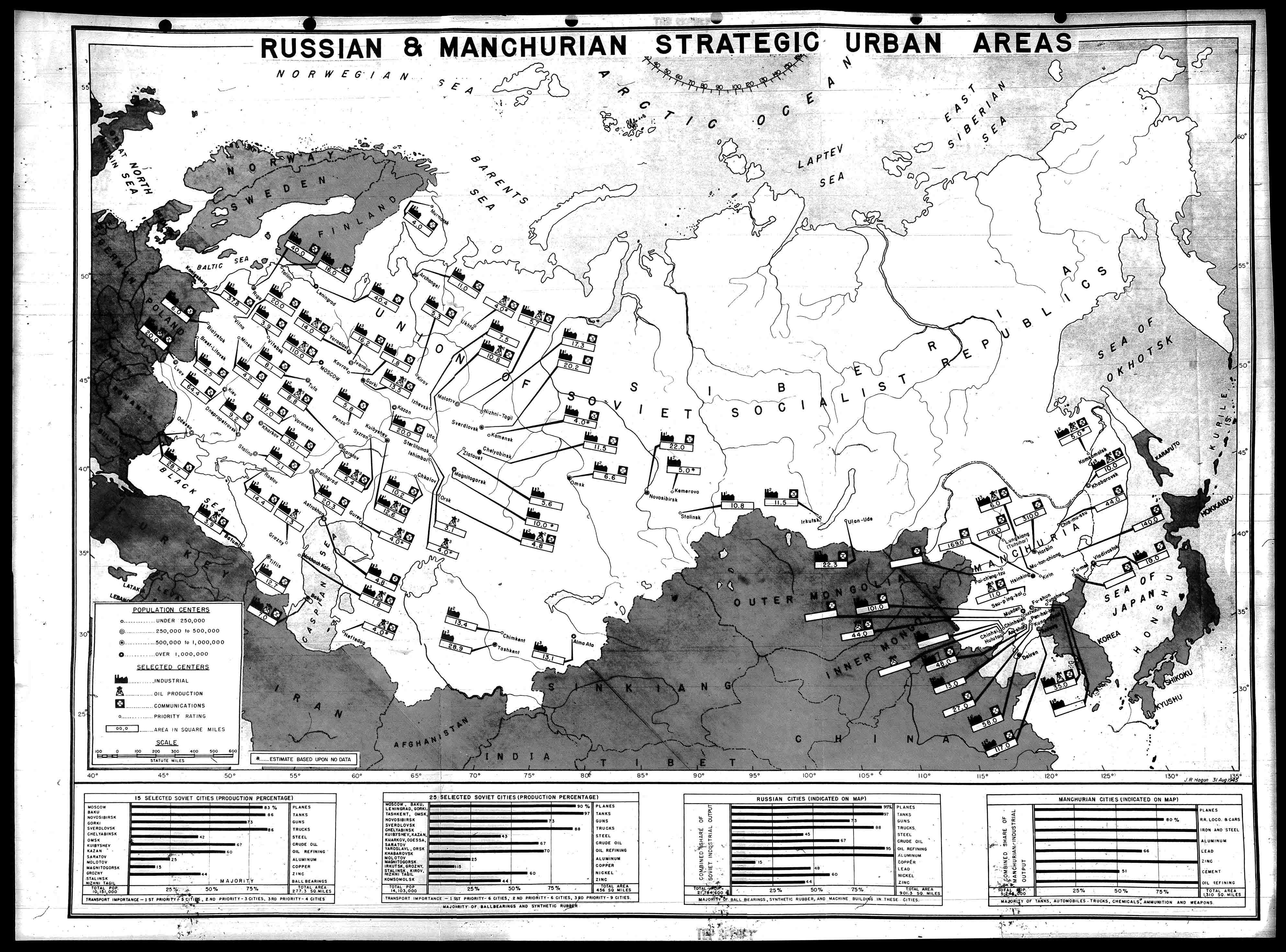
Here is a very detailed map of places in Russia (and Manchuria) targeted by the United States in 1945.
http://blog.nuclearsecrecy.com/wp-content/uploads/2012/05/1945-Russian-and-Manchurian-Strategic-Urban-Areas.jpg
This map is from the Nuclear Secrecy blog, a blog that also features Nukemap, where you can choose your bomb and location and see where the  extent of destruction. There are more recent maps showing the primary targets in Russia that I am not authorized to show (though you can Google them) - mostly production facilities for various metals and oil refineries.

Here is a communist propaganda map showing Russia encircled.
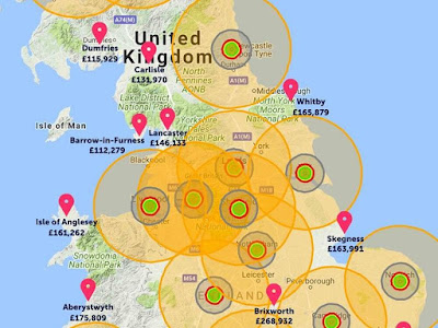
Finally here is a real estate agent's map of where it is safe to buy real estate in the event of an all out nuclear attack on the U.K.'s to 20 cities - via the Shropshire Star.
https://www.shropshirestar.com/news/viral-news/2017/08/11/an-estate-agent-has-drawn-up-a-map-showing-the-best-places-to-avoid-nuclear-fallout/
See you in Lancaster, or Aberystwyth.


Wednesday, April 24, 2019

Range of the German 80-Mile Gun

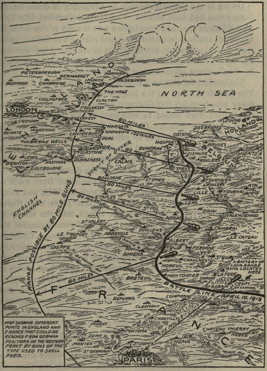
This map, via Project Gutenberg, shows the battle lines of April 10, 1918 and the areas of France and Britain that could be reached by the German guns that had been used used to shell Paris a few weeks previously.
https://www.gutenberg.org/files/34161/34161-h/images/img016.jpg
The map is from The Story of the Great War. This quote provides context.

"The Germans sprung a new form of frightfulness on the Allies when at 8 o'clock in the morning of March 23, 1918, they bombarded Paris with long-range guns. At intervals of about twenty minutes shells of 240 millimeters (about 9.5 inches) reached the capital, killing ten persons and wounding others. The shortest distance from Paris to the front was over sixty-two miles. The first daylight aeroplane raid followed this bombardment, but did little damage. Public interest was centered on the mysterious gun that could drop shells on the city from such a great distance. Pieces of shells examined were found to bear rifling marks showing that they had not been dropped, but were fired from some kind of gun. Later the French located several of these "mystery guns," and some were destroyed. The only purpose they could serve was to terrify the people of Paris, otherwise they were of no military importance."
Here's a zoomed in view to better appreciate the details.


Wednesday, February 7, 2018

More Map Acquisitions

Map Acquistions - Part Two

Central Leningrad from a city guide by Intourist,  travel service of the U.S.S.R, circa 1976.
Another view of Leningrad, Falk plans, Hamburg, Germany, 1976.
A very schematic map of Moscow from Intourist.
Tourist map of Milan - the eye watering color scheme and overly fussy level of detail make it a treat to try and read.
Bus guide-Barnet, North London
A "Parking Disc" for North Yorkshire - set the time of arrival and display on your windscreen. Fail to display the disc and you have "committed an offence."
Hughes Airwest map of Guadalajara,
and Puerto Vallarta
Here's something I haven't come across before - an uncredited map. There is no publishing info but here's the cover.
There are some nice details on it,
 with this odd inset - I guess showing the extent of streets in 1947. Except where they masked them under "San Francisco"
Finally, a personal favorite since I vacation here, "Damariscotta Boxes the Compass" a map with a ridiculously prominent compass.

The houses and churches are drawn so large you can't tell where they're located. This is from the Damariscotta Information Bureau - we still use their maps but they are much more legible these days.