Wednesday, March 27, 2019

City of Women

A couple of years ago, Nonstop Metropolis: A New York City Atlas by Rebecca Solnit and Joshua Jelly-Schapiro, was published. In honor of Women's History Month here is one of the more interesting maps, titled City of Women. The authors renamed subway stations after women "by plotting the places where significant women have lived, worked, gone to school, danced, painted, wrote, and rebelled in order to come up with a feminist city.”
https://www.ucpress.edu/blog/wp-content/uploads/2016/12/CityofWomen_SolnitNMNY.png
“. . . names perpetuate the gendering of New York City. Almost every city is full of men’s names, names that are markers of who wielded power, who made history, who held fortunes, who was remembered; women are anonymous people who changed fathers’ for husbands’ names as they married, who lived in private and were comparatively forgot­ten, with few exceptions..."
Click above for details - here are some highlighted areas.
Upper Manhattan - a diverse mixture of women from all walks of life, including a Supreme Court Justice
 Brooklyn - many actresses and musicians, plus a Supreme Court Justice.
Flushing, Queens - site of the US Open. Tennis players, except for Hannah Feake Brown, a Quaker who probably was not a tennis player.
The Bronx - many women I am should be more familiar with, but are less known probably because of their minority statuses. Actors, musicians, political leaders - and a Supreme Court Justice.

Thursday, March 21, 2019

A Visit to the La Jolla Map Museum-part one of many

On Saturday I had the opportunity to visit the Map and Atlas Museum of La Jolla. The Museum hosts the impressive collection of Michael R. Stone. In the coming weeks, off and on, I will be spotlighting some of the more interesting (to me) items I saw there. For now here is a brief preview. These are my own photographs so they are a bit out of focus and may have light reflections.
Palestine from Rudimentum Novitorum, 1475. This book is considered the first world chronicle. It combined geography with myth. The maps, made from woodcuts and colored by hand show countries and regions as hills. The geographic positions are more relative than accurate. 

Astronomical calendar from the cloister of San Zeno in Verona ca. 1455. Three dials can be rotated to line up months, days and moon phases. It helped monks organize their devotional schedule, including figuring out the date for Easter, a moon phase based holiday - more details here.

Pictorial map of San Diego, 1928 by Jo Mora. "This limned Carte portraying with the most exacting fidelity the History, Romance and Humour of the glorious City of San Diego by the Pacific, likewise showing the Noble Harbor and its surrounding Terraine...." Created for the Marston department store's golden (50th) anniversary.

Wednesday, March 13, 2019

The Geography of Partisan Prejudice

A recent article in The Atlantic features a set of maps showing where in the United States people show more or less prejudice towards people from other political parties.
https://www.theatlantic.com/politics/archive/2019/03/us-counties-vary-their-degree-partisan-prejudice/583072/

The map is based on a survey with questions like how would you feel about a close family member marrying a Democrat or Republican. Darker areas are places where prejudicial feelings are higher. "In general, the most politically intolerant Americans, according to the analysis, tend to be whiter, more highly educated, older, more urban, and more partisan themselves." These people tend to be more politically isolated-less likely to talk to people who disagree with them and more likely to assume the other side is more extreme than they are.

Hover over a county to get percentile information.
What is really interesting is the state to state variability. Compare the Carolinas to each other-or the Dakotas. Some of this may be due to specific statewide factors such as a recent controversial statewide election. There are also maps for each political party's level of prejudice.
The chief takeaway seems to be that people living in certain areas, such as small towns, associate more with other who have different opinions and are better able to see their humanity, if not better understand their point of view. I work with lots of people who have very different opinions than me and sometimes we talk about politics but rarely because they're dumb, awful people who hate America - #justkidding.

Wednesday, March 6, 2019

Equal Earth

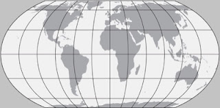
Equal Earth is a new map projection introduced this past fall. It aims to solve the problem of showing countries at their true sizes projected from a spheroid to a flat piece of paper. The most commonly used world projection is the Mercator, great for navigating but terrible for distorting relative landmass sizes - here's an example.
By contrast here is the Equal Earth Projection.
http://equal-earth.com
In addition to the comically monstrous Antarctica, the commonly cited comparison is Greenland vs. South America. Of course many of us in the upper latitudes like the Mercator because it makes our countries look larger and therefore more important. It also makes Russia look scary.
 from The Growth of Russian Imperialism - Cornell digital library.
The problem is that people's perceptions of country and continent sizes once formed are hard to shake. This problem has been amplified by Google's use of Mercator in their maps. Google Maps is so popular that they have created a de-facto standard that most other digital world maps have followed.

One remedy to showing such unequal areas has been to promote the Gall-Peters projection, a rather ugly (my opinion) projection that cartographer Arthur Robinson described as continents that look like wet laundry hung out to dry.
The Boston Public Schools recently began using these maps in their classrooms. As a response Bojan Šavrič (Esri), Tom Patterson (US National Park Service), and Bernhard Jenny (Monash University) developed this new projection. It is based on Arthur Robinson's projection. Here are comparisons of the Equal Area Projection with Gall-Peters,
and with the Robinson Projection.
The projection has been very well received and is already being used by organizations such as NASA. and major GIS software companies.

In addition to the projection, they also created some very attractive, downloadable world maps designed for classroom use. These maps have three versions, one centered on 0 degrees longitude for best viewing Europe and Africa, one at 90 degrees west for the Americas and one at 150 east for East Asia, Australia and the Pacific.
There are two versions, a Political map,
and a Physical Map

For the maps and more info visit their home page.