Wednesday, March 31, 2021

Marine Traffic

Maps showing the number of ships stuck because of the Suez Canal blockage are very eye opening.

via Reuters
The amount of global commerce that can be disrupted by one ship is astonishing.  Marine Tracker is a live map that shows just how much shipping traffic there is worldwide. Here is the ship traffic in western Europe.

You get a good idea from the map where other bottlenecks might occur such as the Straits of Hormuz,

and Malacca.

A click on the map brings up info about individual ships such as this one waiting to get through the Suez Canal. The ship is called the "Mexico City" but is sailing under the flag of Singapore from Colombo, Sri Lanka.

I also like how it shows inland traffic. You can see much of Illinois outlined from this screen shot.


Wednesday, March 24, 2021

Cross Stitch Cartography

Last Spring there was a How to do Map Stuff event including a talk by cartographer Victoria Johnson-Dahl on Cross Stitch Cartography. The full video can be seen here. The talk includes examples from the past and a tutorial on how to make a pattern from a map. Much of what follows has been lifted from her talk. Here are some wonderful examples she unearthed.

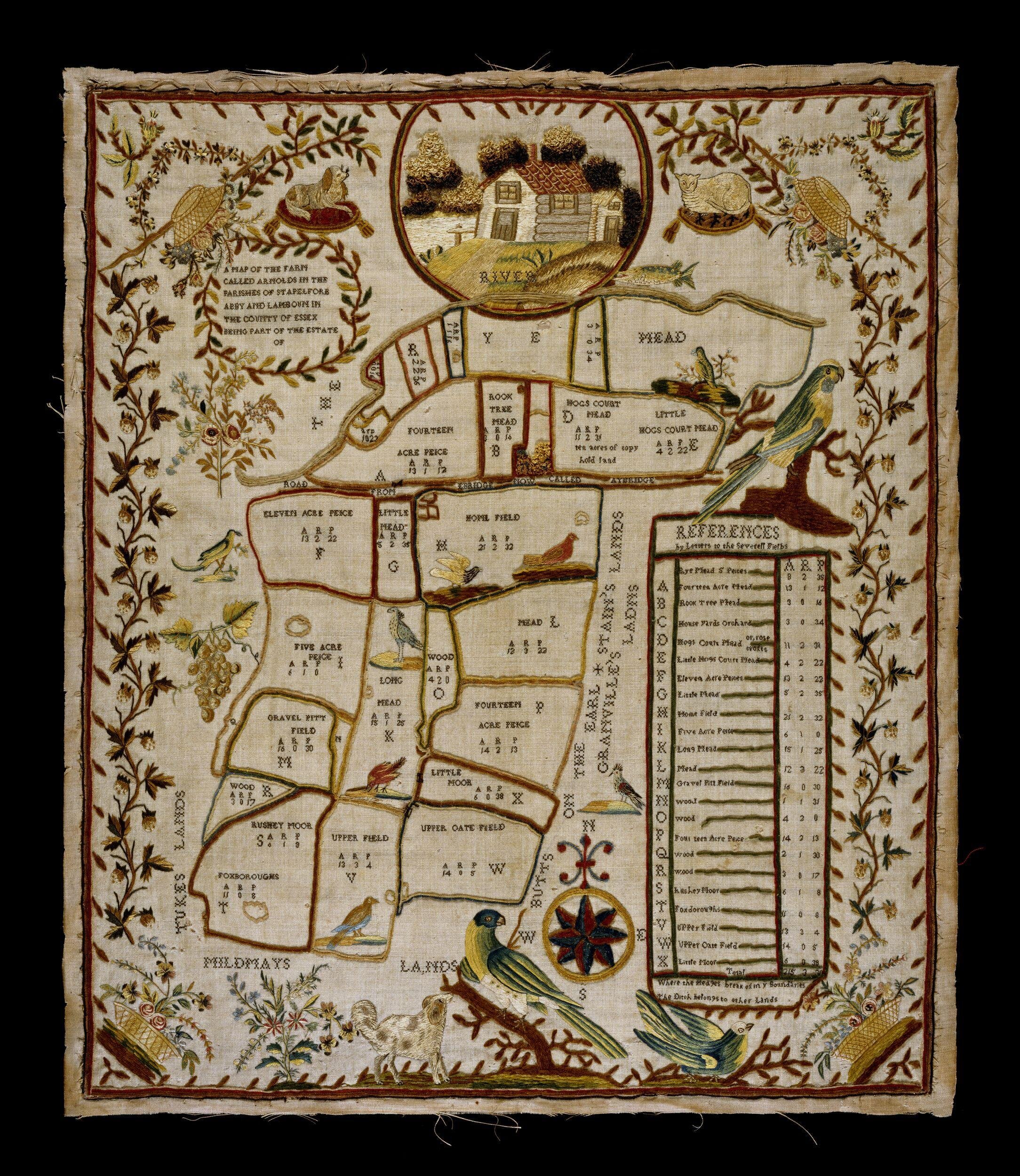
The Farm Called Arnolds in The Parish of Stapelforth Abby & Lambourn in the County of Essex

An unknown author created this detailed embroidery of a farm including some detailed property information. 

The Victoria and Albert Museum page suggests that it may have been an educational exercise for a young girl to learn needlework skills, geography, and rural economy. 

Another educational example are these globes with latitude and longitude lines stitched by Quaker girls at the Westtown School in Pennsylvania.


Here is a Hmong Story Cloth - from the Minnesota Historical Society the description below is from their site


"Story cloth illustrating the participation of Hmong people in the Laotian Civil War (1953-1975), also known as the Secret War, and the subsequent Hmong genocide, resistance, exile in Thailand and emigration to the United States. The scenes depicted on the cloth include the CIA-operated Laotian town of Long Chien as it appeared from 1967-1974; the flight of the Hmong from Laos into Thailand across the Mekong River; the refugee camp at Vinai; Hmong people studying English at Phanat Nikhom; and their arrival at and departure from a Bangkok airport. The cotton cloth's figures are embroidered; its border is appliqued."

Here is a detailed look


For the tutorial she uses this 1829 needlework map of New York Counties by a 14 year old Elizabeth Goldin.

She shows how to use raster image scaling and color simplification to create a cross stitch pattern from public data such as land cover. Here's an example I tried for Rochester, New York.


By greatly reducing the resolution until the image looks very pixelated, it becomes a guide for each stitch. This could be improved upon by simplifying the colors and a little photoshop work but its a start.

Wednesday, March 17, 2021

Famine Roads and Poetry

The British response to the Great Famine of Ireland, when over a million people died from hunger, was to make the Irish work hard for any help provided. One of the work projects was to build "famine roads" - roads that often climbed steep hills and dead ended. Here is a map showing some of these roads in Mayo and Galway - via this history site.


I first heard about these roads because they are mentioned in a lovely poem by Eavan Boland called That The Sceince of Cartography is Limited. You can read the poem here

The area shown above was one of the hardest hit areas in the famine.


Thursday, March 11, 2021

Art Maps-Elizabeth Person

This week is getting away from me so here is a quick post showing the map art of Elizabeth Person, based in northwest Washington.


There's a lot more to discover on her Etsy page.

Wednesday, March 3, 2021

The National Votes for Women Trail

 The National Votes for Women Trail is a project of the National Collaborative for Women's History Sites. The trail shows sites integral to the campaign for women's suffrage.  They have collected over 2,100 sites around the country so far. So many that the map at country level is basically a population map. 


These sites can be filtered in numerous ways such as by organization and ethnicity. The "Latinx" filter for example shows mainly sites in the Southwest. There are no sites east of the Mississippi.

You can also zoom in to an area and choose to keep or exclude certain sites.

You can submit your own sites. The interface, by Tableau is nice and slick looking. However the tools are a bit sticky and don't always work as intended. Also the filters are very hard to use because there are so many choices. My final complaint about the interface is that the aerial photo view makes it difficult to see the sites in built up areas*,

and even more so in dry, built up areas.

*These screen shots actually look better my screen looks. Still, if I were designing this I would have given a simple base map option so the sites stand out more.