Showing posts with label quebec. Show all posts

Thursday, November 3, 2022

Thirty Day Map Challenge 2022 - Days 1-3

November is back and that means another #30DayMapChallenge, making a map each day based on a given theme, For more background on the challenge see this post from last year. Here are the first three days as posted on my Twitter.

Day 1 - Points

The original points came from the Maine Geodata Library. However, these only included towns with “point” in the name which are not many. For example, there is no town called "Pemaquid Point" so it was missing. I got some additional names from various web searches. The inland points were particularly difficult to find-most of these are on lakes. In the final map some of the points got dropped by the auto-label function to reduce clutter, so this is not a complete list.

Day 2 - Lines

This is the most wordy map I’ve ever made. I’m not a huge fan of the overly information-dense National Geographic style maps because it’s just way too much to take in, but this map needs some explanation. I’ve been fascinated by the Haskell Free Library and how it straddles the US-Canada border. A few years ago I finally had a chance to visit it. I took the photos of the black line marking the border and generated the data myself as most of it did not exist from what I could find.

I had to drop my accuracy hangups to make the map more legible. Originally I had all 9 flower pots in their exact right locations. It was unreadable so I spread them out a bit but eventually found that I needed to get rid of a few to keep the map from being a messy jumble.

Day 3 - Polygons

While Lawnstarter is not necessarily the world’s foremost data site, sometimes you have to go where the data is. I was trying out this leaf coloring scheme with its random colors and angles so I looked for a fall foliage by state guide. I found a best “fall scenery” ranking by State from Lawnstarter 2022’s Best States to Visit This Fall  There’s an overall ranking but there is also one specific to fall scenery.

I had trouble coming up with an ideal density function in limited time so some of the larger states look a bit more sparse to the benefit of states like Delaware.

I’ll have many more of these to post throughout November.

Wednesday, December 1, 2021

Thirty Day Map Challenge - Part 3

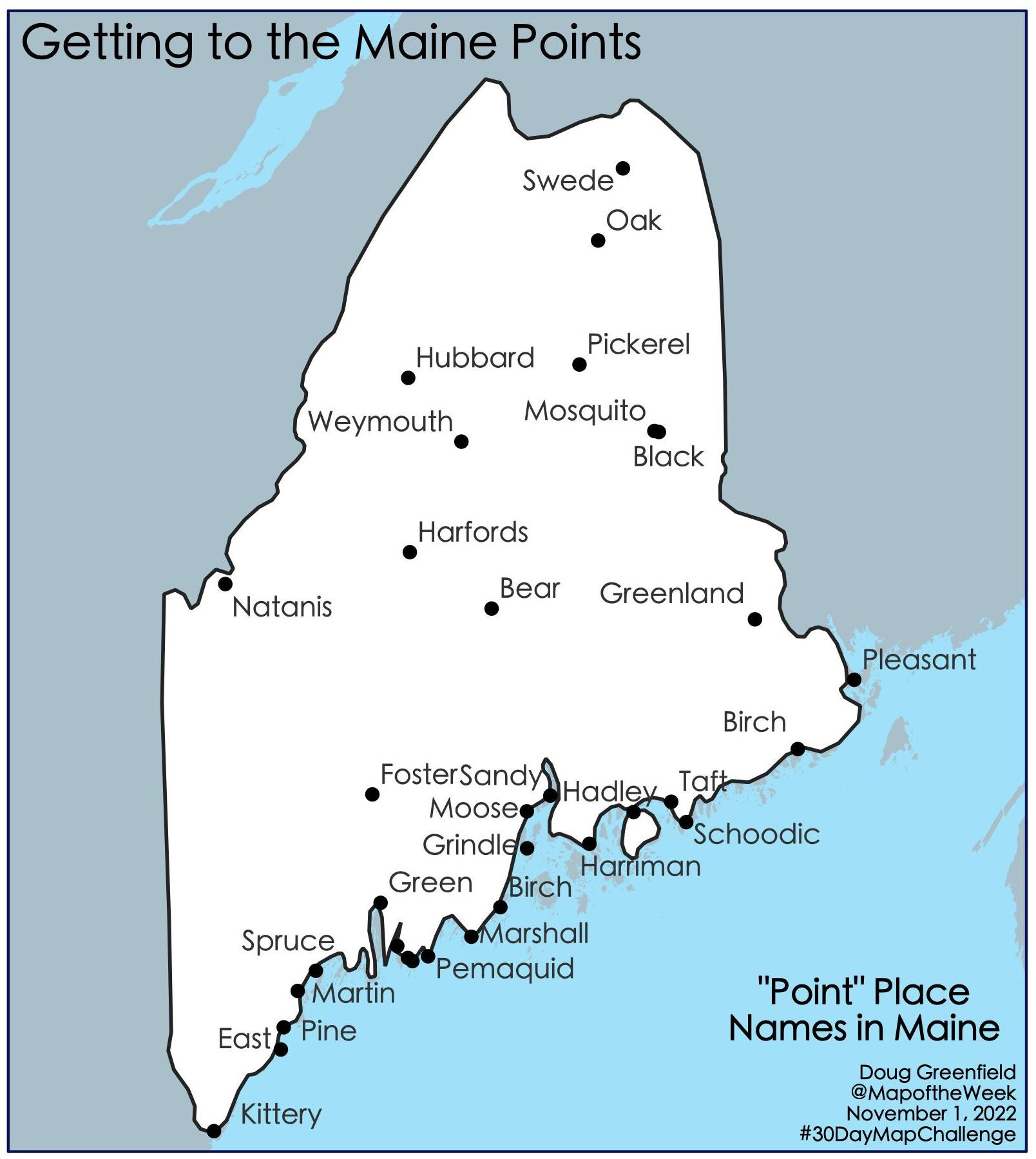
Here is the final batch of maps for the #30DayMapChallenge. The first ten maps are here. The second installment here.

Day 20 -  Theme: Movement

The first plane trip I ever took. PHL to HOU with an hour layover in Atlanta.

Day 21 -  Theme: Elevation

I learned that you can make quick elevation profiles using Google Earth Pro and was curious what the Finger Lakes, some of which are very deep, would look like. Most of the work was in annotating the hills and valleys.

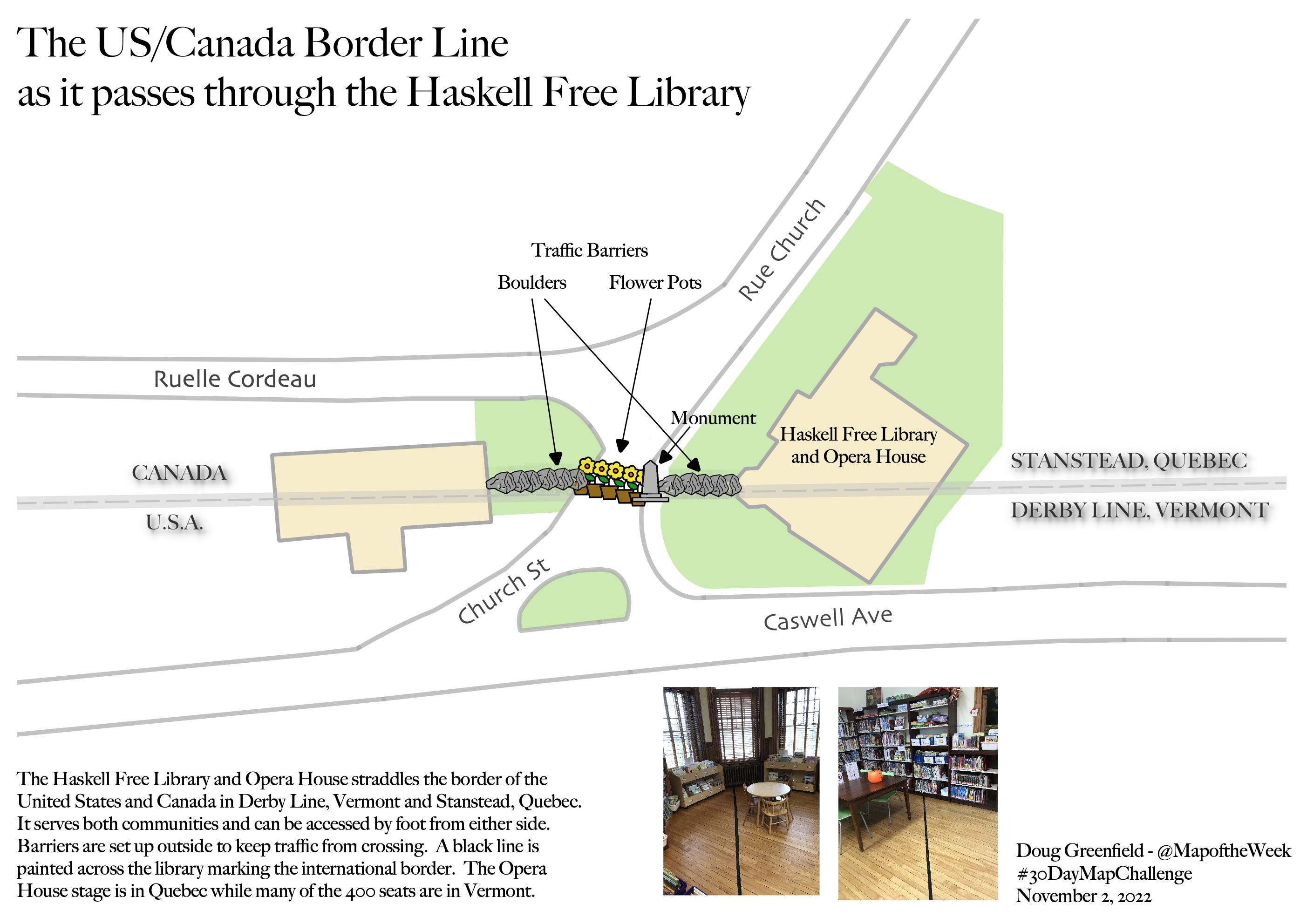
Day 22 -  Theme: Boundaries


At my day job I was asked to emulate a project from  the City of Columbus. When I first encountered that crazy boundary I didn't know what I was looking at but here it is. Many cities such as Detroit and Los Angeles surround well known enclaves but I've never seen anything close to this. Had some fun with the magnifying glass on the locator map.

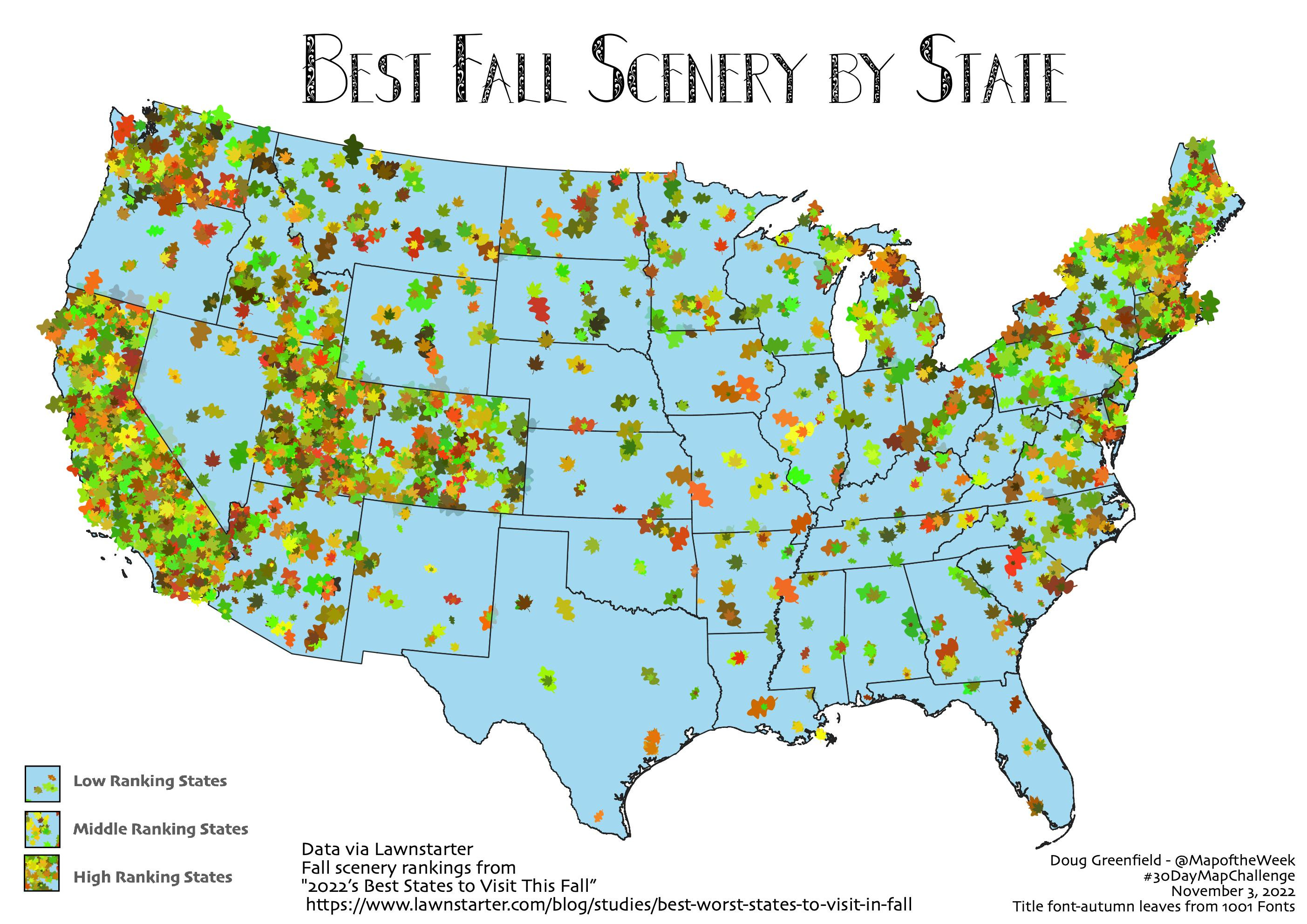
Day 23 -  Theme: Data Challenge 3: Global Human Settlement Layers (GHSL)

Like many, I was completely unfamiliar with this data set. I still don't know much about it but I downloaded their built-up areas and drew them as if they were elevation, hills being the settled areas. I looked around for a good pattern and found Quebec City. In retrospect, I could have done a better job lightening the greys and changing the elevation quotient but there's only so much time in a 30-day challenge. I played around with some additional data layers in GIMP to create this image.

Day 24 -  Theme: Historical Map

I did some recent tutorials on how to create a historic looking map in GIS software.  The least historic place I could think of was Las Vegas. I got the buildings layer from the City of Las Vegas upon which I discovered that the main strip (including the casinos) is not even in the city but rather in Paradise, Nevada. Unable to find their buildings, I drew my own. I added an ad for wagon lumber. The text was inspired by other maps from that era. The title block was taken from a map of Las Vegas, New Mexico via the Library of Congress. Some image manipulation was used to change "N.M." to "NV" and the elevation from 6,400 feet to 2,000.

Day 25 -  Theme: Interactive Map

I enjoy hockey so I was curious about the world's second major league, Russia's KHL. Without reinventing the wheel, I made a similar interactive map to my previous ones of transit tokens and for New Year's Eve. Wikipedia was extremely helpful for providing both an already usable data set and the team logos. Above is just a screen shot. The interactive map can be seen here.

Day 26 -  Theme: Choropleth Map

For anyone that doesn't know the jargon, a choropleth is a map with areas colored based on data. In this case I tried my hand at a bivariate (two data variables) choropleth. This was based on a Tweet from the European Commission showing the relationship between COVID-19 vaccination rates and death rates. These maps can be hard to follow but the expected pattern should be yellow (low death rates, high vaccinations rates) to dark blue (opposite). The lack of red or orange shows that countries with high vaccination rates do not have high death rates. The confusion of the map is compounded by needing to flip the legend so that the high vaccination rates are at the bottom of the legend.

Day 27 -  Theme: Heat Map

It took 27 days but I finally thought to reuse a data set and made a heat map of Day 25's KHL data. I did not love the look of the original map (below) so I tried to hand draw it. It looks sort of nice but I misplaced the Moscow area and had to make up for it by adjusting some of the other locations. Here is the original computer generated version.

Day 28 -  Theme: The World is not Flat.

Once again working with the KHL data I tried my hand at a spherical map projection. This data is good for this because of the impressive longitudinal reach of the league. Those players do some long traveling!

Day 29 -  Theme: NULL

Going back to the theme from Day 26, I noticed that certain countries routinely had null data values for their vaccinations. Here they are.

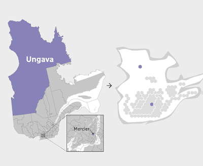
Day 30 - Theme: Metamapping Day

I thought it would be fun to use this theme to show the locations and software used for my other 29 maps. However, the wheels came off the bus or I ran out of gas or some metaphor. I had numerous unexpected technical problems and finally just had to throw up my hands and put this mess out there. A couple of days got buried in the data or otherwise lost, the legend needs work and the US inset map is almost unreadable. 

This has been an excellent learning experience. I can't imagine going through this again which means I'll probably be back at it next November.

I highly recommend checking out other people's entries into the #30DayMapChallenge. There is some beautiful and wonderfully creative stuff out there.

Friday, November 19, 2021

Thirty Day Map Challenge - Part 2

Here are the next batch of maps I've posted for the #30DayMapChallenge. The first ten maps are here.

Day 11 - Theme: 3D

For the 3D theme I attempted to recreate an exercise from my first cartography class back in the 1980's. That exercise was done using a pencil and graph paper. Unfortunately, I do not have my notes or remember the exact procedure. I did this one using GIS software instead. The map shows murder rates by state. Back then North Carolina was #1, now it's Louisiana. The map is "upside down" so that the higher southern states don't block the view of the lower northern states.

Day 12 - Theme: Population

This is a map of Arctic settlements done "firefly" style, which is fashionable these days in cartography circles.

Day 13 - Theme: Data Challenge 2: Natural Earth

Natural Earth is a set of publicly available data. It is a collaboration involving many volunteer NACIS members and cartographers around the globe. Nathaniel Vaughn Kelso and Tom Patterson led the effort. They have produced some beautiful topographic images of the world. The map was also inspired by a NACIS talk on indigenous place names. The topography and streams are from Natural Earth, while the place names came from Canada's Open Data site.

Day 14 - Theme: Map with a new tool

This one is a bit of a mess because I started doing a tutorial using R, a new tool for me, but I ran into some technical difficulties and then ran out of time. I never expected that Sunday, a non-work day might be the day that I run out of time. I had seem some recent Excel maps and made a blog post about this one. At the last minute decided to try one. Last Spring I tried my hand at a cross stitch map of Rochester, New York. This seemed like a natural fit for an Excel map since it is very grid-like. Instead of doing land use though, I tried doing one of those HOLC redlining maps from the 1920's. 

Lack of time forced me to go very low res. so the map ends up looking like not much at all.

Day 15 - Theme: Map made without using a computer. 

Several of the previous maps were hand drawn but I decided on a different approach here. This is a souvenir Pennsylvania cutting board stacked with coins representing the GDP of the metropolitan areas of the state. One cent = $1 Million. It's a nice, even formula but does not make the stacks high enough to really show the pattern well. Since it is helpful to see multiple angles, I created this mediocre video.

Day 16 - Theme: Urban/rural

This was mostly just an exercise in image manipulation to tease out the urban and rural areas by land cover. I picked Charlotte after looking for cities that might have an interesting looking pattern.

Day 17 - Theme: Land

While waiting in the San Diego Airport a few years ago, I noticed a display of Kumeyaay culture. I was unaware of these people as I suspect many are. There were a couple of maps which I later found copies of on a website dedicated to Kumeyaay culture. I find it interesting that their territory predates the US-Mexico border which has been imposed on their land. This is what the area looked like pre-border.

Day 18 - Theme: Water

This was just a fun exercise in grabbing some water data from northern Quebec and overlaying it on top of a cheesy tree pattern that I made just for this purpose. More art than map. The large lake in the west is Lac Couture, an impact crater.

Day 19 - Theme: Islands

I've always been fond of Christo and Jeanne-Claude's Surrounded Islands installation so I decided to map it. Buffering is one of the most common and basic GIS functions (ie. is this property within 200 feet of the river?), here was an example of a real world buffer.


More to come (I hope).

Wednesday, October 24, 2018

The Quebec Election Cartogram

Quebec is a great use case for election cartograms. The map below (via CBC) shows how dominant the cities and suburbs are in population.
http://ici.radio-canada.ca/special/2018/elections-quebec/circonscriptions-resultats-cartes-vote-analyse-politique/
I like how they shaded the shape of the Province behind the hexagons. The geography be unrecognizable without it. The map at the bottom of their page illustrates how one Riding (district), Ungava covers over half of Quebec's area but contains a similar population to a tiny Riding in Montreal.
http://ici.radio-canada.ca/special/2018/elections-quebec/circonscriptions-resultats-cartes-vote-analyse-politique/
In the recent election the conservative Coalition avenir Quebec (CAQ) made huge gains at the expense of the Liberal and Québécois parties. Here are before and after maps. I rearranged the from the side by side view on CBC because the layout of this blog makes it easier to read this way.
Light blue is CAQ, dark blue Québécois red is Liberal and Orange is Québec Solidaire, another party that saw gains in this election. Above is before and below after the election.
Here is the side by side images as they appear on the CBC web page. The comparisons are easier to make when not distracted by the giant low density areas of northern Quebec.


Wednesday, January 31, 2018

Map Acquisition Syndrome

Map Acquisition Syndrome - is there a cure? I have been given so many maps by people clearing out their apartments that it has overwhelmed my filing system. Many have been sitting in shopping bags for a year now while I figure out what to do with them. Here are some paper maps people have foisted on me knowing I can't say no. This is therapy-before I file them away I need to show off my bounty.

Insight FlexiMap of Budapest - so shiny it's hard to get a good picture.
For contrast here's the Budapest tourist agency map  
Details from the shiny flip side of the Insight map - the road to Lake Balaton and the Metro
 
Rand McNally map of Italy-an undated map from a Fodor's travel guide. The credits mention a Stuttgart office that no longer seems to exist. 
Here is a newer Fodor's map of Naples. This one produced by the British map company Lovell Johns.
Old Quebec - a nice pictorial map  
"Marco Polo" map of Russia. These maps come with stickers so you can mark places of personal interest. 
Same company-Thailand, Vietnam, Laos and Cambodia. Note the delicate task of naming Saigon. 
Official City of Rome tourist map with pictorial details.
Monte Carlo tourist agency map
Bilbao Turismo
Bilbao Transportes 
AAA map of Tucson
Sorry for the poor quality of some of these pictures. I don't have a professional map photography setup. There are many more - stay tuned for another installment.

Wednesday, February 19, 2014

R.I.P. Roger Tomlinson

Roger Tomlinson, the "Father of GIS" passed away last week. He developed the Canada Geographic Information System, the world's first computerized GIS.
http://www.gislounge.com/roger-tomlinson-father-gis-died/
Working as a government consultant for Canada in the early 1960's, he was asked to find a location for planting trees in Kenya to feed a paper mill. The location needed a suitable slope, appropriate weather conditions, and access to transportation. The location would need to be free of monkeys, which eat young trees, and away from elephant migration routes. The creation and manual overlay of this many maps made the labor cost too high for the client. Tomlinson began to think about how to put these maps on a computer and generate numbers to measure land suitability.

He brought this idea to several computer companies but they were not interested. In 1962 he met Lee Pratt, head of the Canada Land Inventory, on an airplane. Pratt was looking to generate land use maps for the country to determine suitable areas for agriculture, forestry and wildlife over a million-plus square mile area. Tomlinson published a feasibility study for computerizing overlays and was subsequently asked to join the government in developing its Geographic Information System.
Printed maps from the Canada Land Survey can be accessed online at the Canadian Soil Information Service. The map above is of forestry capability in British Columbia. The green areas (in this case the lowlands) have the most capability while the oranges and pinks are less suitable. Below is a 1967 agricultural soil capability map for the area around Ottawa, where the map was produced. Orange areas are the best, green areas have severe limitations and pink areas are unsuitable.   

Much of the information above came from Putting Canada on the Map by Lynn Greiner, published in the Globe and Mail.