Showing posts with label newspaper. Show all posts

Tuesday, May 10, 2016

MIT's Innovation District

Last week the Boston Globe had a clever map of "The Kendall Network"  I posted it on Twitter but have not had a chance to mention it here. It accompanies an article celebrating the 100th anniversary of MIT's move from Boston to an empty warehouse district of Cambridge. For those unfamiliar with Boston, Kendall Square is the area adjacent to MIT and has recently seen a huge growth in tech companies.
http://www.bostonglobe.com/specials/2016/05/05/mapping-kendall-square-network/whKpe5VayFBBJJD8tsUMWP/igraphic.html
The printed circuit board analogy works great because of the somewhat ordinary (by local standards) street network. If this was Harvard, it would have been much more difficult to make this kind of map. The crazy Harvard Square street network there would have required some major schematic simplification. The Kendall Square area only needed minor adjustments. MIT is the chip that is driving the innovation around it. Nice work Globe graphics team!

Wednesday, January 7, 2015

Toronto's Language Quilt

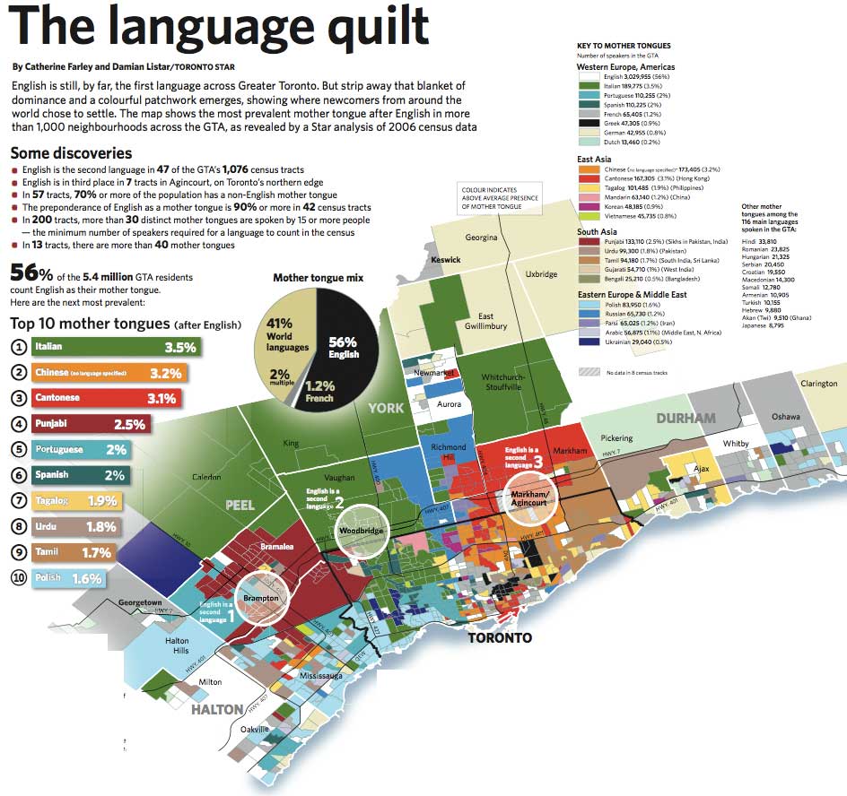
The Toronto Star published a set of maps in 2007 showing the second language (after English) for more than 1000 neighborhoods in the Greater Toronto Area. The map (based on 2006 Census data) is a nice, colorful illustration of where different immigrant groups chose to settle - although languages such as Spanish and Portuguese (and even Chinese to some extent) don't tell you much about where those settlers really came from. The original map is pretty large - here are some smaller images from Bricoleurbanism.
http://www.bricoleurbanism.org/wp-content/uploads/2007/12/gta-language-quilt_main-e.jpg

Particularly striking and unexpected (to me) is the number of Italians. Although many of the green neighborhoods are lower density suburbs creating a false illusion of dominance, Italian is still the largest
second language with almost three times as many speakers as French. The dull, generic gray color used for French (mostly in the far eastern part of the region) minimizes the visual importance of Canada's second language, whether intentionally or not.

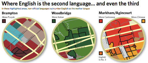
Three neighborhoods where English is not the first language are highlighted with circles and expanded on.
http://www.bricoleurbanism.org/wp-content/uploads/2007/12/gta-language-quilt_eng-2nd-e.jpg
I made a screen shot of the main urban area to show some of the patterns of diversity that are less apparent from the large map. These patterns include Greek (black) in the east, Portuguese (light blue) in the west and various eastern Asian languages, mostly east and north of downtown. There are also numerous French speaking areas, if I'm interpreting the generic gray correctly.
The entire map can be downloaded from the Star here.


Wednesday, January 29, 2014

Ukraine's Messy Situation Inspires a Messy Map

Last week there was an article in the Washington Post titled This is the one map you need to understand Ukraine's crisis. The "one map" is actually two maps, both with fairly awful color and symbol choices.
First, there's the color scheme. The orange is fine but the blue is way too similar to the water. So similar that the Sea of Azov (between the Crimean Peninsula and the easternmost provinces) looks like a province that was won by Yanukoyvich. Looking from a distance you can see that he also won that huge southern region - oh wait, that's the Black Sea!

On top of this confusion, the author represents the areas of protests with diagonal lines that are so fat you lose the light-dark orange pattern of support for the "pro-Europe" party. He could have thinned these lines to make the map more readable. Better yet, since protests happen in isolated places a point symbol would illustrate them without confusing the color scheme. If you want to be dramatic, use a nice explosion symbol like this one.

Finally, there's Kiev. The black line pointing to it is the same color and angle as the government centers seized by protesters symbol, making it look like it's been seized. In fact, some government buildings in Kiev have been seized so maybe the author was trying to be ambiguous.

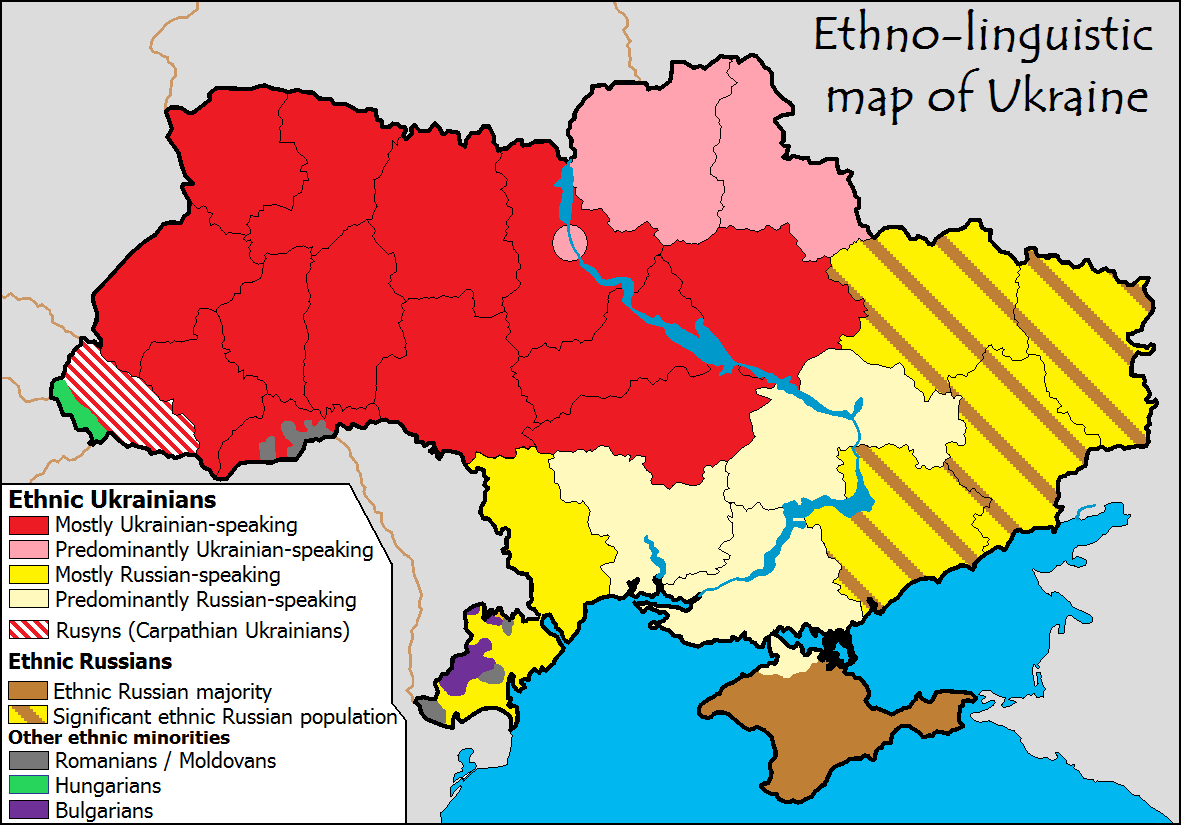
The second map is a linguistic map with the same color scheme. The article does succeed in showing that the political and linguistic divisions break along the same provincial lines. All other information is obscured by bad cartography.

It's really too bad they did such a poor job with this because just last month the same author presented a similar series of maps that are much more legible. In an article with a similar title, This one map helps explain Ukraine's protests, he uses a similar election map but with a slightly better purple color scheme for the Yanukoyvich vote. This time the "one map" is actually three maps, two election maps and an "ethno-linguistic" map from Wikimedia Commons. The linguistic map does explain the divide nicely though the categories are a bit vague (predominantly vs. mostly vs. ethnic majority - huh?)

Wednesday, November 20, 2013

Kennedy Assassination Infographic

Friday will be the 50th anniversary of the Kennedy Assassination. I am not well versed in the conspiracy theories. Reuters produced a good infographic/map showing the layout of Dealey Plaza that helps clarify the events.
I don't know when or where this image was originally published but there is a nice interactive version of it on speakingimage where you can zoom, pan and click a few points for details.

Wednesday, June 19, 2013

Freedom of the Press

Reporters Without Borders produced this map showing the degree of press freedom by country. Click for a full size image.

They picked an excellent color scheme. I can speculate about the politics but I prefer to leave that to others. I will say that I found Mexico and India to be a bit surprising.

Wednesday, May 19, 2010

Map of the Week-Deepwater Drilling and Spilling

The New Orleans Times-Picayune has some very detailed coverage about the BP Deepwater Horizon Oil Spill in the Gulf of Mexico. There are lots of maps and graphics showing how the spill happened, what BP is trying to do to contain it, fishing closures and the extent of the damage. You can also read some fascinating comments. Blame an accident by a British oil company on whatever US politician you don't like. Choose the comments that work for your agenda!

Here is an image from NASA. Not pretty.


Below are forecasts of the extent of the oil slick for today and tomorrow.


They also have a map animation. Click on the image below to see.    


Wednesday, July 29, 2009

Map of the Week-Thinking Big in St. Paul

The Minnesota Historical Society is sponsoring an exhibit called "Minnesota on the Map" at the Minnesota History Center in St. Paul. The exhibit runs through September 7th and features four centuries of maps from the Society's collection. Below is an unusual example. Published by the St. Paul Board of Trade in 1871, it shows the "projected" railway system for 1900. The map was a response to an earlier map from that year published in the St. Paul Press. The Press map showed the "dominating influence of the St. Paul system" of railroads but displayed "extreme modesty" in "underrating the future of the Great Metropolis...."

The main detail that stands out is the St. Paul & London Inter-Continental Double Track Railway, featuring a "most magnificent" suspension bridge over the Atlantic Ocean.

Other details emerge when zooming in on the map such as the Sub-Oceanic tunnel under the Pacific to "Peek-in" that will be excavated by "gopher power" and the "Balloonic Route" to the North Pole. The text at the bottom details the need to move Minneapolis and the small town of Kandiyohi far to the north to accommodate the growth of the Metropolis. It also mentions that Duluth will be "wiped out entirely, as it deserves to be for having the temerity to exist."

Thursday, February 7, 2008

Map of the Week 111- Anchors Away!

Last Wednesday off the coast of Egypt, a ship's anchor severed some cables limiting internet access to 75 million people, primarily in Egypt, India, Pakistan, Saudi Arabia and the United Arab Emirates. This has had significant impacts on the high tech economy in India and on western companies that have outsourced their tech support there. This story appeared in the Guardian along with the map below of undersea internet connections and lots of hand-wringing about the world's fragile infrastructure.


If you want an even more detailed map of the world's internet infrastructure and feel like spending $250 then take a click on the map below.

Thursday, July 12, 2007

MOTW #83


One of my pet peeves is when worthwhile, timely information gets put on the web and then is never updated. This example is cited as a "recent map" from a company that works with newspapers to put maps on their web pages. The map shows "Rummage Sales"* in the "Siouxland" for the weekend of April 14th - note that the date at the top is today. This is/was useful information and if they kept it up to date could be still.** If not take it off or the residents of Ascot/Broadmoor should be expecting visitors this weekend, sale or not.

*I'd like to see a map showing what regions of the country use what terms to describe yard/garage/tag/rummage sales

** I can think of several other ways they could improve this site but I've already gone on for too long here.

Thursday, June 21, 2007

MOTW #80

Yes it's another toilet map. But this one's cool because it shows you how much use they get. It's also helpful to me as I go by Langone Field often on my bicycle and didn't know I had that option. All the fields should have these as I recently watched a softball game and we all had to take turns sneaking into the woods. The Aquarium toilet gets an awful lot of use considering how often it's out of service. This map is from the Boston Globe.

Thursday, January 18, 2007

MOTW #61

The Philadelphia Inquirer published a really good map showing 2006 murders in the city. If you click the map below you can go to the interactive map. Click on any dot to get details about the crime - victim, race, time , weapon, etc. You can also use these as filters to see only daytime murders or murders by "hand". Keep in mind that this a an entire year 's worth of data and in most of the city murder is really not that common an occurrence. Really we have lots of nice neighborhoods! I'm serious!

Thursday, October 26, 2006

MOTW #49

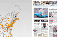
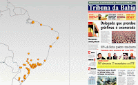
Click on your favorite city and see today's front page courtesy of the Newseum.


Note that you can do this worldwide