Showing posts with label canada. Show all posts

Wednesday, July 12, 2023

Pictorial Bird's Eye Map of Banff

Here is a really nice pictorial map of Banff, showing the mountains, rivers, railroads and hotels. 


 Mountains are listed with their elevations.

A quiet corner at the end of Lake Minnewanka,

and some sky above the ice field.

Browse the whole map here.


Wednesday, July 5, 2023

Protein Survey Map

While looking for unrelated items I came across this 1920's Protein Survey Map of Western Canada.

Wondering what any of this means, I did some research and discovered that protein refers to the gluten content of wheat. In the early 1900's flour mills began classifying their wheat based on protein content with premiums offered for the highest protein flour.

The map follows along the railroad lines because rail cars were tested for gluten content. The color scheme of this map is hard to follow but red is the highest protein content followed by blue. 

The map credits the chemists in addition to the Trade and Commerce Department minsters. I lost the original source of the above map but found this map from a few years later

with an even more detailed and confusing color scheme.

Here is the title block.
 

In a previous post I highlighted the Alphabet Railway. Here is a piece of that, with a few interruptions for pre-existing towns.

See the whole map here.

Wednesday, March 30, 2022

Women's Suffrage in 1917

As a follow up to Women's Suffrage in 1908, here is an ad from 1917 showing how suffrage (the white areas*) had expanded through most of Canada and parts of the United States. 

The ad is from the National Women's Suffrage Publishing Company and asks how long the U.S. will lag behind Canada. For contrast here is the 1908 map again. Keep in mind that the color scheme is reversed.


*yes the white areas are actually sepia areas, OK.
Wednesday, March 11, 2020

Canada's Ecological Disaster

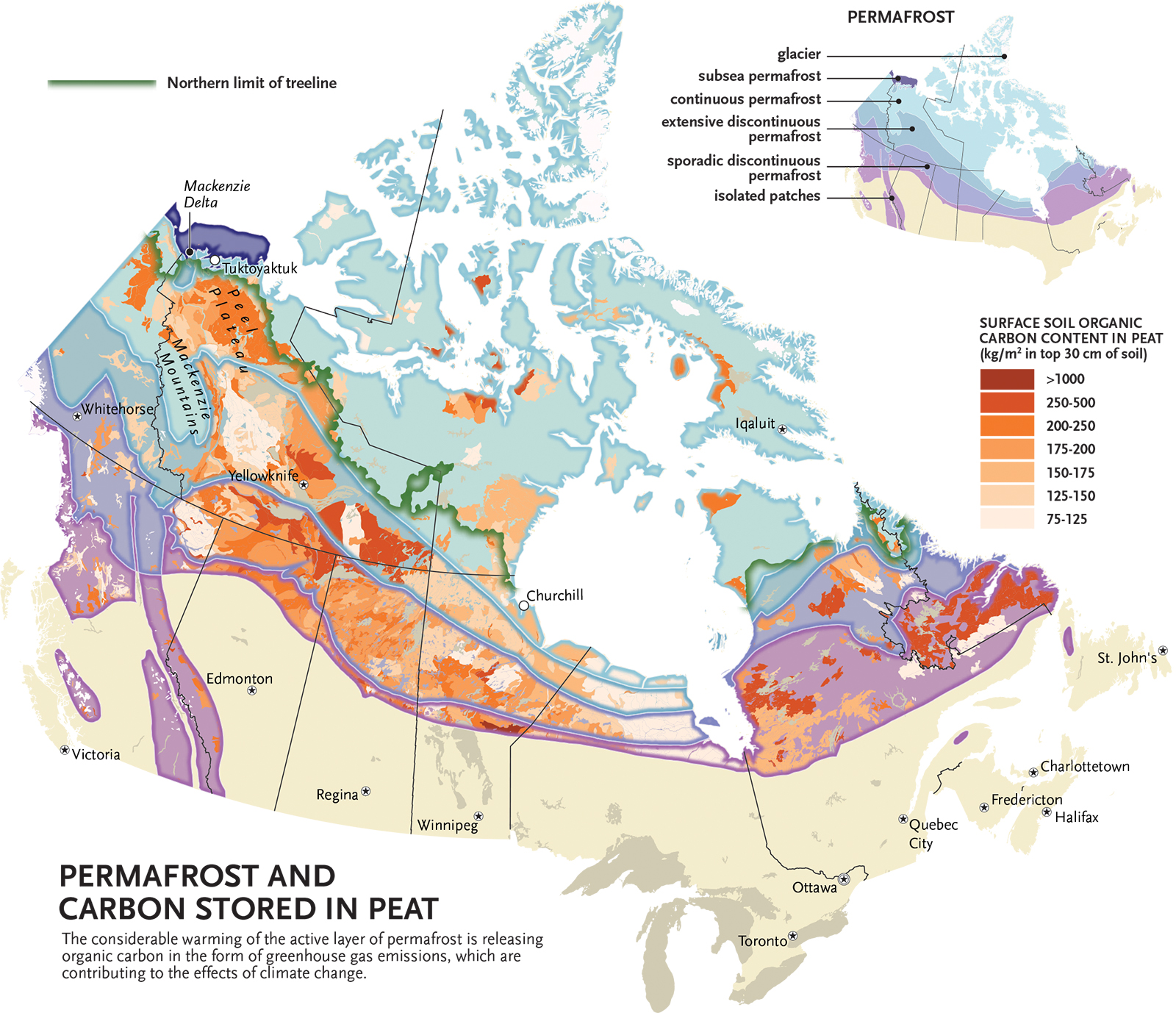
Take a minute out from worrying about infectious diseases to worry about how melting permafrost can kill you (tl;dr go to last sentence). Canadian Geographic cartographer Chris Brackley made a nice map showing permafrost overlaid with subsoil carbon content for a story from last year.
https://cangeo-media-library.s3.amazonaws.com/s3fs-public/images/web_articles/permafrost_final_03-web.jpg

Melting permafrost releases more carbon into the atmosphere further accelerating the planet's warming process. The map clearly shows areas that where the most ecological damage may occur. In addition to carbon, thawing permafrost can also release toxins into the atmosphere. The article details how a child was killed in Siberia by an anthrax infection from a newly exposed reindeer carcass.


Wednesday, July 17, 2019

Grab Bag

Here's a bunch of random maps. They won't "change the way you see the world" like so many other clickbait-y sites claim. They're just kind of interesting, or pretty, or something. Click on the map for the original source and higher resolution.

Meat Production on Ranches - via Pearson Education though I lost the link.
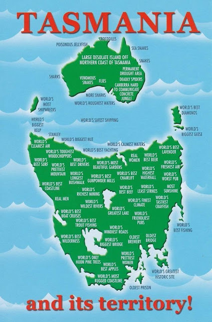
Tasmania's cartographic revenge - via Reddit
https://www.reddit.com/comments/auec0h

WestJet Destinations, 2000 featuring a Canada without Montreal or Toronto.
https://www.flickr.com/photos/erussell1984/45543438864

Proposed development of Toronto's industrial waterfront, 1910
https://static.torontopubliclibrary.ca/da/images/LC/maps-r-80.jpg
- via Toronto Public Library

Saloons, free theatre and "houses of ill fame" in Buffalo, 1893. If you're looking for this neighborhood, it's basically been torn down and replaced with expressways. Easy access from the Children's museum though.
https://imgur.com/a/7ZJ47DO

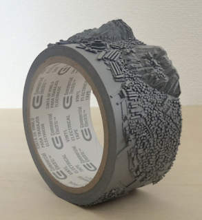
Geo-Eye (Mount Inasa), 2015 by Takahiro Iwasaki carved on a roll of vinyl electrical tape. Iwasaki is a Hiroshima-based artist. Mount Inasa is in Nagasaki.
https://www.artsy.net/artwork/takahiro-iwasaki-geo-eye-mt-dot-inasa
Where Europe and Asia would fit in North America climate-wise - via askthebirds
http://askthebirds.org/wp-content/uploads/2018/09/canada-physical-map-best-of-beautiful-nts-maps-canada-of-canada-physical-map.jpg
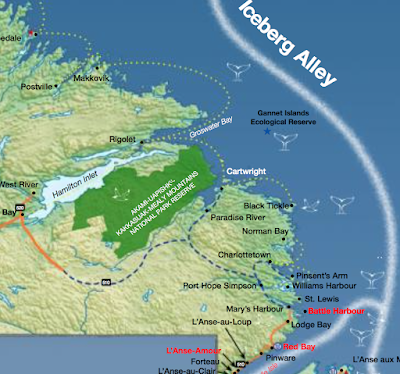
Tourism map - where to see whales, seabirds and icebergs in Newfoundland And Labrador - issuu.
https://issuu.com/newfoundlandlabradortourism/docs/whales_birds_bergs_map
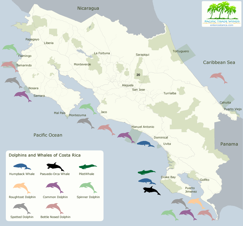
Whales and dolphins in Costa Rica - via Enter Costa Rica
https://www.entercostarica.com/images/maps/map-whales-dolphins-flat-1000.png


Wednesday, February 20, 2019

A Plan for a Canadian Attack on Russia, 1919

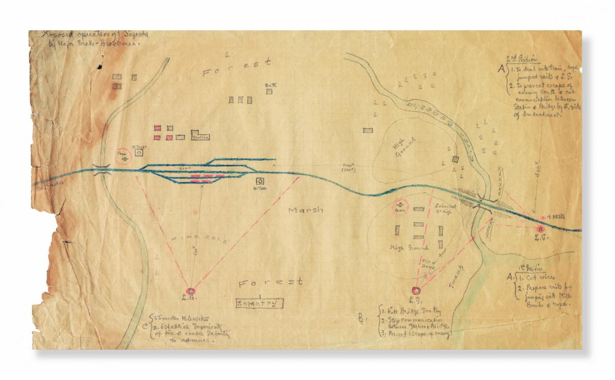
After World War I, many Allied troops remained in Russia to help anticommunist forces fight against the Bolsheviks. This map was made for Canadian troops to plan a February 1919 surprise attack on Segezha in the northwest corner of Russia.
https://cangeo-media-library.s3.amazonaws.com/s3fs-public/styles/web_article_slider_image/public/images/web_articles/article_images/5548/discovery-history_jf19.jpg?itok=ItizXJSl
The map shows terrain features, gun positions, firing ranges, bridges and buildings along with instructions such as "cut wires" and "stop communication between Station and Bridge." Some of the text is hard to read but here is a detail of the area around the bridge over the Segezha River.
Post-war public opinion turned against the Canadian Prime Minister and it was difficult for him to justify keeping troops overseas. Troops were gradually withdrawn from Russia and the planned attack was abandoned. - via Canadian Geographic

Wednesday, October 31, 2018

Canada's Declining Caribou Population

Canadian Geographic posted this map as a snapshot of the status of caribou herds.
https://www.canadiangeographic.ca/article/mapping-decline-canadas-caribou
This map, while visually appealing is a little hard to grasp. The colors represent groupings (referred to as "designated units") of caribou species and the text around the map is color coded to these groups.  The circles show the highest estimated population in gray versus today's estimated population, color coded to the designated unit.

In the words of Justina Ray, the president and senior scientist of Wildlife Conservation Society Canada
“We are a natural resource-driven economy, and limits to our footprint is anathema to most. Our system of monetizing does not extend to species. They have no value.”
more details here

Wednesday, May 16, 2018

Canadian Checkerboard - Part 3

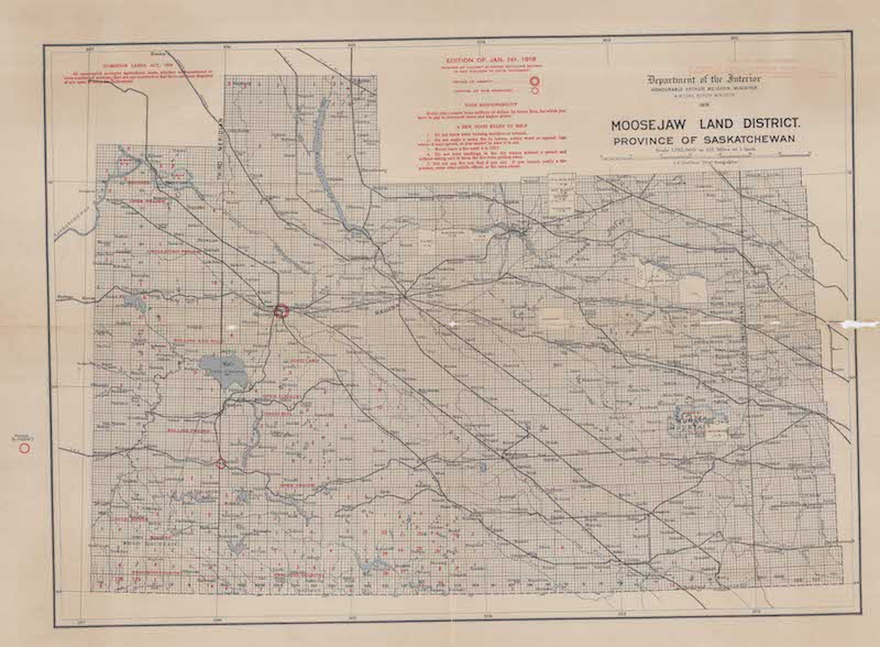
Here is my final Canadian Homesteading map. Moose Jaw Land District.
It is not as colorful as the Northern Alberta map but is similarly effusive about the quality of the land.
Like the previous map each grid cell is a square mile section.
There is not much topographic change here so the "mountains" really stand out.
This map was accompanied by a Saskatchewan Railway Guide
One of the interesting things about this is the ads along the edge for sheaf loaders, livestock brokers, mattresses and overalls.

The back of the map has a yellow detailed map showing ownership of quarter sections around Hodgeville. 
 The apparent purpose of this map is to advertise gopher poison.
 "$276,000 worth of grain sown on the land in this map was destroyed by gophers. My own Gopher Poison will save this year's crop. Get a package either from your council or dealer. Cheapest poison obtianable when you count results. Made only by ANTON MICHELSON COMPANY, Ltd, Winnipeg."


Wednesday, May 2, 2018

Canadian Checkerboard-Part 2

Last week's post featured a map of Alberta, Saskatchewan and Manitoba showing lands available for homesteaders in 1918. Here is a much more detailed map of Northern Alberta, beginning a bit south of Edmonton. Grid cells are 1 mile square sections.
Here are some detailed views.

The meanings of the categories in the legend are a bit unclear to me but the lightest orange are lands reserved for soldiers. These are mostly in the northern and western parts of the province. The middle orange are lands the are "finally disposed of" meaning they have been claimed and are being actively used as homesteads, schools or other. The red squares are "unpatented (entered for, sold or reserved)" - possibly meaning that a claimant is working on establishing a homestead. The uncolored (white-ish with some yellowing of the paper) areas were surveyed and available (my assumption) to be entered as homesteads.

These maps also show parks, timber berths, coal seams, tar sands, borings for oil and gas and grazing leases.
As seen below, most of the land in and around Edmonton has been transferred to private owners.
There is a lot of unsurveyed land (another assumption based on no grid lines) but the map comments seem to be trying to sell people on the virtues of these lands with comments about the high quality of the water, soil and potential for industry.


I'm ready to move here!

Wednesday, April 25, 2018

Canadian Checkerboard - Part 1

In the past year I've accumulated dozens of maps. A friend had grandparents who tried homesteading on the Canadian Prairies and gave me some remarkable maps showing lands that were available via the Dominion Lands Act. Here is a 1917 map showing lands in Manitoba, Saskatchewan and Alberta.
The map is 3 ft x 2 ft. I was able to scan it at a high resolution. Here are some readable details.

The Dominion Lands Act of 1872 was based on the Homestead Act in the United States. Square shaped 160-acre parcels of land (much of it taken from indigenous tribes without compensation) were made available to settlers in return for a small registration fee. They had to establish farms and build permanent dwellings in return. Immigrants from Europe were encouraged to settle on these lands, partially out of fear of the United States (where most of the good land had been taken by then) trying to lay claim to them. Some of the land was set aside for soldiers.
http://www.collectionscanada.gc.ca/obj/021017/f1/c126302k-v3.jpg

Red numbers indicate the number of quarter sections available in each 6 x 6 mile township. The green area is Palliser's Traingle, an arid region where exemptions were made so farmers could buy adjacent lots and double the size of their homesteads, increasing their chances at successful agriculture.  Railroad companies owned the land within 20 miles of their tracks so townships adjacent to the tracks had no numbers while nearby ones had smaller numbers. Here is the legend.
I'm not sure what part of the act was discontinued or what "O. in C." refers to.

For contrast here is a more sparse area along the Peace River in northern Alberta.
I have more of these maps and will show them in another post or two. Stay tuned!

Thursday, April 12, 2018

What is a Milk Run and Y

Y do all the major airport codes in Canada begin with a Y? This map, via They Draw and Travel, partially explains. It also tells you what a "milk run" was. Click for a readable version.
https://static.theydrawandcook.com/uploads/travel/illustrations/images/5945/standard/Milk_Run_Canada_Map.jpg.jpg?1429017235
Here's a map of the weather stations across Canada with all the Y codes, and a couple of Z codes too.
http://www.novaweather.net/cdn_sta_code.jpg