Showing posts with label new york city. Show all posts

Wednesday, July 23, 2025

The New Yorker Cover and its Imitators

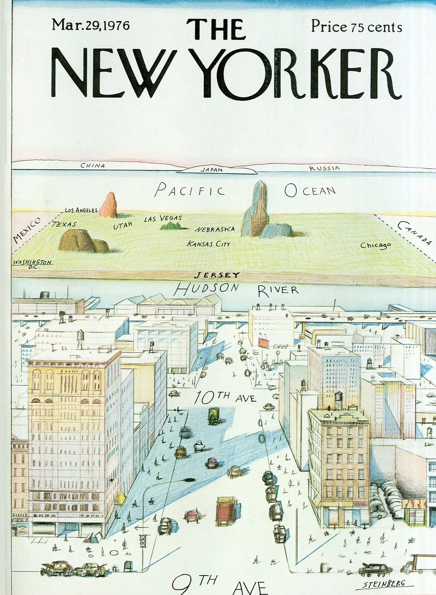
 In 1976, Saul Steinberg illustrated this famous cover for the New Yorker.

The humorously exaggerated myopia of a “typical“ New Yorker led to many imitations across the world. I found a bunch of examples on the David Rumsey Map Collection when looking for something completely unrelated. Here is Milwaukee. 

Interestingly this version has a foreground as well as a background. It also features a better sense of geographic accuracy than the original though the China-Japan-Russia bit is basically duplicated. Look at tiny little Chicago! Saratoga Springs is an interesting addition though its location in Connecticut is a bit off.

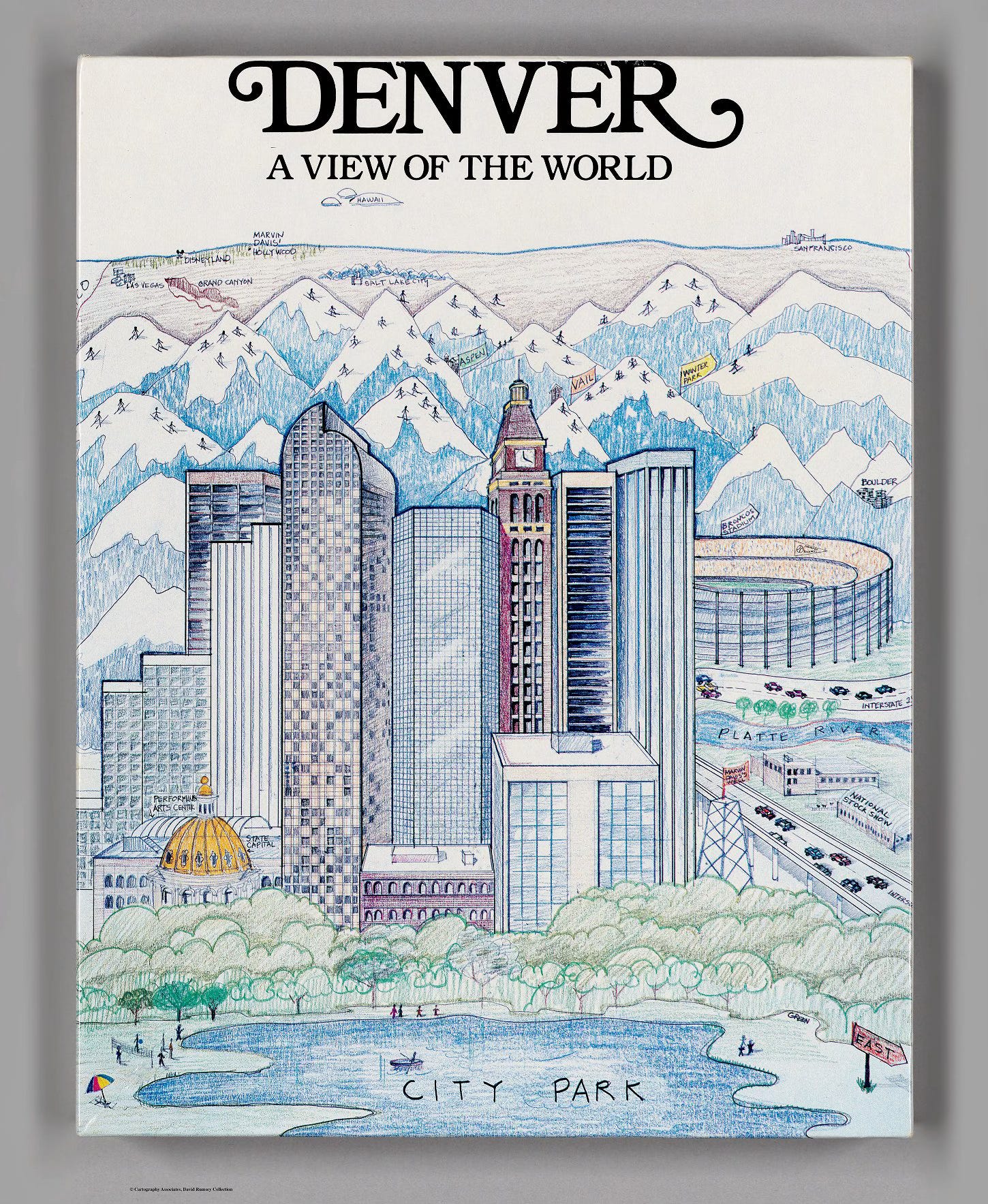
 Here is another example with mountains and skiers.

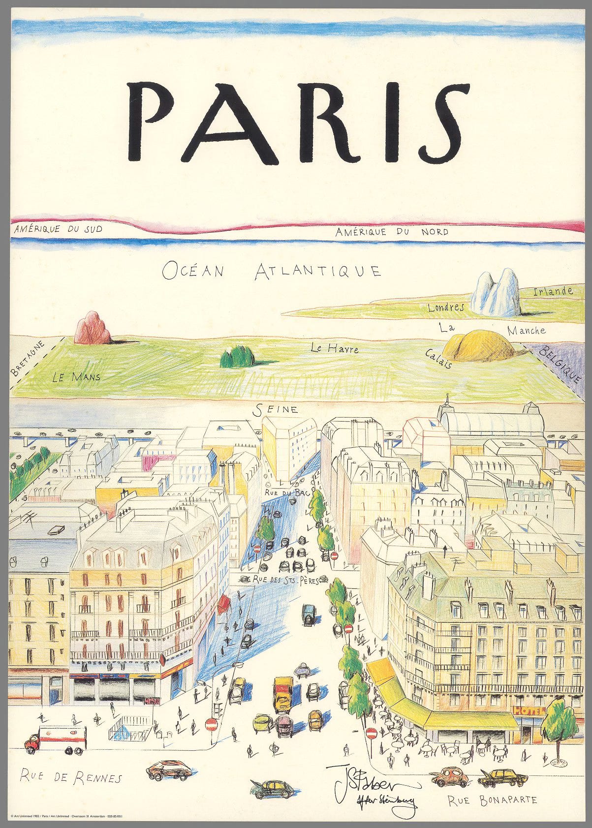
An international perspective, looking westward from Les Deux Magots.

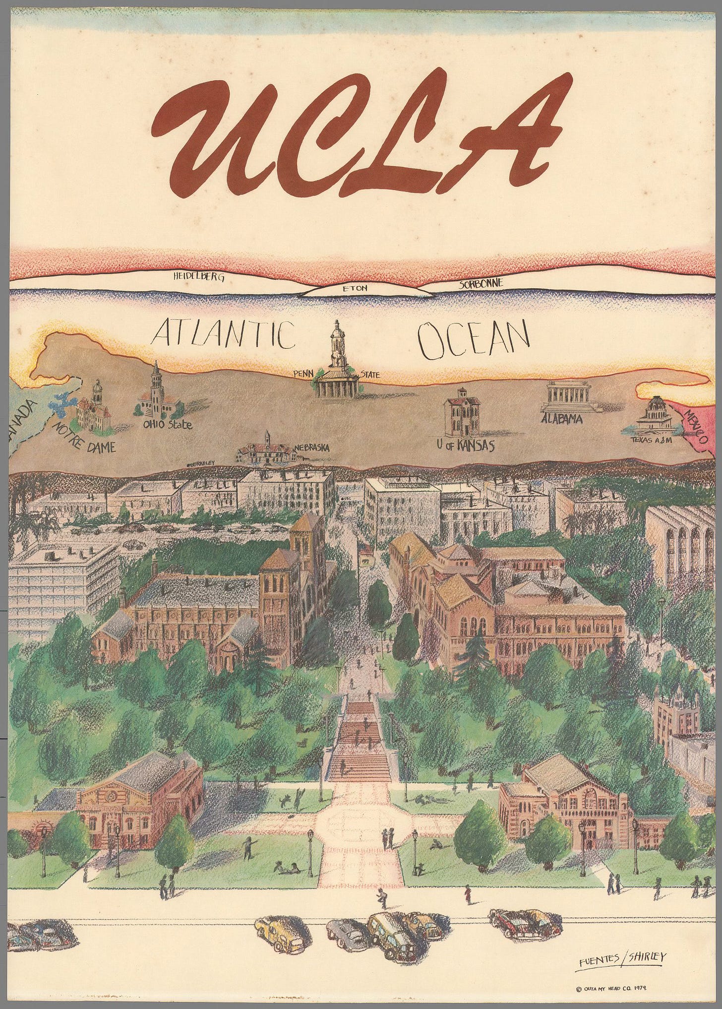
Here is a looking east perspective. This one shows rival colleges. Perhaps ones with better geography departments as the distant locations of Heidelberg and Eton are flipped.

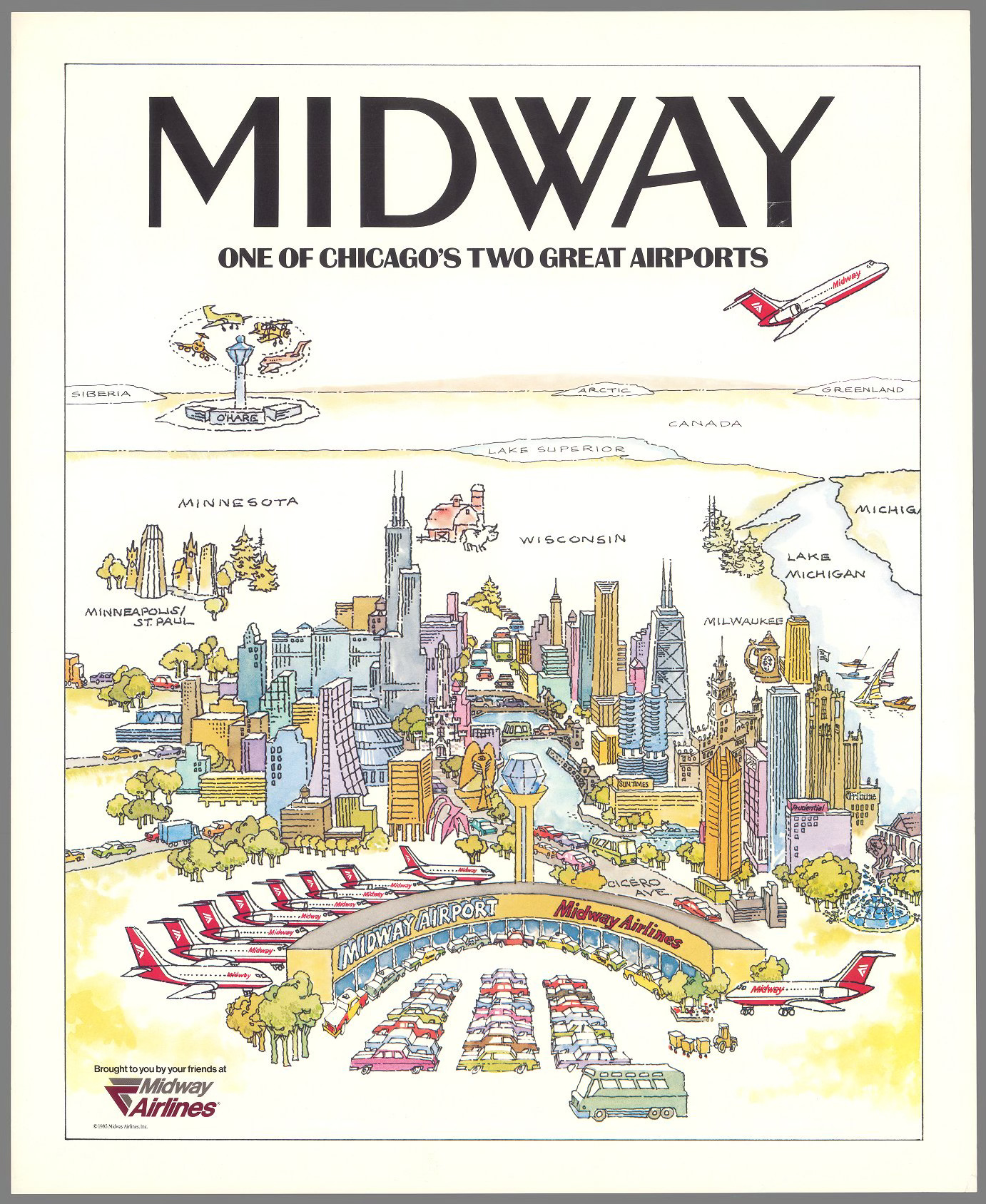
This one is probably my favorite. “One of Chicago’s two great airports“ exaggerating the centrality of Midway while implying that you need to travel almost to Siberia just to get to the chaos of O’Hare Airport.


Wednesday, March 20, 2024

Endangered Languages of New York City

 In January I did a series of posts on endangered languages. A few weeks ago the New York Times had an excellent "scrollytelling" graphic story on these languages and where they are spoken within New York City.

as you scroll down the page languages appear down Manhattan island.

Some quotes from the text: "Most people think of endangered languages as far-flung or exotic, the opposite of cosmopolitan" and "of the 700 or so speakers of Seke, most of whom can be founds in a cluster of villages in Nepal, more than 150 have lived in or around two apartment buildings in Brooklyn." According to linguist Ross Perlin there are more endangered languages in and around New York City than there than "have ever existed anywhere else."

There are profiles of speakers of these languages with a speaker button you can click to hear them speak.

A few neighborhoods are highlighted including the part of the South Bronx where my father grew up.

Continued scrolling reveals some of the languages in very specific places,

so I can see that there are Balanta-Ganja speakers (from Guinea-Bissau and the Gambia in West Africa) right around the corner from my grandmother's apartment building.

Much of the geographic content in this article is from the New York City Language Map, another great resource and rabbit hole to disappear down.


For much more see the  Times story online and the nyc language map.


Wednesday, December 9, 2020

Mapping NYC Capital Spending

Chris Whong, a former planner for the City of New York found a way to muddle through various budget documents to quantify and map where money is being spent on capital projects. The process, documented in a Medium article, involved "scraping" PDF documents ("where data goes to die") and then grouping projects by district to look at his own neighborhood in Brooklyn. Here is the result - click for a more readable version

A sample area.


He also did some nice "small multiple" maps showing 4 year spending by project type across the city. The image below is just a sample - the thing is huge. Clicking it will get you the whole thing.


For details on the convoluted process click here.


Wednesday, April 29, 2020

Mapping Your Neighborhood Under Lockdown

Bloomberg Company's CityLab and the New York Times have both asked readers to submit maps of their neighborhoods under lockdown. The Times one, via Instagram includes this map from Nate Padavick,
https://www.instagram.com/p/B_clPHJA__o/
and some directions on how to make it.

Here are some reader submissions that I like.

Three ways to the creek in Austin, Texas by Champ Turner
https://cdn.theatlantic.com/assets/media/img/posts/2020/04/Champ_Turner_Row_174/98f2ea959.jpg
Birding the Pandemic by Rick Bohannon of Minnesota.
https://cdn.theatlantic.com/assets/media/img/posts/2020/04/Screen_Shot_2020_04_17_at_4.23.58_PM/90b0eeffa.png
Santa Cruz de la Sierra, Bolivia is known as the City of rings for its network of Ring Roads. Augusto Javier León Peralta's shows his neighborhood "ring" incuding the route from home to the market and back. "We can even see some animals in the city that were not seen before"
https://cdn.theatlantic.com/assets/media/img/posts/2020/04/Screen_Shot_2020_04_24_at_10.52.06_AM/f0a6b3aff.png
Here is one from Calais via Twitter
A map from Lauren Nelson of Arlington, Virginia showing the "moat" that the Potomac River has become.
https://cdn.theatlantic.com/assets/media/img/posts/2020/04/Lauren_Nelson_Row_81/4f5455341.jpg

Finally, one from the NY Times Travel Instagram- a nice, simple pen & ink from Emily Bouchard in Chicago.
https://www.instagram.com/p/B_iDBDOliuj/
For more from instagram click here, but you need to wade through a bunch of stupid, gorgeous photos to find the maps. For the more maps go to CityLab

Wednesday, March 27, 2019

City of Women

A couple of years ago, Nonstop Metropolis: A New York City Atlas by Rebecca Solnit and Joshua Jelly-Schapiro, was published. In honor of Women's History Month here is one of the more interesting maps, titled City of Women. The authors renamed subway stations after women "by plotting the places where significant women have lived, worked, gone to school, danced, painted, wrote, and rebelled in order to come up with a feminist city.”
https://www.ucpress.edu/blog/wp-content/uploads/2016/12/CityofWomen_SolnitNMNY.png
“. . . names perpetuate the gendering of New York City. Almost every city is full of men’s names, names that are markers of who wielded power, who made history, who held fortunes, who was remembered; women are anonymous people who changed fathers’ for husbands’ names as they married, who lived in private and were comparatively forgot­ten, with few exceptions..."
Click above for details - here are some highlighted areas.
Upper Manhattan - a diverse mixture of women from all walks of life, including a Supreme Court Justice
 Brooklyn - many actresses and musicians, plus a Supreme Court Justice.
Flushing, Queens - site of the US Open. Tennis players, except for Hannah Feake Brown, a Quaker who probably was not a tennis player.
The Bronx - many women I am should be more familiar with, but are less known probably because of their minority statuses. Actors, musicians, political leaders - and a Supreme Court Justice.

Wednesday, February 6, 2019

A Night Club Map of Harlem

This map was created in 1932 by E. Simms Campbell, the first nationally syndicated African-American illustrator in the United States. It appeared in the first issue of Manhattan Magazine, and was republished nine months later in Esquire.
The map features the most famous speakeasies and night clubs of Harlem (but not all of them as indicated in the title block below) during the Prohibition era.
For example "Gladys'" (Harry Hansberry's) Clam House where Gladys Bentley, who performed as a cross dressing lesbian, "wears a tuxedo and high hat and tickles the ivories."
The map is full of charming details such as "Seventh avenue or heaven", various famous personalities like Cab Calloway and Bill "Bojangles" Robinson, an "actual size" picture of a "shorty" of gin, Harlem's "national drink" and this unique north arrow.
The map also takes some interesting cartographic liberties such compressing the blocks along Lenox Avenue in order to reach up to the Cotton Club. The numbered streets are also deliberately misaligned on either side of Seventh Ave in order to emphasize the important clubs. The blocks between 131st and 110th street are compressed to allow Central Park to be shown.
The map, along with additional details can be found here.  A full resolution version can be found here.

Wednesday, January 23, 2019

The Cost of Water

I found this map created by the Los Angeles Bureau of Power and Light in 1922 via the Cornell University Library's Persuasive Maps collection.
https://digital.library.cornell.edu/catalog/ss:19343636
It appeared on the back of an electric bill and was meant to explain the cost of water. There is a chart of water rates comparing LA favorably to other cities. I like the title "Why Not Free Water? Because of the Cost." It does a good job of breaking down the costs of the 250-mile aqueduct and distribution system.

I stumbled across the map above while looking for the one below. It appeared in some marketing materials and makes a nice modern contrast to the Cost of Water map. It is a different era but the water issues are even more urgent.
https://www.nycwatershed.org/about-us/overview/croton-catskilldelaware-watersheds/
New York City's water system delivers over a billion gallons of water each day to 9 million residents. The length of the aqueducts and reach of the system is impressive - 1,972 square miles of drainage systems flowing into an aqueduct that crosses the Hudson River. That's a lot of cost for water- think about that next time you leave the faucet running.

Wednesday, April 12, 2017

Transit Voyeurism

1. Sydney, Australia programmer Ken Tsang created this live view of the city's transit system showing all vehicles.
https://anytrip.com.au/map
 Every vehicle transmits its location and Transport for NSW has opened the data to the public. It shows all buses, trains, light rail, ferries, delays and track inspections. You can filter by vehicle type. The screen below also serves as a legend of sorts. Trains are in orange, buses blue, light rail red, and ferries green.
You can also see an online version of the station signs.
Just watching all the vehicles moving around is mesmerizing
https://anytrip.com.au/map

NOTE: If you are in North America and looking at this early in the day, you won't see much activity because it will be the middle of the night in Sydney. Wait until later in the day and then see how things pick up.

-via EFTM

2. Will Geary, a data science student has created this wonderful video of a day's transit in New York and suburbs. It is not real time data like the one above but does show an incredible wealth of data - and comes with musical accompaniment!


- via City Lab

Wednesday, April 5, 2017

Grand Theft Auto

I'm not much of a video game player so my ignorance of these things will be pretty obvious to the average gamer. Many video games have cool maps. What's interesting about the geography of Grand Theft Auto is that it is only sort of fictional - the names are different but the places are obviously recognizable. Here is a user created map of San Andreas created by Brazilian user DaniLekBom.
http://gtaforums.com/topic/447751-gta-mapmaking/page-124#entry1069187250
Names like "San Joan" and "Oakplace" are pretty thinly disguised. I like how he squeezed "San Donado" down at the bottom. You can just about see where the ESRI user conference takes place.

There's also a city in the desert. It's called Las Venturas. It has a strip! What was that inspired by? A couple of mysterious places inland like Endsville, Grapeseed and Coconut Springs have less obvious corollaries.

Vice City is another common locale in the game. Sometimes referred to as Vice-Dade County as if it wasn't obvious enough where it is.
http://i.imgur.com/iP2ZiDa.png
Liberty City is also a very familiar looking place. Here's a nice map of it. Lots of green spaces - including a largely empty "Staunton Island."
http://i.imgur.com/6DBJHwZh.jpg
A close-up detail...


Here is the entire United States GTA'ed.
http://i1368.photobucket.com/albums/ag179/gtafan555/gta_america_map3_zpsssl6usgk.jpg
I like how the Dakotas are renamed North and South Yankton and New Jersey becomes New Guernsey.

You can find these, and many more maps, including Europe, Asia and Africa on the GTA Mapmaking Forum.
http://s1368.photobucket.com/user/gtafan555/media/gta_africa_1.9_zpssmpsuimj.jpg.html

NOTE: This is not an endorsement of a violent, sexist video game that may encourage crime and DUI (I don't know, I've never played.)  I'm only here for the maps.

Wednesday, February 15, 2017

The Shadows of New York City

For Part 3 of my New York trilogy, I am revisiting a fantastic interactive map from the New York Times. It shows a day's worth of shadows on the two solstices (it was posted at the Winter Solstice) and at the vernal equinox. Here is midtown Manhattan on December 21st.
https://www.nytimes.com/interactive/2016/12/21/upshot/Mapping-the-Shadows-of-New-York-City.html?rref=collection%2Fsectioncollection%2Fupshot&action=click&contentCollection=upshot&region=rank&module=package&version=highlights&contentPlacement=1&pgtype=sectionfront&_r=1
The dark skyscraper canyons are striking. A closer up view shows why building heights cause such political upheavals. Below we see the shadows cast over the south side of Madison Square by the buildings along 23rd St.
 If you hover over a building you get the height and year built. The Madison Green Condos cast a long and persistent shadow over a corner of the park.


The map was created using publicly available 3D models of New York's buildings The diagram below gives a good idea of how the shadows for each area are calculated.
The interactive map is at the top of the article. You can go to an area of interest and choose your season. Here is my grandmother's old building in the Bronx in winter, spring and then summer.


Since people love to look at stadiums on these things here is Yankee Stadium. In winter it does not get much sun but in summer there's plenty of sunshine for baseball. Too bad most games area at night.