Wednesday, September 26, 2018

Huge North America Pictorial

Last night, thanks to the Leventhal Map Center in Boston, I had the opportunity to see Anton Thomas discuss his amazing map project that has been four years in the works.
We all got to look up close at a copy of the map (from stitched together photographs of the original) as seen above. Magnifiers were also provided.
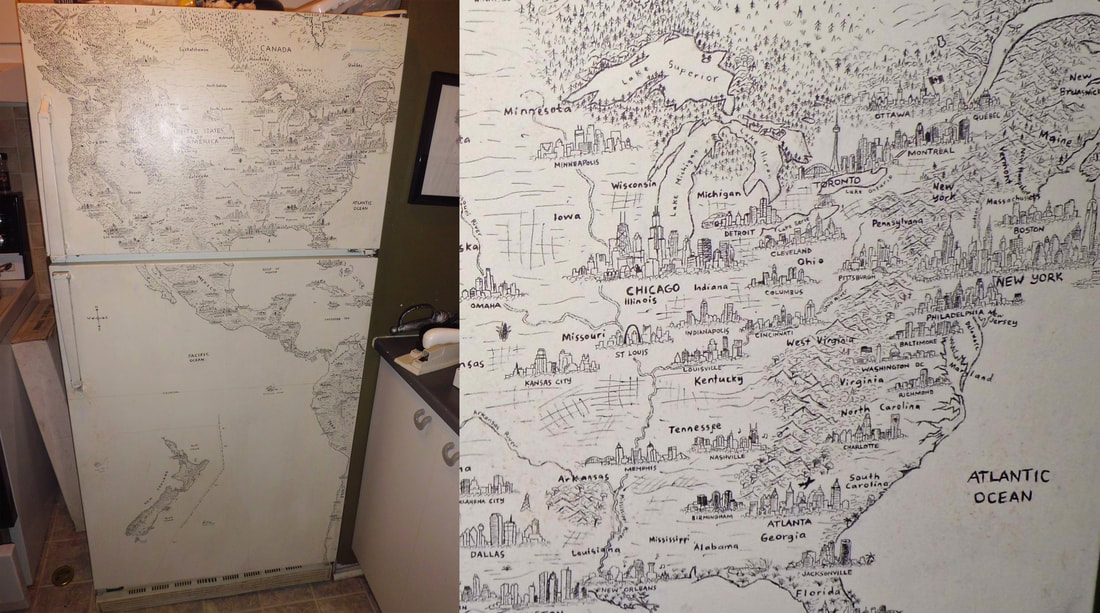
The photos above were taken with my phone under poor lighting conditions. Here is a detail from his web page to get a better sense of the map.
https://www.antonthomasart.com/the-north-american-continent.html
The project started with a drawing on the refrigerator in his apartment in Montreal. He recently visited and confirmed that the fridge is still there though it barely works.
https://www.antonthomasart.com/uploads/3/7/0/5/37051787/h-fridge-montreal_orig.jpg
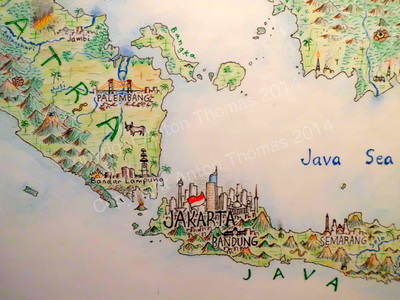
Before embarking on the current map he did one titled South Asia and Australasia.
https://www.antonthomasart.com/uploads/3/7/0/5/37051787/8899799.jpg
There are lots of amazing details including the cityscapes, flora and fauna and music and he spent a ton of time researching each place. Below the Chicago skyline there is a guitar with music coming out of it - specifically the notes and rhythm of "Sweet Home Chicago."
Here is a picture of him showing a collection of bears and moose that he drew in various locations.
One of his challenges is what to do when an area is devastated by an earthquake. Here is Haiti with some of the major buildings of Port Au Prince ghosted in.

If you're interested in digging deeper, here is a video where he describes his process.

Thursday, September 20, 2018

Earth Animations

Earth is a project from Cameron Beccario showing a wide range of climatic conditions that can be animated. Here are the winds animated from Hurricane Florence as it made landfall on September 14th.
At the same time an even more intense Typhoon Mangkhut battering the Philippines.
You can choose to look at air or ocean currents, waves, water and air temperatures (at different heights)  and various other factors. You can even switch map projections. Here are ocean waves using the Waterman Butterfly projection,
and ocean currents in the North Atlantic, looking very Van Gogh-like.
Data are from various global sensors, the geographic data comes from Natural Earth. The visualizations are created in the browser using javascript programming. The color schemes are intuitive enough that no legend is required. Here is the three hour precipitation accumulation over North Carolina from the hurricane.
Another option is the probability of seeing an aurora.
Explore more here


Wednesday, September 12, 2018

Boston's Highway Dreams

Recently I went to a meeting at the public library in Medford, Massachusetts. With some time to kill beforehand, I browsed their map collection and came across this atlas put out by the state (excuse me, Commonwealth) in 1962.
It shows the existing and proposed highways. Here is an optimistic assessment of the reduction in travel times that would result from the proposed expressways.
The green lines are the travel times in 1945 while the red lines are the forecasted times in 1975 after the highway system was expected to be complete. Dotted gray lines are the proposed highways, most of which were never built due to a combination of powerful local opposition and budget constraints. Note how the red lined areas expand along these corridors. With or without expressways the notion of getting downtown within 15 minutes from most of the area below is very quaint.
The plans included a central ring, the Inner Belt or Interstate 695, that was to be built through neighborhoods of Boston, Brookline, Cambridge and Somerville. There were also proposals for a northwest expressway connecting Route 3 to I-695 and one for the Southwest Corridor alignment of Interstate 95.
Much of the housing along the Southwest Corridor was cleared for the highway by the time the project was cancelled. This land was repurposed for a linear park with a transit route for the MBTA Orange Line and Amtrak's Northeast Corridor. Yes, the Southwest Corridor became part of the Northeast Corridor. Here is a detail showing an area of Roxbury that would have been traversed by I-95.
I'm not sure what the orange-green color scheme is for but it clearly shows how the neighborhood would have been split - like an Atlantic Record.

Here is the interchange between 95 and the Inner Belt. This map has south at the top so it's disorienting. Even more so because so much of this neighborhood was wiped out without the highways being built.
Finally, a detail that hits close to home because it is close to my home - the never built Northwest and Route 3 Expressways.


Wednesday, September 5, 2018

Big D

Everything is bigger in Texas but Dallas just got really big according to this map at Winco Foods - via reddit.
By comparison - here are their store locations from their online map.
A closer up look shows that while they may have had fun with the  ridiculous exaggerations, their locations are also pretty awful. Duncanville is east (not west) of Arlington. Denton is not further west than Fort Worth and Carrollton is well to the west of McKinney. At least they got Lewisville sort of right.