Showing posts with label catastrophe voyeurism. Show all posts

Thursday, January 10, 2019

The Great Molasses Explosion

January 15th will mark the 100th anniversary of the Great Molasses Flood. In Boston's North End, a tank filled with molasses burst sending a wave of molasses up to 25 feet high through the streets at 35 miles per hour and knocking buildings off their foundations.

Here is a simulation on YouTube of the flow. User ingomar200 factored in topography, building heights and the size of the tank to create this. He shows the velocity contours later in the video.
This is from a 1917 Bromley Atlas showing the area-via the Boston Planning & Development Agency.
Molasses was used in the manufacture of munitions, The tank is the blue circle. It was conveniently located near the docks and next to the elevated railway that was partially destroyed by flowing molasses. The tank was constructed in haste and inadequately.

21 people and many horses were killed. Some city blocks were flooded to a depth of 2-3 feet. Cleanup of the area took weeks and the harbor was brown for months. Victims brought a successful class action suit against the owners who tried to use fear of terrorism to avoid punishment, claiming that anarchists had placed dynamite in the tank.

Here is the Boston Globe from January 16, 1919 - via the Boston Public Library's flickr page.
and their diagram of the area.
 https://www.flickr.com/photos/boston_public_library/4901511527/in/album-72157624622085789/

Tuesday, November 20, 2018

California Wildfires

Despite the remarkably little press the massive wildfires in California are getting here in the eastern United States, the best sources for maps are from the New York Times and other non-California news organizations. The Times has a fantastic video of the smoke plume over the past week. Unfortunately the code they provided to put it below did not work so here is a small piece of it.
https://www.nytimes.com/interactive/2018/11/16/upshot/california-smoke-map.html
 You can see the entire country here - scroll down the the end of the page. Some of the smoke plumes are shown traveling completely across to the Atlantic Ocean.

Popular Science has a great map showing five years of fires-updated to six including this fire season.
https://www.popsci.com/california-five-year-wildfire#page-2
The best map I've seen showing the current conditions is from the BBC.
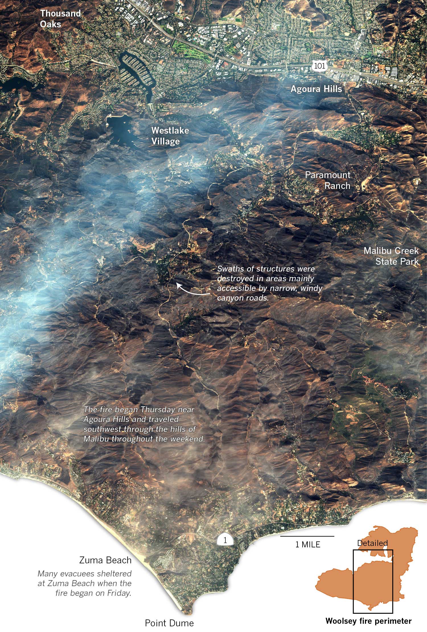
The Los Angeles Times has a great graphic (via DigitalGlobe) showing the Woolsey Fire near Malibu. To see some zoomed in views showing specific houses that were destroyed click here.
https://www.latimes.com/projects/la-me-woolsey-fire-progression/static/img/woolsey_overview_natural.jpg


Tuesday, September 9, 2014

Franklin Expedition Ship Found

The Canadian Government announced today that they have found one of the two ships from the ill fated Franklin Expedition of 1845. While searching for the Northwest Passage, the expedition's ships became trapped in ice and the crew was never found. Sonar images from the waters of Victoria Strait, just off King William Island, show a wrecked ship on the ocean floor.  
http://www.pc.gc.ca/eng/culture/franklin/index.aspx
The wreck location is approximately at the northern ship on this Parks Canada map. The map is nice but could use a "leader line" to connect the inset to the main part of the map, otherwise you might think the area is in Saskatchewan.

These quotes from CBC detail how Inuit hunters of the 1840s helped direct the search:
 "The beauty of where they found it is it's proof positive of Inuit oral history," CBC chief correspondent Peter Mansbridge, who has covered the Franklin search for many years, said Tuesday.

"The Inuit have said for generations that one of their hunters saw a ship in that part of the passage, abandoned and ended up wrecking…. It's exactly where this guy said it was."

Canadian Geographic has a nice detailed map of the search area. It's not completely clear from the articles and announcement exactly where this find is but it appears to be very close, if not in the area outlined below.
http://www.canadiangeographic.ca/franklin-expedition/assets/victoria-strait-expedition-map/


Wednesday, April 23, 2014

How Hollywood has Destroyed America

From the Concourse - an animated map showing the many ways places in the US have been destroyed in movies.
http://theconcourse.deadspin.com/map-how-hollywood-has-destroyed-america-1542969906
Hollywood clearly does not shy away from destroying their own city. The page includes lists and explanations for each symbol type along with several caveats and a discussion of the fine distinction between monsters and creatures. The yet to be released Sharknado 2 was not included. 

Wednesday, November 13, 2013

Nature's Toll on the Philippines

National Geographic has an excellent map showing all the problems nature causes for the Philippines. Not only are the islands magnets for huge typhoons, they also have to cope with earthquakes, volcanoes and landslides. The light brown lines represent a mere 10 years of storm tracks.
http://news.nationalgeographic.com/news/2013/11/131111-philippines-dangers-haiyan-yolanda-death-toll-rises/
The islands are located in a very warm part of the Pacific with no major land masses to the east so they get the full force of these storms. More than 60 percent of the population lives in coastal zones, often in poorly constructed housing. High rates of poverty mean that many people have little control over their living situations. Deforestation has caused mudslides which in turn create sediment clogged stagnant water leading to outbreaks of cholera. On top of all of this, the Philippines are located in the Pacific "ring of fire" where volcanoes, earthquakes and tsunamis are common.

For a more complete summary of their precarious situation see the National Geographic article.

Wednesday, May 29, 2013

Ammonium Nitrate Facilities

Reuters posted a report about last month's explosion in West, Texas* including an interactive map showing facilities that store Ammonium Nitrate. You can zoom out to the entire country and see data for the 29 states that provided data to Reuters. Ten states did not respond and and eleven others refused to provide the information.**
Though I have not found a legend or explanation, it appears that the darker orange facilities are ones that have at least one school or hospital within a one mile radius.

From the article:
At least 800,000 people in the United States live within a mile of 440 sites that store potentially explosive ammonium nitrate, which investigators say was the source of the explosion in West, according to a Reuters analysis of hazardous-chemical storage data maintained by 29 states
A click on the facility brings you a local view showing the potentially vulnerable population. Below is the West Fertilizer Company with six schools within the mile radius. 
Buddy's Plant in Ballinger, Texas is an example of a plant that has hospitals in addition to schools within the one mile radius.
Some not very meaningful personal observations:
*West, Texas is not in West Texas - a fact that bothers me and probably not many other people.
** The geographic pattern of non responding states and those that refused is kind of curious.

Wednesday, May 22, 2013

Oklahoma Destruction

The New York Times put together an excellent map showing the extent of destruction from Monday's tornado in Moore, Oklahoma. The map is based on a visual survey of the aerial photography. It shows that at least 1,500 buildings were destroyed or severely damaged, including entire neighborhoods.


It's truly amazing what nature can do in a few minutes and there's lots of voyeuristic photos on the web page - just be thankful if you're not one of the thousands of people affected.

Wednesday, December 19, 2012

OMG, The End is Nigh!

If the world in fact ends on Friday, I will look stupid for my disbelief. Then again, we'll all be dead so it won't really matter. Here are the "facts" with illustrations that are supposed to prove them.

Nibiru, or Planet X is entering our orbit! You can't see it and neither can any respected astronomer but it's really there!


 It's going to reverse the earth's magnetic poles and cause massive flooding of all coastal areas! This map showing the movement of the north magnetic pole proves it! These images are from Copernicus II.

The evil governments of the world are lying to us while building secret underground cities to hide in. These cities already contain advanced civilizations that previously left the earth's surface. Greg Jenner, a leading proponent of much of this stuff shows maps of an island in the arctic that may contain a passage to the underground.


A quote from Jenner "I cannot discount the possibility that mapmakers (belonging to secret societies) would purposely omit this geographical region known to have UFO activity." Yes, the deliberate omission of secret islands is a frequent topic at NACIS meetings.

There a connection to Atlantis too, why wouldn't there be? That ancient civilization was possibly destroyed by a previous appearance of Nibiru and the survivors scattered to the interior of Brazil, where they built this amazing tunnel system to their secret cities!

 Now you know where to go on Friday to join, if crazy stuff starts happening. Thanks to Greg Jenner and Copernicus II for their amazingly detailed research. Hopefully I'll be back next week.
 

Wednesday, October 12, 2011

Map of the Week-Shipwrecks of the Delmarva

National Geographic features Shipwrecks of the Delmarva on their maps page. I never would have guessed that the chicken farms on Route 13 were perched on such treacherous soil. Here is a detailed view from the Zoomify interface.


From the web page:
Developed by renowned marine archaeologist and accomplished author Don Shomette, and designed by award-winning cartographer Robert Pratt, Shipwrecks of Delmarva is a stunning cartographic piece based on years of research and expert visual design.
I can't resist a few more detailed views.


The burning ship in this last one represents the amazing 2011 Phillies playoff run. Or maybe the gently sinking Rose is the better metaphor - it's just downstream from the stadium.

Wednesday, September 14, 2011

Map of the Week Miscellany for September, 2011

There's a lot going on this week and if I only didn't have to work I could devote more time to these posts and make them more meaningful but be careful what you wish for. Anyway here are a few interesting items I've found this week:

An Army Corps of Engineers map of the flood control structures in Wilkes Barre, Pennsylvania.


 The manual this map appears in describes how the levees in Wilkes Barre and across the river in Kingston can form a bottleneck and make flooding worse for communities downstream. In 1972 these walls were too short to contain the flow from Tropical Storm Agnes and the city was flooded. The water stored from this flooding helped spare downstream places like Sunbury. Since then the levees have been raised, partially sparing Wilkes Barre from this weekend's floods (though water did get in by seeping under the levees.)

This sent more water to downstream places like Bloomsburg, where record setting flooding occurred.


Below is a map from the AP showing the some of the worst hit places.

Daniel Huffman's wonderful river schematic map shows how these places interconnect.


***********************************
Other Miscellaneous Notes:
***********************************
Tomorrow night (September 15th) David Byrne will squish an inflatable globe under the High Line in New York City. It will be there until October 1st. To sort of quote one of his songs "this was a parking lot, now it's all covered in globe." More information is available from New York Magazine.


************************************
From LA Taco ("Celebrating the taco lifestyle in Los Angeles") comes this chart showing the population growth of the largest cities in the USA. 


Wednesday, September 7, 2011

Map of the Week - About that Tropical Storm

My colleagues in Vermont are doing a great job providing timely data for disaster responders under difficult circumstances. The Vermont Center for Geographic Information's offices have been flooded for the last week and a half but they are up and running. Meanwhile the Vermont Agency of Transportation is publishing and updating this detailed map every 12-24 hours.


Here's a detail from Wardsboro, a town I've spent time in and that was until recently inaccessible.


It's a big, colorful mess over there but they're still hoping to be open for the upcoming foliage season when things get really colorful.

Wednesday, August 24, 2011

Map of the Week - About that Earthquake

So we had this earthquake yesterday. OK 5.8 is nothing by west coast standards but when it happens on the east coast it's really important! I'd love to see a map of all the tweets because they apparently traveled quicker than the quake itself. There were reports of people seeing the tweets before feeling the quake. Of all the maps out there, this one from Joe Hanson is clearly the most informative.   


Anyway, the Baltimore Sun shows this map from the USGS showing the intensity felt by color. They use a detailed questionnaire to make it a bit less subjective. 


Here is a link to other USGS maps. Hope you survived. I didn't feel a thing but I was on my bicycle and everything feels bumpy from there.

Wednesday, March 16, 2011

Map of the Week-Nuke Plants in Earthquake Zones

The awful events going on in Japan made me curious about where else in the world there are nuclear plants in earthquake zones. Fortunately maptd had the same idea so they did all the work for me. Click the map below to get to their post and link to a google "heat map" of earthquake areas with a nuke plants overlay.


I was not previously familiar with the maptd blog but they have some excellent coverage of the mess in Japan including before and after pictures. They also include this Fox News "map fail" showing Japan's nuclear plants that includes the Shibuya Eggman, a nightclub in Tokyo. The map also missed several plants according to this wikipedia entry.


Wednesday, January 13, 2010

Map of the Week-Haiti Quake Maps

I don't like to gawk at natural disasters. However, yesterday's earthquake in Haiti is so horrific that's it's a tough one to ignore. The U. S. Geological Survey's PAGER (Prompt Assessment of Global Earthquakes for Response) has some useful maps and graphics to illustrate the severity of the situation. Here are the most recent earthquakes on PAGER with the Haiti quake detailed.


Here are some maps from the PAGER's Haiti earthquake page. First, a graph showing the color codes.

 This is the "shakemap" showing the quake intensity. To the right, a list of the most affected cities using the same color codes.


Finally, a map showing population density (in gray) with the quake intensity shown as colored isolines.

Thursday, May 15, 2008

Map of the Week 125-Asian Disasters

It's been tough finding good maps of the earthquake area in China. The BBC wins out again with this map although the scale is a bit too zoomed in to get a good sense of the surrounding areas. You do get a sense of how close Chengdu, a city of about 4 million people, is to the epicenter and how severe the quake was there. You can click on the affected cities and get more information - or just scroll down on the same page.


One of the more tragic aspects of the China quake is how it has made many of us forget about the cyclone in Myanmar-Burma (Whatever you prefer to call it) where another city of 4 million Yangon-Rangoon (Whatever you prefer to call it) has been hit.
This is a set of before and after satellite images of Cyclone Nargis from the NASA Earth Observatory. The after image shows the extent of flooding as of May 5th using a combination of color and infrared light to clarify the floodwaters.
Anyway be thankful if you're not in one of these places and hopefully we'll all donate a little to help these people-it could be any of us next time.