
The Osher Map Library in Portland, Maine recently posted their 2026 Illustrated Mapmaking Competition results. These are maps made by school children in Maine in the 4th-6th grade range. First prize went to The Broken Islands by Jacob S., a 6th grader at Brunswick Junior High School.

Most of these maps are of fantasy lands, some from literature and other purely made up. I don’t have a strong familiarity with today’s children’s literature or movies so I am probably missing some of the references. Here are some of my favorites from the honorable mentions.
Rough Ridge Mountain Bike Trails by Foster B. of Montville.

Ipad Isles by Aster B. of Brunswick

I love how apps such as the weather and health are classified as boring.
The Land of Three Colors by Erin Q. of Brunswick (a town very well represented here)
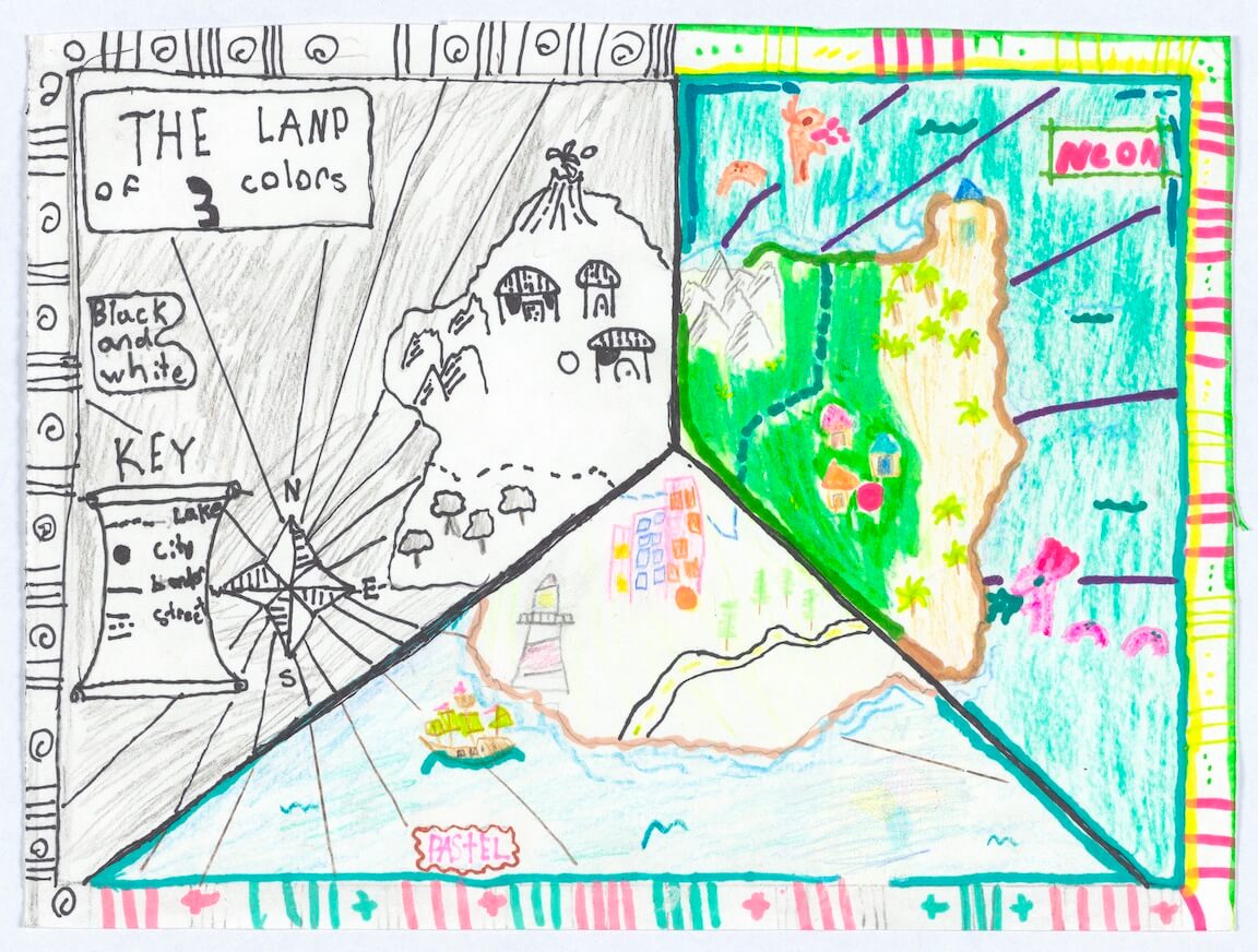
This is really three color palettes but I’m not going to get too uptight about that.
Pine Tree State by Darcy Q. also of Brunswick.

An actual place! Nicely done!
Finally, just in time for lunch, Pizza Island by Katie Cahoon of York.

You can see all of the maps here.


