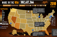
There's been lots of ballyhoo about the US Population
having reached 300 million this past week. Here is a pretty cool
interactive map from
MSNBC's web site. There's a timeline on the
bottom so you can see population change through history and lots of info
when you scroll around the states. I had trouble with this in Internet
Exploder but it worked great in the Netscape/Firefox world. Happy
mapping!
