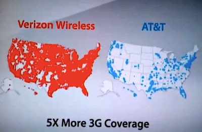
OK - I screwed up this post a bit. I will leave the original post intact but see the correction section at the end.Verizon has blitzed the TV and print media with their clever "There's a map for that" advertisements. Given the ease of manipulating this type of map, I'm surprised that this ad has gone virtually unchallenged so far. Does Verizon's map color in any area of reception regardless of how spotty? Are the map projections the same? Does the red vs blue scheme imply some kind of secret Republican bias on the part of Verizon?
I wasted way too much time on a somewhat extensive web search and found nothing out there that challenges this ad. Here is a screenshot from the ad.

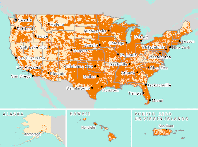
Here's a look at AT&T's "coverage viewer" map - it tells a slightly different story.

Both carriers,
Verizon and
AT&T have interactive coverage maps. You can zoom down to street level to see your local coverage. However, if you live in any urbanized area you're likely to see nothing but a sea of color. Both of these pages have very similar disclaimers. Here's part of AT&T's.
"Map may include areas served by unaffiliated carriers, and may depict their licensed area rather than an approximation of their coverage. Actual coverage area may differ substantially from map graphics, and coverage may be affected by such things as terrain, weather, foliage, buildings and other construction, signal strength, customer equipment and other factors. AT&T does not guarantee coverage"
Sounds like lots of gray areas that can go either way depending on whose map you're making.

The obvious lesson in all of this-don't believe everything you see in advertisements-or maps.
Or on this blog (See below)!!!!!
CORRECTION:So, as anonymous commenter pointed out, the AT&T map I show above from their website is a "Voice & Data" map, not 3G. As are both of the coverage viewers that I linked to above. You can get a 3G map from AT&T but it's very tricky-if you really want it look for instructions in the comments. The map you will find is actually pretty similar to the map shown in the ad.
What's the difference? Is it just speed or are there things you can't do with "Voice & Data?" I don't know enough about this stuff to speculate.
So if I've unfairly portrayed Verizon as a bunch of liars, sorry about that. However, I am still very skeptical about their own coverage map and the entire premise of the ad. As the Verizon disclaimer says:
"This does not show exact coverage. Wireless service is subject to network and transmission limitations, particularly near boundaries and in remote areas"
If you want maps that are better than the blurry ones in the ads, see the
Verizon 3G page.
 The map shows the locations of jack-o-lanterns using an image of each one. The lack of any other detail challenges the idea of this being a map. The author aims to break down boundaries between mapping and art and to focus on the patterns rather than on the specific locations that would be apparent if the streets were included.
